Visual Communication for Architects and Designers teaches you the art of designing a concise, clear, compelling and effective visual and verbal presentation. Margaret Fletcher has developed a reference manual of best practices that gives you the necessary tools to present your work in the best way possible. It includes an impressive 750 presentation examples by over 180 designers from 24 countries in North America, South America, Europe, the Middle East, Asia, Oceania and Africa. This book offers actionable advice to solve a variety of complex presentation challenges.
You will learn how to:
Understand differences in communication design, representation design and presentation design and know how to use these skills to your advantage;
Structure the visual and verbal argument in your presentation;
Design your presentation layouts, architectural competitions, boards and digital presentations;
Manage issues related to the presentation of architectural and design ideas;
Present yourself professionally.
Your ability to communicate your design ideas to others is an invaluable and important skill. Visual Communication for Architects and Designers shows you how to develop and implement these skills and gain command of your presentations.
Trusted by 375,005 students
Access to over 1.5 million titles for a fair monthly price.
There are many things that go into the development of a compelling design argument; some parts of the argument can start at the beginning of the design project and some things will develop as the design process moves along. Typically, the primary artifacts developed during the course of a design project are visual ones such as drawings, models, images and renderings. Knowing the ideas behind the visual artifacts that are being developed will help hone the representations into meaningful pieces of communication.
There are certain graphic standards that should be understood and implemented by all designers to prevent graphic calamities that can get in the way of clear visual communication. This section aims to help the designer sharpen and integrate both their verbal and visual skills while tackling the challenge of the visual argument.
One of the single most difficult things to achieve with a presentation is a true and powerful visual and verbal representation of design thinking and not just a display of project artifacts. Remember our definition of the project narrative: the project narrative in a presentation relates to the specific project and is the unique visual and written representational material required to convey the design thinking behind the work.
Time is precious during project development and often it is all a designer can do to just get the project visually described. Using design artifacts without thinking about what they are representing is never a good idea when it comes to presentation design. This method of presentation design is just a representation of production. It only demonstrates that artifacts were made, that there is a basic skill set. However, it is missing a radically important skill and, frankly, a more elusive skill to demonstrate: the skill of design thinking.
Often a project reviewer has multiple projects to review. They could even have hundreds of competition submissions to review that they need to narrow down to a short list. Every single project is from a competent designer who has the basic skills of all architecture students—they can build physical models, they can build digital models, and they can all produce a set of drawings. These are skills that are expected! But you are declaring that you are a designer and being a designer requires the demonstration of an inquisitive and robust mind! A designer creates; a designer strives to expose something previously unknown. It is a very specific set of skills to display.
The ultimate challenge in presentation design is to strive to uncover, reveal and explain the design thinking—the previously unknown—through the artifacts of the design project. As a result of successful presentation design, the designer can direct the reviewer to exactly what they want them to see and understand about a project—use this fact to your advantage. Don’t simply rely on the material that is available. New visual representations to explain your project may need to be produced in order to explain the complexity of your design ideas.1
Finding Gaps in the Project Narrative
It is important to work diligently toward a cohesive and logical project narrative. It is a relatively straight-forward process but one that needs to begin early in the project’s development.
To get started at the beginning of a project, make a list of the kinds of project representations that should typically exist for a project. This is a list of artifacts that covers the basics: site plan, plans, elevations, sections, descriptive diagrams, etc. As the project progresses, this list will naturally develop and morph depending on the descriptive needs of the project.
Likewise, as the project develops, keep a list of all of the project ideas that are evolving that will ultimately need to be conveyed in the presentation. This list should include every idea that has been incorporated into the project, no matter how significant or insignificant. Do not leave any ideas off this list. As with the artifact representation list, this one will adjust and shift as the project progresses.
The goal with this exercise is to match important ideas to the artifacts that will best describe them. This is your greatest device in the development of both the project and the presentation. So, I will say it again: the goal is to match important ideas to the artifacts that will best describe them.
While moving through the design process, these lists will need to be organized and reordered to establish a hierarchy of design ideas. It is always better to communicate a few ideas and communicate them well than to try to express too much and risk the entire argument becoming unclear, that is why an idea hierarchy is needed. In the case of a presentation, the reviewer spends a relatively short amount of time with the work compared to how long the designer has and it is imperative that the design thinking is clearly conveyed. Prioritizing and acting as a curator to your own design ideas is a must. It is not enough to simply demonstrate your production skills. Design ideas must be represented. If they are not represented in the presentation, they do not exist.
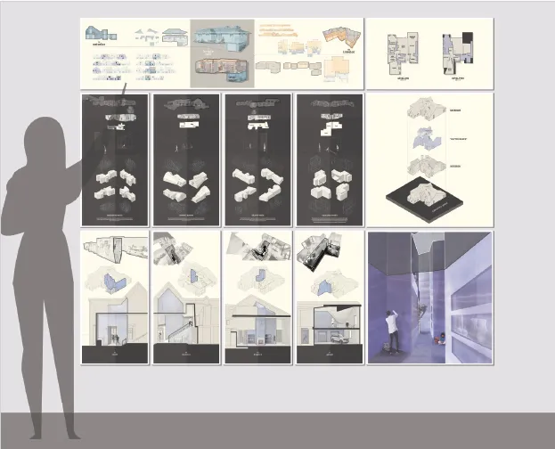
Clear image hierarchy supports the design argument in this printed presentation. Drawing selections from The Glitch by Neely Sutter.
It is entirely likely that additional material of some sort—drawings, models, diagrams—will need to be produced to flesh out your visual argument. It is a critical step in the clarity of your presentation to be realistic with yourself about what needs to be done. It is important to step back and be truly honest with yourself to determine if what you have to show actually delivers the message you intend. If you do decide that additional visual representation is needed, be careful and determine what you can actually accomplish in the time left. If time is limited, be focused and accomplish the work of absolute value to your argument.
Order of the Project Narrative
It is important to give some thoughtful reasoning to the order in which the project is presented. Your first instinct might be to organize the project narrative based on the order in which the project was developed and designed. This could be a reasonable strategy. However, it completely removes any opportunity to build a hierarchical and cohesive design argument. Instead, this method simply describes what you did and in the order you did it. This isn’t always the best way to present your work.
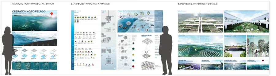
Broad categories help organize the complexity of ideas embedded in this thesis presentation, Agro-Pelago: Foodscapes for the Future by Jaclyn Kaloczi.
Try this instead: review the lists generated earlier about project artifacts—existing and missing—and project ideas. From these lists, match design ideas to visual artifacts that best explain them and begin to combine and relate ideas to one another in an effort to streamline your thoughts into similar categories. Through this activity you can establish a hierarchy between the primary ideas and support ideas. Once you understand the hierarchy of ideas, it becomes clearer which representations should appear as the most visually prominent within the presentation—the ones that convey the primary ideas best! Keep in mind that this primary representation could be anything. It could be an exploded axonometric drawing, a plan or a section, a wire-frame sequence of views, a rendered or illustrated perspective view or even an annotated diagram. It could be anything really. The most important thing to remember about the order of the project narrative is that it should be considered and not just a retelling of the history of the development of a project—unless, of course, after careful consideration, you decide this is the best way to present your specific project narrative.
Keep in mind, as the designer you have full control of what the project reviewer understands about the work—absolute and complete control. Take advantage of this knowledge when developing the order of the project narrative. And remember, even though it is good practice to formally structure an argument, there is no way to absolutely control what a reviewer spends time focusing on. They will likely focus on what they, personally, think is the most interesting visual item in the presentation. Making sure to prioritize ideas and their respective representations increases the chance that the focus of the reviewer will go to the place you wish.
Primary Images and Support Images
It is important to establish a strong and pronounced visual hierarchy within the project imagery to determine which project representations are most important to the design argument. Once this determination is made, it becomes much easier to make decisions about both the placement of other images as well as their relative size. As mentioned before, images that are most important to the design argument should lead the visual presentation and should be large relative to other artifacts within the presentation. This is a very simple but powerful strategy.
Once the primary images have been identified, it is time to determine which images should act as support images. Primary images are the images that best convey the main design objectives and are generally larger within the presentation. Support images are images that need other visual content to be fully meaningful or images that are purposefully subordinate to a primary image. It is important to understand this relationship between images, to identify the relationships early and to let this information influence the presentation layout.2
Begin Constructing Your Presentation
Development of the project and presentation narrative should happen almost simultaneously. In fact, it can be quite difficult to conceptually separate these tasks. This is a good thing! If a presentation is the final outcome of a design project, then the design of the presentation narrative is actually a primary component of the design of the project.
In truth, the evaluation of a design project and therefore the presentation is based on the clarity and conveyance of ideas through the presentation. It is imperative that the presentation demonstrates the designer’s ability to think through and solve complex design problems. The presentation is ultimately the only thing being designed for. Your project does not exist anywhere else or in any other way. The presentation is essentially all you have. All drawings you make or models you build are representation tools. Keep this in mind and make sure the design presentation is a clear, compelling and focused message of your design ideas.
Systems of visual structure and visual organization
constructing a visual argument
Developing the Visual Narrative
Employing visual structure and visual organization systems across the entire presentation is vital for the visual consistency of the work. In simple terms, without this visual organization, it can be very difficult for reviewers to focus on the design work. The last thing you want to have happen is for reviewers to be so distracted by an inconsistent organization system, that they are completely unable to visually stitch your design argument together. Implementing structured ordering systems is the best way to elevate your presentation from a random set of images on boards to a choreographed collection of work that supports a clear design argument.
There are two important ideals that can be achieved through the consistent application of visual ordering systems:
1. Using visual ordering systems makes it easier for the designer to organize and convey their design ideas. Establishing physical parameters to work within provides constraints to push against—always a good strategy on a design problem and the presentation is certainly a design problem.
2. Having a clear ordering system makes it easier for the reviewer to actually see, follow and understand the design argument.
As you see, simply stated, visual ordering systems work for both the designer and the reviewer and exist as a primary means through which a message can be effectively delivered.
Fortunately, there is a full collection of systems that can be used to attain visual organization—grid and alignment systems, hanglines and baselines, the active area and margins, adjacency relationships—and all can operate together as both visual organization systems and content organization systems. These systems work in conjunction with each other to achieve the visual structure needed to consistently organize a presentation—this describes the nature of the visual narrative.
Grid and Alignment Sys...
Table of contents
Cover
Half Title
Title
Copyright
Dedication
Contents
Introduction
01: communication, representation and presentation
02: constructing a visual argument
03: presentation design
04: presenting yourself professionally
05: drawing for impact
Notes
Acknowledgments
Illustration Credits
Index
Frequently asked questions
Yes, you can cancel anytime from the Subscription tab in your account settings on the Perlego website. Your subscription will stay active until the end of your current billing period. Learn how to cancel your subscription
No, books cannot be downloaded as external files, such as PDFs, for use outside of Perlego. However, you can download books within the Perlego app for offline reading on mobile or tablet. Learn how to download books offline
Perlego offers two plans: Essential and Complete
Essential is ideal for learners and professionals who enjoy exploring a wide range of subjects. Access the Essential Library with 800,000+ trusted titles and best-sellers across business, personal growth, and the humanities. Includes unlimited reading time and Standard Read Aloud voice.
Complete: Perfect for advanced learners and researchers needing full, unrestricted access. Unlock 1.5M+ books across hundreds of subjects, including academic and specialized titles. The Complete Plan also includes advanced features like Premium Read Aloud and Research Assistant.
Both plans are available with monthly, semester, or annual billing cycles.
We are an online textbook subscription service, where you can get access to an entire online library for less than the price of a single book per month. With over 1.5 million books across 990+ topics, we’ve got you covered! Learn about our mission
Look out for the read-aloud symbol on your next book to see if you can listen to it. The read-aloud tool reads text aloud for you, highlighting the text as it is being read. You can pause it, speed it up and slow it down. Learn more about Read Aloud
Yes! You can use the Perlego app on both iOS and Android devices to read anytime, anywhere — even offline. Perfect for commutes or when you’re on the go. Please note we cannot support devices running on iOS 13 and Android 7 or earlier. Learn more about using the app
Yes, you can access Visual Communication for Architects and Designers by Margaret Fletcher in PDF and/or ePUB format, as well as other popular books in Architettura & Architettura generale. We have over 1.5 million books available in our catalogue for you to explore.