eBook - ePub
The Craft of Information Visualization
Readings and Reflections
- 432 pages
- English
- ePUB (mobile friendly)
- Available on iOS & Android
eBook - ePub
About this book
Since the beginning of the computer age, researchers from many disciplines have sought to facilitate people's use of computers and to provide ways for scientists to make sense of the immense quantities of data coming out of them. One gainful result of these efforts has been the field of information visualization, whose technology is increasingly applied in scientific research, digital libraries, data mining, financial data analysis, market studies, manufacturing production control, and data discovery.This book collects 38 of the key papers on information visualization from a leading and prominent research lab, the University of Maryland's Human-Computer Interaction Lab (HCIL). Celebrating HCIL's 20th anniversary, this book presents a coherent body of work from a respected community that has had many success stories with its research and commercial spin-offs. Each chapter contains an introduction specifically written for this volume by two leading HCI researchers, to describe the connections among those papers and reveal HCIL's individual approach to developing innovations.*Presents key ideas, novel interfaces, and major applications of information visualization tools, embedded in inspirational prototypes.*Techniques can be widely applied in scientific research, digital libraries, data mining, financial data analysis, business market studies, manufacturing production control, drug discovery, and genomic studies.*Provides an "insider" view to the scientific process and evolution of innovation, as told by the researchers themselves.*This work comes from the prominent and high profile University of Maryland's Human Computer Interaction Lab
Trusted by 375,005 students
Access to over 1.5 million titles for a fair monthly price.
Study more efficiently using our study tools.
Information
Chapter 1
Database Discovery with Dynamic Queries
Introduction to Database Discovery with Dynamic Queries
Visual Information Seeking: Tight Coupling of Dynamic Query Filters with Starfield Displays
C. Ahlberg and B. Shneiderman
Dynamic Queries for Visual Information Seeking
B. Shneiderman
Temporal, Geographical and Categorical Aggregations Viewed through Coordinated Displays: A Case Study with Highway Incident Data
A. Fredrikson, C. North, C. Plaisant, and B. Shneiderman
Broadening Access to Large Online Databases by Generalizing Query Previews
E. Tanin, C. Plaisant, and B. Shneiderman
Dynamic Queries and Brushing on Choropleth Maps
G. Dang, C. North, and B. Shneiderman
As yet I know of no person or group that is taking nearly adequate advantage of the graphical potentialities of the computer … In exploration they are going to be the data analyst’s greatest single resource.
John Tukey. “The Technical Tools of Statistics.”
American Statistician 19 (1965)
When users are confronted by a new and large database, they usually begin by trying to understand its schema, attributes, and attribute values, possibly by referring to data dictionaries. But understanding the extent of the data is often difficult-How many items are there? Which attribute values or patterns occur often or rarely? Where are the clusters, gaps, or outliers? Which attributes are correlated? These questions are very difficult to discover with existing tools. But the hardest task is to know which questions to ask in the first place.
The goal of designers of modem information visualization tools is to help users discover which questions to ask. These new tools enable users to gain an overview, explore rapidly, test hypotheses, and then share their results with colleagues.
One significant approach toward this end is called dynamic queries, a technique that enables interactive exploration. Dynamic queries allow users to update two-dimensional graphical displays in less than 100 milliseconds, even with databases of a million items. As users adjust sliders, buttons, check boxes, and other control widgets, the continuously visible display of results updates rapidly. There is no Submit button because users can select rapidly from the set of permissible attribute values. There are no syntax errors, and users feel they are in control. They can explore quickly, testing their hypotheses, finding outliers, and identifying patterns.
The appropriate visual display depends on the data—world maps, tree diagrams, tree maps, body diagrams, timelines, scatter plots, and more innovative ideas have all been used. Two of our early applications of dynamic queries were a chemical table of elements (1992 video*), and HomeFinder, a regional map of the Washington, D.C. area (91–11). As query widgets were changed, the chemical symbols changed color to signify inclusion and dots indicating homes for sale lit up on the regional map (92–01) (free downloadable version at www.cs.umd.edu/hcil/pubs/products.shtml).
Christopher Ahlberg, a visiting student from Sweden during the summer of 1991, took up Ben Shneiderman’s lunch-time challenge to work on dynamic query interfaces that applied the following direct manipulation principles (originally described in Shneiderman 1982):

When used appropriately, these principles can lead to designs that have these beneficial features.
Christopher’s first overnight success was making a modern slider-based version of a polynomial viewer first built in 1972 (Shneiderman 1974). As users move the sliders for each coefficient, the curve gracefully reshapes on the screen, creating dancing parabolas. Within a week, he had satisfied a second challenge of a dynamic query interface for the chemical table of elements. He put up the periodic table with chemical symbols in red with six sliders for attributes such as atomic radius, ionization energy, and electronegativity. As users move the sliders, the chemical symbols change to red showing the clusters, jumps, and gaps that chemists find fascinating. A study with 18 chemistry students showed faster performance with use of a visual display (versus a simple textual list) and a visual input device (versus a form fill-in box).
At about the same time, Christopher Williamson’s HomeFinder showed a map of Washington, D.C. and 1100 lights indicating homes for sale (Figure 1.1). Users could mark the workplace for both members of a couple and then adjust sliders to select circular areas of varying radii. Other sliders selected number of bedrooms and cost, with buttons for air conditioning, garage, and so on. Within seconds, users could see how many homes matched their query and adjust accordingly. Controlled experiments with benchmark tasks showed dramatic speedups in performance and high subjective satisfaction (93–01 [1.2], 94–16, 1993 video, 1994 video). This demo continues to be compelling and comprehensible even though it is more than ten years old.
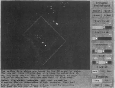
Figure 1.1 The Dynamic Query HomeFinder showed 1100 homes for sale in the area of Washington, D.C. Users could set sliders to indicate distances from markers, number of bedrooms, and price.
Williamson earned a trip to the ACM SIGIR ‘92 conference in Copenhagen to present his work. Then he went on to the University of Colorado at Boulder to do a master’s thesis that expanded the idea into a well-engineered and commercially viable version. One of the amusing stories about this project was the unwillingness of corporate or university sources of regional housing information to share their data. Each organization felt protective of its data and saw little benefit to cooperating with us. Undaunted, Chris Williamson and his friends took a Sunday Washington Post and typed in the data for the 1100 homes. The resistance of these same institutions to learning about or applying our approach is surprising. They were successful with their current interfaces and satisfied with doing training courses so that staff could serve clients. They had little motivation to change to an interface that enabled users to do searches on their own, until a serious competitor arose.
Soon after, we worked with the National Center for Health Statistics and built prototypes of Dynamaps (93–21, 1993 video). A thematic map of the United States showing cancer rates was animated by adjusting sliders (Figure 1.2). A time slider illustrated time trends, and states or counties could b...
Table of contents
- Cover image
- Title page
- Table of Contents
- The Morgan Kaufmann Series in Interactive Technologies
- Copyright
- Preface
- Acknowledgments
- Introduction
- Chapter 1: Database Discovery with Dynamic Queries
- Chapter 2: Seeing the World Through Image Libraries
- Chapter 3: Preserving Context with Zoomable User Interfaces
- Chapter 4: The World’s Information in Digital Libraries
- Chapter 5: Making Sense of the World Wide Web
- Chapter 6: Understanding Hierarchical Data
- Chapter 7: Innovating the Interaction
- Chapter 8: Theories for Understanding Information Visualization
- Appendix A: Videos
- Appendix B: Project Pages
- Appendix C: Software
- Appendix D: HCIL Technical Report Listing (1993–2002)
- Author Index
- Key Terms Index
Frequently asked questions
Yes, you can cancel anytime from the Subscription tab in your account settings on the Perlego website. Your subscription will stay active until the end of your current billing period. Learn how to cancel your subscription
No, books cannot be downloaded as external files, such as PDFs, for use outside of Perlego. However, you can download books within the Perlego app for offline reading on mobile or tablet. Learn how to download books offline
Perlego offers two plans: Essential and Complete
- Essential is ideal for learners and professionals who enjoy exploring a wide range of subjects. Access the Essential Library with 800,000+ trusted titles and best-sellers across business, personal growth, and the humanities. Includes unlimited reading time and Standard Read Aloud voice.
- Complete: Perfect for advanced learners and researchers needing full, unrestricted access. Unlock 1.5M+ books across hundreds of subjects, including academic and specialized titles. The Complete Plan also includes advanced features like Premium Read Aloud and Research Assistant.
We are an online textbook subscription service, where you can get access to an entire online library for less than the price of a single book per month. With over 1.5 million books across 990+ topics, we’ve got you covered! Learn about our mission
Look out for the read-aloud symbol on your next book to see if you can listen to it. The read-aloud tool reads text aloud for you, highlighting the text as it is being read. You can pause it, speed it up and slow it down. Learn more about Read Aloud
Yes! You can use the Perlego app on both iOS and Android devices to read anytime, anywhere — even offline. Perfect for commutes or when you’re on the go.
Please note we cannot support devices running on iOS 13 and Android 7 or earlier. Learn more about using the app
Please note we cannot support devices running on iOS 13 and Android 7 or earlier. Learn more about using the app
Yes, you can access The Craft of Information Visualization by Benjamin B. Bederson,Ben Shneiderman in PDF and/or ePUB format, as well as other popular books in Computer Science & Human-Computer Interaction. We have over 1.5 million books available in our catalogue for you to explore.