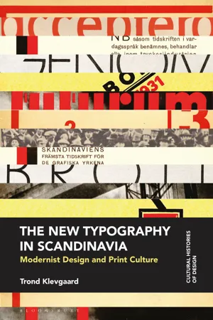
This is the first monograph on Scandinavia's 'New Typography'. It provides a detailed account of the movement's lifespan in the region from the 1920s up until the 1940s, when it was largely incorporated into mainstream practice.
The book begins by tracing how the New Typography, from its origins in the central and eastern European avant-garde, arrived in Scandinavia. It considers the movement's transformative impact on printing, detailing the cultural and technological reasons why its ability to act as a modernising force varied between different professional groups. The last two chapters look at how New Typography related to Scandinavian society more widely by looking at its ties to functionalism and social democracy, paving the way for a discussion of the reciprocal relationship between the culture of practitioners and the cultural work performed through their practice.
Based on archival research undertaken at a number of Scandinavian institutions, the book brings a wealth of previously unpublished visual material to light and provides a fresh perspective on a movement of central and enduring importance to graphic design history and practice.
- 280 pages
- English
- ePUB (mobile friendly)
- Available on iOS & Android
eBook - ePub
About this book
Trusted by 375,005 students
Access to over 1.5 million titles for a fair monthly price.
Study more efficiently using our study tools.
Information
1
Origins and networks
The New Typography developed out of experiments carried out by a small number of avant-garde poets and artists in the 1910s and 1920s. Although the term is perhaps most closely associated with Jan Tschichold’s Die Neue Typographie, it was coined by László Moholy-Nagy (1895–1946) in a short text published in the catalogue for the first Bauhaus exhibition in Weimar in 1923. In order to gain an appreciation of how the New Typography is usually understood, the following traces its origins in avant-garde poetry and painting. Before discussing Moholy-Nagy’s definition, it therefore looks at how the futurist notion of words-in-freedom was interpreted in typography and how this reverberated in the simultaneous poetry of Guillaume Apollinaire (1880–1918) and in the seemingly unstructured, explosive compositions of Dada. It also examines how the New Typography adopted formal means from the ‘objective’ art practised by the De Stijl group and the suprematists, and how constructivism lent it utilitarian purpose and utopian vision.
As stated in the introduction, the avant-garde can be seen as a network. Although limited in number and distributed across the European continent, individual nodes were connected through personal encounters, correspondence and through the publication and exchange of journals. Scandinavian practitioners also played a role in this exchange, notably through the Swedish painter Georg Pauli’s journal Flamman and the publications issued by the New Student Society in Copenhagen, active between the years 1922 and 1924. The second part of this chapter examines Flamman and the New Student Society’s publications’ status as nodes in the avant-garde network and discusses their contribution to the New Typography.
Origins of the New Typography
The starting point for the extraordinary decade of experimentation with the printed word which ultimately gave rise to the New Typography can be found in the work of Filippo Tommaso Marinetti and the Italian futurists. In the ‘Manifesto of Futurism’, published on the front page of the Parisian newspaper Le Figaro in 1909, Marinetti proposed a programme which celebrated speed, dynamism and war, and which set out to destroy the stifling influence of tradition.1 Seeking to distance himself from his symbolist roots, Marinetti developed a poetic programme which radically broke with linguistic and typographic conventions in order to liberate the expressive potential of language. Syntax was to be destroyed, verbs were to be used only in the infinitive, adjectives, adverbs, punctuation and ‘the “I” in literature’ were all to be abolished. Nouns should be doubled up one after another and images or analogies distributed with ‘a maximum of disorder’.2 The traditional smooth grey pages of the printed book also came under attack. In a manifesto titled ‘Destruction of Syntax – Wireless Imagination – Words-in-Freedom’ (1913) Marinetti promised a typographical revolution:
My revolution is aimed at the so-called typographical harmony of the page, which is contrary to the flux and reflux, the leaps and bursts of style that run through the page itself. For that reason we will use, in the very same page, three or four colors of ink, or even twenty typefaces if necessary. For example: italics for a series of swift or similar sensations, boldface for the violent onomatopoeias, etc. The typographical revolution and the multicolored variety in the letters I mean I can double the expressive force of words.3
Shortly thereafter, Marinetti put his ideas of a typographical revolution into practice. The book-length poem Zang Tumb Tumb described the siege of Adrianople which he had witnessed as a reporter during the First Balkan War. On the front cover, onomatopoetic interpretations of the sounds of war were integrated into a dynamic typographic composition (Figure 1.1). Words were set in a number of different typefaces, sizes and angles to convey the cacophony and chaos of battle. For instance, a mechanically repetitive ‘tuuumb tuuuum tuuuum tuuuum’ rose from the bottom right-hand corner like bullets flying through the air. The title itself referenced a shell flying through the air (Zang) and its echoing impact (Tumb Tumb). This onomatopoetic typographic approach continued throughout the book’s 159 pages.

Figure 1.1 F. T. Marinetti: Front cover of Zang Tumb Tumb (1914) © The British Library Board (12331.f.57, front binding). Photograph by the British Library. Item held by the British Library.
The international spread of words-in-freedom
The idea of words-in-freedom had a significant impact on avant-garde artists and poets all over Europe. In Paris, Guillaume Apollinaire, whose poetry already made use of appropriated words and phrases in the manner of cubist collage, was moved to consider his poetry’s visual form. Although Apollinaire later developed his own approach to visual poetry by resurrecting the ancient art of picture poem, as made famous in his Calligrammes (1918), the early visual poem ‘Lettre-Océan’ (1914) clearly shows a futurist influence (Figure 1.2). The poem’s title referred to a particular kind of message sent by telegraph from ship to ship across the ocean. The telegraphic theme was further emphasized by the inclusion of the acronym ‘TSF’, placed prominently near the centre of the composition. Standing for Transmission Sans Fil, or wireless transmission, this was, as Johanna Drucker has suggested, a nod to Marinetti’s idea of the wireless imagination.4 The visual composition certainly broke with the traditional ideal of the smooth grey page. All the different elements were meant to be taken in simultaneously, rather than in a particular order. To achieve this, text was placed according to a schematic logic rather than the conventions of linear top-to-bottom, left-to-right reading. Selected words and phrases, like ‘Mayas’ and ‘mon frère Albert’, were highlighted through the use of bold typefaces. This allowed them to compete for attention with two striking circular devices, the larger of which is meant to depict the Eiffel tower seen from above. Less immediately noticeable elements included a series of wavy rules used to represent water. The text was primarily constructed from fragments of correspondence between Apollinaire in Paris and his brother Albert in Mexico, to which Apollinaire added pieces of onomatopoeia and other elements in order to evoke the two brothers’ physical surroundings.5
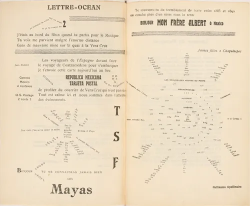
Figure 1.2 Guillaume Apollinaire: ‘Lettre-Océan’. Published in Les Soirées de Paris no. 25 (1914): 340–1. Photograph by Bibliothèque nationale de France. Item held by Bibliothèque nationale de France.
Words-in-freedom also informed the typographic work of the Dadaists in Zurich. In the ‘Dada Manifesto 1918’, Tristan Tzara (1896–1963) called for a literature in which ‘every page must explode’.6 This explosive force was reflected in his typographic design. In the third issue of the group’s journal Dada (1917–21), words and phrases were scattered across the page at various angles. Poems and articles were set in a wide variety of typefaces, sizes and alignments giving the journal the appearance of having been assembled from multiple sources. Text and illustrations were placed seemingly without adherence to any underlying structure. This gave them the appearance of floating haphazardly around on the sheet. In Germany, Dada found expression in the typographic work of Kurt Schwitters in Hanover and figures like Raoul Hausmann (1886–1971) and John Heartfield (1891–1968) in Berlin. In Die Neue Typographie Jan Tschichold singled out Heartfield’s design for the broadsheet Neue Jugend (New Youth, 1917) as ‘one of the earliest and most significant documents of the New Typography’. According to Tschichold, Neue Jugend was significant because it was the first time a number of formal features associated with the New Typography were used alongside one another. Dynamic typographic contrasts in size, form and colour were used alongside photography, and ‘all kinds of type’ were set at ‘all sorts of angles’.7
An abstract language of form
The New Typography also drew upon principles of abstract art and on publications designed by abstract artists. The Dutch De Stijl group used sans-serif typefaces and asymmetric layouts for their self-titled journal from the fourth volume onwards in 1921. Bold, plain rules were used structurally but sparingly on back covers and on smaller items like post cards and mailing wrappers. In Russia, suprematism, the extreme form of abstraction introduced by Kazimir Malevich (1879–1935) with works like ‘Black Square’ and ‘Aeroplane Flying’ (both 1915), informed the active use of abstract shapes in El Lissitzky’s graphic work, such as the propaganda poster ‘Beat the Whites With the Red Wedge’ (1919), and the children’s book About Two Squares which bore the subtitle A Suprematist Tale.
The New Typography was particularly closely associated with constructivism, so much so that it was sometimes referred to as constructivist typography.8 The term ‘constructivism’ can be traced back to the First Working Group of Constructivists, founded in 1921 by artists Alexander Rodchenko (1891–1956), Varvara Stepanova (1894–1958) and others including the writer and critic Alexei Gan (1887–1942). The October Revolution of 1917 led Russian avant-gardists to call for all aspects of life, including morals, philosophy and art, to be recreated according t...
Table of contents
- Cover
- Half-Title
- Series
- Dedication
- Title
- Contents
- List of illustrations
- Acknowledgements
- Introduction
- 1 Origins and networks
- PART I Printing and advertising cultures
- PART II Printing and society
- Conclusion
- Glossary
- Index
- Plates
- Copyright
Frequently asked questions
Yes, you can cancel anytime from the Subscription tab in your account settings on the Perlego website. Your subscription will stay active until the end of your current billing period. Learn how to cancel your subscription
No, books cannot be downloaded as external files, such as PDFs, for use outside of Perlego. However, you can download books within the Perlego app for offline reading on mobile or tablet. Learn how to download books offline
Perlego offers two plans: Essential and Complete
- Essential is ideal for learners and professionals who enjoy exploring a wide range of subjects. Access the Essential Library with 800,000+ trusted titles and best-sellers across business, personal growth, and the humanities. Includes unlimited reading time and Standard Read Aloud voice.
- Complete: Perfect for advanced learners and researchers needing full, unrestricted access. Unlock 1.5M+ books across hundreds of subjects, including academic and specialized titles. The Complete Plan also includes advanced features like Premium Read Aloud and Research Assistant.
We are an online textbook subscription service, where you can get access to an entire online library for less than the price of a single book per month. With over 1.5 million books across 990+ topics, we’ve got you covered! Learn about our mission
Look out for the read-aloud symbol on your next book to see if you can listen to it. The read-aloud tool reads text aloud for you, highlighting the text as it is being read. You can pause it, speed it up and slow it down. Learn more about Read Aloud
Yes! You can use the Perlego app on both iOS and Android devices to read anytime, anywhere — even offline. Perfect for commutes or when you’re on the go.
Please note we cannot support devices running on iOS 13 and Android 7 or earlier. Learn more about using the app
Please note we cannot support devices running on iOS 13 and Android 7 or earlier. Learn more about using the app
Yes, you can access The New Typography in Scandinavia by Trond Klevgaard in PDF and/or ePUB format, as well as other popular books in Design & Design General. We have over 1.5 million books available in our catalogue for you to explore.