- 536 pages
- English
- ePUB (mobile friendly)
- Available on iOS & Android
eBook - ePub
About this book
Most designers know that yellow text presented against a blue background reads clearly and easily, but how many can explain why, and what really are the best ways to help others and ourselves clearly see key patterns in a bunch of data? When we use software, access a website, or view business or scientific graphics, our understanding is greatly enhanced or impeded by the way the information is presented.
This book explores the art and science of why we see objects the way we do. Based on the science of perception and vision, the author presents the key principles at work for a wide range of applications--resulting in visualization of improved clarity, utility, and persuasiveness. The book offers practical guidelines that can be applied by anyone: interaction designers, graphic designers of all kinds (including web designers), data miners, and financial analysts.
- Complete update of the recognized source in industry, research, and academic for applicable guidance on information visualizing
- Includes the latest research and state of the art information on multimedia presentation
- More than 160 explicit design guidelines based on vision science
- A new final chapter that explains the process of visual thinking and how visualizations help us to think about problems
- Packed with over 400 informative full color illustrations, which are key to understanding of the subject
Trusted by 375,005 students
Access to over 1.5 million titles for a fair monthly price.
Study more efficiently using our study tools.
Information
Chapter One
Foundations for an Applied Science of Data Visualization
In his book The End of Science, science writer John Horgan (1997) argued that science is finished except for the mopping up of details. He made a good case where physics is concerned. In that discipline, the remaining deep problems may involve generating so much energy as to require the harnessing of entire stars. Similarly, biology has its foundations in DNA and genetics and is now faced with the infinite but often tedious complexity of mapping genes into proteins through intricate pathways. What Horgan failed to recognize is that cognitive science has fundamental problems that are still to be solved. In particular, the mechanisms of the construction and storage of knowledge remain open questions. He implicitly adopted the physics-centric view of science, which holds that physics is the queen of sciences and in descending order come chemistry, then biology, with psychology barely acknowledged as a science at all. In this pantheon, sociology is regarded as somewhere on a par with astrology. This attitude is shortsighted. Chemistry builds on physics, enabling our understanding of materials; biology builds on chemistry, enabling us to understand the much greater complexity of living organisms; and psychology builds on neurophysiology, enabling us to understand the processes of cognition. At each level is a separate discipline greater in complexity and level of difficulty than those beneath. It is difficult to conceive of a value scale for which the mechanisms of thought are not of fundamentally greater interest and importance than the interaction of subatomic particles. Those who dismiss psychology as a pseudo-science have not been paying attention. Over the past few decades, enormous strides have been made in identifying the brain structures and cognitive mechanisms that have enabled humans to create the huge body of knowledge that now exists. But we need to go one step further and recognize that a person working with the aid of thinking tools is much more cognitively powerful than that person alone with his or her thoughts. This has been true for a long time. Artifacts such as paper and pens, as well as techniques such as writing and drawing, have been cognitive tools for centuries.
As Hutchins (1995) so effectively pointed out, thinking is not something that goes on entirely, or even mostly, inside people’s heads. Little intellectual work is accomplished with our eyes and ears closed. Most cognition is done as a kind of interaction with cognitive tools, pencils and paper, calculators, and, increasingly, computer-based intellectual supports and information systems. Neither is cognition mostly accomplished alone with a computer. It occurs as a process in systems containing many people and many cognitive tools. Since the beginning of science, diagrams, mathematical notations, and writing have been essential tools of the scientist. Now we have powerful interactive analytic tools, such as MATLAB, Maple, Mathematica, and S-PLUS, together with databases. The entire fields of genomics and proteomics are built on computer storage and analytic tools. The social apparatus of the school system, the university, the academic journal, and the conference are obviously designed to support cognitive activity.
Cognition in engineering, banking, business, and the arts is similarly carried out through distributed cognitive systems. In each case, “thinking” occurs through interaction between individuals, using cognitive tools and operating within social networks. Hence, cognitive systems theory is a much broader discipline than psychology. This is emerging as the most interesting, difficult, and complex, yet fundamentally the most important, of sciences.
Visualizations are an increasingly important part of cognitive systems. Visual displays provide the highest bandwidth channel from the computer to the human. Indeed, we acquire more information through vision than through all of the other senses combined. The 20 billion or so neurons of the brain devoted to analyzing visual information provide a pattern-finding mechanism that is a fundamental component in much of our cognitive activity. Improving cognitive systems often means optimizing the search for data and making it easier to see important patterns. An individual working with a computer-based visual thinking tool is a cognitive system where the critical components are, on one side, the human visual system, a flexible pattern finder coupled with an adaptive decision-making mechanism, and, on the other side, the computational power and vast information resources of a computer coupled to the World Wide Web. Interactive visualization is the interface between the two sides. Improving this interface can substantially improve the performance of the entire system.
Until recently, the term visualization meant constructing a visual image in the mind (Little et al., 1972). It has now come to mean something more like a graphical representation of data or concepts. Thus, from being an internal construct of the mind, a visualization has become an external artifact supporting decision making. The way visualizations can function as cognitive tools is the subject of this book.
One of the greatest benefits of data visualization is the sheer quantity of information that can be rapidly interpreted if it is presented well. Figure 1.1 shows a visualization derived from a multibeam echo sounder scanning part of Passamoquoddy Bay, between Maine in the United States, and New Brunswick in Canada, where the tides are the highest in the world. Approximately one million measurements were made. Traditionally, this kind of data is presented in the form of a nautical chart with contours and spot soundings; however, when the data is converted to a height field and displayed using standard computer graphics techniques, many things become visible that were previously invisible on the chart. A pattern of features called pockmarks can immediately be seen, and it is easy to see how they form lines. Also visible are various problems with the data. The linear ripples (not aligned with the pockmarks) are errors in the data because the roll of the ship that took the measurements was not properly taken into account.
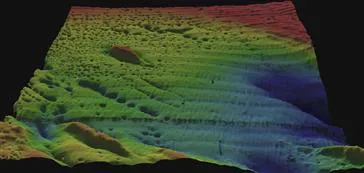
Figure 1.1 Passamoquoddy Bay visualization. Data courtesy of the Canadian Hydrographic Service.
The Passamoquoddy Bay image highlights a number of the advantages of visualization:
• Visualization provides an ability to comprehend huge amounts of data. The important information from more than a million measurements is immediately available.
• Visualization allows the perception of emergent properties that were not anticipated. In this visualization, the fact that the pockmarks appear in lines is immediately evident. The perception of a pattern can often be the basis of a new insight. In this case, the pockmarks align with the direction of geological faults, suggesting a cause. They may be due to the release of gas.
• Visualization often enables problems with the data to become immediately apparent. A visualization commonly reveals things not only about the data itself but also about the way it is collected. With an appropriate visualization, errors and artifacts in the data often jump out at you. For this reason, visualizations can be invaluable in quality control.
• Visualization facilitates understanding of both large-scale and small-scale features of the data. It can be especially valuable in allowing the perception of patterns linking local features.
• Visualization facilitates hypothesis formation. For example, the visualization in Figure 1.1 led to questions about the how the pockmarks might have formed and motivated a research paper concerning the geological significance of the features (Gray et al., 1997).
Visualization Stages
The process of data visualization includes four basic stages, combined in a number of feedback loops. These are illustrated in Figure 1.2. The four stages consist of:
• The collection and storage of data.
• A preprocessing stage designed to transform the data into something that is easier to manipulate. Usually there is some form of data reduction to reveal selected aspects. Data exploration is the process of changing the subset that is currently being viewed.
• Mapping from the selected data to a visual representation, which is accomplished through computer algorithms that produce an image on the screen. User input can transform the mappings, highlight subsets, or transform the view. Generally this is done on the user’s own computer.
• The human perceptual and cognitive system (the perceiver).
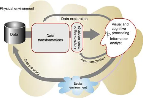
Figure 1.2 The visualization process.
The longest feedback loop involves gathering data. A data seeker, such as a scientist or a stock-market analyst, may choose to gather more data to follow up on an interesting lead. Another loop controls the computational preprocessing that takes place prior to visualization. The analyst may feel that if the data is subjected to a certain transformation prior to visualization, it can be persuaded to give up its meaning. Sometimes the process is a search through a very large volume of data to find an important nugget. Finally, the visualization process itself may be highly interactive; for example, in three-dimensional (3D) data visualization, the scientist may “fly” to a different vantage point to better understand the emerging structures. Alternatively, a computer mouse may be used interactively to select the parameter ranges that are most interesting.
Both the physical environment and the social environment are involved in the data-gathering loop. The physical environment is a source of data, while the social environment determines in subtle and complex ways what is collected and how it is interpreted. In this book, the emphasis is on data, perception, and the various tasks to which visualization may be applied. In general, algorithms are discussed only insofar as they are related to perception. The computer is treated, with some reservations, as a universal tool for producing interactive graphics. This means that once we figure out the best way to visualize data for a particular task, we assume that we can construct algorithms to create the appropriate images.
The critical question is how best to transform the data into something that people can understand for optimal decision making. Before plunging into a detailed analysis of human perception and how it applies in practice, however, we must establish the conceptual basis for the endeavor. The purpose of this discussion is to stake out a theoretical framework wherein claims about visualizations being “visually efficient” or “natural” can be pinned down in the form of testable predictions.
Experimental Semiotics Based on Perception
This book is about the applied science of visualization. It is based on the idea that the value of a good visualization is that it lets us see patterns in data and therefore the science of pattern perception can provide a basis for design decisions, but the claim that visualization can be based on science may be disputed. Let’s look at the alternative view. Some scholars argue that visualization is best understood as a kind of learned language and not as a science at all. In essence, their argument is the following. Visualization is about diagrams and how they can convey meaning. Diagrams are made up of symbols, and symbols are based on social interaction. The meaning of a symbol is normally understood to be created by convention, which is established in the course of person-to-person communication. Diagrams are arbitrary and are effective in much the same way as the written words on this page are effective—we must learn the conventions of the language, and the better we learn them the clearer that language will be. Thus, one diagram may ultimately be as good as another; it is just a matter of learning the code, and the laws of perception are largely irrelevant. This view has strong philosophical proponents from the classical field of semiotics. Although it is not the position adopted here, the debate can help us define where vision research can assist us in designing better visualizations and where we would be wise to consult a graphic designer trained in an art college.
Semiotics of Graphics
The study of symbols and how they convey meaning is called semiotics. This discipline was originated in the United States by C. S. Peirce and later developed in Europe by the French philosop...
Table of contents
- Cover Image
- Table of Contents
- Title
- Copyright
- Preface
- About the Author
- Chapter One. Foundations for an Applied Science of Data Visualization
- Chapter Two. The Environment, Optics, Resolution, and the Display
- Chapter Three. Lightness, Brightness, Contrast, and Constancy
- Chapter Four. Color
- Chapter Five. Visual Salience and Finding Information
- Chapter Six. Static and Moving Patterns
- Chapter Seven. Space Perception
- Chapter Eight. Visual Objects and Data Objects
- Chapter Nine. Images, Narrative, and Gestures for Explanation
- Chapter Ten. Interacting with Visualizations
- Chapter Eleven. Visual Thinking Processes
- APPENDIX A. Changing Primaries
- APPENDIX B. CIE Color Measurement System
- APPENDIX C. The Perceptual Evaluation of Visualization Techniques and Systems
- APPENDIX D. Guidelines
- Bibliography
- Index
Frequently asked questions
Yes, you can cancel anytime from the Subscription tab in your account settings on the Perlego website. Your subscription will stay active until the end of your current billing period. Learn how to cancel your subscription
No, books cannot be downloaded as external files, such as PDFs, for use outside of Perlego. However, you can download books within the Perlego app for offline reading on mobile or tablet. Learn how to download books offline
We are an online textbook subscription service, where you can get access to an entire online library for less than the price of a single book per month. With over 1.5 million books across 990+ topics, we’ve got you covered! Learn about our mission
Look out for the read-aloud symbol on your next book to see if you can listen to it. The read-aloud tool reads text aloud for you, highlighting the text as it is being read. You can pause it, speed it up and slow it down. Learn more about Read Aloud
Yes! You can use the Perlego app on both iOS and Android devices to read anytime, anywhere — even offline. Perfect for commutes or when you’re on the go.
Please note we cannot support devices running on iOS 13 and Android 7 or earlier. Learn more about using the app
Please note we cannot support devices running on iOS 13 and Android 7 or earlier. Learn more about using the app
Yes, you can access Information Visualization by Colin Ware in PDF and/or ePUB format, as well as other popular books in Computer Science & Computer Graphics. We have over 1.5 million books available in our catalogue for you to explore.