![]()
1. AN ANALYSIS OF THE WORK OF ART
“What is it?” or “What is it about?” we hear people asking in the picture galleries. No matter how “advanced” our views, the subject matter of a painting or a piece of sculpture always in some measure engages our attention, even though it is only slightly suggested. In fact, too often it is with the recognition of the subject matter that our consideration of the work stops. Although to stop there would be regrettable, the question “What is it?” is not necessarily an impertinent one, since the recognition of objects and incidents is usually an important ingredient in the artistic experience. Much history of art is concerned with the reclarification of subject matter that has become obscure with time. But such an understanding remains only one ingredient; it is not sufficient in itself to characterize the particular quality of a work of art. If it were, a verbal description could be the exact equivalent of a painting. Clearly there are other forces in action, affecting our experience and contributing to the specific meaning of the work. These forces are visual and belong appropriately to the visual arts. But how can the visual aspect of a painting in itself have meaning? This is the basic question for discussion in this chapter.
To keep from confusing what we normally call the subject matter of a work—the identifiable objects, incidents, or suggested outside experiences that we recognize—with the more complete aspect, taking as it were, the part for the whole, it might be useful to adopt the term “expressive content” to describe that unique fusion of subject matter and specific visual form which characterizes the particular work of art. “Subject matter,” then, would be the objects and incidents represented; “expressive content” would refer to the combined effect of subject matter and visual form. This rather complicated relationship might become clearer were we to compare two paintings of precisely the same subject matter, even nominally of the same arrangement, which yet provide very different experiences; two paintings which have, in other words, the same subject matter but very different expressive contents.
“The Crucifixion with Saints” (Plate I), painted by the Italian artist Perugino late in the fifteenth century, presents a subject that is hardly new to us. The very mention of the title is sufficient to evoke many feelings based on past representations we have seen or on general attitudes toward the event itself. But Perugino’s painting does not simply pose a subject to which can be attached any number of different emotional connotations; it would seem to quell the possible anguish and effects of suffering which might be associated with the scene and to establish a serenity and calm, a complete relaxation of the emotional and physical forces which might be expected to operate in connection with such a subject. Perugino has at once presented a subject and a statement about it. He has made us feel in a particular way about the Crucifixion, in a way we may not before have considered. Instead of being just the repetition of a familiar subject, the painting becomes, then, the basis of a new experience. Since the particular character of this new experience seems not to be the inevitable product of the subject, it behooves us, if we wish to discuss the peculiar power of the painting, to discover on what it depends: what produces the effect of calm, of limpid clarity, an atmosphere in which contemplation takes the place of physical violence. For this we must look to the visual forms of the painting itself.
So instantaneously does a painting seem to produce its effect that it is difficult to separate the steps by which the effect is achieved, and it must be admitted that such a separation is an arbitrary one. Nonetheless, it may lead us past the simple level of subject-matter identification to the particular character we associate with this painting, a character inseparable from our visual experience.
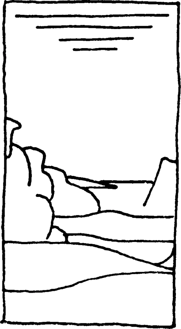
To begin on quite a literal level, this painting shows us, in a landscape that seems to extend at measured pace directly into depth, two figures standing on either side of the Cross upon which is fixed the figure of Christ. The vista seems calm, progressing through the repetition of gently curved horizontal lines suggesting a series of planes which overlap and repeat each other. In contrast, the compact, vertical forms of the figures seem somewhat isolated. We look from the figure of St. John on the right, to Christ, to the Virgin, and back again, and yet have little feeling that these persons could make physical contact with one another. Each part of the painting, landscape as well as figures, seems to take its place in a fixed harmony, and a sense of stately measure results.
But before considering this relationship further, study for a moment the color environment of which these forms are part. The number of hues employed in the work is small and the eye quickly accepts the simplicity of their relationship. It would be difficult to say whether the painting seems warm or cool in tone, tending toward red or toward blue. The hues of blue and yellow appear to be almost equal in quantity, although the yellow is far less vivid than it appears in the solar spectrum: it is low in saturation, to use a term defined in chapter ii. As a kind of intermediate color there is a bit of green which, containing both yellow and blue, serves as a buffer between them. But of far greater power in holding our attention than this intermediary green is the vivid red robe of the right figure, St. John. Because of the nature of the hue and its high saturation, it seems equal in importance to the blue and yellow. Red, blue, and yellow, subtly modulated in value but distinct and uncomplicated as hues, achieve in the painting a kind of equilibrium. Both the distinctness of the hues and the effect of balance may be understood by studying the chart on page 70, which illustrates the fact that these colors, called primaries, contain no part of each other and as a group represent a balance of the entire spectrum. That colors provoke a direct emotional response we constantly bear witness to in everyday speech: we see red, feel blue, and speak of a dark character. Had Perugino caused his red to dominate over the other hues so that it might seem to characterize the entire atmosphere—and a very warm atmosphere it would seem—our reaction to the painting would be very different. Instead there is an equilibrium of hues just as there is a marked clarity in the distinction of one hue from another, and this equilibrium and clarity are part of our experience of the painting.
Color, however, does more than simply characterize generally the emotional climate of the work. The hues occur in different relationships, sometimes red next to yellow, sometimes red next to blue, and in the background there is a kind of sequence ranging from yellow through green into blue. These relationships are made more complex and varied, by the modification of the hues in light and dark, that is, in value, and in saturation. Note, for example, the difference in blue between the sky, the tunic of St. John, and the robe of the Virgin. Cover for a moment the red robe of St. John with a piece of dark paper. Not only is the key of the painting basically changed, but the figures no longer bear the same relation to each other. Instead of our eye’s going first to the figure of St. John and then rising to the figure of Christ, we seize at once upon the figure of Christ which pushes forward, losing all contact with the lower part of the painting. This is not just a compositional variation but a dramatic change in the way we feel about the painting, in its expressive content. Further, note the distribution of blue and yellow. The blue of the sky is carried through the lower portion of the painting in the tunic of St. John, in which it is slightly changed, and in the robe of the Virgin, in which it is very low in value and saturation. The yellow follows a more complex scheme. In the landscape it is broken up into contrasting areas of light and dark that become less marked as the yellow fuses with the green to merge imperceptibly into the blue. But this complexity prepares us for the dramatic appearance above of Christ, in whose body the yellow is freed to contrast simply and eloquently with the rival blue.
From this kind of study we might draw some general conclusions. Our eye tends to relate similar colors. Further, strong contrasts, whether of hue or of value, tend to attract our attention immediately, while gradual changes seem to lead us progressively from one step to the next. In this way our eye seems to move about the painting from color to color, from points of greater to points of lesser contrast or through marked sequences, following a pattern which may vary with regard to point of origin or concentration but not in expressive character.
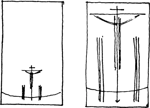
The nature of this pattern, sensed as we shift our attention from one part of the painting to another, should be considered with care since, as in our gestures, much feeling can be conveyed in the experience of movement. As we noted, our attention unites chiefly three points: the figures of the Virgin and St. John and the figure of Christ. Were we to diagram this relationship it might look like this:
How tremendously extended the vertical movement seems. While the Cross divides the painting into halves that are about equal in their attraction of color and contrast, affording the measured effect of symmetry, the vertical movement is so insistent that we cannot linger for any time on the horizontals of the landscape which cut across the painting and attempt to lure us plane by plane into depth. Yet these horizontals, especially the starkly defined bar of the Cross with the help of the contrasting inscription above the head of Christ, hold the vertical movement in check so that again we sense equilibrium rather than a dynamic continuity of force. The importance to this aspect of the organization the tiny inscription assumes by virtue of its value-contrast and shape can be tested by covering it with a piece of dark paper. That so much should depend on so small an element is indicative of the delicacy of balance which distinguishes this painting, a delicacy encouraging us to compare part with part and enjoy the justness of proportion. To a large extent, the relationships we have just observed are dependent on our perception of line, that is, the continuity of direction. Each figure seems to contain within itself a vertical line contrasting with the horizontal line of landscape and other elements. Moreover, diagonal lines, implied by our shift in attention rather than being explicit in any form, seem to go from the head of St. John to that of Christ, then down to Mary to become a part of a great elongated diamond shape completed by the suggestion of the two wedges at the foot of the Cross. It would be meaningless to point out such a shape except that in this case its symmetry gives new reason for the sense of stability and balance we derive from the painting.
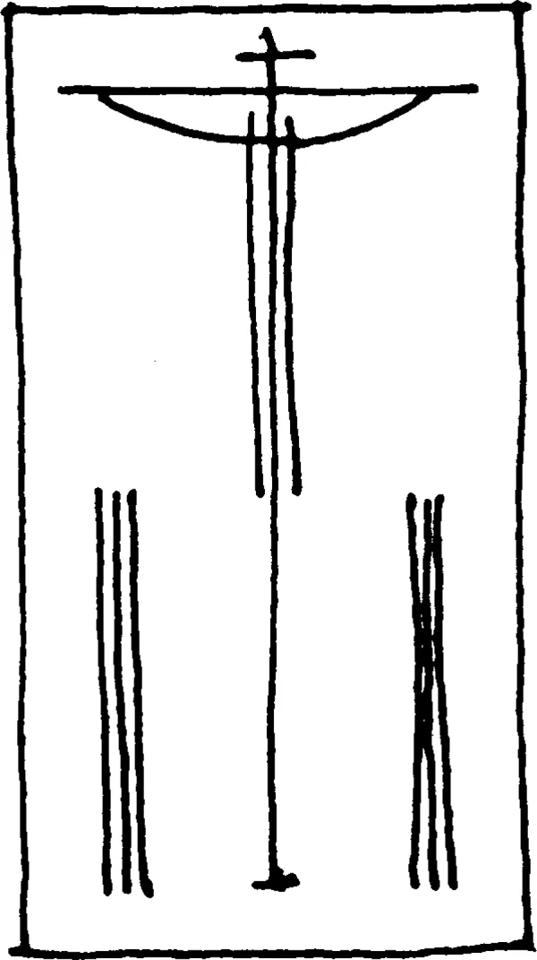
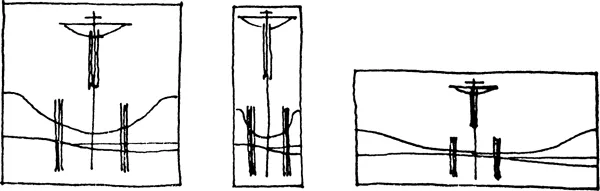
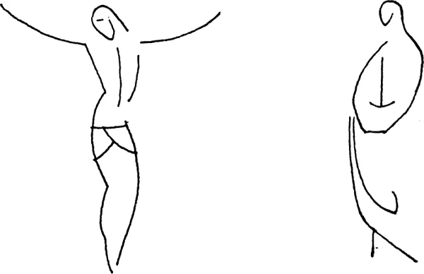
Our consciousness of a particular proportion, a sense of measure, which determines our movement through the large structural lines of the painting is dependent on a great many factors. For example, consider the shape of the painting as a whole. It is considerably taller than it is broad, though not so tall as to minimize completely the measurement of width. This is important, since the framing shape qualifies the effect of every form created within it. Suppose the construction lines remained the same but were contained within a different format:
Each of these schemes would be quite possible, but the effect of the pictures, their expressive content, would be very different. Scale also plays its part. We quickly take as a module, as a kind of measure, some identifiable object or simply a strongly marked form, and judge the rest of the space in comparison with it. Not only are we brought close to or left far from the subject, but we can feel ourselves lost in a vast expanse or painfully crowded in a confining space.
But to characterize the painting simply through its precise adjustment of vertical and horizontal structural lines within the determined format would be to ignore much of its particular effect. Although the figure of St. John may count roughly as a vertical movement with regard to the whole, it embodies in its contours and implied interior lines rhythmical movements that not only give character to the figure but bring it into a harmony with other forms in the picture. In the very simplest terms these might be seen as flattened, drawn-out curves which in themselves seem to produce the effect of slow, co-ordinated movement. Note how similar lines, sometimes depending on contrasting contours, sometimes seeming to be within the forms as a core, characterize also the figure of Christ. Since our eye is quick to relate like things, we sense the figures as existing together in a rhythmical harmony even though the figures do not lose their compactness as entities nor seem in themselves to move. Nor are these rhythms confined to the figures. Examine the trees—for example the entwining branches of the one delicately silhouetted on the right which move in quiet undulation—the long smooth curve of the road and bridge, the repeated arcs of the hills, all of which have a similarity of character, and you will see how far-reaching is the harmony that pervades this particular pictorial world.
We have made only a rudimentary beginning in analyzing in pictorial terms our experience of this picture, and of course we should not stop without studying the relationship of this panel to the two side panels that complement it (see Fig. 1). This painting is, in fact, the central portion of a three-panel altar piece, a triptych. The artist has had the problem of designing three compositions which are self-contained yet which join with each other to form a single whole. The complete work is reproduced in Figure 1. Note how the side panels modify and intensify various aspects we have mentioned of the central painting. It is well to remember that a composition can be affected by forms outside itself, that two paintings viewed together, for example, may take on a different aspect than when viewed separately.
But before we complete this study it might be useful to test our assumptions and our procedure thus far by looking at another painting of exactly the same subject as our central panel.
Plate II reproduces another “Crucifixion,” painted by the Italian artist Carlo Crivelli, also late in the fifteenth century. The subject matter is identical with Perugino’s painting: Christ is shown on the Cross between St. John and the Virgin; the rocky landscape, the towered building, and the sea in the background are all familiar to us. Only the symbolic skull at the foot of the Cross has been added. But how different is our response to the painting. Here is no rest, no calm or contemplation. Instead we take upon ourselves the anguish and physical hurt which seem to motivate the actions of the figures. And nowhere is there escape, no point on which our attention can fix itself to bring order to our excited emotions. Yet the raw structure of the painting is the same as in the Perugino: two figures and the crucified Christ arranged traditionally in symmetrical fashion. On what, then, does this tremendous difference depend?
We have used the term color environment or color key, and much of the effect of clarity and balance in the Perugino depended on it. What is the color key of this? It is difficult even to name the colors used. For one thing, hues seem to combine with one another in many areas, as in the background that seems to modulate from yellow to green and yellow to red, or in Mary’s cape where the blue emerges in places with green and elsewhere itself moves toward red. As a result we are less conscious of defined color shapes than in the other painting. Furthermore, the hues are hard to describe; they seem to be “in-between” hues: the cloak of St. John is not quite violet yet not quite red. Characteristic of its intermediate nature, each hue is mixed with at least one other hue in the painting. Again in the cloak of St. John, even the red-violet is reduced in saturation with yellow to bring it into accord with the green and yellow of his other garments; only the white, unrivaled by vivid, saturated hues, makes a sharp contrast. While no hue dominates this painting any more than it did the work of Perugino, there is not the effect of a color equilibrium existing between well-defined entities. Rather there is the impression of slightly...