The Republic of Color delves deep into the history of color science in the United States to unearth its origins and examine the scope of its influence on the industrial transformation of turn-of-the-century America.
For a nation in the grip of profound economic, cultural, and demographic crises, the standardization of color became a means of social reform—a way of sculpting the American population into one more amenable to the needs of the emerging industrial order. Delineating color was also a way to characterize the vagaries of human nature, and to create ideal structures through which those humans would act in a newly modern American republic. Michael Rossi's compelling history goes far beyond the culture of the visual to show readers how the control and regulation of color shaped the social contours of modern America—and redefined the way we see the world.
Trusted by 375,005 students
Access to over 1.5 million titles for a fair monthly price.
Late in 1894, Roland Rood returned home to New York City after several years studying painting in Paris.1 He’d worked with the notable muralist Pierre Puvis de Chavannes; he’d practiced portraiture with Léon Bonnat; he’d followed the prominent academic painter William-Adolphe Bouguereau; he’d exhibited in the 1894 Salon des beaux-arts.2 But it was his encounter with French impressionism that had left its greatest mark. In Paris he’d discovered the works of Camille Pissarro and Georges Seurat; on a trip to Claude Monet’s home in Giverny he’d “tasted” the shimmering surfaces of Monet’s canvases—and when he arrived back in America, he later recalled, his head was “filled with violent violets and chrome yellows, and the forms of solid bodies seemed a la Giverny as illusory as dreams.”3 Impressionism had transformed Roland’s vision of the world around him, and in his excitement, he went to see his father—the physicist and amateur painter Ogden Rood—bearing with him a copy of his father’s well-known book Modern Chromatics, with Applications to Art and Industry.4
In Paris Roland had become aware that his favorite painters read his father’s book enthusiastically—Modern Chromatics was, as he put it, “the impressionists’ Bible.” In its pages, Paris’s painterly avant-garde found an account of color based not on pigments and optics but on “psychophysics”—the physiology, psychology, and physics of the sensing body. They read about the ways in which cells in the retina of the eye processed color sensations; they learned how colors mixed unexpectedly when the eye was fatigued; they learned about the paradoxical ways in which the actual colors of objects might not correspond to the colors that the observer perceived. Ultimately, they learned about what Roland called “the wrong-workings” of the eye—the subtle, subjective, protean qualities of color that made it at once so apparent to the consciousness of the observer, so tangibly real, and yet so deeply difficult to grasp. When they applied paint to canvas, then, impressionists were not naively representing landscapes and people and things. They were directly addressing the subjective color sensations of their viewers, as carefully delineated by Rood in Modern Chromatics.
Roland intended to thank his father for this contribution to a new mode of art-making. But when the two men met, Roland saw that the elder Rood “seemed . . . mentally much depressed.”
“Are you ill?” Roland asked.
“No,” Rood grumbled, “but I have just been to see an exhibition of paintings at the galleries of Durand-Ruel. . . . They are by a lot of Frenchmen who call themselves ‘impressionists’; some are by a fellow called Monet, others by a fellow called Pissarro, and a lot of others.” Roland explained that the painters’ techniques had been based on Rood’s own theories of color and nervously asked his father his opinions of the paintings. “Awful! Awful!” exploded the elderly scientist; “if that is all I have done for art I wish I had never written that book!”5
Art historian Herschel Chipp writes that Rood “freed” colors from “the symbolic and metaphysical associations with which they had been endowed by earlier artists and theoreticians.”6 And indeed, his work had resounding influence. Ophthalmologists and photographers, architects and educators, professional artists and hobbyist decorators, all read Modern Chromatics.7 Classicist Edward Hopkins pointed his readers toward Modern Chromatics to explicate the complicated nature of the term “indigo.”8 Anthropologist Franz Boas cited Rood in his dissertation on the color of water (and Rood later sponsored some of Boas’s first lectures in the United States).9 Philosopher Henri Bergson read Modern Chromatics in its French translation while pondering perception and time.10 Architect Louis Sullivan reached for the book when he designed the interior of the Chicago Stock Exchange in 1893.11 Landscapist Thomas Moran drew from Modern Chromatics in his compositions, and painter, decorator, and glazier John La Farge counted himself as one of Rood’s students.
But the tradition that Rood broke was ultimately one that had less to do with color itself and more to do with the rules by which his fellow citizens understood the meaning of vision, aesthetics, and scientific authority. Rood had written Modern Chromatics, as he put it, in order to “prevent ordinary persons, critics, and even painters, from talking and writing about colour in a loose, inaccurate and not always rational manner.”12 It was a book, that is, not about seeing but about understanding. The very title, Modern Chromatics, signaled a departure from the science of color—the “chromatics”—of the previous half century, in which color was simply apparent before the viewer. In place of a science of optics based on common sense, Rood presented a science in which color was a product of occult mental and physiological processes of the viewer—vital and alive, fugitive and mysterious, indelibly real and yet inescapably removed from the everyday experience of “ordinary persons” and “even painters.” This science of color held as one of its implicit tenets that it was irrational (indeed, unscientific) simply to see and believe—one had to consult experts in order to truly understand one’s own apprehension of reality. It was an idea, moreover, which Rood offered to a strata of social reformers bent on navigating a sharp transformation in society from one based on traditional structures of church and family to one based on centralized, rationalized, impersonal structures of power. And yet, it was an idea which took shape within the highly traditional, highly personal structure of painting—one for which Rood hoped to provide new rules for depicting a common reality.
CHROMATICS
To understand what was “modern” about Modern Chromatics, it is first necessary to understand what the term “chromatics” meant to mid-nineteenth-century scientists, artists, and “ordinary people.” Chromatics, as one early nineteenth-century American dictionary defined it, was “the science which examines and explains the various properties of the colours of light and of natural bodies, and which forms a principal branch of optics.”13 It was a natural science—an examination of the objective facts of color, beginning with the relationship of color to light and extending to the ways in which different colors mixed, harmonized, and produced beauty. As such, chromatics was a quintessential example of common sense philosophy—an empirical investigation into the real, in which observation, experimentation, and deduction led the rational observer to discover inviolable laws that bridged the material, mental, and moral constituents of the real.
A principal tenet of chromatics was the idea that objects themselves did not have color. Rather, color was a property of different “undulations” of light reflected from the surface of objects. The majority of nineteenth-century natural philosophers believed that light was caused by waves propagating in an “imponderable” (i.e., not directly measurable) substance called the ether, which suffused all matter in the universe. Although light from the sun might appear to be simply white (or achromatic), it was, in fact, composed of all possible colors—as demonstrated by Isaac Newton’s famous experiment in which he split a beam of white, solar light into a spray of rainbow colors using a glass prism. Colors, Joseph Henry told his natural philosophy classes, were just variations in the “length or frequency of the undulation” of the ether—“the red wave being the longest; the violet the shortest.”14 The colors of things in the world were therefore just a function of the ways that different materials reflected and absorbed light of various frequencies.
Color was not an arbitrary property of interactions between matter and ether, though. The fact that colors always appeared in the rainbow in a fixed order—Newton identified red, orange, yellow, green, blue, indigo, and violet—suggested a basic, structural relationship among colors. But what was the nature of this relationship?
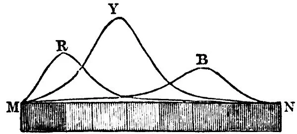
Primary colors provided an initial clue. As painters and pigment manufactures had known for centuries, some colors could not be mixed from other colors. These colors—red, yellow, and blue—were called “primary.” Mixtures of primary colors were called “secondary” colors; these were orange, green, and purple. In the early nineteenth century, Scottish physicist David Brewster explained the order of primary and secondary colors in the solar spectrum by arguing—on the basis of his experiments viewing the spectrum through chunks of colored glass—that rather than one single solar spectrum, white light really consisted of three separate spectra: one composed of red light, one composed of yellow light, and one composed of blue light. The superposition of these three spectra at points of greater and lesser intensity produced the varying hues of the rainbow, as Brewster demonstrated with a diagram (fig. 1).
FIGURE 1 Brewster’s red, yellow, and blue spectra. (Brewster, Treatise on Optics, 74)
This theory also helped to elucidate another well-known phenomenon of color mixing: that of contrast colors. As color theorists had long noted, every spectral color appeared to have its opposite—a color that, when mixed with the original color, produced a neutral gray. The neutralizing effect of contrast colors could be explained by the fact that each contrast to a primary color was a secondary color composed of the two other primary colors. Red contrasted with green (yellow mixed with blue); yellow with purple (blue mixed with red); and blue with orange (red mixed with yellow). Since secondary colors were composed of primary colors, mixing a primary and its secondary counterpart was like mixing all the primary colors at once—and all primary colors combined, as Brewster’s diagram showed, into white (or neutral) light.
This idea of mixing primary colors to produce white formed the basis of rules of chromatic harmony. When primary colors produced white light, they were said to be “balanced”—they returned to unity; they harmonized. But, as the varying peaks of the curves on Brewster’s diagram showed, different primary colors had different intensities. To produce a truly harmonious mix, both the contrast and the primary color had to be combined in the proper proportions. Determining these proportions was one of the tasks of chromatics. On the basis of his research, Brewster held the proportions in white light to be two parts red, three parts yellow, and one part blue.15 A composition which used these colors in the proper proportion would therefore be pleasing to the eye because it mimicked the properties of solar light.
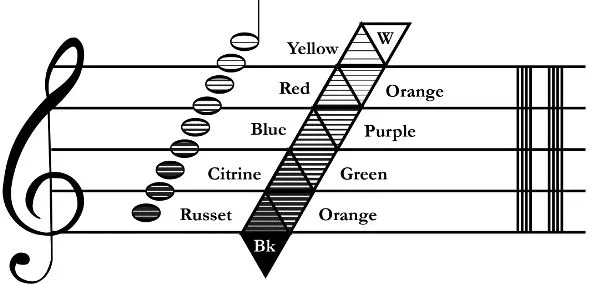
Brewster said little more about the matter of color harmony, but his contemporary, British painter and pigment manufacturer George Field, devoted successive editions of his textbook Chromatics (1817, 1835, 1845) to ever-more-elaborate explanations of the science of harmonious color composition.16 Field’s foundational principle was the idea that color and music were analogous. Like musical notes, Field wrote, colors were vibrations. And like musical notes, colors combined in ways that were either harmonious (pleasing) or dissonant (ugly). Thus, given the fact that musical harmonies were governed by precise, mathematical relationships, so too must be colorimetric harmonies.
This was an old idea, stretching from ancient Greek philosophy through Newton and his contemporaries and into the nineteenth century.17 What Field did was to formalize this folk wisdom—extending the ratios that governed musical notes to the structures underpinning color compositions. A major chord sounded pleasing because it was composed of notes that fell at intervals of 3/8, 5/8, and 8/8 on a vibrating medium (such as a string). These nodes corresponded to the pitches E, G, and C—the tonic, third, and fifth pitches of the C major scale. In a similar way, Field argued, in order to combine perfectly into white—in order to achieve balance, according to Brewster’s terms—primary colors would have to mix in proportions of “three yellow, five red, and eight blue,” where yellow was the equivalent of E (or major third), red the equivalent of G (the perfect fifth), and blue the root.18 Any composition would be pleasing if its chromatic elements combined in variations on these proportions.19 Moreover, Field wrote, just as playing adjacent notes in a musical scale together produced discordant sounds, so too did using adjacent colors produce a disharmonious composition.
Incorporating this formal basis with contemporary science—such as Brewster’s optics, in later editions of Chromatics—Field explained in dizzying detail the mathematics of color combination and color mixing. Each color had a different scale—a different “key”—constructed according to the mathematical proportions in which sets of colors produced balance. Field illustrated this system with sets of triangles (fig. 2)—a trinitarian motif which could be arranged along a musical staff to exemplify the harmony of color.
FIGURE 2 Chromatic scale. (Redrawn from original, hand-colored diagram in Field, Chromatics, plate 4)
Field’s system, as he took pains to explain, was not merely speculative. It was founded on strict empirical observation. As proof of the empirical validity of his system, Field insisted that readers need look no further than the diagrams in his book. “That the system before us is comfortable to nature,” he explained, “is ocularly demonstrated by the immediate exhibition of its objects, an advantage peculiar to chromatics.”20 In other words, readers could simply look at the colors printed in the book, and they would see for themselves that the colors were harmonious. As such, the science of chromatics, wrote Field, “addresses itself to reason and common sense.”21
This concern with a science of common sense observation did not mean that Field or his fellow researchers ignored the role of ocular physiology in color perception. In successive editions of Chromatics, Field devoted ever-greater space to the topic of “transient,” or “accidental,” colors—phenomena such as the contrasting afterimages that appeared when an observer stared for too long at a bright color source, or the apparent shifts in color that occurred when viewing a pale hue against a more vivid one.22 Brewster, similarly, devoted some later pages in his Treatise on Optics (1831) to the “accidental” colors that arose in response to fatigue of the eye.23 The celebrated French chemist Michel Eugène Chevreul, for his part, made “accidental” colors the centerpiece of his La loi du contraste simultané des couleurs (The law of simultaneous contrast of colors; 1838)—an exhaustive exploration of the optical effects produced when different colors appeared adjacent to one another.24
But the very names used to classify t...
Table of contents
Cover
Title Page
Copyright Page
CONTENTS
INTRODUCTION / Cloven Tongues of Fire
CHAPTER ONE / Modern Chromatics: Ogden Rood and the Wrong-Workings of the Eye
CHAPTER TWO / From Chemistry to Phanerochemistry: Charles Sanders Peirce and the Semiotic of Color
CHAPTER THREE / Pathologies of Perception: Benjamin Joy Jeffries and the Invention of Color Blindness
CHAPTER FOUR / Colors and Cultures: Evolution, Biology, and Society
CHAPTER FIVE / The Pragmatic Physiology of Color Vision: Christine Ladd-Franklin and the “Evolutionary Theory” of Color
CHAPTER SIX / Small Lies for Big Truths: Standards, Values, and Color Terms
CHAPTER SEVEN / The Logical and the Genetic: Bodies, Work, and Formal Color Notations
CONCLUSION / Talking about Color
Color Gallery
Acknowledgments
Bibliography
Index
Footnotes
Frequently asked questions
Yes, you can cancel anytime from the Subscription tab in your account settings on the Perlego website. Your subscription will stay active until the end of your current billing period. Learn how to cancel your subscription
No, books cannot be downloaded as external files, such as PDFs, for use outside of Perlego. However, you can download books within the Perlego app for offline reading on mobile or tablet. Learn how to download books offline
Perlego offers two plans: Essential and Complete
Essential is ideal for learners and professionals who enjoy exploring a wide range of subjects. Access the Essential Library with 800,000+ trusted titles and best-sellers across business, personal growth, and the humanities. Includes unlimited reading time and Standard Read Aloud voice.
Complete: Perfect for advanced learners and researchers needing full, unrestricted access. Unlock 1.5M+ books across hundreds of subjects, including academic and specialized titles. The Complete Plan also includes advanced features like Premium Read Aloud and Research Assistant.
Both plans are available with monthly, semester, or annual billing cycles.
We are an online textbook subscription service, where you can get access to an entire online library for less than the price of a single book per month. With over 1.5 million books across 990+ topics, we’ve got you covered! Learn about our mission
Look out for the read-aloud symbol on your next book to see if you can listen to it. The read-aloud tool reads text aloud for you, highlighting the text as it is being read. You can pause it, speed it up and slow it down. Learn more about Read Aloud
Yes! You can use the Perlego app on both iOS and Android devices to read anytime, anywhere — even offline. Perfect for commutes or when you’re on the go. Please note we cannot support devices running on iOS 13 and Android 7 or earlier. Learn more about using the app
Yes, you can access The Republic of Color by Michael Rossi in PDF and/or ePUB format, as well as other popular books in Biological Sciences & North American History. We have over 1.5 million books available in our catalogue for you to explore.