An accessible fast paced introduction to all aspects of Power BI for new or aspiring BI professionals, data analysts, and data visualizers.
Purchase of the print or Kindle book includes a free eBook in the PDF format.
Key Features
Updated with the latest features in Power BI including Dataflow, AI insights, visuals and row level security
Get faster and more intuitive data insights using Microsoft Power BI and its business intelligence capabilities
Build accurate analytical models, reports, and dashboards
Book Description
This revised edition has been fully updated to reflect the latest enhancements to Power BI. It includes a new chapter dedicated to dataflow, and covers all the essential concepts such as installation, designing effective data models, as well as building basic dashboards and visualizations to help you and your organization make better business decisions.
You'll learn how to obtain data from a variety of sources and clean it using Power BI Query Editor. You'll then find out how you can design your data model to navigate and explore relationships within it and build DAX formulas to make your data easier to work with. Visualizing your data is a key element in this book, and you'll get to grips rapidly with data visualization styles and enhanced digital storytelling techniques.
In addition, you will acquire the skills to build your own dataflows, understand the Common Data Model, and automate data flow refreshes to eradicate data cleansing inefficiency.
This guide will help you understand how to administer your organization's Power BI environment so that deployment can be made seamless, data refreshes can run properly, and security can be fully implemented.
By the end of this Power BI book, you'll have a better understanding of how to get the most out of Power BI to perform effective business intelligence.
What you will learn
Connect to data sources using import and DirectQuery options
Use Query Editor for data transformation and data cleansing processes, including writing M and R scripts and dataflows to do the same in the cloud
Design optimized data models by designing relationships and DAX calculations
Design effective reports with built-in and custom visuals
Adopt Power BI Desktop and Service to implement row-level security
Administer a Power BI cloud tenant for your organization
Use built-in AI capabilities to enhance Power BI data transformation techniques
Deploy your Power BI desktop files into the Power BI Report Server
Who this book is for
Aspiring business intelligence professionals who want to learn Power BI will find this book useful. If you have a basic understanding of BI concepts and want to learn how to apply them using Microsoft Power BI, this book is for you.
Trusted by 375,005 students
Access to over 1.5 million titles for a fair monthly price.
Power BI is best known for its impressive visualization capabilities. Up to this point, the focus has been on importing data and modeling it to your specifications. The goal of this chapter is to bring that data to life through impactful visuals. The number of visuals is vast, and the aim is to provide an overview of most of the included visuals. It is impossible to do an in-depth tour of all the options; instead the focus will be on getting familiar with the basic configuration, appropriate use for each of the built-in visuals, and how to acquire custom visuals not included in Power BI by default. The topics detailed in this chapter include the following:
Report view basics
Creating new visuals
Filtering visualizations and data
Visualizing tabular data
Visualizing categorical data
Visualizing trend data
Visualizing KPI data
Visualizing data using cards
Visualizing geographical data
Natural language
Visuals from analytics
Power BI custom visuals
Data visualization tips and tricks
At the time of this book's publication, there are 36 readily available visuals in Power BI Desktop including the Shape map and Azure map visuals that are in preview and must first manually be enabled to use. Let's get started with bringing the model you have worked on up to this point to life!
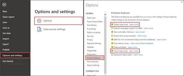
With Power BI's rapid update cycle, there will be many visuals added to the application over time. If you would like to leverage these as soon as they are available, you can find them in the Preview features section of Power BI Desktop's options. Figure 5.1 shows how to access the Preview features setting. Once you have enabled something in this area, it usually requires you to restart Power BI Desktop, so make sure to save your work!
To turn on Preview features, click File | Options and settings | Options | Preview features and check the box next to Shape map visual and Azure map visual.
Figure 5.1: Enable Power BI preview features on the Options menu
As features are moved from preview to generally available, they will automatically fall off the preview features list and be automatically available upon loading Power BI Desktop. Other preview features are available but because they are not related to visualizations they will not be explored in this chapter.
Report view basics
As soon as you launch Power BI Desktop and close the initial splash screen, you will find yourself in the Report view, which is where you will stay for the duration of this chapter. In the previous chapter, you explored the Model view as well as the Data view, but these areas are not necessary for the visualization work discussed in this chapter. There are many items of interest in this initial Report view area that need to be discussed so that you can work efficiently. Let's open the completed Power BI file from Chapter 4, Leveraging DAX, which includes all of the calculated columns and calculated measures that will be used in the upcoming visuals.
For this chapter, you can build on top of the completed pbix file from Chapter 4, Leveraging DAX. If you would like to keep your work from each chapter separate, please follow the noted steps here. Open the completed pbix file called Chapter 5 - Visualizing Data.pbix. Then, under the File option, choose Save As and give this file a new name for the work you will be doing in Chapter 5, Visualizing Data.
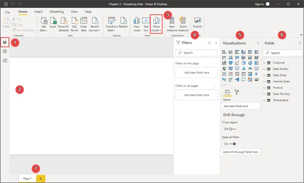
Let's review the key areas of Power BI Desktop:
Report view: Displays the report canvas, page navigation, and panes for customizing visualizations within the report. This is the default view open when Power BI Desktop is launched.
Report canvas: The main design area holding all report visuals.
More visuals: A menu with options to access custom visuals from AppSource or local files. After importing, these will appear in the Visualizations pane.
Filters pane: Apply filters to various scopes:
Filters on this page applies to every visual on the selected page.
Filters on all pages applies to every visual on every page in the report.
Filters on this visual only appears when a visual is selected, and only affects the selected visual.
Visualizations pane: Consists of four sections working together to customize the data and formatting of visualizations:
The Visuals section displays all available visualizations including enabled preview and imported custom visuals.
The Fields section displays buckets used to populate the different areas on the visual and varies based on the visual chosen. For instance, a table will have a single Values bucket, while a pie chart will have Legend, Details, Values, and Tooltips buckets.
The Format section controls the look and feel of the visual. The formatting options will vary based on the visual selected but generally include title, font size and color, and data label settings.
The Analytics section allows for the addition of reference lines like minimum or maximum thresholds, the median line, and an average line. The options will vary based on the visual selected and often allow for both static and data-driven lines.
Fields pane: Displays all available fields to be added to visuals and filters. If a table or column is hidden in the data view it will not appear in the Fields pane.
Page navigation: Select which report page to display on the canvas. Each page has a limited work area where visuals are displayed, so it is common to have more than one page in a Power BI report. Pages can be added by clicking the plus button at the end of the page list.
Figure 5.2: First view of Power BI Desktop
It is important to note that when working with visual filters, a visual must be selected. A visual is selected when you see the anchor points around the visual in question after clicking on it. Now that you are familiar with the Report view features and layout, it is time to start visualizing!
Creating new visuals
Before exploring the various visualizations available in Power BI let's look at the three ways to add visuals to the report canvas. All these methods will result in the same final product. However, depending on the type of visualization needed it may cut a few clicks off your workflow to use one method over another.
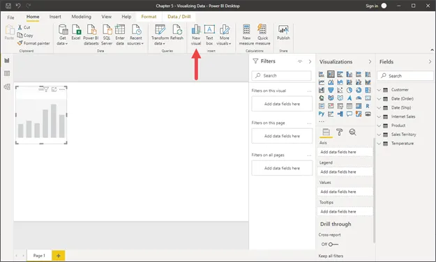
The first, and least common, method for adding a visual is using the New visual button on the ribbon. This will add a blank stacked column chart to the Report canvas at which point you can start to drag and drop fields or check the box next to a field to add it to the visual. If a stacked bar chart is not the desired visual, it can be changed by selecting a different visual from the Visualizations pane:
Figure 5.3: New visual button on the Home ribbon to add a blank visual
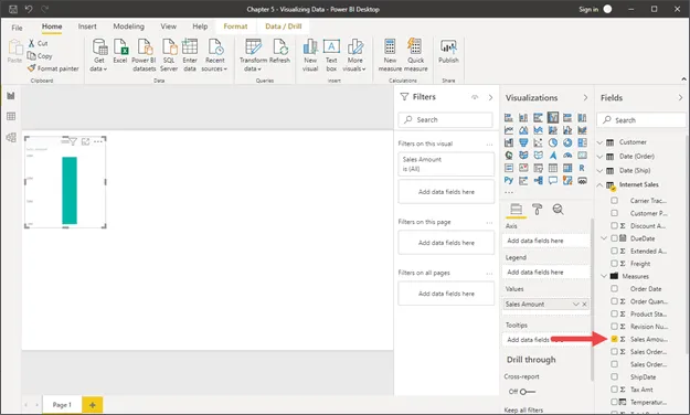
The second method for creating a new visual is starting from the Fields pane. To get started simply check the box next to a field or drag a field and drop it on the Values bucket in the Visualizations pane. A new visual will be created based on the data type of the field selected. The result is generally a clustered column chart for numeric fields and a table for non-numeric fields. You can then change to the desired visual if the correct type was not generated automatically.
Figure 5.4: Create a new visual by checking the box next to any item in the field list
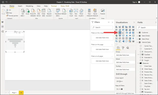
The final method is to start from the Visualizations pane, which allows for a more customized visualization creation experience. Using this method, you will first determine the type of visual needed and select it from the list. The result will be a blank visual that can then be populated with the desired fields being checked off or dragged from the Fields pane to the field buckets in the Visualizations pane.
Figure 5.5: Create a blank visual of your choice by clicking on an...
Table of contents
Preface
Getting Started with Importing Data Options
Data Transformation Strategies
Building the Data Model
Leveraging DAX
Visualizing Data
Digital Storytelling with Power BI
Using a Cloud Deployment with the Power BI Service
Data Cleansing in the Cloud with Dataflows
On-Premises Solutions with Power BI Report Server
Other Books You May Enjoy
Index
Frequently asked questions
Yes, you can cancel anytime from the Subscription tab in your account settings on the Perlego website. Your subscription will stay active until the end of your current billing period. Learn how to cancel your subscription
No, books cannot be downloaded as external files, such as PDFs, for use outside of Perlego. However, you can download books within the Perlego app for offline reading on mobile or tablet. Learn how to download books offline
We are an online textbook subscription service, where you can get access to an entire online library for less than the price of a single book per month. With over 1.5 million books across 990+ topics, we’ve got you covered! Learn about our mission
Look out for the read-aloud symbol on your next book to see if you can listen to it. The read-aloud tool reads text aloud for you, highlighting the text as it is being read. You can pause it, speed it up and slow it down. Learn more about Read Aloud
Yes! You can use the Perlego app on both iOS and Android devices to read anytime, anywhere — even offline. Perfect for commutes or when you’re on the go. Please note we cannot support devices running on iOS 13 and Android 7 or earlier. Learn more about using the app
Yes, you can access Microsoft Power BI Quick Start Guide by Devin Knight,Mitchell Pearson,Bradley Schacht,Erin Ostrowsky in PDF and/or ePUB format, as well as other popular books in Business & Business intelligence. We have over 1.5 million books available in our catalogue for you to explore.