- 216 pages
- English
- ePUB (mobile friendly)
- Available on iOS & Android
eBook - ePub
About this book
Peter Fine's innovative study traces the development of a mass visual culture in the United States, focusing on how new visual technologies played a part in embedding racialized ideas about African Americans, and how whiteness was privileged within modernist ideals of visual form. Fine considers the visual and material manifestations of this process through the history of three important technologies of the art of mechanical reproduction – typography, lithography, and photography, and then moves on to consider how racialized representation has been configured and contested within contemporary film and television, fine art and digital design.
Trusted by 375,005 students
Access to over 1.5 million titles for a fair monthly price.
Study more efficiently using our study tools.
Information
1
Vestiges in Word and Image
This first chapter is a look at the links between text and image in contemporary art as central to the work of five important contemporary African American artists. All these artists reappropriate and interrogate racialized texts and images, whose meanings they often subvert or invert. I consider closely their consistent use of the archetypal language and forms of graphic design especially the inclusion and reworking of lettering, letterforms, and typography as signifiers of artistic agency through mark making. In addition, I propose that their work provides a new intertextuality of text and image—an expression of the play between identity and stereotype related to the optics of racialized visual experiences.
The materiality of their work is central to my argument in a consideration of these as designed artifacts, in their remediation of the verbal and the visual, and in their trade in images of blackness as consumables. This book demands that graphic design—as a process of education and creative field—recognize the central role of race in defining how representations are mass produced and mass consumed not simply as they function from a strict formalist point of view. This distinction may seem minor, but not if we consider how racialized representations are largely ignored in graphic design education and criticism which itself is quite limited within the United States when compared to other fields associated with media production and therefore mediation. Furthermore, there is no better field of study—to be studied—for its impact on the creation and reproduction of representations considering the immense output and ephemerality of graphic design production and consumption. As equally important is that no other field of study is equally concerned with and directly utilizes the verbal and the visual and none that typically marries these two in a seamless integration of what are generally accepted as opposing forms, residing in different spheres. It is this lack of bifurcation of text and image in graphic design’s direct engagement with the reproduction of both that a design perspective brings to the consideration of artists working to come to terms with the history of race in the United States. African American artists who themselves are visualized as other in images across the visual culture in art, science, and commercial imagery. This is why I wish to examine these works if not as images always directly referencing specific historical graphic design images then as designed objects operating in the exchange of ideas and as exchangeable within the visual sphere.
Glenn Ligon provides a baseline example in Self-Portrait Exaggerating My Black Features and Self-Portrait Exaggerating My White Features, no doubt a homage alluding to Adrian Piper’s earlier work by the same title (Figure 1.1). He poses himself in two identical, full-length, black-and-white photographs with “Self-Portrait Exaggerating My Black Features” set in type beneath the left-hand piece and “Self-Portrait Exaggerating My White Features,” beneath the right-hand piece. He is perhaps obliquely referencing the stereoscope to indicate the use of the photograph explicitly as a lens. In doubling our gaze at himself, he gives us insight into double consciousness as a visual phenomena constructed mechanically through words and images. He spells out the ways that looking and naming enforce the everyday and mundane ways that these contribute to implicit visual modes of racism. By dressing himself in ordinary street clothes signaling status quo respectability, oxford shirt buttoned and tucked, clean white T-shirt, jeans with belt, and runners, he reinforces the mundane aspects of being visualized as black despite all appearances. In labeling himself, he signifies the ways that typography draws out the inaudible, inner monologue of looking and naming without truly seeing. This intertextual approach to reading words set in type, to reading a photograph as a text that represent his body, he searches to uncover the truth of his own identity hidden within the stereotypes applied to him.
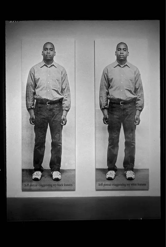
FIGURE 1.1 Glenn Ligon, Self-Portrait Exaggerating My Black Features and Self-Portrait Exaggerating My White Features, 1998. Silkscreen ink on canvas. Two panels: 120 × 40 inches (304.8 × 101.6 cm) each.
© Glenn Ligon; Courtesy of the artist, Hauser & Wirth, New York, Regen Projects, Los Angeles, Thomas Dane Gallery, London and Chantal Crousel, Paris.
This unveiling typified by Ligon’s work hinges on an acknowledgement of the several ways that the technologies of the art of mechanical reproduction have fundamentally formed the image of the African American, utilized as a commodity and a vessel of an-“other,” racialized, US national identity. Here I analyze the response to this dynamic by these artists who reassert black identity over the spectacle of blackness and against the grain of white supremacy as not simply an expression of racism but the very material of white supremacy formed through words and images. These artists provide in contemporary terms a trenchant analysis of the racialized workings of graphic design almost entirely ignored by the profession itself. Considering these artifacts in part as design reveals the important interplay between design, commerce, technology, art, materiality, and identity in US visual culture. This consideration of visual culture as the materially reproduced evidence of racism reveals these as well as a wide variety of other actors who exert agency over visual culture—a culture enacted through and upon others whose own agency is denied. These artists resist this denial by reasserting their presence within the same visual landscape in which they have been silenced, absented, and removed. This landscape is crucial to understanding the black imagination as a potentially autonomous space of creative production witnessed by these artists.
These artists write and rewrite upon images, usually side by side with bodies. Crucial to their work are bodies themselves, especially as observed and evidenced within the context of a US visual culture founded in racialized representation. Many of the works deal with flattened planes, figures of absence, and collapses that directly confront the “pure” formalism of modernism. This is seen in Glenn Ligon’s stencils; Kara Walker’s silhouettes; Lorna Simpson’s divided, turned, and headless figures; Carrie Mae Weems’s coloration; and Hank Willis Thomas’s active, headless figures. These artists often rely on vernacular graphic forms or the seemingly naïve application of these forms that draw on the early, formative, and commodity driven roots of the US visual culture—of graphic design. They then revisualize many of the forms associated with this period and its direct impact and legacy on their lived experience.
Their work questions art as commodity, as value abstracted just as they also interrogate the images and the bodies of others who are pictured and therefore abstracted, who labor to serve and to be exchanged. The presence of text within and upon these works makes clear that these works are designed to be read. The words in the texts may at times either seemingly confirm or deny the visual tropes, stereotypes, and clichés presented or confront their flaws by revealing the gaps between text and image, past and present, and subject and object. The interstitial spaces running through these apparently bifurcated forms are the blind spots in which these artists operate to reveal how the black subject has been constructed to serve a polarized vision of race.
In situating their responses in the context of contemporary art, these artists displace the designed and domesticated racialized subject from its familial context and extricate its value as commodity. This is mirrored by the imagery of commodities in the exchange of commercial goods dating to reconstruction, Jim Crow, and the nascent consumer economy of the United States based in the black subject being pictured and seen as exchangeable.1 The consistent coupling of text and image and the comingling of the verbal and the visual in the work of these artists bring into relief the hybridity of African American life beginning in and through the standardization of US visual culture reproduced not for African Americans but to assert white supremacy over them as racialized subjects continuing to labor to serve. These artists draw upon the material experience of words and the effects of rereading these in direct opposition to racialized imagery as a means to confront racism.
Michael Ray Charles: Whistling While He Works
In the opening pages of the catalog to his 1997 exhibition at the Tony Shafrazi Gallery, Michael Ray Charles appears in a photograph coyly holding a penny in his mouth in a nod to the mechanical banks I discuss in Chapter 5. Like those mechanical banks, several of the characters in this body of work include a deep coin slot in the tops of their heads. These characters are based primarily on the Sambo caricature but also morph between clowns and jesters as well. In doing so, they track the parallel phenomena of the transmutation over time of racist caricature in US visual culture as figures arrested in a timeless and negative otherness. Through these recharacterizations, Charles continuously multiplies meanings and redoubles these with texts meant to confront the reader’s viewership and the dominant narrative applied through purposefully negative stereotypes.
I am considering the work of Charles here first because among these artists, he most closely mimics early American vernacular, advertising design and other graphic forms and is most obligated to these formats that define the picture plane and the worlds his characters inhabit. Significantly, he utilizes and upends forms defined typically as “Americana”—images of a nostalgic, imagined past—that still hold meaning and power in the US imaginary. He implicates us, the viewer through our own assumptions borne of sentimentality associated with a false nostalgia for these exchangeable images and objects now bearing new value as collectables. He reutilizes various printed matter such as advertisements, magazine covers, lithographs, and posters as well as objects such as packages, signs and signage, sideshow games, and paintings. Each of these again defines the field in which he plays with meaning and reanimates his characters to act against type, sometimes violently.
Charles repaints the text contained in his paintings when referencing original works and in doing so rewrites their meanings. Formally and materially—by painting the words—he clearly grounds the work in the medium of painting, and this most obviously associates it with the art market rather than with its roots in early US consumer culture. In painting, he applies meaning by reinscribing the vernacular letterforms of the nineteenth century. These historical letterforms were not typically grounded in traditional typography but were generated by the rapidly expanding markets of the time, usually created by untrained designers working in litho houses, as sign makers and painters, and job printers. The overall aesthetic defined by these works was eclectic and often profusely ornamental. Therefore, many voices were expressed in the compendium of letterforms and other visual tropes necessary for the quick and dirty production of graphic imagery. Despite this plurality of voices, the central voice that dominates in Charles’s work is his own. He codes it into the vernacular of print culture, where he asserts himself through the application of paint in rewriting existing words and inserting other texts that deviate from the message of the originals to remix various meanings. The letters appear through his reinscription to be worn, weathered, and tasked by time and use. The work’s overall surface quality is determined by his material strategy of reading through rewriting. Typically, chipped paint indicates loving wear through use and a sentimental attachment to an idealized past. Here it also indicates his work’s use value as exchangeable, and despite time it is able to retain and further encode meaning. Their time-worn appearance also indicates use and...
Table of contents
- Cover
- Half-Title Page
- Title Page
- Contents
- Figures
- Plates
- Preface
- Acknowledgments
- Introduction
- Chapter 1 Vestiges in Word and Image
- Chapter 2 Typography and Types
- Chapter 3 First Impressions: Lithography and the Packaging of Race
- Chapter 4 Photography by Design
- Chapter 5 Racialized Play, Caught in Real Time
- Conclusion: The Physiognomist’s Gimlet Eye
- Index
- Copyright Page
- Plates
Frequently asked questions
Yes, you can cancel anytime from the Subscription tab in your account settings on the Perlego website. Your subscription will stay active until the end of your current billing period. Learn how to cancel your subscription
No, books cannot be downloaded as external files, such as PDFs, for use outside of Perlego. However, you can download books within the Perlego app for offline reading on mobile or tablet. Learn how to download books offline
Perlego offers two plans: Essential and Complete
- Essential is ideal for learners and professionals who enjoy exploring a wide range of subjects. Access the Essential Library with 800,000+ trusted titles and best-sellers across business, personal growth, and the humanities. Includes unlimited reading time and Standard Read Aloud voice.
- Complete: Perfect for advanced learners and researchers needing full, unrestricted access. Unlock 1.5M+ books across hundreds of subjects, including academic and specialized titles. The Complete Plan also includes advanced features like Premium Read Aloud and Research Assistant.
We are an online textbook subscription service, where you can get access to an entire online library for less than the price of a single book per month. With over 1.5 million books across 990+ topics, we’ve got you covered! Learn about our mission
Look out for the read-aloud symbol on your next book to see if you can listen to it. The read-aloud tool reads text aloud for you, highlighting the text as it is being read. You can pause it, speed it up and slow it down. Learn more about Read Aloud
Yes! You can use the Perlego app on both iOS and Android devices to read anytime, anywhere — even offline. Perfect for commutes or when you’re on the go.
Please note we cannot support devices running on iOS 13 and Android 7 or earlier. Learn more about using the app
Please note we cannot support devices running on iOS 13 and Android 7 or earlier. Learn more about using the app
Yes, you can access The Design of Race by Peter Claver Fine,Peter C. Fine in PDF and/or ePUB format, as well as other popular books in Art & Art General. We have over 1.5 million books available in our catalogue for you to explore.