Typography Essentials Revised and Updated
eBook - ePub

Typography Essentials Revised and Updated

100 Design Principles for Working with Type

  1. 208 pages
  2. English
  3. ePUB (mobile friendly)
  4. Available on iOS & Android
eBook - ePub

Typography Essentials Revised and Updated

100 Design Principles for Working with Type

About this book

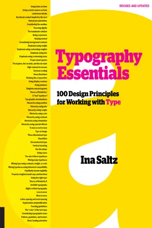
Typography Essentials: 100 Design Principles for Working with Type is a practical, hands-on resource that distills and organizes the many complex issues surrounding the effective use of typography. An essential reference for designers since 2009, Typography Essentials is now completely refreshed with updated text, new graphics and photos, and a whole new look. 

Divided into four sections—The Letter, The Word, The Paragraph, and The Page—the text is concise, compact, and easy to reference. Each of the 100 principles, which cover all practical aspects of designing with type, has an explanation and inspiring visual examples drawn from international books, magazines, posters, and more.

Typography Essentials is for designers of every medium in which type plays a major role, and is organized and designed to make the process enjoyable and entertaining, as well as instructional.

Frequently asked questions

Yes, you can cancel anytime from the Subscription tab in your account settings on the Perlego website. Your subscription will stay active until the end of your current billing period. Learn how to cancel your subscription.
No, books cannot be downloaded as external files, such as PDFs, for use outside of Perlego. However, you can download books within the Perlego app for offline reading on mobile or tablet. Learn more here.
Perlego offers two plans: Essential and Complete
  • Essential is ideal for learners and professionals who enjoy exploring a wide range of subjects. Access the Essential Library with 800,000+ trusted titles and best-sellers across business, personal growth, and the humanities. Includes unlimited reading time and Standard Read Aloud voice.
  • Complete: Perfect for advanced learners and researchers needing full, unrestricted access. Unlock 1.4M+ books across hundreds of subjects, including academic and specialized titles. The Complete Plan also includes advanced features like Premium Read Aloud and Research Assistant.
Both plans are available with monthly, semester, or annual billing cycles.
We are an online textbook subscription service, where you can get access to an entire online library for less than the price of a single book per month. With over 1 million books across 1000+ topics, we’ve got you covered! Learn more here.
Look out for the read-aloud symbol on your next book to see if you can listen to it. The read-aloud tool reads text aloud for you, highlighting the text as it is being read. You can pause it, speed it up and slow it down. Learn more here.
Yes! You can use the Perlego app on both iOS or Android devices to read anytime, anywhere — even offline. Perfect for commutes or when you’re on the go.
Please note we cannot support devices running on iOS 13 and Android 7 or earlier. Learn more about using the app.
Yes, you can access Typography Essentials Revised and Updated by Ina Saltz in PDF and/or ePUB format, as well as other popular books in Design & Graphic Design. We have over one million books available in our catalogue for you to explore.

Information

eBook ISBN
9781631596483
Topic
Design

THE LETTER

1 Using letter as form

EACH LETTER IS A SHAPE UNTO ITSELF, a shape that may serve as an illustration, as an icon, as a vessel, or as a graphic focal point, apart from its meaning as an alphabetic unit. Especially when used at very large sizes, the extreme proportions of letterforms can have exceptional impact—this technique has been exploited very effectively by many successful designers.
Letters can be expressive when used alone, as a simple silhouette, as an outline, or as a container for image, texture, or pattern. The beauty and power of the individual form may also be used partially: or a shape that is sliced and diced, cropped, or reversed horizontally or vertically. Because it is a letterform, it has a built-in relationship with any typeface that accompanies it. Its inherent integration unifies the design of the whole piece.
Project
Rebecca Minkoff Couture Identity Concept
Design Studio
Remake
Art Director, Designer
Michael Dyer
Client
Rebecca Minkoff
This custom-lettered logo forms a discrete shape, but within its boundaries, each letter is delicate and leaf-like. The delicacy is further underscored by the pastel color gradation. The logo also appears with some of its counter spaces filled with a similar hue.
Image
Project
Brooklyn Public Library Branding
Studio
Eight and a Half
Art Director
Bonnie Siegler
Designer
Andrew James Capelli
Client
Brooklyn Public Library
The letters comprising the logo can accommodate images, textures, and colors to reflect different aspects of the organization’s identity and a variety of events. It is a vessel made of the letters Bklyn, the common abbreviation for Brooklyn.
Image
Project
Salute the Sound
Design Director
Paul Sych
Typographer
Paul Sych
Client
Bass the Beat Productions
These letterforms are beautiful abstractions, chunky ribbons of color. It is amazing that we can actually read this phrase, given how spare the forms are. The letterforms suggest the vinyl ridges of an album or LP.
Image

2 Using counter spaces as form

THE SPACES INSIDE AND AROUND the shape of a letter, called counter spaces, are often overlooked as design elements. Their shapes can be customized using color, pattern, or textur...

Table of contents

  1. Cover
  2. Title Page
  3. Contents
  4. Introduction
  5. The Letter
  6. The Word
  7. The Paragraph
  8. The Page
  9. Contributors Index
  10. About the Author
  11. Acknowledgments
  12. Dedication
  13. Copyright