Color Harmony for Artists
eBook - ePub

Color Harmony for Artists

How to Transform Inspiration into Beautiful Watercolor Palettes and Paintings

  1. 244 pages
  2. English
  3. ePUB (mobile friendly)
  4. Available on iOS & Android
eBook - ePub

Color Harmony for Artists

How to Transform Inspiration into Beautiful Watercolor Palettes and Paintings

About this book

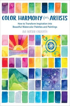
Explore and create expressive palettes and paintings with Color Harmony for Artists.

Watercolor author, artist, and teacher Ana Victoria Calderon guides you through choosing, mixing, and using color with watercolor and mixed media to create the most expressive and appealing combinations and effects for a wide range of moods and subjects. You'll explore a variety of subjects and themes, including flowers, foliage, landscapes, skies, cities, figures, art movements, and historical eras.

  • Begin with a quick overview of the basics of color, color mixing, and mixed media.
  • Explore a variety of color and media combinations, including brilliant brights, muted neutrals, high-contrast complements, and special effects.
  • Find inspiration in evocative photos, abundant palettes, and beautiful paintings.

With Color Harmony for Artists, every artist, from beginner to advanced, will be inspired to embrace the creative possibilities of color and paint!

Frequently asked questions

Yes, you can cancel anytime from the Subscription tab in your account settings on the Perlego website. Your subscription will stay active until the end of your current billing period. Learn how to cancel your subscription.
At the moment all of our mobile-responsive ePub books are available to download via the app. Most of our PDFs are also available to download and we're working on making the final remaining ones downloadable now. Learn more here.
Perlego offers two plans: Essential and Complete
  • Essential is ideal for learners and professionals who enjoy exploring a wide range of subjects. Access the Essential Library with 800,000+ trusted titles and best-sellers across business, personal growth, and the humanities. Includes unlimited reading time and Standard Read Aloud voice.
  • Complete: Perfect for advanced learners and researchers needing full, unrestricted access. Unlock 1.4M+ books across hundreds of subjects, including academic and specialized titles. The Complete Plan also includes advanced features like Premium Read Aloud and Research Assistant.
Both plans are available with monthly, semester, or annual billing cycles.
We are an online textbook subscription service, where you can get access to an entire online library for less than the price of a single book per month. With over 1 million books across 1000+ topics, we’ve got you covered! Learn more here.
Look out for the read-aloud symbol on your next book to see if you can listen to it. The read-aloud tool reads text aloud for you, highlighting the text as it is being read. You can pause it, speed it up and slow it down. Learn more here.
Yes! You can use the Perlego app on both iOS or Android devices to read anytime, anywhere — even offline. Perfect for commutes or when you’re on the go.
Please note we cannot support devices running on iOS 13 and Android 7 or earlier. Learn more about using the app.
Yes, you can access Color Harmony for Artists by Ana Victoria Calderón,Ana Victoria Calderon in PDF and/or ePUB format, as well as other popular books in Art & Art Techniques. We have over one million books available in our catalogue for you to explore.

Information

Publisher
Quarry Books
Year
2019
Print ISBN
9781631597718
eBook ISBN
9781631597725
Topic
Art

Inspired Palettes

Image

Austere De Stijl

When studying art history in college, De Stijl always stood out for me because it was so distinctive. De Stijl, which translates to “The Style,” was a Dutch art and architecture movement founded in 1917. Also known as Neoplasticism, the approach has many strict rules, including using only vertical and horizontal lines and rectangular shapes in black, white, gray, and primary colors (red, blue, and yellow).
For this palette’s primaries, use your purest pigments. For instance, a neutral blue like cobalt or royal blue is a better fit than an indigo or navy (both of which lean toward violet) or a turquoise (which tends toward green).
For the texture swatch, I decided to create my own De Stijl composition.
TECHNIQUE NOTES Swatching this movement is challenging because of its many restrictions. Although I limited myself to black and the three primaries, I followed watercolor’s lead and swatched those colors in different values by modifying the amount of water in each swatch to create some visual variation. Note that this is the only palette in the book where the colors aren’t mixed together.
Image
Image

Shimmering Impressionism

Nineteenth-century Impressionism, originally centered in Paris, is famous for a specific style of brushstroke that is repetitive, relatively small, and uses lighter tones of paint to allude to the effects of reflected light.
The movement’s name comes from Claude Monet’s Impression, Sunrise, painted in 1892, when an art critic in France published a satirical review of the style. Hence the name “Impressionism.” Another inspiring painting is Monet’s Vétheuil in Summer, 1880. In this scene from the Seine River, the shimmering effect of repetitive brushstrokes on water demonstrates the importance Monet placed on representing light accurately.
In honor of this movement, I experimented with mixing color by laying out numerous short brushstrokes. The direction and value of each stroke is incredibly important to create enough contrast.
COLOR NOTES This palette is soft, romantic, and slightly muted. The painting mainly depicts a cool vibe with light greens and blues as accents and details of lovely peachy tones. To create the perfect peach, water down an orange mix or add a touch of white gouache to give it a creamy appearance.
Image
Image

Swirling Art Nouveau

Art Nouveau arose when European art was heavily academic. The movement drew inspiration from such styles as two-dimensional Japanese woodblock prints, Rococo curves, and Celtic motifs. Organic yet structured, applications of this style moved beyond the canvas and fine art to poster art, stained glass, architecture, metal art, jewelry, ceramics, textiles, and wallpapers, to name a few. It’s an important ancestor to what we know as graphic design. The movement also paved the way for Art Deco and Modernism.
I’m pretty sure this is my favorite movement, specifically pieces by artists like Gustav Klimt and Alphonse Mucha. Our reference design is Mucha’s The Arts: Poetry, 1898.
The color palette is muted and soft, and an exemplary use of split-complementary color harmony. Orange tones make perfect contrast with the various blue and green shades, plus a touch of neutrals. I used complementaries in the color mixing process, adding a touch of blue to the orange mix to dull the bright and sunny feel and gain a...

Table of contents

  1. Cover
  2. Title Page
  3. Contents
  4. Preface
  5. Hands-on Color Theory
  6. Inspired Palettes
  7. Template
  8. Resources
  9. Acknowledgments
  10. About the Author
  11. Index
  12. Dedication
  13. Copyright