Colored Pencil Step by Step, from the acclaimed Walter Foster Artist’s Library Series, is filled with information that will help artists of all levels learn all about drawing with colored pencil.
*Named One of the 54 Best Colored Pencil Drawing Books of All Time by BookAuthority*
This colorful, comprehensive guidebook explores drawing and layering colors, plus a range of styles and techniques for creating your own works of art in colored pencil. Three renowned colored pencil artists guide you step by step through 11 vibrant lessons, demonstrating a variety of special techniques and tricks along the way.
Whether you’re a novice or an accomplished artist who has never experimented with a colored pencil, this book will provide the instruction and inspiration you need to master this versatile medium.
eBook - ePub
Colored Pencil Step by Step
Explore a range of styles and techniques for creating your own works of art in colored pencils
- 64 pages
- English
- ePUB (mobile friendly)
- Available on iOS & Android
eBook - ePub
Colored Pencil Step by Step
Explore a range of styles and techniques for creating your own works of art in colored pencils
About this book
Trusted by 375,005 students
Access to over 1.5 million titles for a fair monthly price.
Study more efficiently using our study tools.
Information
Topic
ArtSubtopic
Art TechniquesMaking the Best of a Limited Palette
with Debra Yaun
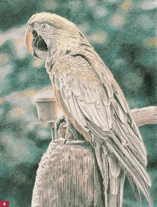
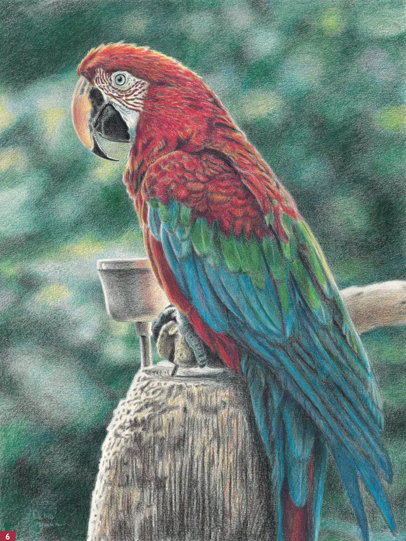
An artist may choose a limited palette (just a few colors) for convenience, experimentation, or the desire to express a particular mood in a scene (such as using only blues and greens to depict a somber mood). Working with a limited palette can also force you to think creatively—you must carefully plan your values, blend and build up colors that you don’t have in your palette, and use special techniques to achieve the effects you want. It’s certainly simpler to depict a colorful subject with a huge selection of colors, but consider challenging yourself by working with a limited palette. In this example of a colorful parrot (and in all of her lessons in this book), Debra Yaun admirably extracts an amazing array of brilliant hues from only eight colors.
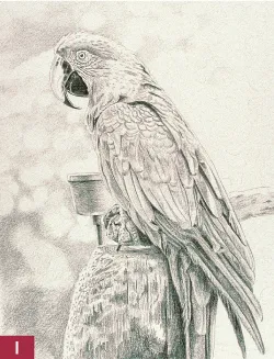
Step One I start with a sketch on practice paper, and then I transfer the drawing to my art paper. To do this, I cover the back with graphite (creating a sort of carbon paper). Then I place the drawing, graphite-side down, over my art paper and trace over the lines, effectively transferring the sketch to my drawing paper. Now I’m ready for color. I fill in the darkest areas first, using small, circular strokes of black colored pencil and smoothly applying the color to the feathers and the beak. I also use black for the shadows of the feet, the cup, and the perch, leaving some white along the edges to indicate the strong back lighting. Then I apply black in the background, forming some abstract shapes with smooth, circular strokes.
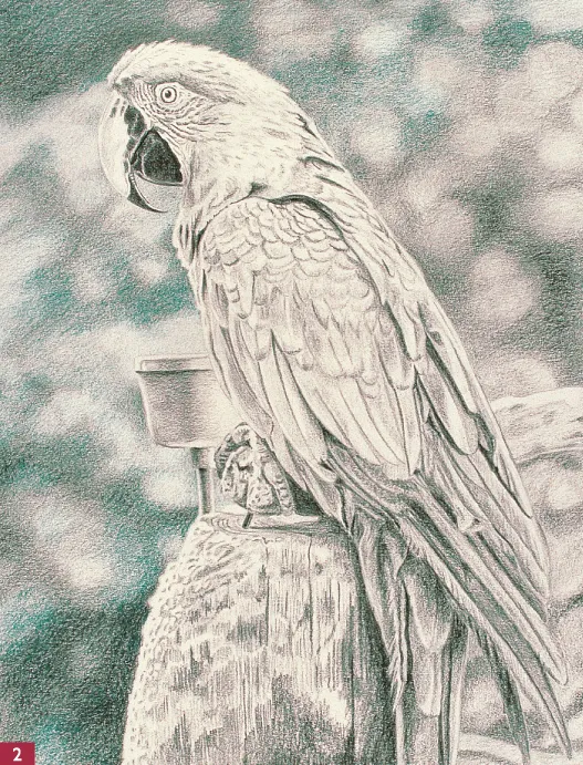
Step Two I darken the background with more black, adjusting the shapes for balance and interest but keeping them blurred so they don’t compete with the subject. Then I add a layer of cobalt blue over the black, applying the color with circular strokes to keep the layers soft and blended.
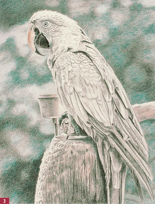
Step Three I add a little more cobalt blue to the background, to the iris of the eye, around the outside of the eye, and along the white area near the beak. I also apply blue with medium pressure over the black parts of the beak and feet and add blue to the bird’s cast shadow. Then I stroke peach on the upper beak with a smooth, circular motion, leaving the white highlight at the outer edge. I also add some peach to the black areas of the beak to create small, cracklike lines. Then I apply peach lightly and smoothly to the cup, the wood perch, and the wood support, leaving the highlights white. I darken the wood a bit more with some black, using strokes that follow the direction of the wood grain.
Step Four I smoothly apply canary yellow to the beak, over the peach, using medium pressure. Then I add yellow to the head, the details around the eye, the chest, the top part of the wing, and the back. I layer some cobalt blue over the more shadowed areas of the head and over the black lines in the feathers. Next I lightly apply yellow to the cup, overlapping the white area a little. I also layer yellow over all the wood and on some of the light spots in the background. Then I apply dark green to the background, pressing firmly in small, circular motions over the darker areas. I make sure to keep my pencils sharp to help work the color into the paper. Then, using a blending stump, I soften the background colors with small, circular motions.
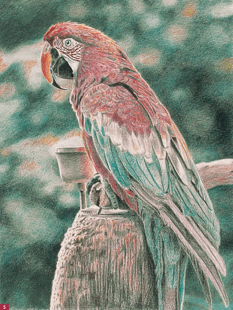
Step Five I apply first dark umber and then canary yellow to the perch with short, vertical strokes that mimic the wood grain. I also give the cup a light layer of dark umber, but I leave the edges white to indicate reflections of the strong sunlight. Since I don’t have red in the limited palette I’m using, I must build a red hue by repeatedly layering magenta and yellow over each other. I begin with a layer of magenta to the head, using medium pressure and short strokes that follow the direction the feathers lie and allowing the yellow to show through along the top of the sunlit head. Next I apply magenta firmly to the spots on the face and under the eye, and then I go over the spots with a little more yellow to create an orange-red. I lightly add a little magenta on the beak and apply a layer of cobalt blue to a lower row of feathers, pressing firmly. Then I blend the feathers with the blending stump and add light layers of magenta and blue to the long wing and tail feathers.
Step Six Next I apply first dark green and then canary yellow to the middle row of feathers. I layer more magenta on the head, and then I add white to a few areas to create lighter feathers on top. I add magenta to the cup to create the reflection and add a little more black to the center of the cup to give it some dimension. To balance the dark green behind the parrot’s head, I add some dark umber in a circular motion. Then I use cobalt blue to smooth and blend the colors in the background and in the feathers. I use a blending stump to work in the color, and I apply white over the blue, pressing firmly to create some shine on the feathers. I use black to emphasize the edges of the tail feathers and blend it in with a blending stump. I lightly work magenta into some of the dark areas of the blue feathers and the one red tail feather, and I darken the edges of the red feathers with dark umber and black. Finally I add highlights with touches of white over the blue tail feathers.
Starting with a Simple Subject
with Debra Yaun
Intricate, complex scenes are certainly visually interesting, but they can also be challenging to draw. A better way to begin is to choose a simple subject, which can be equally compelling, even with a limited palette. Before you start drawing, look closely at your subject and try to break it down into basic shapes (such as circles, triangles, and wedges). You can also reduce the distractions in your scene by keeping the background vague, as Debra Yaun did here in this simple portrayal of colorful daylilies.
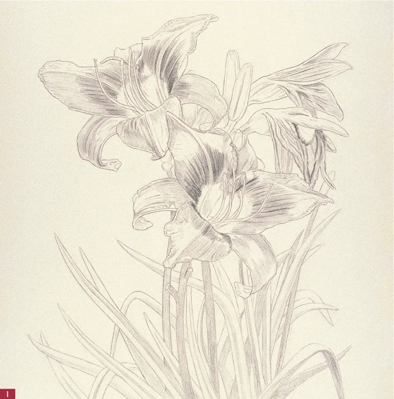
Step One First I sketch out the day lilies in graphite pencil, taking care to draw the correct proportions. Then I use black colored pencil to indicate the darkest veins on the flower petals, creating long strokes that start at the center of each flower. I am using a grisaille technique here (see box on page 33), applying black colored pencil to the stems and leaves with short, even strokes. This will establish a foundation for all the subsequent values in the drawing.
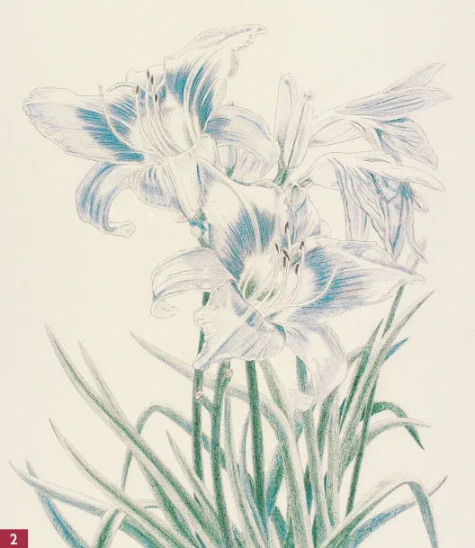
Step Two Next I lightly apply short strokes of cobalt blue over the black on the leaves. I also layer blue over the rest of the leaves, but I retain some of the white of my paper on the leaves in the foreground. This helps set the background leaves behind the foreground leaves. I give the stems a little heavier application of blue, since they appear a bit darker in my reference photo.
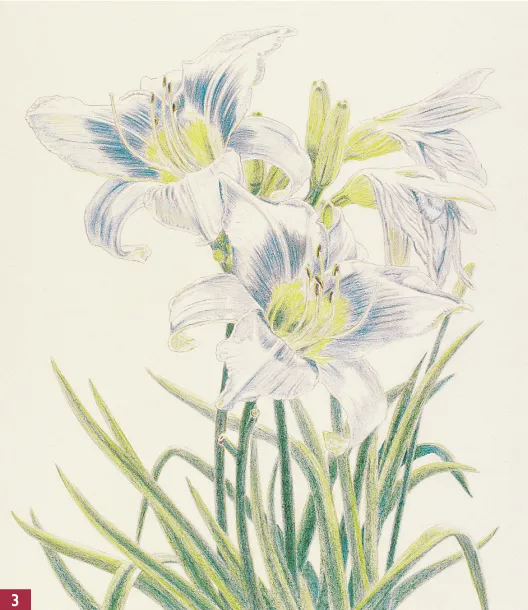
Step Three With short strokes, I add a light layer of dark green to the centers of the two open flowers. Then I apply dark umber to the ends of the stamens, leaving the pollen edges white. I use short strokes of dark green along the length of the leaves and stems, and then I lightly layer dark green on the flower buds and the bases of the two closed flowers. Next I add dark umber to the stems and some of the darker leaves and layer canary yellow over the green buds and leaves, using a paper stump to blend the colors. Then I apply more yellow to the leaves in the foreground. (Remember that warm colors appear to “pop” forward.) I layer black on the base of the stamen to indicate the shadow and apply a fairly heavy layer of yellow to the centers of the flowers. Then I use a sharp yellow pencil to indicate pollen on the stamens, leaving a white edge for contrast.
Step Four Using strokes that follow the direction of the veins, I add a layer of magenta to the open petals, leaving some white to indicate the sunlit areas. To achieve a “glow” on the petals, I layer magenta over the yellow to create orange; notice also that the cobalt blue I’ve added shows through under the magenta, creating a purple hue. Developing this variety of reds gives a better contrast between the shadows and the lighter areas. Next I lightly apply magenta along the petal lines and inner edges of the buds to indicate some reflected color from the surrounding flowers. I give the closed flowers a layer of magenta as well, pressing firmly where the petals fold. Then I layer magenta over the brown on the ends of the stamens to darken and warm them.
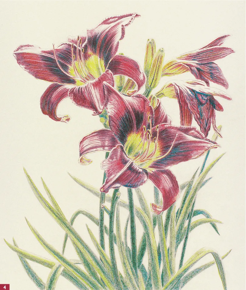
Step Five Next I erase any graphite lines that are still visible along the outside of the petals. Using medium pressure, I apply a layer of cobalt blue to the background with horizontal strokes. I keep the point of the pencil very sharp and stroke along the edges of the petals. Then I layer dark green and magenta onto the blue in horizontal strokes to add some color and interest to the background. Next I use a paper blending stump to soften and blend the background colors; I want to make sure I don’t have a complex or distracting backdrop that would detract from these simple flowers. Finally I take another look at the leaves and decide they seem a little light, so I darken them in a few areas with some blue and more dark green.
Using References
with Debra Yaun
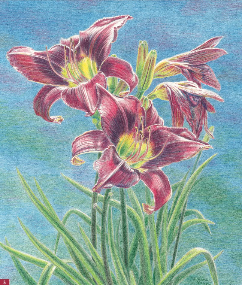
Observing nature firsthand is a wonderful practice for an artist. Be sure to bring a sketchbook with you so you can make some field sketches on site—these quick studies can be invaluable reference tools when you return to your studio. If you bring your camera along, you have the option of observing and recording a subject from several different angles. You can also snap various shots of the entire setting, as well as some closeups of the details. Give yourself as much information to work with as you can. When you return to the studio, you can compile your photos—as well as drawings, magazine clippings, and other static references—into a permanent file for future use (also called an “artist’s morgue”). In this example, Debra Yaun portrays a colorful floral scene using a photo from her reference file.
Using Photos Many artists prefer to dr...
Table of contents
- Cover
- Title Page
- Contents
- Introduction
- Tools and Materials
- Color Theory
- Colored Pencil Techniques
- About the Artists
- Lesson 1: Making the Best of a Limited Palette
- Lesson 2: Starting with a Simple Subject
- Lesson 3: Using References
- Lesson 4: Drawing Animals Accurately
- Lesson 5: Achieving a Likeness
- Lesson 6: Composing a Landscape
- Lesson 7: Capturing Mood
- Lesson 8: Understanding Value
- Lesson 9: Setting Up a Still Life
- Lesson 10: Creating Drama with Contrast
- Lesson 11: Utilizing Artistic License
- Conclusion
- Copyright Page
Frequently asked questions
Yes, you can cancel anytime from the Subscription tab in your account settings on the Perlego website. Your subscription will stay active until the end of your current billing period. Learn how to cancel your subscription
No, books cannot be downloaded as external files, such as PDFs, for use outside of Perlego. However, you can download books within the Perlego app for offline reading on mobile or tablet. Learn how to download books offline
Perlego offers two plans: Essential and Complete
- Essential is ideal for learners and professionals who enjoy exploring a wide range of subjects. Access the Essential Library with 800,000+ trusted titles and best-sellers across business, personal growth, and the humanities. Includes unlimited reading time and Standard Read Aloud voice.
- Complete: Perfect for advanced learners and researchers needing full, unrestricted access. Unlock 1.5M+ books across hundreds of subjects, including academic and specialized titles. The Complete Plan also includes advanced features like Premium Read Aloud and Research Assistant.
We are an online textbook subscription service, where you can get access to an entire online library for less than the price of a single book per month. With over 1.5 million books across 990+ topics, we’ve got you covered! Learn about our mission
Look out for the read-aloud symbol on your next book to see if you can listen to it. The read-aloud tool reads text aloud for you, highlighting the text as it is being read. You can pause it, speed it up and slow it down. Learn more about Read Aloud
Yes! You can use the Perlego app on both iOS and Android devices to read anytime, anywhere — even offline. Perfect for commutes or when you’re on the go.
Please note we cannot support devices running on iOS 13 and Android 7 or earlier. Learn more about using the app
Please note we cannot support devices running on iOS 13 and Android 7 or earlier. Learn more about using the app
Yes, you can access Colored Pencil Step by Step by Pat Averill,Sylvester Hickmon,Debra Kaufman Yaun in PDF and/or ePUB format, as well as other popular books in Art & Art Techniques. We have over 1.5 million books available in our catalogue for you to explore.