Type, Form, and Function is a useful, comprehensive typography resource that both students and professional designers should have in their library. It looks at the influences of modern typography and symbols going back through time and examines certain type treatments and movements in design and logo types. It focuses on how type works and emphasizes typographic fundamentals, while touching on logo/logotype design and page layout (print and interactive). This book promises to guide designers through the visual typographic clutter to make their designed messages more meaningful.
- 208 pages
- English
- ePUB (mobile friendly)
- Available on iOS & Android
eBook - ePub
About this book
Trusted by 375,005 students
Access to over 1.5 million titles for a fair monthly price.
Study more efficiently using our study tools.
Information
Topic
DesignSubtopic
Design GeneralFORM
“There will never be a font that is as pervasive as Helvetica again, because there are going to be too many typefaces out there, too many designers wanting to do things that are specific.”
—Jeffery Keedy 1990
Typographically speaking, form relates to rendered letters, typefaces, words, or logotypes. Custom lettering has been around since the invention of writing, and current practitioners continue to generate unique, labor-intensive specimens that may or may not possess all of a language’s alphanumeric characters. But typeface designers, who produce fully developed fonts, must undergo some of the most rigorous training to aid them in developing a highly functional product.
Type designers can spend years learning typography history, strengthening their drawing abilities, and fostering the ambition necessary to render one letter after another. Having keen visual literacy is equally important since it helps one to make judgments objectively. Cell phones, PDAs, digital cameras, and games provide new opportunities for the type designer, in much the same way that the computer revolution did in the 1980s. But mostly, it is graphic designers who spend time pushing and pulling existing letterforms in order to create a unique typographic composition.
These one-off designs can become a simple word, rendered as a corporate identity, magazine masthead, movie title, t-shirt emblem, advertising headline, or poster graphic, among others. But, it’s not as simple as it sounds. It takes skill and knowledge to create letterforms that communicate the message to the intended audience.
At the same time, technology empowers anybody to dabble in type design. Even the lesser-trained neophyte now has the means to create novelty typefaces and distribute them through the Internet. Some argue that this never-ending font genesis becomes pollution in the already massive typographic library available. But even type designers and graphic designers have been known to dabble, experimenting with how type can be used in never-before-seen ways. Such activities should not suggest that one practice is better than another; instead, it serves to answer a hotly debated question: Why do we need more typefaces? Why not?
FORM
Words with Zuzana Licko / Emigre
My type design skills have developed along with the technology.
Q. Why did you become a type designer?
I started my college studies in architecture, but then changed my major to graphic design, and I soon realized that typography interested me the most. Experimenting with type as a form of illustration fascinated me. But this was before the digital revolution opened up type design to anyone with a personal computer; so at that point, I only got to use typefaces, not create them. The Macintosh computer was released the year I graduated. We purchased one, and I immediately started experimenting with designing bitmaps, which was state-of-the-art type design for the Mac at that point. (This was before PostScript and the laser printer.) My type design skills have developed along with the technology.
Q. Why do you continue to design type?
It continues to intrigue me.
Q. When viewing your body of work, few of (if any) the fonts feel calligraphic in nature. If you were commissioned to create a calligraphic typeface, would you do it?
That would depend on the specifics of the job. I would not be the right designer if the project required a traditional approach to calligraphy. Being left-handed made it virtually impossible to practice this craft.
I had a calligraphy instructor in college who insisted that I had to switch to writing with my right hand to participate in his class! In general, I’ve done very few commissions because I’ve found that I don’t create my best work this way. If I have to rush a design to meet a deadline, then my work suffers. Sometimes I have to put a design away for months, even years, before being able to see it with fresh eyes, which is sometimes required to solve a problem. Commissions do not allow for this germination process.
Page from Mrs Eaves XL type specimen
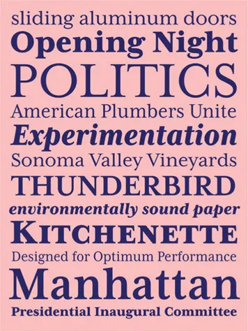
Type specimen sheet for Mrs Eaves XL
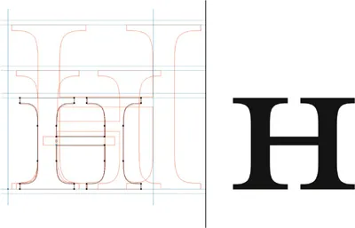
Mrs Eaves Roman computer renderings for H and small cap H

Mrs Eaves Roman computer rendering
Q. Mrs Eaves became a popular font during the late 1990s and into the early 2000s. Why was 2009 the time to release the sans serif mate to Mrs Eaves called Mr Eaves?
It wasn’t planned that way, but that’s how long it took me to find a solution that I was happy with. I didn’t immediately see how to adapt Mrs Eaves into a sans serif. I guess it took years of observing it in use to finally spark the idea.
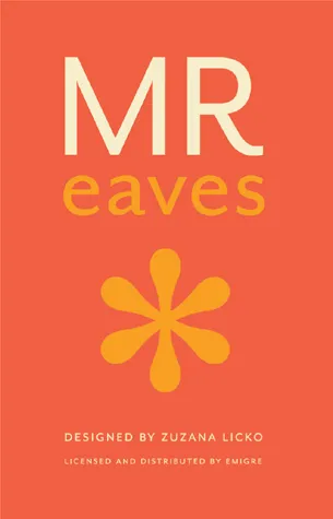
Cover for Mr Eaves catalog
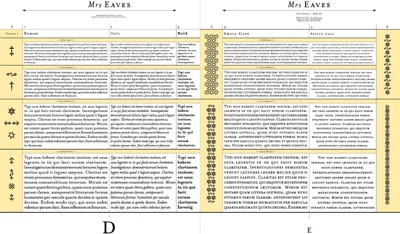
Page spreads from Mrs Eaves catalog
Q. On average, how much time do you devote to designing a typeface?
I’m not sure because I’ve never kept a time log, which would be difficult...
Table of contents
- Cover
- Title Page
- Dedication
- Contents
- Preface: Typography Today
- Introduction: Historical Primer
- Form
- Composition
- Principles
- Experimentation
- Appendix: Making this Book
- Copyright Page
Frequently asked questions
Yes, you can cancel anytime from the Subscription tab in your account settings on the Perlego website. Your subscription will stay active until the end of your current billing period. Learn how to cancel your subscription
No, books cannot be downloaded as external files, such as PDFs, for use outside of Perlego. However, you can download books within the Perlego app for offline reading on mobile or tablet. Learn how to download books offline
Perlego offers two plans: Essential and Complete
- Essential is ideal for learners and professionals who enjoy exploring a wide range of subjects. Access the Essential Library with 800,000+ trusted titles and best-sellers across business, personal growth, and the humanities. Includes unlimited reading time and Standard Read Aloud voice.
- Complete: Perfect for advanced learners and researchers needing full, unrestricted access. Unlock 1.5M+ books across hundreds of subjects, including academic and specialized titles. The Complete Plan also includes advanced features like Premium Read Aloud and Research Assistant.
We are an online textbook subscription service, where you can get access to an entire online library for less than the price of a single book per month. With over 1.5 million books across 990+ topics, we’ve got you covered! Learn about our mission
Look out for the read-aloud symbol on your next book to see if you can listen to it. The read-aloud tool reads text aloud for you, highlighting the text as it is being read. You can pause it, speed it up and slow it down. Learn more about Read Aloud
Yes! You can use the Perlego app on both iOS and Android devices to read anytime, anywhere — even offline. Perfect for commutes or when you’re on the go.
Please note we cannot support devices running on iOS 13 and Android 7 or earlier. Learn more about using the app
Please note we cannot support devices running on iOS 13 and Android 7 or earlier. Learn more about using the app
Yes, you can access Type Form & Function by Jason Tselentis in PDF and/or ePUB format, as well as other popular books in Design & Design General. We have over 1.5 million books available in our catalogue for you to explore.