
eBook - ePub
Type Form & Function
A Handbook on the Fundamentals of Typography
Jason Tselentis
This is a test
Partager le livre
- 208 pages
- English
- ePUB (adapté aux mobiles)
- Disponible sur iOS et Android
eBook - ePub
Type Form & Function
A Handbook on the Fundamentals of Typography
Jason Tselentis
Détails du livre
Aperçu du livre
Table des matières
Citations
À propos de ce livre
Type, Form, and Function is a useful, comprehensive typography resource that both students and professional designers should have in their library. It looks at the influences of modern typography and symbols going back through time and examines certain type treatments and movements in design and logo types. It focuses on how type works and emphasizes typographic fundamentals, while touching on logo/logotype design and page layout (print and interactive). This book promises to guide designers through the visual typographic clutter to make their designed messages more meaningful.
Foire aux questions
Comment puis-je résilier mon abonnement ?
Il vous suffit de vous rendre dans la section compte dans paramètres et de cliquer sur « Résilier l’abonnement ». C’est aussi simple que cela ! Une fois que vous aurez résilié votre abonnement, il restera actif pour le reste de la période pour laquelle vous avez payé. Découvrez-en plus ici.
Puis-je / comment puis-je télécharger des livres ?
Pour le moment, tous nos livres en format ePub adaptés aux mobiles peuvent être téléchargés via l’application. La plupart de nos PDF sont également disponibles en téléchargement et les autres seront téléchargeables très prochainement. Découvrez-en plus ici.
Quelle est la différence entre les formules tarifaires ?
Les deux abonnements vous donnent un accès complet à la bibliothèque et à toutes les fonctionnalités de Perlego. Les seules différences sont les tarifs ainsi que la période d’abonnement : avec l’abonnement annuel, vous économiserez environ 30 % par rapport à 12 mois d’abonnement mensuel.
Qu’est-ce que Perlego ?
Nous sommes un service d’abonnement à des ouvrages universitaires en ligne, où vous pouvez accéder à toute une bibliothèque pour un prix inférieur à celui d’un seul livre par mois. Avec plus d’un million de livres sur plus de 1 000 sujets, nous avons ce qu’il vous faut ! Découvrez-en plus ici.
Prenez-vous en charge la synthèse vocale ?
Recherchez le symbole Écouter sur votre prochain livre pour voir si vous pouvez l’écouter. L’outil Écouter lit le texte à haute voix pour vous, en surlignant le passage qui est en cours de lecture. Vous pouvez le mettre sur pause, l’accélérer ou le ralentir. Découvrez-en plus ici.
Est-ce que Type Form & Function est un PDF/ePUB en ligne ?
Oui, vous pouvez accéder à Type Form & Function par Jason Tselentis en format PDF et/ou ePUB ainsi qu’à d’autres livres populaires dans Design et Typography. Nous disposons de plus d’un million d’ouvrages à découvrir dans notre catalogue.
Informations
Sujet
DesignSous-sujet
TypographyFORM
“There will never be a font that is as pervasive as Helvetica again, because there are going to be too many typefaces out there, too many designers wanting to do things that are specific.”
—Jeffery Keedy 1990
Typographically speaking, form relates to rendered letters, typefaces, words, or logotypes. Custom lettering has been around since the invention of writing, and current practitioners continue to generate unique, labor-intensive specimens that may or may not possess all of a language’s alphanumeric characters. But typeface designers, who produce fully developed fonts, must undergo some of the most rigorous training to aid them in developing a highly functional product.
Type designers can spend years learning typography history, strengthening their drawing abilities, and fostering the ambition necessary to render one letter after another. Having keen visual literacy is equally important since it helps one to make judgments objectively. Cell phones, PDAs, digital cameras, and games provide new opportunities for the type designer, in much the same way that the computer revolution did in the 1980s. But mostly, it is graphic designers who spend time pushing and pulling existing letterforms in order to create a unique typographic composition.
These one-off designs can become a simple word, rendered as a corporate identity, magazine masthead, movie title, t-shirt emblem, advertising headline, or poster graphic, among others. But, it’s not as simple as it sounds. It takes skill and knowledge to create letterforms that communicate the message to the intended audience.
At the same time, technology empowers anybody to dabble in type design. Even the lesser-trained neophyte now has the means to create novelty typefaces and distribute them through the Internet. Some argue that this never-ending font genesis becomes pollution in the already massive typographic library available. But even type designers and graphic designers have been known to dabble, experimenting with how type can be used in never-before-seen ways. Such activities should not suggest that one practice is better than another; instead, it serves to answer a hotly debated question: Why do we need more typefaces? Why not?
FORM
Words with Zuzana Licko / Emigre
My type design skills have developed along with the technology.
Q. Why did you become a type designer?
I started my college studies in architecture, but then changed my major to graphic design, and I soon realized that typography interested me the most. Experimenting with type as a form of illustration fascinated me. But this was before the digital revolution opened up type design to anyone with a personal computer; so at that point, I only got to use typefaces, not create them. The Macintosh computer was released the year I graduated. We purchased one, and I immediately started experimenting with designing bitmaps, which was state-of-the-art type design for the Mac at that point. (This was before PostScript and the laser printer.) My type design skills have developed along with the technology.
Q. Why do you continue to design type?
It continues to intrigue me.
Q. When viewing your body of work, few of (if any) the fonts feel calligraphic in nature. If you were commissioned to create a calligraphic typeface, would you do it?
That would depend on the specifics of the job. I would not be the right designer if the project required a traditional approach to calligraphy. Being left-handed made it virtually impossible to practice this craft.
I had a calligraphy instructor in college who insisted that I had to switch to writing with my right hand to participate in his class! In general, I’ve done very few commissions because I’ve found that I don’t create my best work this way. If I have to rush a design to meet a deadline, then my work suffers. Sometimes I have to put a design away for months, even years, before being able to see it with fresh eyes, which is sometimes required to solve a problem. Commissions do not allow for this germination process.
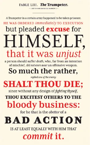
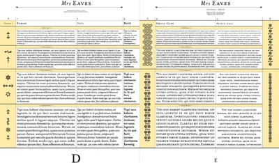
Page from Mrs Eaves XL type specimen
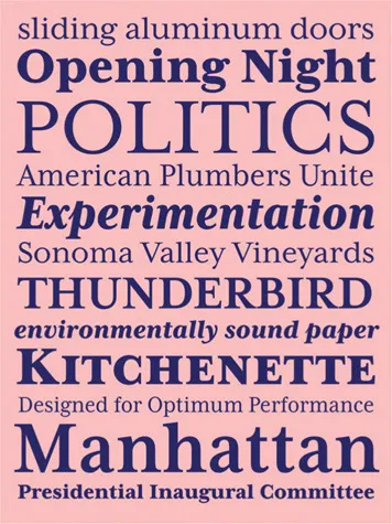
Type specimen sheet for Mrs Eaves XL
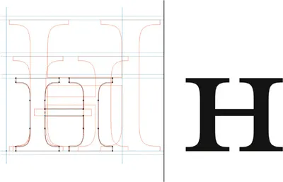
Mrs Eaves Roman computer renderings for H and small cap H

Mrs Eaves Roman computer rendering
Q. Mrs Eaves became a popular font during the late 1990s and into the early 2000s. Why was 2009 the time to release the sans serif mate to Mrs Eaves called Mr Eaves?
It wasn’t planned that way, but that’s how long it took me to find a solution that I was happy with. I didn’t immediately see how to adapt Mrs Eaves into a sans serif. I guess it took years of observing it in use to finally spark the idea.
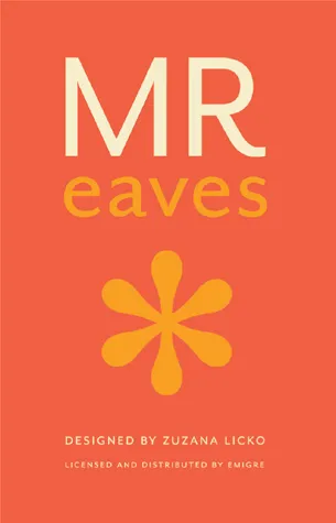
Cover for Mr Eaves catalog
Page spreads from Mrs Eaves catalog
Q. On average, how much time do you devote to designing a typeface?
I’m not sure because I’ve never kept a time log, which would be difficult...