Working with Acrylic
Color Theory
Acquaint yourself with the ideas and terms of color theory, which involve everything from color relationships to perceived color temperature and color psychology. In the following pages, we will touch on the basics as they relate to painting.
Color Wheel
The color wheel, pictured to the right, is the most useful tool for understanding color relationships. Where the colors lie relative to one another can help you group harmonious colors and pair contrasting colors to communicate mood or emphasize your message. The wheel can also help you mix colors efficiently. Below are the most important terms related to the wheel.
Primary colors are red, blue, and yellow. With these you can mix almost any other color; however, none of the primaries can be mixed from other colors. Secondary colors include green, orange, and violet. These colors can be mixed using two of the primaries. (Blue and yellow make green, red and yellow make orange, and blue and red make violet.) A tertiary color is a primary mixed with a near secondary, such as red with violet to create red-violet.
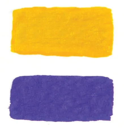
COMPLEMENTARY COLORS are those situated opposite each other on the wheel, such as purple and yellow. Complements provide maximum color contrast.
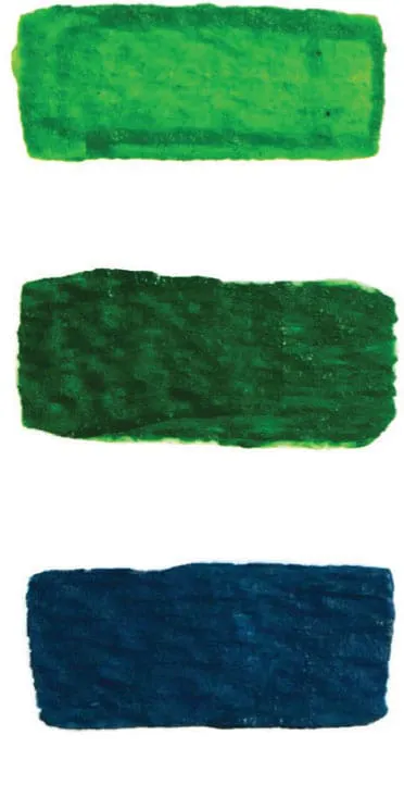
ANALOGOUS COLORS are groups of colors adjacent to one another on the color wheel, such as blue-green, green, and yellow-green. When used together, they create a sense of harmony.
A hue is a color in its purest form (A), a color plus white is a tint (B), a color plus gray is a tone (C), and a color plus black is a shade (D).
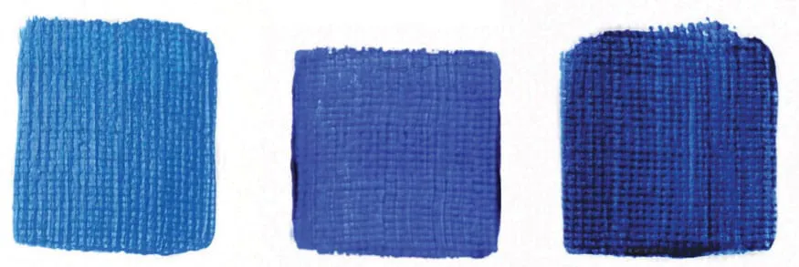
A single color family, such as blue, encompasses a range of hues—from yellow-leaning to red-leaning.
Color & Value
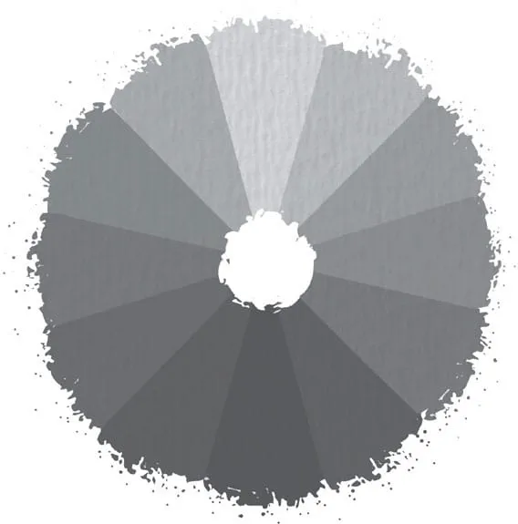
Within each hue, you can achieve a range of values—from dark shades to light tints. However, each hue has a value relative to others on the color wheel. For example, yellow is the lightest color and violet is the darkest. To see this clearly, view the color wheel in grayscale (a photograph or scan of a color wheel that has been changed using computer-editing software). It is also very helpful to create a grayscale chart of all the paints in your palette so you know how their values relate to one another.
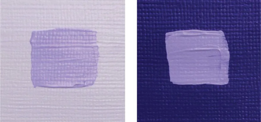
Value Relativity
Values are perceived relative to others in the same scene. A color may appear dark against a white surface or light tint, but the same color may appear light against a dark surface. Above are middle-value strokes of purple over light and dark backgrounds. The same value can appear very different depending on its surroundings.
Color Temperature
Color temperature refers to the feeling one gets when viewing a color or set of colors. Generally, yellows, oranges, and reds are considered warm, whereas greens, blues, and purples are considered cool. When used within a work of art, warm colors seem to advance toward the viewer, and cool colors appear to recede into the distance. This dynamic is important to remember when suggesting depth or creating an area of focus. For more about color temperature, turn to here.
Types of Acrylic
Acrylic is a unique medium with unparalleled versatility. While it has its own look and feel, it also beautifully mimics other media, such as watercolor, oil, and even pastel. Acrylic paint dries quickly like watercolor but is as permanent as oil and as vibrant as pastel. You can thin acrylic paint with water to create luminous washes, or you can use it straight from the tube to build up thick layers. And because acrylics are water-based, cleanup is simple with soap and water.
Acrylic paint, which ...