Redesigns are part of every designer's repertoire, but sometimes getting inspired or motivated to redesign an existing logo can be challenging and cumbersome. The goal of maintaining equity by using existing elements in new ways and combining them with new elements is akin to the task of "recycling" In other words – how do designers improve and recreate identities without throwing out the usable stuff that is makes up the existing brand? Recycling and Redesigning Logos demonstrates the strategies and processes of successful redesigns and shows readers how to build on the equity the brand already retains to create a fresh look. The case studies feature before and afters of the logos and discuss why the redesign was necessary and demonstrate how to reuse, reformat and build on the ingredients, materials and essence that is already there.
eBook - ePub
Recycling and Redesigning Logos
A Designer's Guide to Refreshing & Rethinking Design
- 192 pages
- English
- ePUB (mobile friendly)
- Available on iOS & Android
eBook - ePub
About this book
Trusted by 375,005 students
Access to over 1.5 million titles for a fair monthly price.
Study more efficiently using our study tools.
Information
Topic
DesignSubtopic
Graphic DesignSECTION 1
CHAPTER 1: A REFRESHER COURSE
CHAPTER 2: THE ONLY CONSTANT: CHANGE
CHAPTER 3: SLEIGHT OF HAND (EVOLUTION)
CHAPTER 4: REVOLUTIONS
CHAPTER 1
A Refresher Course
A LOGO IS JUST THE START OF THE STORY. A good logo—or sometimes simply a familiar one—is visually arresting and symbolically potent. It sums up the company or organization it represents ... which is exactly why it’s just the start.
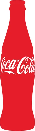
The personal associations a logo calls up normally aren’t apparent in the visual symbol itself. The Coca-Cola logo pulls some emotional triggers for everyone—positive and/or negative depending upon whom you ask—but the emotional content of that response isn’t just in the familiar flowing script.
I was a Coca-Cola collector as teenager growing up in England. I gathered bottles and bits of ephemera from around the world. I have not enjoyed Coca-Cola much since I was that teenager (and that’s a few years ago now), but there remains a link between the Coke look, its contoured bottle, the familiar script, the red, and that syrupy drink. Once every five years or so I try it, if only to remind myself of that taste and my memories and associations. Such is the definition of a good logo: it transcends design by creating an emotional connection between the symbol and your personal story. Between you and it.
In a favorable state, these connections evoke warm feelings and a sense of belonging. Today, we think of these personal connections, held by “consumers,” people, as the essence of a brand.
The sum total of the brand experience is “Visual Personality.” A successful visual personality captures the emotional attributes of a brand and becomes its personality.
VISUAL PERSONALITY
A brand, then, is the sum of all the connections and shared experiences, feelings, and associations held by stakeholders like customers, employees, shareholders, etc. Sometimes the associations can be bad: think Enron, Exxon, Edsel. But let’s not talk about the bad stuff. We are here to talk about successful brands and the associations they hold. What happens when change requires the redesign of a logo or mark so that such brands stay current and connected to new audiences while keeping the existing base?
At Ph.D, we call the sum total of the brand experience “Visual Personality.” A successful visual personality captures the emotional attributes of a brand and becomes its personality. Just like someone you know and love. Personality is the trait that attracts you to them: its gentleness, its concern, its intelligence, its wit, its historical connection to your life, its integrity. As designers, we control visual personality, which includes the logo and the logotype. But it is much more than that. Take a look at UPS and its signature “brown.” That is a huge part of its visual personality—the UPS logo is brown, the trucks are brown, and the drivers wear brown. Brown is also used in the company’s advertising, and it appeared in the company’s tagline and advertising, (“What can brown do for you?”—but that is soon changing).

Do the Math. The sum of all experiences of a brand is its “visual personality.” A successful visual personality captures the emotional attributes of a brand and becomes its symbol—the emblem of its products, services, and people.
Visual personality is a specific kind of identity. First, it is visual, but it can be a word, such as a logo coupled with a tagline, slogan, or typographic identifier. Or, in the case of a logotype (or wordmark), it may be just words or letters. But, it is always visual.
A visual personality in a sense points all the way back into a brand’s amorphous nature. A well-managed visual personality summons positive associations and warm emotions, and packages them in a visual capsule. The term logo is often used to describe a single symbol or mark that embodies a visual personality. But logos are often designed as families, in a range of sizes, applications, or colors that function as a single system.
“When a redesign is successful, it retains equity from the past, instills it with new meaning in order to position the client or product for future growth.”
Visual personalities often include signature colors. They include words—think of Verizon’s classic “Can you hear me now?” tagline that became a part of everyday lexicon. Visual personalities can include audible cues—“Zoom-zoom,” from Mazda’s personality, and those of us “of a certain age” know Alka-Seltzer “Plop, plop, fizz, fizz” jingle and sound. Visual personalities can be people or animals: Michael Jordon for Nike, Karl Malden for American Express, Geico’s Gecko, or AFLAC’s duck.
THE CHICKEN OR THE EGG?
When a product or organization is new, it is in an egg stage. A new brand gives us a clean slate, and if the product pleases, positive associations accumulate. A brand is hatched, and we start to build brand equity.
The same thing happens with a new visual personality. By signaling a positive visual image, the public associates the visual personality with their experiences, and equity accumulates.
But this book isn’t about new brands or new visual personalities. This book is about refreshing and revitalizing. Evolution and revolution. What characteristics of a brand’s visual personality are valuable (have equity)? Which do not? What do you keep? What do you toss? When do you make subtle change—and when must you make wholesale change? When a redesign is successful, it retains equity from the past, instills it with new meaning in order to position the client or product for future growth.
So what is the Coca-Cola visual personality? Why did this young lad collect those bottles and retain an association with the brand long after he had stopped sipping its intoxicating sweetness? Was it the name? The Spenserian script? The red? Or the long-tracking shot pulling back to reveal a multicultural group of young people lip-syncing, “I’d like to teach the world to sing ...” on an Italian hilltop? My answer: all of these. The sum of its visual personality still resonates with me. I like Coca-Cola’s personality. It reminds me of happy times as a skinny youth in Greece with my uncle. Maybe I should try Coke Zero!
BEST PRACTICES
PROCESS MAKES PERFECT
DESIGN: SPRING ADVERTISING
VANCOUVER, BRITISH COLUMBIA
LOGO REDESIGNS RANGE FROM tune-ups and refreshes to blue-sky reimaginings. Designers often flatter themselves with the notion that the blue-sky stuff is the usual work. “We started from scratch,” or “We didn’t keep anything from the old system,” they say.
But the truth is that there’s almost always some sort of carryover, and that most redesigns can’t succeed without knowing what to keep. Unless the client in question has been remarkably bereft of design direction, there’s always something that resurfaces in a logo. It might be a tagline or a typographic style; it might be an intangible asset that arises from the consumer’s emotional dialogue with the product.
Spring, of Vancouver, British Columbia, is a full-service advertising and design agency, but its design team has developed specialized systems when it comes to logo redesigns. In the few years since they started, they’ve refined a four-step process that’s a wonder of its kind. It achieves simplicity without shallowness:
1. Define the goals. What’s happening with the client that makes a new logo necessary?
2. Market study. Who are the customers? Who are the competitors? What are they doing?
3. Articulate the personality. If the product were a person, what would it be like?
4. Develop the identity.

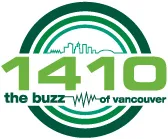
Well Grounded. Spring’s four-step process is fair, accurate, honest, and complete. It leads to creative strategies that lead to effective solutions. Their work for Talk 1410 AM in Vancouver wasn’t brain surgery, but it was very smart.
(Before: below, After: above)
(Before: below, After: above)
The principals of Spring Advertising are industry veterans who understand the value of a well-written client brief and the importance of knowing how much to retain in the new logo. Design director Perry Chua elaborates: “The brief dictates our approach: Are we repositioning the company? Has there been a merger or acquisition? Is this simply a refresh of the identity?”
Blue sky is wonderful, of course, but so is solid ground.
DEFINE THE GOALS: ONE PROCESS, MANY LOGOS: TALK 1410
Talk 1410, a Vancouver radio station, is a prime example of the value of working through step 1 of Spring’s process. The station was changing its name and seeking a new audience, younger and hipper, without losing its more mature listening base.
“You instantly turn an object into a topic of discussion by simply applying the quote marks.”
The creatives at Spring conceived of an identity with a built-in marketing advantage. “The redesign strategy aimed to deliver the station with more than just a logo redesign,” says Chua. “We wanted to give the client a creative platform from which their personality could be expressed.”
The palette is black and white—in Chua’s words, “because talk radio is about opinions, which are black and white: you either agree with something or you don’t.” The station’s tagline, “The Buzz of Vancouv...
Table of contents
- Cover
- Title Page
- Dedication
- Contents
- Introduction
- Section 1
- Section 2: Case Studies
- Section 3: Logo Gallery
- Directory of Contributors
- About the Author
- Acknowledgments
- Copyright Page
Frequently asked questions
Yes, you can cancel anytime from the Subscription tab in your account settings on the Perlego website. Your subscription will stay active until the end of your current billing period. Learn how to cancel your subscription
No, books cannot be downloaded as external files, such as PDFs, for use outside of Perlego. However, you can download books within the Perlego app for offline reading on mobile or tablet. Learn how to download books offline
Perlego offers two plans: Essential and Complete
- Essential is ideal for learners and professionals who enjoy exploring a wide range of subjects. Access the Essential Library with 800,000+ trusted titles and best-sellers across business, personal growth, and the humanities. Includes unlimited reading time and Standard Read Aloud voice.
- Complete: Perfect for advanced learners and researchers needing full, unrestricted access. Unlock 1.5M+ books across hundreds of subjects, including academic and specialized titles. The Complete Plan also includes advanced features like Premium Read Aloud and Research Assistant.
We are an online textbook subscription service, where you can get access to an entire online library for less than the price of a single book per month. With over 1.5 million books across 990+ topics, we’ve got you covered! Learn about our mission
Look out for the read-aloud symbol on your next book to see if you can listen to it. The read-aloud tool reads text aloud for you, highlighting the text as it is being read. You can pause it, speed it up and slow it down. Learn more about Read Aloud
Yes! You can use the Perlego app on both iOS and Android devices to read anytime, anywhere — even offline. Perfect for commutes or when you’re on the go.
Please note we cannot support devices running on iOS 13 and Android 7 or earlier. Learn more about using the app
Please note we cannot support devices running on iOS 13 and Android 7 or earlier. Learn more about using the app
Yes, you can access Recycling and Redesigning Logos by Michael Hodgson in PDF and/or ePUB format, as well as other popular books in Design & Graphic Design. We have over 1.5 million books available in our catalogue for you to explore.