This Fourth Edition of Cartography: Visualization of Geospatial Data serves as an excellent introduction to general cartographic principles. It is an examination of the best ways to optimize the visualization and use of spatiotemporal data. Fully revised, it incorporates all the changes and new developments in the world of maps, such as OpenStreetMap and GPS (Global Positioning System) based crowdsourcing, and the use of new web mapping technology and adds new case studies and examples. Now printed in colour throughout, this edition provides students with the knowledge and skills needed to read and understand maps and mapping changes and offers professional cartographers an updated reference with the latest developments in cartography.
Written by the leading scholars in cartography, this work is a comprehensive resource, perfect for senior undergraduate and graduate students taking courses in GIS (geographic information system) and cartography.
New in This Edition:
Provides an excellent introduction to general cartographic visualization principles through full-colour figures and images
Addresses significant changes in data sources, technologies and methodologies, including the movement towards more open data sources and systems for mapping
Includes new case studies and new examples for illustrating current trends in mapping
Provides a societal and institutional framework in which future mapmakers are likely to operate, based on UN global development sustainability goals
Trusted by 375,005 students
Access to over 1.5 million titles for a fair monthly price.
Maps are used to visualize geospatial data, i.e. data that refer to the location or the attributes of objects or phenomena located on Earth (the terms ‘spatial data’ and ‘geographical data’ will be used interchangeably). Maps help their users to better understand geospatial relationships. From maps, information on distances, directions and area sizes can be retrieved; patterns revealed; and relations understood and quantified. Since the 1980s, developments in digital geospatial data handling have gained momentum. Consequently, the environment in which maps are used has changed considerably for most users. With the computer came on-screen maps. Through these maps, the database from which they are generated can be queried, and some basic analytical functionality can now be accessed through menus or legends. In the 1980s, these software packages that allowed for queries and analyses of geospatial data became known as ‘geographical information systems’ (GISs). As their functionality matured, their application spread to all disciplines working with geospatial data. GIS introduced the integration of geospatial data from different kinds of sources. Its functionality offers the ability to manipulate, analyse and visualize the combined data. Its users can link their application-based models to the data contained in the systems, and try to find answers to questions such as ‘Which is the most suitable location to start a new branch of a supermarket chain?’ or ‘What effect will this plan, or possibly its alternative, have on the surrounding area?’
Maps are no longer only the final products they used to be. The paper map functioned, and functions, as a medium for storage and presentation of geospatial data. The introduction of on-screen maps and their corresponding databases resulted in a split between these functions. To cartographers, it brought the availability of database technology and computer graphics techniques that resulted in new and alternative presentation options such as three-dimensional and animated maps. Geospatial analysis often begins with maps; maps support judging intermediate analysis results and presenting final results. In other words, maps play a major role in the process of geospatial analysis.
The rise of Internet brought the next revolution in mapping. Access to interactive maps is no longer limited to professionals. Products such as Google Maps/Google Earth even allow people to add their own data to the maps and share it with others in a mouse click. The IT-related developments have resulted in a convergence of the different disciplines working with geo-information. GIS is integrated in the workflow of geo-related problem-solving. The disciplines studying related methods and techniques have converged under the header of geographical information science (GIScience). Scientists in this field do research on GIS (e.g. study principles on which GIS is based) and with GIS (e.g. study how GIS can be used in scientific applications (Longley et al., 2015).
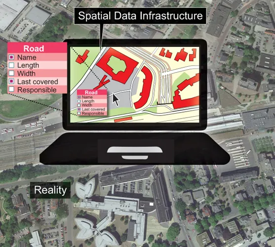
The above development also led to spatial or geographical data infrastructure (SDI or GDI). Next to a technical setting, a GDI comprises a set of agreements and arrangements to access, integrate and use geo-information. These new infrastructures for accessing geospatial data are being developed all over the world in order to allow access to the geospatial data files created and maintained in order to monitor the population, resources and environment spatial aspects of our modern societies. Access to the data needed requires complex querying procedures that are simplified when using maps to pinpoint the areas and themes for which data are needed (Figure 1.1).
FIGURE 1.1 The interface role of maps in the spatial data infrastructure. Here, the GIS answers a query regarding a clicked object
In a GIScience environment, visualization is applied in four different situations. Firstly, visualization can be used to explore, for instance, in order to play with unknown data. In several applications, like those dealing with remote sensing data, there are abundant (temporal) data available. Questions such as ‘What is the nature of the data set?’ or ‘Which of those data sets reveals patterns related to the current problem studied?’ have to be answered before the data can actually be used in a geospatial analysis operation. Secondly, visualization is applied in analysis, for instance, in order to manipulate known data. In a planning environment, the nature of two separate data sets can be fully understood (e.g. the groundwater level and the possible location of a new road), but their relationship cannot. A geospatial analysis operation, like overlay, can combine several data sets regarding the same area to determine their possible geospatial relationship. The result of the overlay operation could, when necessary, be used to adapt the plans. Thirdly, maps are used to synthesize the results of the analysis. Fourthly, visualization is applied to present or communicate the new geospatial knowledge. The results of geospatial analysis operations can be displayed in well-designed maps easily understood by a wide audience. The cartographic discipline offers design rules to do so. As the fourth objective of visualization, we have already mentioned the easier access to the data files behind the maps.
Considering these four different fields of visualization in GIScience (exploration, analysis, synthesis and presentation), it can be noticed that the tools for presentation are the most highly developed. While producing maps to communicate geospatial information, cartographic rules and guidelines (together called ‘cartographic grammar’, based on the nature of the data and the communication objectives) are available to make the maps effective. However, as these rules are not part of the mapping software, it allows users to produce their own maps even when they are unaware of cartographic grammar. In other words, there is no guarantee that the maps will be effective. These cartographic rules could also be applied in the analysis phase, but the necessity to do so would be less strong here. When cartographers and analysts discuss this matter, the second group would always claim ‘Who cares about mapping rules, as long as one understands one’s own maps?’ And because the analysts knew their own data, they probably would understand their own maps, but when showing their maps to others communication problems would start. In a data exploration environment, it is likely that the user does not know the exact nature of the data and therefore might not be able to apply the relevant cartographic rules.
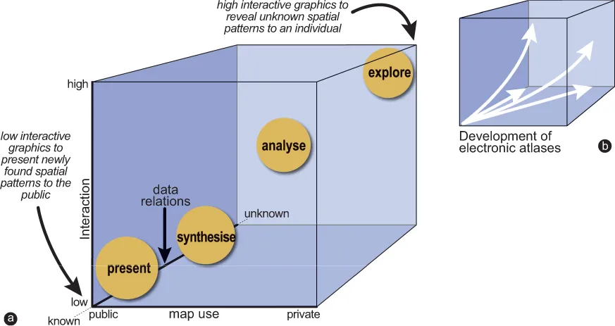
At this moment, the terms ‘private visual thinking’ and ‘public visual communication’ should be introduced (DiBiase, 1990). Private visual thinking refers to the situation where users explore and analyse their own data, and public visual communication refers to the situation where users present their results in the form of maps to a wider audience. The first describes the exploration circumstances, and the second presentation circumstances. Analyses can be found somewhere in the middle along a line between the two. This becomes more evident when it is realized that private versus public map use (i.e. maps tailored to an individual versus those designed for a wide audience) is just one of the axes of the so-called map-use cube, first introduced by MacEachren (1994). Along the two other axes, the revelation of the unknown versus the presentation of the known, respectively, and high versus low user interaction are plotted, which are shown in Figure 1.2.
FIGURE 1.2 The map-use cube (adapted from MacEachren and Taylor, 1994): (a) the four main situations to visualize data in a GIS, (1) to present, (2) to synthesize, (3) to analyse and (4) to explore; (b) the evolution of the electronic atlas since 1987 plotted in the map-use cube
Most chapters in this book concentrate on maps that should communicate geospatial information (the lower-left front corner of the cube). However, recent developments in cartography and other disciplines handling geospatial data not only require a new line of thought, but also create one. This can be illustrated by plotting the evolutionary stages of the development of electronic atlases in the cube along the diagonal from the corner ‘wide audience, presenting knowns and low interaction’ towards the corner ‘private use, presenting unknowns and high interaction’ (Figure 1.2b). Possibilities for interaction are boosted by the advent of the Internet and its potential for querying the databases behind the maps presented there. Early electronic atlases were, in effect, sequential slide shows, but today’s electronic atlases have high interactive multimedia mapping capabilities, and allow users to combine their own data with atlas data. Each category of map use in Figure 1.2 cube asks for its own visualization approach. New cartographic tools and rules have to be found for these approaches. They are probably not as restrictive as traditional cartographic rules, but on the other hand not as free as the technology allows either.
The demand for sophisticated geospatial data presentation is further stimulated by developments in scientific and information visualization, multimedia, virtual reality and exploratory data analysis. In each of these external developments influencing GIScience and maps, it would appear that from a technical point of view, there are almost no barriers left. The user is confronted with a screen with multiple windows displaying text, maps and even video images supported by sound. Important questions remain. Can we manage all the information that reaches us? The ever more detailed satellite imagery available, the increasing number of sensor networks and new techniques for analysing textual sources with spatial references like geoparsing all lead to highly varied ‘big data’, characterized by large volumes of data, coming available with high velocity. In order to make sense of them and derive meaning or trends, cartography, with its capacity of generalizing data in order to fit their purpose, plays an important role. What will be the impact of these developments on the map in its function to explore, analyse and present geospatial data? This book tries to provide an overview of the role that maps will play both today and in the near future in the world of geospatial data handling. There is an enormous amount of geospatial data out there, on the Internet, useful for any kind of geospatial research, waiting to be harnessed, made accessible and structured by being visualized as maps. The nature of these geospatial data is discussed in Chapter 2, and the characteristics of the maps that visualize them are dealt with in Chapter 3.
1.2 Geospatial Data
Geographical information is different from other information in that the data, as a special characteristic, refer to objects or phenomena with a specific location in space and therefore have a spatial address. Because of this special characteristic, the locations of the objects or phenomena can be visualized, and these visualizations – called ‘maps’ – are the key to their further study. Figu...
Table of contents
Cover
Half Title
Title Page
Copyright Page
Table of Contents
Preface
Acknowledgements
Authors
Chapter 1 Geographical Information Science and Maps
Chapter 2 Data Acquisition
Chapter 3 Map Characteristics
Chapter 4 GIS Applications: Which Map to Use?
Chapter 5 Map Design and Production
Chapter 6 Topography
Chapter 7 Statistical Mapping
Chapter 8 Mapping Time
Chapter 9 Maps at Work: Presenting and Using Geospatial Data in Maps and Atlases
Chapter 10 Maps at Work: Analysis and Geovisualization
Chapter 11 Cartography at Work: Maps as Decision Tools
References
Index
Frequently asked questions
Yes, you can cancel anytime from the Subscription tab in your account settings on the Perlego website. Your subscription will stay active until the end of your current billing period. Learn how to cancel your subscription
No, books cannot be downloaded as external files, such as PDFs, for use outside of Perlego. However, you can download books within the Perlego app for offline reading on mobile or tablet. Learn how to download books offline
Perlego offers two plans: Essential and Complete
Essential is ideal for learners and professionals who enjoy exploring a wide range of subjects. Access the Essential Library with 800,000+ trusted titles and best-sellers across business, personal growth, and the humanities. Includes unlimited reading time and Standard Read Aloud voice.
Complete: Perfect for advanced learners and researchers needing full, unrestricted access. Unlock 1.5M+ books across hundreds of subjects, including academic and specialized titles. The Complete Plan also includes advanced features like Premium Read Aloud and Research Assistant.
Both plans are available with monthly, semester, or annual billing cycles.
We are an online textbook subscription service, where you can get access to an entire online library for less than the price of a single book per month. With over 1.5 million books across 990+ topics, we’ve got you covered! Learn about our mission
Look out for the read-aloud symbol on your next book to see if you can listen to it. The read-aloud tool reads text aloud for you, highlighting the text as it is being read. You can pause it, speed it up and slow it down. Learn more about Read Aloud
Yes! You can use the Perlego app on both iOS and Android devices to read anytime, anywhere — even offline. Perfect for commutes or when you’re on the go. Please note we cannot support devices running on iOS 13 and Android 7 or earlier. Learn more about using the app
Yes, you can access Cartography by Menno-Jan Kraak,Ferjan Ormeling in PDF and/or ePUB format, as well as other popular books in Technology & Engineering & Geology & Earth Sciences. We have over 1.5 million books available in our catalogue for you to explore.