A bold reassessment of "smart cities" that reveals what is lost when we conceive of our urban spaces as computers
Computational models of urbanism—smart cities that use data-driven planning and algorithmic administration—promise to deliver new urban efficiencies and conveniences. Yet these models limit our understanding of what we can know about a city. A City Is Not a Computer reveals how cities encompass myriad forms of local and indigenous intelligences and knowledge institutions, arguing that these resources are a vital supplement and corrective to increasingly prevalent algorithmic models.
Shannon Mattern begins by examining the ethical and ontological implications of urban technologies and computational models, discussing how they shape and in many cases profoundly limit our engagement with cities. She looks at the methods and underlying assumptions of data-driven urbanism, and demonstrates how the "city-as-computer" metaphor, which undergirds much of today's urban policy and design, reduces place-based knowledge to information processing. Mattern then imagines how we might sustain institutions and infrastructures that constitute more diverse, open, inclusive urban forms. She shows how the public library functions as a steward of urban intelligence, and describes the scales of upkeep needed to sustain a city's many moving parts, from spinning hard drives to bridge repairs.
Incorporating insights from urban studies, data science, and media and information studies, A City Is Not a Computer offers a visionary new approach to urban planning and design.
- 224 pages
- English
- ePUB (mobile friendly)
- Available on iOS & Android
eBook - ePub
About this book
Trusted by 375,005 students
Access to over 1.5 million titles for a fair monthly price.
Study more efficiently using our study tools.
Information
Topic
ArchitectureSubtopic
Urban Planning & LandscapingChapter 1
City Console
In late 2010, after a spring of devastating floods and mudslides, Rio de Janeiro launched its new Operations Center (Centro de Operações da Prefeitura do Rio, or COR) to much global fanfare. The New York Times photographed an IBM executive in front of an endless wall of screens integrating data from thirty city agencies, including traffic accidents, rainfall patterns, waste collection, social services, power failures, and more. This “potentially lucrative experiment,” tech reporter Natasha Singer predicted, “could shape the future of cities around the world”—and, indeed, images of Rio’s municipal mission control circulated widely, sparking dashboard dreams across the land (fig. 5).1
Shortly after IBM installed its equipment in Rio, the Mayor’s Office in London’s City Hall assembled a 4 × 3 array of iPads mounted in a wooden panel, which seemed a charmingly Terry Gilliam-esque take on the Brazilian Ops Center. Those iPads ran the new web-based TALISMAN City Dashboard created by the Bartlett Centre for Advanced Spatial Analysis (CASA) at University College London. Data provided by various city agencies, as in Rio, were supplemented by CASA’s own sensors (and, presumably, by London’s vast network of CCTV cameras). The board incorporated other urban cadences via tweets from city media outlets and universities, along with a “happiness index” based on affect analysis of local social media activity. In aggregate, these sources were meant to convey the “pulse” of London (figs. 6a and 6b).2 Today some of those feeds are frozen, and some data fields lie fallow, highlighting the liability of relying on ephemeral data flows and fickle technologies.
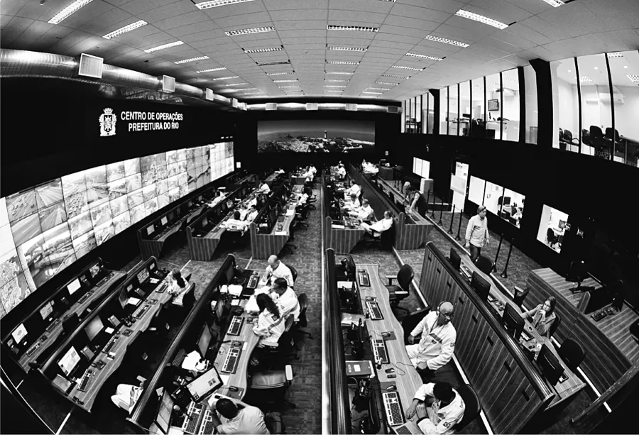
5. Rio Operations Center / Centro de Operações Prefeitura do Rio.
A talisman is imbued with protective powers. By repelling harmful forces, it ideally leads its owner to a safe, healthy, happy, prosperous future. Talismans are used to manage risk, yet, as with any faith-based operation, there is risk inherent in their use: risk that the spell won’t work, that the talisman hasn’t been properly “cleansed” or “charged,” that the hoped-for future won’t materialize. Today’s talismans manifest not as rings or stones but as glowing screens. The dashboard-as-talisman, when deployed in municipal buildings, on trading floors, and in operations centers around the world, is intended to aggregate data for the purposes of divining the future—and shaping policies and practices to bring a desired world into being. Yet even these high-tech, data-fed amulets bring their own risks: that the feeds will freeze, that the connection will fail, that some glitch will take down the machine, that the algorithm was miscalibrated, that the truth it purports to display is merely a fiction.
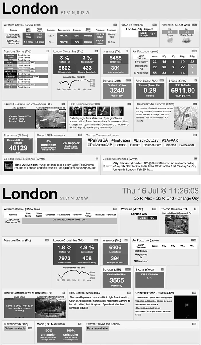
6a and 6b. London Dashboard, 2014 and 2020. Bartlett Centre for Advanced Spatial Analysis.
The first two decades of the twenty-first century have been the age of “dashboard governance,” heralded by gurus like Stephen Few, founder of the “visual business intelligence” and “sensemaking” consultancy Perceptual Edge, who defines the dashboard as a “visual display of the most important information needed to achieve one or more objectives; consolidated and arranged on a single screen so the information can be monitored at a glance.” A well-designed dashboard, he says—one that makes proper use of bullet graphs, sparklines, and other visualization techniques informed by the “brain science” of aesthetics and cognition—can afford its users not only a perceptual edge but a performance edge too. The ideal display offers a big-picture view of what is happening in real time, along with information on historical trends, so that users can divine the how and why and redirect future action.3
In 2006, when Few published the first edition of his Information Dashboard Design manual, entrepreneurs were starting to appreciate the broad applications of social media and location-based technologies. Design critic John Thackara foretold an emerging market for “global spreadsheets” (his term for data displays) that could monitor the energy use of individual buildings or the ecological footprint of entire cities and regions. Thackara identified a host of dashboard players already on the scene—companies like Juice Software, KnowNow, Rapt, Arzoon, ClosedloopSolutions, SeeBeyond, and CrossWorlds—whose names conjured up visions of an Omniscient Singularity fueled by data, hubris, and Adderall.4
By now we know to interpret the branding conceits of tech startups with amused skepticism (if not outright cynicism), but those names reflect a recognition that dashboard designers are in the business of translating perception into performance, epistemology into ontology.5 There’s an alchemical ambition to their operation: they seek to divine and conjure up a new reality. Dashboard makers intend not merely to display information about a system but to generate insights that human analysts can use to change that system—to render it more efficient or secure or profitable or resilient to climate change, depending upon whatever qualities are valued. And while today’s government and tech leaders might align themselves more with data-derived empiricism than with superstitious belief, their dashboards, like other talismans before them, rely on their users’ faith in panoramic tools of perception and predictive modes of analysis (data aggregation becomes “a kind of religion,” one administrator says).6 The prevalence and accessibility of data have dramatically changed the way we see and govern our cities, in ways that we can see more clearly when we examine the history, aesthetics, and politics of the urban dashboard.
From Trading Floor to City Hall
Data displays often mimic the dashboard instrumentation of cars or airplanes. Where in a car we’d find indexes for speed, oil, and fuel levels, here we’ll find widgets representing our business’s “key performance indicators”: cash flow, stocks, inventory, and so forth. Bloomberg terminals, which debuted in 1982, allowed finance professionals to customize their multiscreen displays with windows offering real-time and historical data regarding equities, fixed-income securities, and derivatives, along with financial news feeds and current events (because social uprisings and natural disasters have economic consequences too), and messaging windows, where traders could provide context for the data scrolling across their screens (fig. 7). Over the last few decades, the terminals have increased in complexity. They involve custom input and security devices: a specialized keyboard with color-coded keys for various kinds of shares, securities, markets, and indexes, and the B-UNIT portable scanner that can biometrically authenticate users on any computer or mobile device. The Bloomberg dashboard is no longer locked into the iconic two-screen display; traders can now access the dashboard “environment” on a variety of devices.
The widespread adoption of the Bloomberg terminal notwithstanding, it took a while for dashboards to catch on in the corporate world. Stephen Few reports that during much of the 1980s and ’90s, large companies focused on amassing data, without carefully considering which indicators were meaningful or how they should be analyzed. He argues that the 2001 Enron scandal incited a cultural shift. Recognizing the role of data in corporate accountability and ethics, the chief information officers of major companies finally embraced the dashboard’s panoptic view. I’d add another reason: before dashboards could diffuse into the zeitgeist, we needed a recognized field of data science and a cultural receptivity to data-driven methodologies and modes of assessment.7
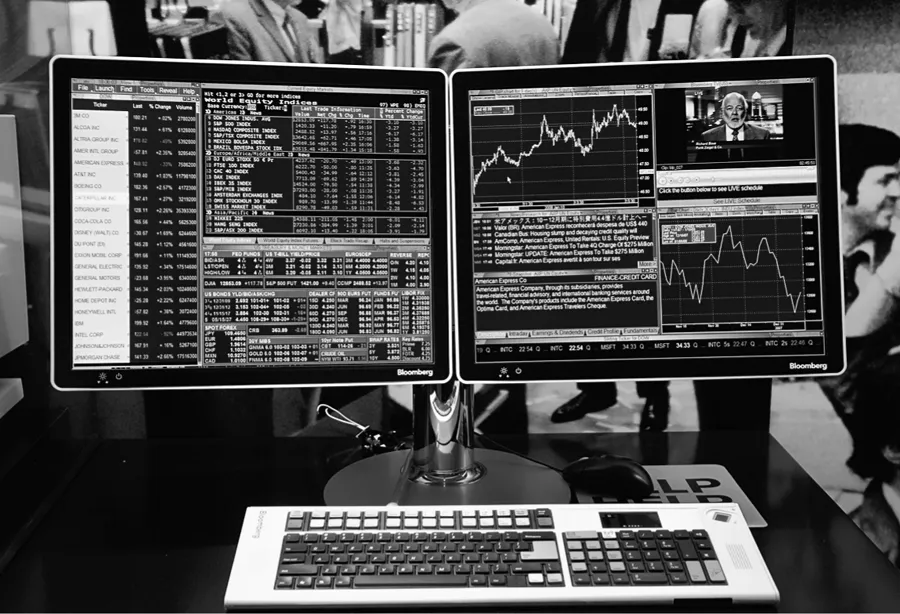
7. Bloomberg terminals on display in the Museum of American Finance’s Financial Markets exhibit, July 17, 2008.
As we approached the new millennium, the dashboard market spread from the corporate world to the civic realm, primarily via police departments and in response to broader calls for managerial “accountability.” In 1994, New York City police commissioner William Bratton adapted former officer Jack Maple’s analog crime maps to create the CompStat model of aggregating and mapping crime statistics. Around the same time, the administrators of Charlotte, North Carolina, borrowed a business idea—Robert Kaplan’s and David Norton’s “total quality management” strategy known as the “Balanced Scorecard”—and began tracking performance in five “focus areas” defined by the city council: housing and neighborhood development, community safety, transportation, economic development, and the environment. Atlanta followed Charlotte’s example in creating its own city dashboard.8
In 1999, Baltimore mayor Martin O’Malley, confronting a crippling crime rate and high taxes, designed CitiStat, “an internal process of using metrics to create accountability within his government.” (This rhetoric of data-tested internal “accountability” has been prevalent throughout the history of civic dashboard development.9) A couple of years later the city renovated its CitiStat Room, where department heads stand at a podium before a wall of screens and account for their units’ performance. The project turned to face the public in 2003, when Baltimore launched a website of city operational statistics, which inspired DCStat (2005), Maryland’s StateStat (2007), and NYCStat (2008). As London installed its mayoral dashboard in 2012, the UK’s then prime minister David Cameron commissioned his own iPad app—the “No. 10 Dashboard” (a reference to his residence at 10 Downing Street)—which gave him access to financial, housing, employment, and public opinion data. The following year, when iPads were banned from cabinet meetings for security reasons, Cameron pivoted to his Blackberry, claiming that he “could run government remotely from his smartphone.”10
Around the same time, Michigan governor Rick Snyder launched the “Open Michigan” initiative to demonstrate his “ongoing commitment to government transparency and accountability.” While his Michigan dashboard is now defunct, its rudimentary graphic design and rhetorical strategy distill a commonly reductive mode of thinking. The platform presented data on education, health and wellness, infrastructure, “talent” (employment, innovation), public safety, energy and environment, financial health, and seniors. One could monitor the state’s performance through a side-by-side comparison of “prior” and “current” data, punctuated with a thumbs-up or thumbs-down icon indicating the state’s “progress” on each metric. Another click revealed a graph of annual trends and a citation for the data source, but little detail about how the data were derived—or how the public was supposed to use this information.11
In 2016 New York City built a similar tool. The Mayor’s Office partnered with Vizzuality, Xenity, and Hyperakt—“change agents,” consultants, and designers who, it seems, borrowed their zippy appellations from the previous dot-com era—and the mapping platform CARTO to build a dashboard that aggregated real-time data from across the city (figs. 8a and 8b). The team established indicators for various agencies: perhaps number of arrests would operationalize success for the NYPD, or average length of stay in a shelter would mark success for the Department of Homeless Services. City workers could then choose to access those data via a grid of statistics or an interactive map. As with the Michigan dashboard, users could compare figures across time, measuring developments from day to day or year to year, and establish thresholds of progress, which, when met, were flagged with a digital notification and indicated by color: green showed that things were moving in the right direction, and red noted that an area needed extra attention. While Mayor Bill de Blasio himself had a “reputation for being inattentive to the minutiae of governing” (and, frankly, to the broad view too), his staff used the dashboard to track the administration’s progress in achieving his campaign promises—promises undoubtedly translated into, and in many cases reduced to, outcomes whose measurements would trend in favorable directions.12
Over the past decade, myriad other states and metro areas—driven by a “new managerialist” approach to urban governance, committed to “benchmarking” their performance against other regions, and obligated to demonstrate compliance with sustainability agendas—have developed their own dashboards (figs. 9, 10, and 11). Aakash Solanki describes how Indian cities have implemented dashboards to track employees’ attendance using their unique, government-issued Aadhar identity numbers. Nashin Mahtani explains how Indonesian cities have, like Rio, deployed dashboards to track flood-relat...
Table of contents
- Cover Page
- Title Page
- Copyright Page
- Contents
- Acknowledgments
- Introduction Cities, Trees & Algorithms
- 1. City Console
- 2. A City Is Not a Computer
- 3. Public Knowledge
- 4. Maintenance Codes
- Conclusion Platforms, Grafts & Arboreal Intelligence
- Notes
- Index
- Photo Credits
Frequently asked questions
Yes, you can cancel anytime from the Subscription tab in your account settings on the Perlego website. Your subscription will stay active until the end of your current billing period. Learn how to cancel your subscription
No, books cannot be downloaded as external files, such as PDFs, for use outside of Perlego. However, you can download books within the Perlego app for offline reading on mobile or tablet. Learn how to download books offline
Perlego offers two plans: Essential and Complete
- Essential is ideal for learners and professionals who enjoy exploring a wide range of subjects. Access the Essential Library with 800,000+ trusted titles and best-sellers across business, personal growth, and the humanities. Includes unlimited reading time and Standard Read Aloud voice.
- Complete: Perfect for advanced learners and researchers needing full, unrestricted access. Unlock 1.5M+ books across hundreds of subjects, including academic and specialized titles. The Complete Plan also includes advanced features like Premium Read Aloud and Research Assistant.
We are an online textbook subscription service, where you can get access to an entire online library for less than the price of a single book per month. With over 1.5 million books across 990+ topics, we’ve got you covered! Learn about our mission
Look out for the read-aloud symbol on your next book to see if you can listen to it. The read-aloud tool reads text aloud for you, highlighting the text as it is being read. You can pause it, speed it up and slow it down. Learn more about Read Aloud
Yes! You can use the Perlego app on both iOS and Android devices to read anytime, anywhere — even offline. Perfect for commutes or when you’re on the go.
Please note we cannot support devices running on iOS 13 and Android 7 or earlier. Learn more about using the app
Please note we cannot support devices running on iOS 13 and Android 7 or earlier. Learn more about using the app
Yes, you can access A City Is Not a Computer by Shannon Mattern in PDF and/or ePUB format, as well as other popular books in Architecture & Urban Planning & Landscaping. We have over 1.5 million books available in our catalogue for you to explore.