![]()
It’s widely accepted that beautiful things work better,* but why is this true? In the pages that follow, you’ll learn there is a direct relationship between slide designs that are pretty and ones that are functional. You’ll start to develop an awareness of and basic vocabulary for the qualities that make it so. In this first lesson, we’ll analyze exactly what you’re responding to when you see a beautiful graphic design so that you can evaluate your own slide designs and decide how to improve them. As your awareness of what makes a design effective and functional grows, so too will your ability to create more effective, functional slides.
The Functional Role of Pretty Things
For nearly a decade I provided instructional design support to busy physicians who practiced and taught at a university hospital. I worked on slide decks of fifty, sixty, eighty slides that were crammed to the margins with textbook facts delineated by bullets.
Teaching physicians often asked me to take slides like these and “make them pretty” the week before (or the day before) a lecture or conference presentation. So I did what I could with them: I made sure the font was the same throughout the deck, that the bullet points followed a logical hierarchy, that acronyms were spelled out, and that typos were corrected. I removed decoration. I aligned and balanced the composition of the slides to make space around important information. I loved this work. It was completely satisfying, and I felt useful. But the word pretty in that context really started to get my goat after a while.
Why? Because I realized that what I was really doing for these decks was to make them more effective as teaching materials.
This “prettying up” actually served to make the meaning clearer and more apprehensible so students and audiences in conference ballrooms, clinic workrooms, and lecture halls could focus on the message of the talk. They wouldn’t have to strain to read or make sense of what was often a convoluted or completely unorganized slide.
The word pretty unintentionally trivializes the important work that is design. People often tend to think of prettyness as a cosmetic quality: surface level and a nice addition, but certainly not essential. Now is the time to give proper credit to the impact pretty has on the visual display of information. Consider these points about the difference prettyness makes.
- Pretty plays an essential role in information clarity. Students can’t acquire knowledge if the information isn’t clear in the first place.
- Pretty plays a functional role in gaining students’ attention. Students won’t learn when they’re not motivated to try and make sense of an overwhelming slide, or if they can’t find a point of entry into a slide that is a wall of words.
- Pretty plays a functional role in maintenance of attention over time. In the absence of within-slides consistency and across-slides cohesion, students may eventually give up trying to figure out what you and your slides are trying to say.
- Pretty also plays a supportive role in understanding and remembering. Simply, if students didn’t notice or didn’t pay attention to the message in the first place, how can they remember it later, let alone apply it in new situations?
- Not to mention, pretty contributes to the creation of unified, cohesive-looking slide decks, which can affect your professional credibility.
To be fair and precise, I wasn’t “designing” back in the day, at least not in the structural sense. But the cosmetic and structural also have an intricate relationship: design is serious work that requires training, apprenticeship, practice, and commitment. Designers spend years learning not only how to create effective designs but also how to discuss and defend those decisions. The decisions that designers make are always toward the functional and intentional rather than the random, haphazard, or purely decorative.
I hope that you’ll cease to dismiss the value of visually attractive slides as simply pretty and start thinking in terms of functionality. Prettyness is intricately connected with your slides’ function as effective visual aids. Functional slides clearly communicate the intended message.
Attributes of Prettyness
What are the surface-level qualities that people are responding to when they say your slides are pretty? Let’s explore this question in terms of three “ugly” slides and their “pretty” makeovers. Then we’ll identify some key characteristics that contribute to prettyness. Remember, pretty equals functional, so the real question is: What qualities make a design more functional?
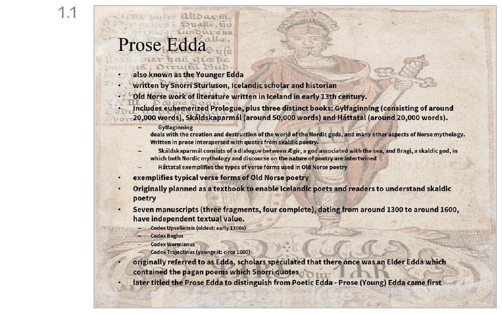
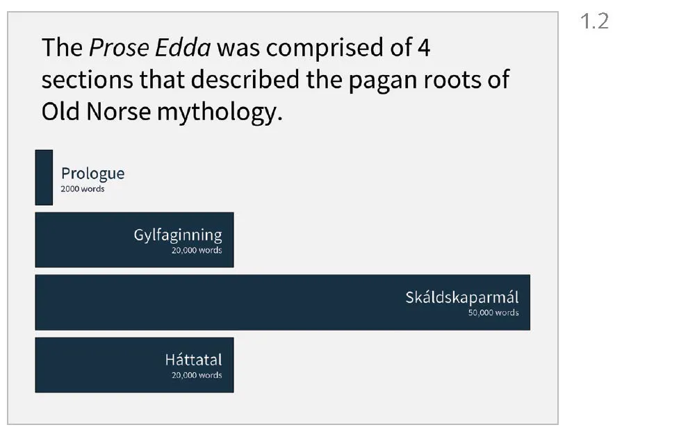
Consider the slide depicted in Figure 1.1. You’ve seen this type of slide before, a design I’ll refer to throughout the book as the topic-subtopic structure (terminology that is borrowed from the work of Joanna Garner, Michael Alley and colleagues). You might even have spent a moment wondering what is wrong with it. What words would you use to describe it? Perhaps busy, complex, crowded, and cluttered come to mind. Compare it with its makeover (Figure 1.2). Words you might use to describe this slide are clear, focused, simple, and spacious. The makeover also happens to look so drastically different that you might not even believe it deals in the same subject matter as the original.
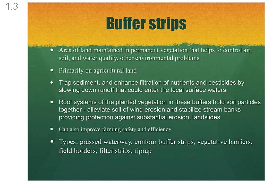
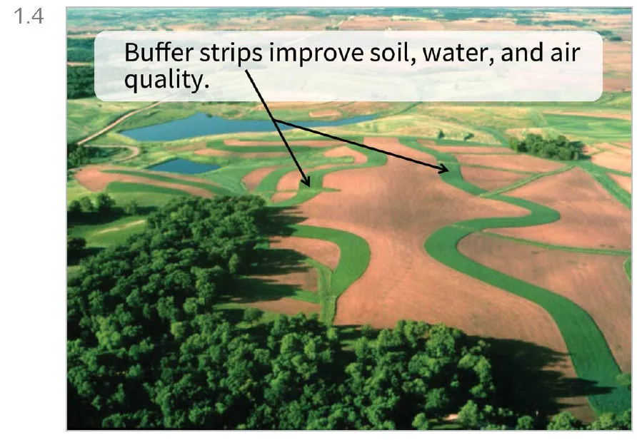
In a second set of slides, you could describe the ugly original (Figure 1.3) as mismatched, wordy, and unbalanced. It’s impossible to tell at a glance what the slide is about, and you don’t necessarily want to spend a lot of time figuring it out because the color scheme and styling of the background make it appear dated. The makeover (Figure 1.4) is more visually appealing because it stands to prove just one point as simply as possible.
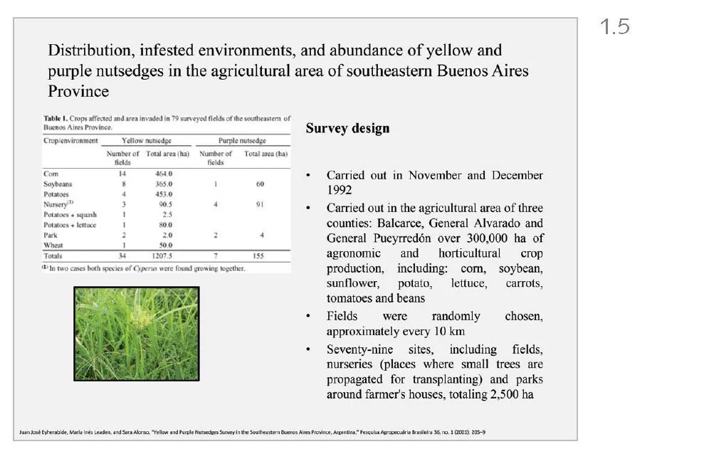
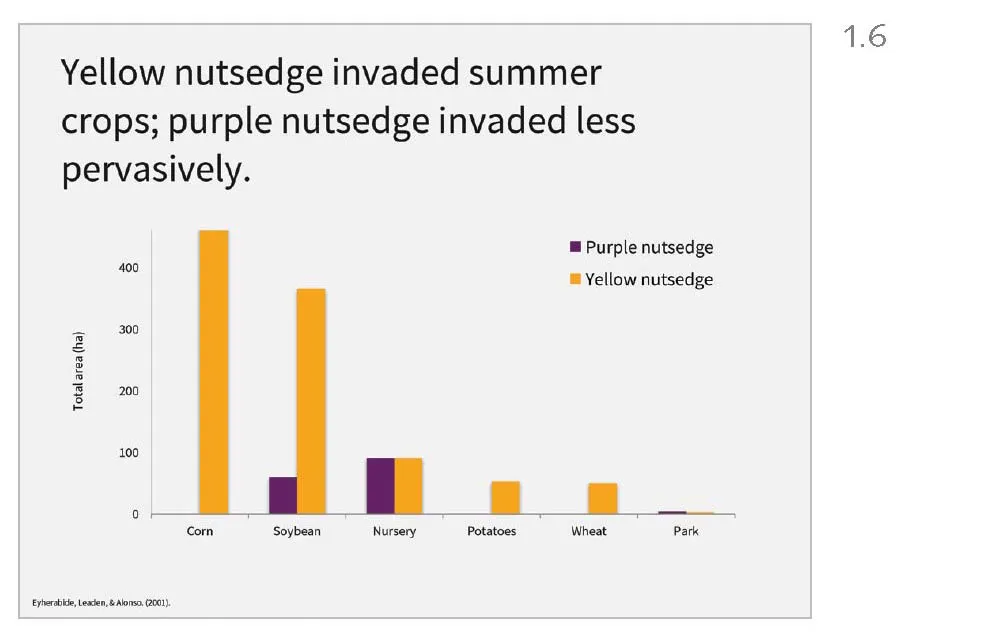
The ugly slide in Figure 1.5 is cluttered and disjointed. The data table is too small to read, and it’s so low resolution that it appears a bit fuzzy. The column of survey design information is hard to read because the differing amounts of space between words are distracting. The photograph at the bottom left looks like it was added as an afterthought. Last, the slide seems to be presenting at least three different topics. By contrast, the makeover (Figure 1.6) is, once again, focused and clear. It presents one main idea and gives that idea plenty of breathing room.
In all three of these comparisons, notice how the lists of descriptors we’ve gathered contain a mix of attributes of information (complex, focused, simple) alongside attributes normally used for visual presentation (crowded, cluttered, spacious). The presentation—that is, the visual experience of a design—is closely tied to your perception of the quality of the information contained in it.
What makes the original versions so uninviting to look at, while their makeovers are so much more appealing? Consider the words that surfaced as each set was discussed. Pleasing designs communicate a single message, so they are focused rather than overwhelming or digressive. They are precise rather than ambiguous, confounding, or confusing. Their messages are easily apprehensible because they’re spacious rather than crowded, cramped, or cluttered; their designs balance space with the other elements on the slide. They are orderly rather than erratic or haphazard. Each of these attributes (focused, precise, spacious, and orderly) leads to a condition of information clarity.
Those characteristics that you thought were subjective, surface-level impressions (the features and aspects you were responding to when you tried to determine what was pretty and ugly) are actually intimately tied to whether the slide effectively communicates the intended message. Prettyness clearly isn’t just about surface characteristics.
Intentionality Begets Better Designs
Clear communication is always the result of intentional—rather than arbitrary—design decisions. Always start with this goal: not just, What is this slide trying to say? but rather, What am I trying to say that I need a visual aid to help me show or to help back me up?
Slides also are rarely seen in nature just by themselves; they travel in packs. Consider the cohesion of the slides together as part of the deck. You achieve cohesion across a deck by adhering to a consistent set of design decisions from slide to slide. A cohesive deck is important because the slides are visual aids to the lecture, and the lecture overall needs to be cohesive. Throughout your own lecture planning process, you can repeat these three words to yourself:
clear consistent cohesive
They create an alliterative little mantra that can help remind you of the keys to successful visual communication. And you can leverage these qualities to create more effective designs.
EXERCISES
- Look around. This week, look around you and begin to notice the graphic designs that catch your eye: professionally designed posters, billboards, and newspaper and magazine ads. What elements of the design caught your attention? How would you describe your reactions to any of these designs? What words would you ascribe: beautiful, bland, spare, complex, balanced? Try and articulate as specifically as possible what aspects of the design please or displease you. Capture your first impressions; you’re just starting out here, and you’re just starting to hone your awareness of the designs all around you. You can learn a lot about design just by taking notice of what makes a professional designer’s work effective. Just as instructive, notice ways an inexperienced designer’s work is less effective.
- Start a visual journal. A natural extension of the exercise above is to begin to keep a visual journal, as design students and professional designers do. In a visual journal you collect examples of designs and your reflections on them. In developing this perhaps lifelong habit, the more you look, the more you see, and the stronger your visually literate eye will become.
*This idea is from the influential essay “Emotion and Design: Attractive Things Work Better” by Donald A. Norman.
![]()
The biggest problem with the topic-subtopic slide structure is that if you’re doing it this way, you’re probably trying to do three things at once. You’re using a medium that was intended for the creation of visual aids to do triple duty in creating visual aids, speaker notes, and handouts. It just doesn’t work. Like most things that attempt to fulfill several disparate functions at the same time, you end up doing none of them well. It’s the same with slides. In this lesson, we’ll look closely at the history of the traditional topic-subtopic slide structure: its rise to power, its proven lack of fitness for rule, and why you should elect a different design to govern your slide canvases. Then we’ll review the basic principles of m...