A deep dive into the wildly successful 1990s animated series Batman.
It's possible that no other version of Batman has been more influential than the one that debuted as a children's cartoon in 1992. For millions of fans around the world, the voices of Batman and the Joker introduced in Batman: The Animated Series ( BTAS ) remain the default. The characters, designs, and major themes of the show went on to shape other cartoons, films, and bestselling video games. In this study, Joe Sutliff Sanders argues that BTAS is not only a milestone of television but a milestone in the public persona of one of the most recognizable characters in the world.
The series introduced a new generation to Batman and provided the foundation for a family of cartoons that expanded the superhero universe. It introduced or reinvented major characters including Mr. Freeze, Robin, the Joker, and Harley Quinn. In three chapters, Sanders pursues the intricate arguments that still energize BTAS. Chapter 1 explores the visuals of the show, the artistic histories and tensions that inform its revolutionary style, and what ideas—intentional and otherwise—its aesthetic implies. Chapter 2 turns to the task of defining a "good" wealthy person against a backdrop of "bad, " getting to the heart of one of Batman's most problematic characteristics. Lastly, chapter 3 considers Harley Quinn, a character who emblemizes much of what made BTAS successful. From her first appearance, Harley has been both sexy and witty, victor and victim, and this chapter explains the duality that defines her.
Since its debut in 1992, BTAS has garnered multiple awards, launched or developed the careers of countless important artists, and created aesthetic styles—in terms of both visuals and voice acting—that continue to resonate. Sanders's book follows an informative and exciting path through the material and is designed to be accessible to aficionados as well as relative newcomers. Batman fans, popular culture enthusiasts, and media studies scholars will find within these pages insights and ironies to provoke endless conversations.
Frequently asked questions
Yes, you can cancel anytime from the Subscription tab in your account settings on the Perlego website. Your subscription will stay active until the end of your current billing period. Learn how to cancel your subscription.
At the moment all of our mobile-responsive ePub books are available to download via the app. Most of our PDFs are also available to download and we're working on making the final remaining ones downloadable now. Learn more here.
Perlego offers two plans: Essential and Complete
Essential is ideal for learners and professionals who enjoy exploring a wide range of subjects. Access the Essential Library with 800,000+ trusted titles and best-sellers across business, personal growth, and the humanities. Includes unlimited reading time and Standard Read Aloud voice.
Complete: Perfect for advanced learners and researchers needing full, unrestricted access. Unlock 1.4M+ books across hundreds of subjects, including academic and specialized titles. The Complete Plan also includes advanced features like Premium Read Aloud and Research Assistant.
Both plans are available with monthly, semester, or annual billing cycles.
We are an online textbook subscription service, where you can get access to an entire online library for less than the price of a single book per month. With over 1 million books across 1000+ topics, we’ve got you covered! Learn more here.
Look out for the read-aloud symbol on your next book to see if you can listen to it. The read-aloud tool reads text aloud for you, highlighting the text as it is being read. You can pause it, speed it up and slow it down. Learn more here.
Yes! You can use the Perlego app on both iOS or Android devices to read anytime, anywhere — even offline. Perfect for commutes or when you’re on the go. Please note we cannot support devices running on iOS 13 and Android 7 or earlier. Learn more about using the app.
Yes, you can access Batman: the Animated Series by Joe Sutliff Sanders in PDF and/or ePUB format, as well as other popular books in Mezzi di comunicazione e arti performative & Televisione. We have over one million books available in our catalogue for you to explore.
At even just a glance, Batman: The Animated Series breaks from every animated Batman that precedes it. Through long lines and dramatic lighting, airbrush-textured skyscrapers, and dark blue on heavy gray on endless black, the design of the show commands a new visual territory. “We call it Dark Deco,” says Alan Burnett, the most experienced producer of the team (“Batman: The Legacy Continues” 2004). Dark Deco, as its name implies and the show’s creators repeatedly recognize, draws heavily on the early-twentieth-century style of Art Deco. In commentary on the first completed episode of the series, another of the producers, Eric Radomski, praises “the background designers and painters,” saying that they “brought Gotham City to life with all the Art Deco influences” (“On Leather Wings: Commentary” 2004). In commentary on a later episode, the final of the original producers, Bruce Timm, points specifically to the Art Deco influence on the robots threatening our heroes (“Heart of Steel: Commentary” 2004). Paul Dini, the writer who would become most closely identified with the show and who had assumed the role of producer by the series finale, explains that “In my mind, it was like what if the 1939 World’s Fair had gone on another sixty years or so, and the cool sense of design and stylishness from the Art Deco years was in operation well up until the 90s?” (“Batman: The Legacy Continues” 2004)
There is a mistake buried in these universal allusions to Art Deco, one that I will explore in the final part of the chapter, but for now, let’s take the producers at their word. What fundamentals of Art Deco found their way into the original and highly influential visual style of BTAS? How did the creators fashion the dark part of Dark Deco, and what did the combination of dark and deco mean? What does accepting the new term at face value reveal?
Dark Deco and the Batman that Wasn’t
The animated series’ remaking of Batman begins with the striking, highly stylized, minute-long title sequence in which the show sketches the principles of Dark Deco. In an interview with Bruce Timm years later, director and devoted fan Kevin Smith said, “I remember the first time I saw what we all know as the opening sequence to the show.” His reaction describes that of any number of fans: “You were flabbergasted” (“Bruce Timm: The Batman of Batman Artists” 2012, 33:00). The opening sequence announced a visual style unlike anything that popular animation had attempted in decades, a style that became the starting point for the visual aesthetics of a wave of superhero cartoons to follow.
Although Dark Deco was revolutionary in 1990s mainstream animation, it did have one crucial antecedent: the 1940s Superman cartoon, a masterpiece of superhero storytelling developed by the legendary Fleischer studio. Jean MacCurdy, the president of Warner Bros. Animation who showed the foresight to pair Timm and Radomski at the earliest stages of development, even suggested from the beginning of their collaboration that the pair look to the Fleischer Superman shorts for inspiration (Trumbull 2017, 2). The show’s debt to the Fleischers, however, has been widely discussed,1 so rather than document it yet again, I want to look back further, to the most public face of Art Deco, a lowbrow, widely accessible piece of the movement that inspired both the 1940s Superman and the 1990s Batman: advertising.
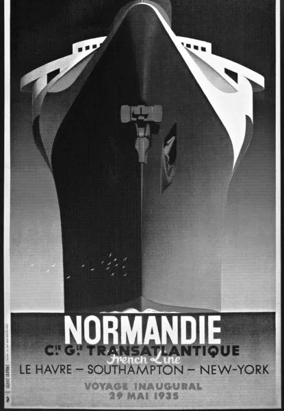
Fig. 1. A. M. Cassandre’s Normandie: Voyage Inaugural (1935), the prototype of Art Deco simplicity and suggestion.
Many of the most familiar, indeed most iconic Art Deco posters demonstrate the key principles of advertising during the period, and there may be no poster more iconic than A. M. Cassandre’s advertisement for the SS Normandie. This painting of a massive passenger ship, an icon of French technology when it was launched in 1935, became one of the most recognizable pieces of commercial art of the period and embodies a crucial principle of the style. William W. Crouse writes that Cassandre’s success as he “perfectly captures the vessel’s magnificence, comfort, and speed” is the result of the image’s “deceptively simple design” (2013, 225), and even a cursory reading of the painting agrees. The striking perspective of the piece, from almost exactly sea level, uses an unbroken line for the water and an idealized profile to emphasize the vessel’s grand height and sensuous swell up out of the water. Although the ship could carry almost two thousand passengers in lavishly appointed cabins, the poster lingers over the smooth sweep of the prow rather than the details of the spaces through which people moved. The elegance of the design rests on its simplicity, how it erases detail, preferring to suggest the sea, sky, and magnificent ship with long, flowing lines.
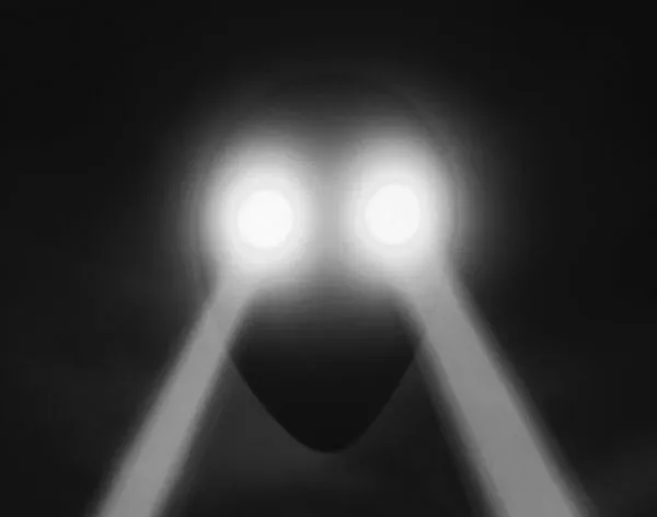
Cassandre’s poster offers an approach to portraying an intimidating image—indeed, an intimidating vessel—that would be prominent from the opening images of BTAS. The title sequence begins with the Warner Bros. shield, but as the music swells, the background slips to a deep black, and the shield itself fades to a near-oval that a first-time viewer might be forgiven for mistaking to be a disembodied head peering from an ochre-brown mist. In fact, the object is a police blimp, and the eyes are spotlights searching the ground below. The screen shows us the blimp from beneath, just as Cassandre positioned perspective from the waterline, making the vessel more ominous. As with the Normandie, the artists simplify the machinery and design of the ship, leaving the suggestion of a blimp’s image rather than the details of a specific aircraft. The subtle curves of the ship are broken only by the long lines of the beams of light cast by the spotlights. These first few seconds prompt a sense of dislocation, as we transition from the banality of the corporate logo to an eerily confrontational gaze and on to the blimp, suggesting a shift back in time from the 1990s and a shift in style from the flat representationalism of television superheroics to the highly stylized vision of Dark Deco.
Fig. 2. The Warner Bros. shield turns into an ominous, highly stylized police blimp in the opening sequence.
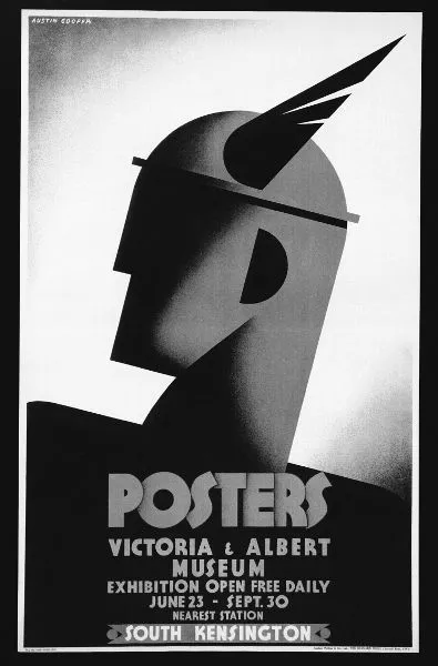
Consider, too, this poster more obviously relevant to superheroes: Austin Cooper’s advertisement for an exhibition at the Victoria and Albert Museum.
Fig. 3. Austin Cooper’s advertisement for the Victoria & Albert Museum (1931), a cheat sheet for superhero design in the Art Deco mode.
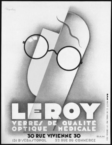
In Cooper’s painting, the god Mercury, shown, as Crouse puts it, “in minimalist profile” (2013, 112), obeys the rule of simplicity and abstraction, and to do so it invokes a Deco celebration of pure form. Theodore Menten has even gone so far as to say that “The chief force underlying all Art Deco is its emphasis upon geometric patterns” (1972, np). In this painting, consider that emphasis in the perfect right angles of Mercury’s chin and nose as well as the uncomplicated dome of his gray helmet, sharp and confident against the off-white background. His ear, too—a prominent black half circle—is an uncomplicated form at the near-center of the poster. Paired with that ear through a color saturation that defies the robust shading of the rest of the image is Mercury’s iconic wing tip, sprouting from the helmet in a flattened cone punctuated only by two sharp triangles. A year earlier, Lajos Marton published an advertisement for eyeglasses based on similar techniques.
Apart from a single squiggle near the top to suggest hair or an eyebrow, Marton composes the face almost entirely of fused geometric shapes. Long rectangles join seamlessly to elegant curves that compose the two halves of the face, and dark black frames dominate the image. These frames, two perfect circles, are made all the more arresting by their discoloration of the fields behind them, resulting in another whole circle over one eye and two perfect half-circles over the other. The geometricism and simplicity work together to communicate quickly to the potential customer.
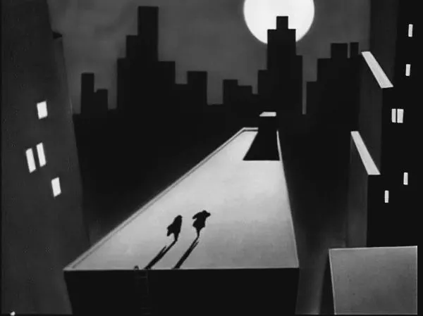
These advertising techniques from Art Deco also work well to communicate quickly to the audience of BTAS’s title sequence. When the camera lowers from the geometric, simplified police blimp to a bank in the darkened city, a pair of goons appears, thieves described not by detail but by a cobbling together of geometric shapes: a triangular nose and the square jaw of a pronounced underbite on the villain in the back, the sharp diagonals of a fedora and the broad shoulders beneath it on the villain in the foreground. As the thieves flee across a rooftop, the cityscape around them looks more like something out of a Cubist painting than a popular afternoon television program; as the roof stretches before them in a distended rectangle, skyscrapers crowd around in unblemished planes and harsh angles, and the rooftop access point reclines before them, a black cube suggested only by the illuminated square of its rooftop and the trapezoid of the shadow it casts.
Fig. 4. Lajos Martin’s Leroy: Verres de Qualité (1930), a study in the geometric simplicity of Art Deco.
Fig. 5. The rooftops of Gotham in the series’ opening sequence.
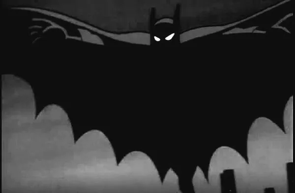
That black cube, an emptiness that somehow communicates a presence, represents the Dark Deco aesthetic not only through its geometric simplicity but also through its use of silhouette, a technique prevalent throughout the confrontation on the rooftop. As we follow our villains, a reversed camera angle reveals their surprise when they suddenly stop. The next shot will reveal the arrival of Batman, but the current image focuses only on the shock that the villains feel. Their eyes open wide in fear, and their shoulders, once angular with confidence, now bunch up in curves around their necks. Silhouette conjures the simple shapes of both aspects, with the eyes wide and white against the square black of their heads, shoulders pale gray stripes set within the black fields of their bodies. Their arms and hands, too, visible through matching gray backlighting, suggest surprise. The perspective cuts to Batman’s arrival and a brief, detailed close-up of his face, but when he springs to attack them, the detail drops away, and Batman transforms briefly into a figure defined by silhouette, the scalloped cape broadening behind him to give the black impression of a bat swooping down on its prey.
Fig. 6. The silhouette of Batman’s scalloped cape in the opening sequence.
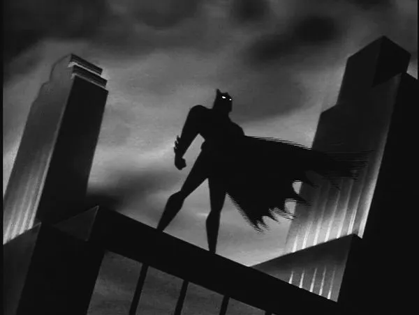
As the sequence comes to a close, the camera plays over images of skyscrapers, which by now feel inevitable. Skyscrapers have loomed over Gotham throughout, under the beams of the police blimps, housing the bank that the shady hoods attempt to rob, and under the feet of the battling villains and hero. Once the police arrive to apprehend the goons whom Batman has captured, the camera pans up along a series of skyscrapers to reveal the silhouette of Batman perched atop one, with two more flanking him.
Fig. 7. Art Deco skyscrapers in the closing moments of the opening sequence.
From the original promotional reel,2 with backgrounds designed by Eric Radomski, to the premiere of the series itself, with backgrounds designed by Ted Blackman, these geometric, dramatically lit skyscrapers fill Gotham with buildings distinctly suited to Art Deco sensibilities. Tim Benton calls the early twentieth-century skyscraper in the United States of this time “the most complete expression of Art Deco architecture” (2003, 248), and BTAS uses both the constant presence of skyscrapers and the style in which they are portrayed to invoke that artistic mode. In an early interview, Timm explains that an artist working on BTAS should “just design as much as you really need to make it convincing without drawing in every single window in a building. Work more on composition rather than detail” (qtd. in Miller 1992, 28). The skyscrapers work, therefore, as both an Art Deco setting and an excuse to perform an Art Deco sensibility.
These Deco techniques came naturally to the style of BTAS because of an early innovation by Eric Radomski. In painting the backgrounds across which the characters moved, Radomski established the practice of beginning not with clear or white material but with black.3 According to a profile published in 1993, BTAS was “the first animated series ever to employ the technique of painting on a black surface.” By beginning with black and adding “light and color as needed,” Radomski infused the setting with the dark aesthetic that the producers preferred, but the decision also had a practical dimension, one specifically relevant to the towering skyscrapers. “We show a lot of buildings, mainly at night,” Radomski said; “as much as half of every drawing would be black anyway” (“Batman, the Animated Series” 1993, 14). In this way, the series’ penchant for dark tones as well as its innovative approach in building up the backgrounds from black dovetailed with its Art Deco inspirations: they were both dark and Deco.
Even the way that the artists laid paint on the page tied the series’ aesthetic to Art Deco. In the opening sequence, the telltale signs of airbrush peek around every corner. When the villains stop in surprise at the appearance of Batman, haze smudges the outline of the skyscrapers, haze created by changing the density of paint spattered on the black background. When Batman stands surrounded by stepped-pyramid skyscrapers (see figure 7), a rich texture from the random scatter of paint enriches the buildings and even clouds. The touch of ai...