Using a combination of explanatory text, step-by-step photographs and classic and contemporary examples, this unique survey brings together over 80 processes involved in creating lettering and applying it to surfaces. Included are hand-drawn lettering techniques (from sign writing to tattooing); dimensional lettering (hand engraving to laser cutting); typesetting (from letterpress to lettering in food); printing (Letraset to printing on bank notes); lettering on textiles (embroidery to flag-making); and illuminated type (neon signage to holography). Lettering is an essential and exhaustive reference guide for any designer wishing either to create lettering themselves or to commission work from external sources.
- 240 pages
- English
- ePUB (mobile friendly)
- Available on iOS & Android
eBook - ePub
About this book
Trusted by 375,005 students
Access to over 1.5 million titles for a fair monthly price.
Study more efficiently using our study tools.
Information
Topic
DesignSubtopic
Art General
1.1Calligraphy
1.2Digital calligraphy
1.3Graffiti
1.4Tattooed lettering
1.5Signwriting
1.6Fairground painting
1.7Canal boat painting
1.8Road lettering and markings
1.9Painting stained glass
1.10Mosaic lettering
1.1 Calligraphy
Calligraphy literally means beautiful writing, from the Greek kalligraphia, and kallos, meaning beauty. Unlike type design, calligraphy does not rely on construction or drafting, drawing and redrawing. Each calligraphic letter is individual, described by H. Jenkins as:‘a freehand in which the freedom is so nicely reconciled with order that the understanding eye is pleased to contemplate it’.
The origins of calligraphy stretch back into ancient times. From 3200 BCE, Egyptian scribes are known to have written hieroglyphs on papyrus and calligraphy was practised in China, Japan and Korea as early as 2000 BCE.The Western or Latin alphabet used today was primarily developed during Imperial Roman times in the first few centuries CE.The formal, square capital letters used for Roman inscriptions were derived from earlier Greek characters and are referred to as majuscules. Early Roman handwritten letterforms (in contrast to inscribed letterforms) were also majuscules – all the letters shared a common cap line and baseline – but these rustic forms (condensed capitals with pronounced thick and thin strokes) were quicker to write than formal, square caps.
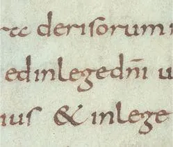
Carolingian minuscules from the Gospels of Metz (early ninth century). These early calligraphic minuscules inform our modern perception of lower-case characters.
The development of minuscules
The desire of scribes to write quickly led to the development of informal handwriting and the use of minuscules (small letters). The simplest minuscules were scribed using a bronze stylus (writing implement for scratching letters) on a small wax tablet contained in a wooden frame. Once the words had been read, the wax could be melted and the tablet used again. The pointed stylus produced a scratched, single-width line and, as a consequence, the letterforms were functional but crude. Important documents were written with a reed dip pen on papyrus, vellum or parchment (a two-sided skin stretched on a frame, dried, whitened with chalk and smoothed flat with a pumice stone). The dip pen was held at a consistent angle so that the letters were made up of the thick and thin strokes characteristically associated with calligraphy.
From the fourth century CE, Roman uncials – 2.5-cm-(1-in-) high letters – were popular. The forms had large, round counters, very short ascenders and descenders and minimal interword spacing. Referred to as insular uncials, they were initiated by monasteries at the edge of the Roman Empire – Kells in Ireland and Lindisfarne in Northumberland, England.
A combined alphabet
At the end of the ninth century, the Holy Roman emperor Charlemagne (742–814) sought to unify the disparate script styles of the various monastic orders by imposing a new form known as the Carolingian minuscule, developed by Alcuin of York (c.735–804 CE) in the monastery at Tours in France. It was written with a pen held at an angle and used round, open forms and formalized the idea of a twin alphabet, both upper- and lower-case letters were the products of a single-dip pen. Charlemagne’s hope that the Carolingian minuscule would unify the lettering style of his empire was initially realized, but over the next five centuries a range of hands or lettering styles evolved throughout Europe from the original forms. The principle of holding the dip pen at a common angle, and producing consistent thick and thin stroke widths, was retained.
In parts of northern Europe, letterforms were condensed, the nodes and transition points emphasized and descenders and ascenders were compacted to produce angular forms (see p.17) – later termed blackletter because of their colour, gothic after the period, or broken script after their appearance. In fifteenth-century southern Europe, the Carolingian minuscule was used as a basis for the development of humanist bookhand which had wide, open forms, generous ascenders and descenders and significant interline space. Both broken script and humanist bookhand featured paired alphabets in which upper- and lower-case letters were integrated on a single line, as in handwriting today.
The development of calligraphic letterforms from the rustics, Roman uncials, insular uncials, Carolingian minuscules and broken script, was based on the hands or lettering styles not of individuals but of a particular monastic order. Each scribe in a monastery learned his craft in a scriptorium (the room where manuscripts were copied) as an apprentice copying the work of a master. Several scribes would work on different pages of a psalter that was bound into a single codex (ancient manuscript text in book form). Such was the conformity of the letterforms that to the untrained eye they appear to be the work of a single hand. Calligraphy was the principal form of reproducing writing, and the craft skills of the scribe were highly prized.
The invention of movable type
After Johannes Gutenberg (1400–68) discovery of movable type (in the West) and letterpress printing in around 1454, the pre-eminence of the scribe diminished. Gutenberg’s type was often referred to as mechanical writing as the letterforms used in the Mainz indulgences of 1454–55 were modelled on the informal calligraphic broken script Bastarda, while his more famous 42-line Bible of 1455 used the more formal broken script Textura. With letterpress printing, a literate middle class emerged in fifteenth- and sixteenth-century Europe whose interest in literature, poetry, scientific investigation, mathematics, exploration, trade and banking was enabled by their ability to write and to read in both Latin and their own language. The purpose of writing had expanded beyond the domain of the specialist calligraphic scribe, who copied precious ecclesiastical books. Handwriting had become detached from the calligraphy of the Church and began to carry a plethora of secular messages.
In early sixteenth century Italy the forms of the Carolingian minuscule were adapted into Chancery script by the calligrapher Ludovico Arrighi (1475–1527). Austere in form and inclined for speed, this script was ideally suited to legal documentation. It also had a range of alternative decorative majuscules that were used to open paragraphs. Arrighi published his new calligraphic letterforms in La Operina (1522). Chancery script was widely adopted by Renaissance diplomats, scholars and artists.
Engraved lettering
In the mid-eighteenth century, the use of lettering engraved into a copper plate with a burin – a hand-held steel tool – led to the development of a new calligraphic hand: copperplate (see p.19). Engravers devised lettering with flowing forms ideally suited to chasing the burin away from the hand. As a result many of the characters in a single word were linked through connectives. Calligraphers of the time, impre...
Table of contents
- Cover
- Title Page
- Contents
- Introduction
- 1. Hand-drawn and painted lettering
- 2. Type casting, composition and design
- 3. Printing
- 4. Cut, engraved and etched three-dimensional lettering
- 5. Moulded and cast three-dimensional lettering
- 6. Lettering in textiles
- 7. Illumination, animation and motion graphics
- Further reading
- Glossary
- Index
- Acknowledgements
Frequently asked questions
Yes, you can cancel anytime from the Subscription tab in your account settings on the Perlego website. Your subscription will stay active until the end of your current billing period. Learn how to cancel your subscription
No, books cannot be downloaded as external files, such as PDFs, for use outside of Perlego. However, you can download books within the Perlego app for offline reading on mobile or tablet. Learn how to download books offline
Perlego offers two plans: Essential and Complete
- Essential is ideal for learners and professionals who enjoy exploring a wide range of subjects. Access the Essential Library with 800,000+ trusted titles and best-sellers across business, personal growth, and the humanities. Includes unlimited reading time and Standard Read Aloud voice.
- Complete: Perfect for advanced learners and researchers needing full, unrestricted access. Unlock 1.5M+ books across hundreds of subjects, including academic and specialized titles. The Complete Plan also includes advanced features like Premium Read Aloud and Research Assistant.
We are an online textbook subscription service, where you can get access to an entire online library for less than the price of a single book per month. With over 1.5 million books across 990+ topics, we’ve got you covered! Learn about our mission
Look out for the read-aloud symbol on your next book to see if you can listen to it. The read-aloud tool reads text aloud for you, highlighting the text as it is being read. You can pause it, speed it up and slow it down. Learn more about Read Aloud
Yes! You can use the Perlego app on both iOS and Android devices to read anytime, anywhere — even offline. Perfect for commutes or when you’re on the go.
Please note we cannot support devices running on iOS 13 and Android 7 or earlier. Learn more about using the app
Please note we cannot support devices running on iOS 13 and Android 7 or earlier. Learn more about using the app
Yes, you can access Lettering by Andrew Haslam in PDF and/or ePUB format, as well as other popular books in Design & Art General. We have over 1.5 million books available in our catalogue for you to explore.