Taking a practical approach to color, Color: A workshop for artists and designers is an invaluable resource for art students and professionals alike. With its sequence of specially designed assignments and in-depth discussions, it effectively bridges the gap between color theory and practice to inspire confidence and understanding in anyone who works with color.This second edition has been carefully reviewed and revised throughout. Presented in a new larger format, it includes much-enhanced sections on key color principles such as color perception, visual structure, materials and techniques, psychological experience of color, and color composition in digital formats.Generously illustrated—including all-new, contemporary examples—this book provides a unique set of tools that makes the complex theory of color accessible and practical.
- 168 pages
- English
- ePUB (mobile friendly)
- Available on iOS & Android
eBook - ePub
About this book
Trusted by 375,005 students
Access to over 1.5 million titles for a fair monthly price.
Study more efficiently using our study tools.
Information
Topic
ArtSubtopic
Art General1 . SEEING COLOR

“Color is my day-long obsession, joy, and torment.”
Claude Monet
Color is said to be contained within light, but the perception of color takes place in the mind. As waves of light are received in the lens of the eye, they are interpreted by the brain as color.
Colors that seem similar (such as orange and yellow-orange) do so because their wavelengths are nearly the same. Wavelength in a ray of light can be measured on a nanometer:

A ray of sunlight can be conceived of as being divided, like a rainbow, into a continuum of color zones. Each color zone contains more gradients than the mind can distinguish. The boundaries between colors are blurred, not sharply delineated. In the example below (fig. 1.1), the color yellow extends from the edge of yellow-orange on one side, across to where yellow merges into yellow-green on the other.

1.1 The full gamut of the the hue yellow extends from golden yellow (leaning toward orange) to lemon yellow (leaning toward green).
The perception of colored surfaces is caused by the reflection of light from those surfaces to the eye. A lemon appears “lemon yellow” to us because its molecules reflect light waves that pulsate at approximately 568 nm while predominantly absorbing waves of other frequencies. Lightwaves that are not reflected are not perceived as color (fig. 1.2).
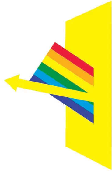
1.2 On a yellow surface, the yellow wavelengths are reflected while other colors are absorbed and are therefore not perceived.
Color sensation can also be caused by gazing, directly or indirectly, at colored light. When different colored lights are combined (as on a theater set), the combination adds luminosity or brightness. Hence, light intermixing is considered an ADDITIVE COLOR1 process.
In contrast to mixing colored light, the intermixture of spectral colors in pigment tends to produce colors that are duller and darker than those being combined. (Spectral colors are those that approach the purity of colors cast by a glass prism or seen in a rainbow.) The more unalike the pigments being mixed, the darker the result. Darkness means less LUMINOSITY, thus mixing pigments is a SUBTRACTIVE COLOR process.
Intermixing pigments darkens color because the reflection and absorption of color in pigment are never absolutely pure. Although lemon yellow, for example, does reflect the yellow part of the SPECTRUM, its absorption of other colors is not total, as suggested in figure 1.10 on page 17. We see yellow predominantly, but subtle color reflections of all the other colors are also present. In the case of lemon yellow, a greenish cast is visible. (The diagram at right, figure 1.3, gives a truer picture of light reflected from a lemon-yellow surface.)
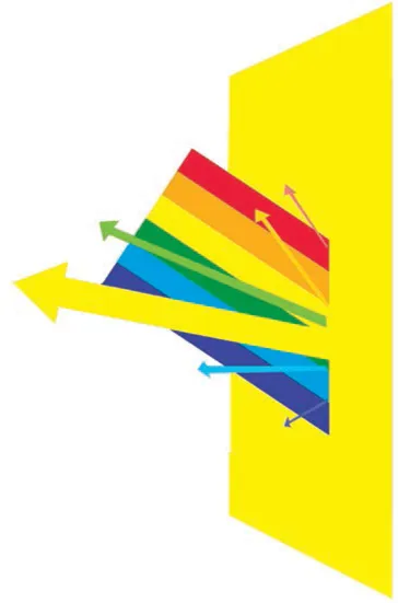
1.3 Color absorption in pigments is not total. Lemon yellow, for example, reflects visible amounts of green and smaller, less perceptible amounts of other colors.
COLOR OVERTONES AND THE PRIMARY TRIAD
Throughout the history of color theory, there has been a tendency to arrange the HUE CONTINUUM in a circle. The extremities of the continuum, infrared and ultraviolet, resemble each other and seem to complete the sequence of HUES that proceeds gradually across the color zones of the spectrum. There is also, admittedly, a satisfying wholeness and symmetry to the circular configuration that suggests a sense of timeless rectitude. It also happens to distribute the hues in a way that facilitates an understanding of their relationships (fig. 1.4).When hues are arranged in a circle, one triad is considered more elemental than any other: the PRIMARY TRIAD of red, yellow, and blue.
While an infinite number of such triangles reside within the spectrum, the primary triad is unique because red, yellow, and blue are each, in theory, indivisible. They cannot be made by combining other colors. Conversely, all other colors can be made by combining two or more colors of the primary triad. But, as with our initial comments on color reflection, this is an oversimplification. Any color mixture also includes, along with the intended colors, their subsidiary color reflections. The simplicity and symmetry of the primary triad have a powerful appeal and, for some, an elemental significance.
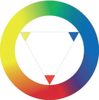
1.4 The primary triad forms an equilateral triangle on the spectral continuum.
The idea that one can mix all possible colors from the primary triad is based on the assumption that there are pure pigments that represent the true primary colors. Unfortunately, none really exist. All red, yellow, and blue pigments are visually biased, to a degree, toward one or another of the colors that adjoin them.
It is commonly understood, for example, that green can be mixed by combining blue with yellow. But to make a vivid, seemingly pure green would be impossible if the only blue available were ultramarine. An even duller green would result if the mixture were based upon a combination of ultramarine blue and yellow deep (fig. 1.5).

1.5 The color overtones of ultramarine blue and yellow deep make it impossible to mix a vivid, spectral green from them.
Both ultramarine blue and yellow deep are biased toward colors that contain red (violet and orange, respectively). Red lies opposite green on the COLOR WHEEL. Colors that oppose each other directly on the color wheel are called COMPLEMENTARY HUES. Mixing complementary colors lowers the SATURATION (richness) and VALUE (luminosity) of the resulting tone. In other words, it has a dulling and darkening effect. Mixing ultramarine blue and yellow deep adds a latent red (the subsidiary reflections of both colors) which dulls and darkens the resulting green (fig. 1.5).
To mix a vivid green, choose lemon yellow and sky blue (fig. 1.6). Both are biased toward green and reflect insignificant amounts of red.

1.6 When lemon yellow and sky blue are mixed, a vivid green can result because both are biased toward green.
It should be understood that this discussion pertains to the mixing of pigments and, in particular, to the generation of secondary colors from the intermixing of primary colors. We don’t mean to suggest that all colors are physically achieved by combining primaries. To describe a green as “containing” blue is only literally true if that green has been made by intermixing blue and yellow pigments. Some pigments appear green in their pure physical form, e.g. chromium oxide green, but physically contain no blue. But all greens contain blue visually, and the blue element comes into play with color interaction, which we will cover in depth in Part Five.
A Musical Analogy
In this course we call a color bias an OVERTONE, a term borrowed from music. When a C string is plucked on a harp or struck on the piano, the string vibrates at a specific rate that causes our ears to hear a C. But in addition to the C, we also hear a weaker vibration: a G and (more subtly) an E (fig. 1.7). In fact, a diminishing succession of subvibrations always accompanies the strong pitch of a plucked string. As when colors are mixed, when individual musical tones are combined, so are their overtones. The result is a denser sound than one might expect. Adding a third and fourth note thickens the harmonic texture. The role of color bias in mixing paint parallels this acoustical phenomenon.

1.7 Each plucked note is accompanied by a series of subsidiar acoustical overtones.
Mixing a Secondary Triad
If we try to mix a vibrant SECONDARY TRIAD (orange, green, and violet) from a primary triad consisting of one specific red, one blue, and one yellow, some of the results will be compromised by con...
Table of contents
- Cover
- Title Page
- Copyright
- Contents
- Acknowledgments
- Preface: Michael James
- Foreword: Lydia Neuman
- Introduction
- Part One: Seeing Color
- Part Two: First Principles
- Part Three: Materials and Techniques
- Part Four: Beginning Color Studies
- Part Five: Color Interaction
- Part Six: Applying Color Principles
- Part Seven: Color Harmony
- Part Eight: Color Research
- Part Nine: Color Experience and Interpretation
- Part Ten: Color Studies on the Computer
- Illustrated Glossary
- Bibliography
- Credits
- Index
Frequently asked questions
Yes, you can cancel anytime from the Subscription tab in your account settings on the Perlego website. Your subscription will stay active until the end of your current billing period. Learn how to cancel your subscription
No, books cannot be downloaded as external files, such as PDFs, for use outside of Perlego. However, you can download books within the Perlego app for offline reading on mobile or tablet. Learn how to download books offline
We are an online textbook subscription service, where you can get access to an entire online library for less than the price of a single book per month. With over 1.5 million books across 990+ topics, we’ve got you covered! Learn about our mission
Look out for the read-aloud symbol on your next book to see if you can listen to it. The read-aloud tool reads text aloud for you, highlighting the text as it is being read. You can pause it, speed it up and slow it down. Learn more about Read Aloud
Yes! You can use the Perlego app on both iOS and Android devices to read anytime, anywhere — even offline. Perfect for commutes or when you’re on the go.
Please note we cannot support devices running on iOS 13 and Android 7 or earlier. Learn more about using the app
Please note we cannot support devices running on iOS 13 and Android 7 or earlier. Learn more about using the app
Yes, you can access Colour Second Edition by David Hornung in PDF and/or ePUB format, as well as other popular books in Art & Art General. We have over 1.5 million books available in our catalogue for you to explore.