A great introduction for retail students, this book offers a user-friendly reference guide to all aspects of visual merchandising and covers both window dressing and in-store areas. Using examples from a range of shops, from fashion emporia to small outlets, the book offers practical advice on the subject, supported by hints and tips from established visual merchandisers. It reveals the secrets of their toolkit and information on the use of mannequins, the latest technology and how to construct and source props, and explains the psychology behind shopping and buyer behaviour. This new edition contains new case studies and updated images. Presented through colour photographs, diagrams of floor layouts and store case studies, and including invaluable information such as a glossary of terms used in the industry, Visual Merchandising is an essential handbook for anyone working in and learning about this exciting area.
- 208 pages
- English
- ePUB (mobile friendly)
- Available on iOS & Android
eBook - ePub
Visual Merchandising Second Edition
About this book
Trusted by 375,005 students
Access to over 1.5 million titles for a fair monthly price.
Study more efficiently using our study tools.
Information
Topic
DesignSubtopic
Fashion DesignIn-store Visual Merchandising
“It is extremely important that we have an established theme that begins with our windows and translates to all areas in-store nationally. The in-store areas are just as important as our windows and provide our customers with information and entertainment.”
John Gerhardt, Creative Services Director, Holt Renfrew
In-store visual merchandising is the process used to lead customers through a shop in a logical order, encouraging them to stop at designated points and, hopefully, to make a purchase. Ask shoppers why their favorite store should stand so high in their estimation and many will probably explain that the space is easy to shop in, the product is simple to find, and the signage is clear and informative. Each of these answers demonstrates effective in-store visual merchandising.
As a visual merchandiser, your input into the merchandising of the store will vary depending on the type of shop in which you are working. In a small boutique, you may be called upon to refresh the layout in order to encourage customers to browse, and you will have a great deal of input into how this is done. With a big chain, you will be more likely to be following directions from head office, which will often relate to buying programs, store promotions, and seasonal events. Specialist stores may rely on the visual merchandiser working with the buyers to arrange the floor according to the new season’s products and trends. Whichever type of store you are in, the same disciplines of in-store merchandising will apply.
The key to successful in-store visual merchandising is a successful floor layout. First you need to establish product adjacencies before you can start to plan your floor layout. There is then a series of options from which you can choose your fixtures, as well as some basic rules of product handling to help you display your merchandise effectively. Trend areas and in-store displays, and point of purchase and add-on sales, will help merchandise your shop. Signage and graphics can also help in-store visual merchandising, as can the creation of ambience. Finally, care and attention need to be given to maintenance standards.
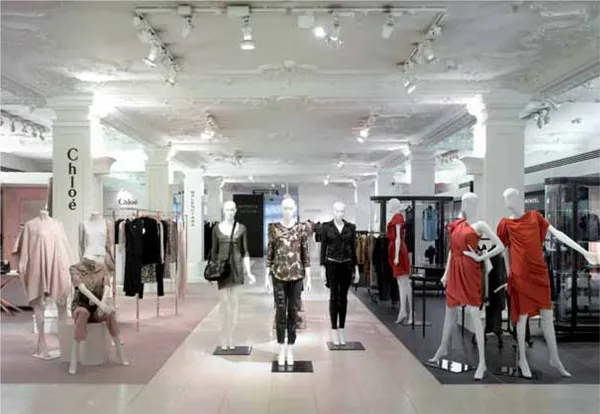
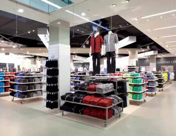
A range of visual merchandising tools, including linear and mid-floor fixtures, brand signage, and mannequins, helps customers navigate Harrods’ womenswear floor in London.
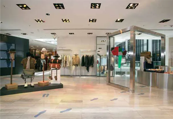
Not only has Lane Crawford, Hong Kong, created strong focal points to attract the customer on this men’s floor, it has also added footprints on the floor to help guide the customer toward them.
Product adjacencies
The starting point is product adjacencies. This refers to which products sit next to each other: hosiery next to lingerie, kettles next to toasters, and fruit next to vegetables. To maximize the space and use of the selling floor, the customer should be guided through the fixtures and aisles from one product to the next. By placing products that have empathy with each other, customers will not get confused and possibly pick up other items for which they may not have specifically been shopping. Clever use of product adjacencies will reinforce the appearance of the area and give it authority. A handbag fixture positioned next to scarves, gloves, hats, and purses suddenly becomes an accessory department.
Making a rough plan
Before starting to lay out a floor, always check which product categories and brands are available to you to merchandise. The best and most effective way to start is by making a list. Taking a floor plan and tentatively noting where the products should sit will make the task more manageable. As well as product adjacencies, you might want to think about the location of strong product categories or key brands, which should ideally be positioned in prime locations. These brands and products will help the customer gain awareness of what the store, department, or space is selling and reinforce the strength and quality of the merchandise on offer. A wall of denim with strong branding, like Levi’s for example, will make a statement and guide the consumer to the area where other brands of jeans are for sale. In the same way, a wall of pillows will inform customers that they are approaching the linen department.
As well as product adjacencies and the use of merchandise to guide the customer around the store, the other area to consider is customers’ comfort level. A boutique selling both men’s and women’s clothes could have the two ranges merchandised together. However, men might feel uncomfortable browsing through women’s clothes to find their own; therefore a sensible approach might be to split the shop in two and dedicate one area to menswear and one to womenswear. The two areas would have to meet somewhere, and at this point the cash desk could be used to divide them, or you could feature products that could be classed as unisex, such as magazines, jewelry, or T-shirts. Getting the product adjacencies incorrect could be costly to the store and also drive customers away.
Finally, if you are positioning name brands, it is best to understand where they see themselves on a floor plan. Large brand owners may have very strong views and have the clout to exercise them. Egos can clash when dealing with prestigious brands that will expect prime locations; their demands should never be overlooked. Many smaller brands, on the other hand, often wish to be placed adjacent to brands to which their customers aspire.
Once you have placed the product categories and brands roughly on the floor plan, you should visually walk the shop floor; the aim is for your eye to follow naturally from one category to the other.
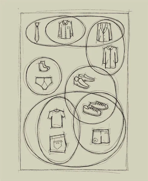
Making a rough plan of the products that should sit next to each other is the first step in laying out a shop floor. This is called making the product adjacencies. Ties, jackets, and suits or socks and underwear are two examples. Eventually, all the groups of product adjacencies will interlink to create one cohesive floor plan that contains them all.
Floor layouts
Neatly folded merchandise has been color-blocked to make it easier for customers to shop in Primark, Bristol. Clearly defined walkways make it easy for the shoppers to browse.
Once you have noted your product adjacencies, it is time to plan your detailed floor layout. Any shopper who is struggling to navigate the labyrinth of an IKEA furniture store will have noticed how difficult it is not to be tempted to leave the designated route. Once the customers have entered the store, they have no choice but to traverse the shop to find the exit; while doing so they are led through numerous lifestyle room settings designed to offer inspiration, and then to a warehouse to spend. Even while standing in line, their children can enjoy an ice cream. Few people will understand the ingenious planning that has gone into creating such a disciplined floor layout.
Similarly, the countless aisles of shelves in a supermarket have been rigorously planned. While they may not inspire the customer, they do achieve their aim by making the monotony of grocery shopping effortless and uncomplicated. The exact location of the dairy products in relation to the cleaning products, for example, would have been carefully planned, not only to assist the customer but also to drive sales. Staples such as milk and eggs are not always placed at the front of a supermarket for the customer’s convenience; they are often located in the center of the store or toward the back, ensuring that the shopper has to pass other items before discovering them. While searching, shoppers will probably add additional products, for which they were not necessarily shopping, to their baskets. Even the ends of the fixtures are used to make extra sales, often being used to promote offers. These invaluable spaces are usually placed along a central walkway with heavy traffic, making them a useful commodity to grab the shopper’s attention—and money.
Each of these examples proves the power and effectiveness of a well-planned floor layout.
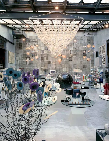
Milan’s Corso Como features an eclectic mix of old and new furniture to display its products. Quirky lighting and art adorning the walls also help create atmosphere.
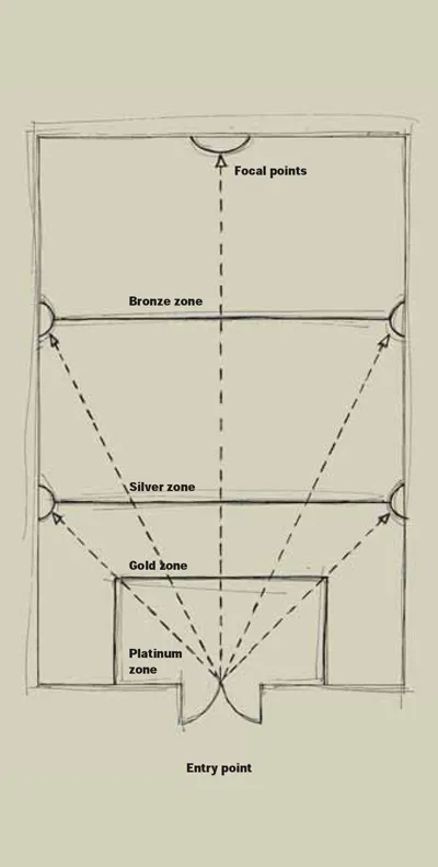
The floor layout here clearly shows the most profitable platinum selling space inside the entrance to the store. This area will be expected to take the most money, followed by the gold, silver, and finally bronze areas at the rear of the store.
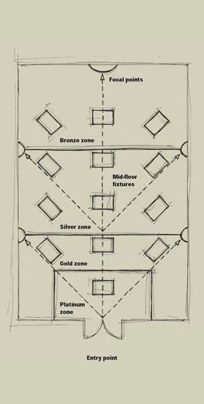
The same floor layout is shown here with fixtures in place. Each fixture is angled at 45 degrees to funnel customers into the store. Fixtures are also placed in line with displays on the side walls, which create focal points that are designed...
Table of contents
- Cover
- Half Title
- Title Page
- Copyright
- Contents
- Preface
- The History of Visual Merchandising
- The Role of a Visual Merchandiser
- Store Design
- Windows
- In-store Visual Merchandising
- Mannequins
- The Visual Merchandiser’s Studio
- Glossary
- Further reading
- Index
- Picture credits and acknowledgments
Frequently asked questions
Yes, you can cancel anytime from the Subscription tab in your account settings on the Perlego website. Your subscription will stay active until the end of your current billing period. Learn how to cancel your subscription
No, books cannot be downloaded as external files, such as PDFs, for use outside of Perlego. However, you can download books within the Perlego app for offline reading on mobile or tablet. Learn how to download books offline
We are an online textbook subscription service, where you can get access to an entire online library for less than the price of a single book per month. With over 1.5 million books across 990+ topics, we’ve got you covered! Learn about our mission
Look out for the read-aloud symbol on your next book to see if you can listen to it. The read-aloud tool reads text aloud for you, highlighting the text as it is being read. You can pause it, speed it up and slow it down. Learn more about Read Aloud
Yes! You can use the Perlego app on both iOS and Android devices to read anytime, anywhere — even offline. Perfect for commutes or when you’re on the go.
Please note we cannot support devices running on iOS 13 and Android 7 or earlier. Learn more about using the app
Please note we cannot support devices running on iOS 13 and Android 7 or earlier. Learn more about using the app
Yes, you can access Visual Merchandising Second Edition by Tony Morgan in PDF and/or ePUB format, as well as other popular books in Design & Fashion Design. We have over 1.5 million books available in our catalogue for you to explore.