This book is a guide to the use of type in design for print and screen. It provides a creative, informative and practical introduction for those studying all pathways of graphic design.
The authors discuss who uses type, where and when type is employed, audience and appropriateness of type and communication. The book includes basic information about type and its terminology, using typefaces, designing and communicating with type, colour and movement, experimentation with type and production issues. Throughout, examples are drawn from design for both print and screen.
How to Use Type includes illustrated activities and case studies linked to key issues discussed in the text. This book offers an invaluable overview of an essential aspect of visual communication.
- 208 pages
- English
- ePUB (mobile friendly)
- Available on iOS & Android
eBook - ePub
How to Use Type
About this book
Trusted by 375,005 students
Access to over 1.5 million titles for a fair monthly price.
Study more efficiently using our study tools.
Information
Topic
DesignSubtopic
Art General1
Chapter 1 : The basics
This chapter looks at fundamental principles related to the use of type and identifies the terminology used. We will consider the different categories of typeface, such as serif and sans serif, and the main differences between them. Alongside this, we will examine families of type, which include styles such as bold and italic, the structure of letterforms, and how these properties may be used in an experimental and adventurous way both for print and screen.
The anatomy of type
When we talk about a set of letterforms of a particular design, we refer to it as a typeface or, as it has become a term in everyday use, a font. Each letterform consists of one or more of the following parts: serif, ascender, descender, counter, bar, and stem.
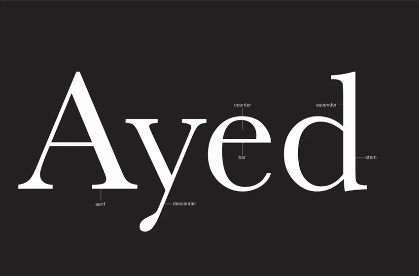
This diagram shows the essential parts of a letterform referred to in this book. Further diagrams focusing on individual components will be included later in the chapter.
Categories of type
Typefaces may be divided into two main categories: serif and sans serif. The difference between these is basically that serif typefaces are based on Roman incised lettering, which features small strokes at the ends of letterforms, as seen in the diagram opposite. Sans serif letterforms do not have these strokes—hence “sans,” which means “without.”
Variations
There are many other sorts of letterform, most of which sit within these broad categories. Examples include block, or slab, serif (which has a large slab rather than a stroke at the ends of the letterform), headline, and script typefaces.
Headline, or display, typefaces are usually intended to draw attention to isolated words, phrases, or short sentences. Such typefaces tend to be eye-catching and attractive but would prove difficult to read in a large block because they often incorporate complex or quirky designs. Display faces may be hand drawn from scratch or be hand- or digitally manipulated variants of an existing typeface. Such typefaces are often available from websites as free downloads. A word of caution: you usually get what you pay for, but there is some excellent experimental work out there—for example, HVD Fonts’ Square Pants typeface (see next page).
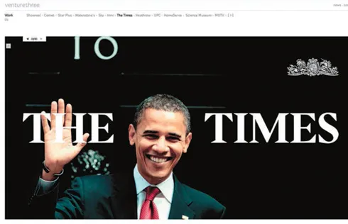
This website by Venture 3/CHI & Partners shows the classic serif typeface designed specifically for The Times newspaper and called Times New Roman. You can clearly see the small strokes that form the serifs.
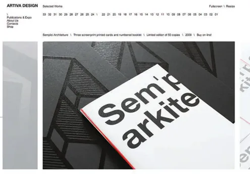
A sans serif typeface has been used by Artiva for their logotype at the head of this website page and also in the print example displayed on the website.

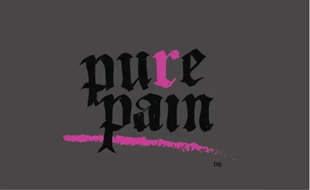
This playful identity by Doink uses a typeface with a prominent serif. The serifs provide a foundation for the uprights that make the letter A look as if it is standing up, with the button balanced halfway down to form the crossbar.
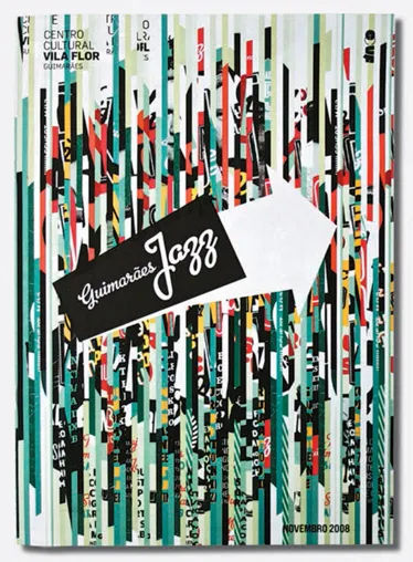
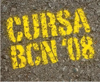
This poster, designed by Eurico Sá Fernandes, shows a slab serif typeface used to give a chunky and solid feel to the letterforms, bringing impact to the design.
 | Pitfall: It is a common mistake to use a display typeface for sections of text that are meant to be read, such as magazine articles or books. These sections of text are referred to as body type, body text, or copy. We will examine this issue further in the section on legibility (see page 44). |
Script typefaces are usually intended to replicate handwriting or calligraphy. As with display or headline typefaces, script typefaces are often difficult to read if used in body text. Because they replicate handwriting, script typefaces work best as a combination of upper and lower case, rather than as all capital letters. You will probably be familiar with one of the most common applications of script typefaces: the invitation card.
Atelier Martino&Jaña have used different typefaces to complement each other and the collaged background image, which includes different letterforms.
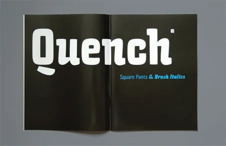
This display typeface, Square Pants by HVD Fonts, is quirky and attracts attention.
Insane have used a headline/display typeface in this logotype. The typeface draws on the structure of early hand-drawn letterforms like those produced by monks for medieval manuscripts. Although the typeface is well designed, it is not appropriate for continuous reading as it is quite complex and some of the letterforms do not form instantly recognizable letter shapes.
These hand-constructed letterforms by Eva Blanes illustrate how effective such typefaces can be when used selectively, such as for a single word. But imagine trying to read a paragraph or whole page in this …
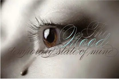
Alejandro Paul’s typeface Compendium complements the sophisticated feel of the photograph and text.
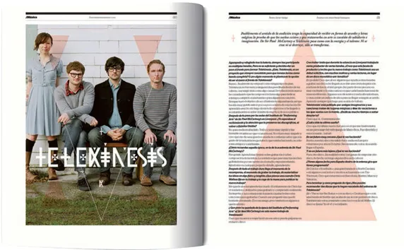
Distinctive headline type has been used by Pablo Abad for the heading on this double-page spread.
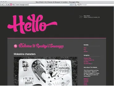
Ross Elliott has used a script typeface in a bright color on a gray background to produce an attention-grabbing introductory page for his website.
Combining typefaces
Many typographic designs call for a combination of typefaces. The way in which different typefaces are used together can have a considerable bearing on the message they communicate and can also affect legibility. For example, you might set the main text on a menu card for a chic bistro in a sans serif typeface to help communicate a modern, pared-down theme, but this effect would be nullified if the titles were set in an elaborate script typeface. Also, combining two display faces may halve rather than double their impact: the typefaces may end up competing for attention and cancel each other out.
However, typeface combination can work very well. Designers will often use contrasting typefaces to show the difference between pieces of information or to emphasize an item. An example of this could be a poster where the name of the event is in one typeface and information such as venue, times, and dates is in another typeface. It is a commonly held principle that two typefaces from the same category, such as sans serifs, do not work well together because they can look too similar. However, as with most rules, there are exceptions. There are a large variety of typefaces that have strong individual characteristics and these may work together.
You will find many examples of combinations of headline or script typefaces used as titles. A headline or script typeface is often used for titles and other short sections. This is in order to differentiate between the sections of information and/or to highlight the importance of the title. Serif and sans serif typefaces lend themselves to body text as they...
Table of contents
- Cover
- Title Page
- Copyright
- Contents
- Introduction
- 1. The basics
- 2. Using the typeface
- 3. Designing with type
- 4. Communication
- 5. Color and movement
- 6. Experiments with type
- 7. Production considerations
- Glossary
- Some further reading / Websites
- Index
- Picture credits
Frequently asked questions
Yes, you can cancel anytime from the Subscription tab in your account settings on the Perlego website. Your subscription will stay active until the end of your current billing period. Learn how to cancel your subscription
No, books cannot be downloaded as external files, such as PDFs, for use outside of Perlego. However, you can download books within the Perlego app for offline reading on mobile or tablet. Learn how to download books offline
Perlego offers two plans: Essential and Complete
- Essential is ideal for learners and professionals who enjoy exploring a wide range of subjects. Access the Essential Library with 800,000+ trusted titles and best-sellers across business, personal growth, and the humanities. Includes unlimited reading time and Standard Read Aloud voice.
- Complete: Perfect for advanced learners and researchers needing full, unrestricted access. Unlock 1.5M+ books across hundreds of subjects, including academic and specialized titles. The Complete Plan also includes advanced features like Premium Read Aloud and Research Assistant.
We are an online textbook subscription service, where you can get access to an entire online library for less than the price of a single book per month. With over 1.5 million books across 990+ topics, we’ve got you covered! Learn about our mission
Look out for the read-aloud symbol on your next book to see if you can listen to it. The read-aloud tool reads text aloud for you, highlighting the text as it is being read. You can pause it, speed it up and slow it down. Learn more about Read Aloud
Yes! You can use the Perlego app on both iOS and Android devices to read anytime, anywhere — even offline. Perfect for commutes or when you’re on the go.
Please note we cannot support devices running on iOS 13 and Android 7 or earlier. Learn more about using the app
Please note we cannot support devices running on iOS 13 and Android 7 or earlier. Learn more about using the app
Yes, you can access How to Use Type by Lester Meachem,Lindsey Marshall in PDF and/or ePUB format, as well as other popular books in Design & Art General. We have over 1.5 million books available in our catalogue for you to explore.