Excel Dashboards & Reports For Dummies
eBook - ePub

Excel Dashboards & Reports For Dummies

  1. English
  2. ePUB (mobile friendly)
  3. Available on iOS & Android
eBook - ePub

Excel Dashboards & Reports For Dummies

About this book

It's time for some truly "Excel-lent" spreadsheet reporting

Beneath the seemingly endless rows and columns of cells, the latest version of Microsoft Excel boasts an astonishing variety of features and capabilities. But how do you go about tapping into some of that power without spending all of your days becoming a spreadsheet guru?

It's easy. You grab a copy of the newest edition of Excel Dashboards & Reports For Dummies and get ready to blow the pants off your next presentation audience!

With this book, you'll learn how to transform those rows and columns of data into dynamic reports, dashboards, and visualizations. You'll draw powerful new insights from your company's numbers to share with your colleagues – and seem like the smartest person in the room while you're doing it.

Excel Dashboards & Reports For Dummies offers:

  • Complete coverage of the latest version of Microsoft Excel provided in the Microsoft 365 subscription
  • Strategies to automate your reporting so you don't have to manually crunch the numbers every week, month, quarter, or year
  • Ways to get new perspectives on old data, visualizing it so you can find solutions no one else has seen before

If you're ready to make your company's numbers and spreadsheets dance, it's time to get the book that'll have them moving to your tune in no time. Get Excel Dashboards & Reports For Dummies today.
Frequently asked questions

Yes, you can cancel anytime from the Subscription tab in your account settings on the Perlego website. Your subscription will stay active until the end of your current billing period. Learn how to cancel your subscription.
At the moment all of our mobile-responsive ePub books are available to download via the app. Most of our PDFs are also available to download and we're working on making the final remaining ones downloadable now. Learn more here.
Perlego offers two plans: Essential and Complete
  • Essential is ideal for learners and professionals who enjoy exploring a wide range of subjects. Access the Essential Library with 800,000+ trusted titles and best-sellers across business, personal growth, and the humanities. Includes unlimited reading time and Standard Read Aloud voice.
  • Complete: Perfect for advanced learners and researchers needing full, unrestricted access. Unlock 1.4M+ books across hundreds of subjects, including academic and specialized titles. The Complete Plan also includes advanced features like Premium Read Aloud and Research Assistant.
Both plans are available with monthly, semester, or annual billing cycles.
We are an online textbook subscription service, where you can get access to an entire online library for less than the price of a single book per month. With over 1 million books across 1000+ topics, we’ve got you covered! Learn more here.
Look out for the read-aloud symbol on your next book to see if you can listen to it. The read-aloud tool reads text aloud for you, highlighting the text as it is being read. You can pause it, speed it up and slow it down. Learn more here.
Yes! You can use the Perlego app on both iOS or Android devices to read anytime, anywhere — even offline. Perfect for commutes or when you’re on the go.
Please note we cannot support devices running on iOS 13 and Android 7 or earlier. Learn more about using the app.
Yes, you can access Excel Dashboards & Reports For Dummies by Michael Alexander in PDF and/or ePUB format, as well as other popular books in Computer Science & Desktop Applications. We have over one million books available in our catalogue for you to explore.

Information

Part 1

Getting Started with Excel Dashboards and Reports

IN THIS PART …
Discover how to think about your data in terms of creating effective dashboards and reports and get a solid understanding of the fundamentals and basic ground rules for creating effective dashboards and reports.
Uncover the best practices for setting up the source data for your dashboards and reports and explore the key Excel functions that help you build effective dashboard models.
Explore how pivot tables can enhance your analytical and reporting capabilities as well as your dashboards.
Dive into Power Query and explore some of the ways to incorporate external data into your reporting mechanisms.
Chapter 1

Getting in the Dashboard State of Mind

IN THIS CHAPTER
Bullet
Comparing dashboards to reports
Bullet
Getting started on the right foot
Bullet
Dashboarding best practices
In his song “New York State of Mind,” Billy Joel laments the differences between California and New York. In this homage to the Big Apple, he implies a mood and a feeling that come with thinking about New York. I admit it’s a stretch, but I’ll extend this analogy to Excel — don’t laugh.
In Excel, the differences between building a dashboard and creating standard table-driven analyses are as great as the differences between California and New York. To approach a dashboarding project, you truly have to get into the dashboard state of mind. As you’ll come to realize in the next few chapters, dashboarding requires far more preparation than standard Excel analyses. It calls for closer communication with business leaders, stricter data modeling techniques, and the following of certain best practices. It’s beneficial to have a base familiarity with fundamental dashboarding concepts before venturing off into the mechanics of building a dashboard.
In this chapter, you get a solid understanding of these basic dashboard concepts and design principles as well as what it takes to prepare for a dashboarding project.

Defining Dashboards and Reports

It isn’t difficult to use report and dashboard interchangeably. In fact, the line between reports and dashboards frequently gets muddied. I’ve seen countless reports referred to as dashboards just because they included a few charts. Likewise, I’ve seen many examples of what could be considered dashboards but have been called reports.
Now, this may all seem like semantics to you, but it’s helpful to clear the air and understand the core attributes of what are considered to be reports and dashboards.

Defining reports

The report is probably the most common application of business intelligence. A report can be described as a document that contains data used for reading or viewing. It can be as simple as a data table or as complex as a subtotaled view with interactive drill-downs, similar to Excel’s Subtotal or Pivot Table functionality.
The key attribute of a report is that it doesn’t lead a reader to a predefined conclusion. Although reports can include analysis, aggregations, and even charts, reports often allow for the end users to apply their own judgment and analysis to the data.
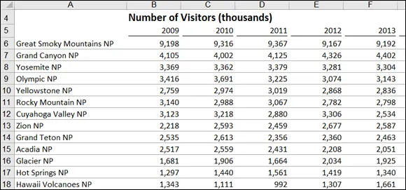
To clarify this concept, Figure 1-1 shows an example of a report. This report shows the National Park overnight visitor statistics by period. Although this data can be useful, it’s clear this report isn’t steering the reader toward any predefined judgment or analysis; it’s simply presenting the aggregated data.
Snapshot of reports present data for viewing but don’t lead readers to conclusions.
FIGURE 1-1: Reports present data for viewing but don’t lead readers to conclusions.

Defining dashboards

A dashboard is a visual interface that provides at-a-glance views into key measures relevant to a particular objective or business process. Dashboards have three main attributes:
  • Dashboards are typically graphical in nature, providing visualizations that help focus attention on key trends, comparisons, and exceptions.
  • Dashboards often display only data that are relevant to the goal of the dashboard.
  • Because dashboards are designed with a specific purpose or goal, they inherently contain predefined conclusions that relieve the end user from performing his own analysis.
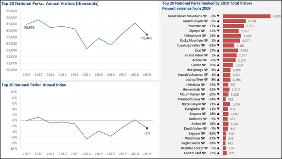
Figure 1-2 illustrates a dashboard that uses the same data shown in Figure 1-1. This dashboard displays key information about the national park overnight-visitor stats. As you can see, this presentation has all the main attributes that define a dashboard. First, it’s a visual display that allows you to quickly recognize the overall trending of the overnight-visitor stats. Second, you can see that not all the detailed data is shown here — you see only the key pieces of information relevant to support the goal of this dashboard, which in this case would be to get some insights on which parks would need some additional resources to increase visitor rates. Finally, by virtue of its objective, this dashboard effectively presents you with analysis and conclusions about the trending of overnight visitors.
Snapshot of dashboards provide at-a-glance views into key measures relevant to a particular objective or business process.
FIGURE 1-2: Dashboards provide at-a-glance views into key measures relevant to a particular objective or business process.
...

Table of contents

  1. Cover
  2. Title Page
  3. Table of Contents
  4. Introduction
  5. Part 1: Getting Started with Excel Dashboards and Reports
  6. Part 2: Building Basic Dashboard Components
  7. Part 3: Adding Charts to Your Dashboards
  8. Part 4: Advanced Reporting Techniques
  9. Part 5: The Part of Tens
  10. Index
  11. About the Author
  12. Advertisement Page
  13. Connect with Dummies
  14. End User License Agreement