![]()
CHAPTER 1
Overview and Importance of Visual Representation
Introduction
Graphs and charts are visual representation of data. They provide a powerful means of summarizing and presenting data in a way that most people find easier to comprehend. Charts and graphs enable us to see the main features or characteristics of the data. They not only enable us to present the numerical findings of a study, but also provide the shape and pattern of the data, which is critical in data analysis and decision making.
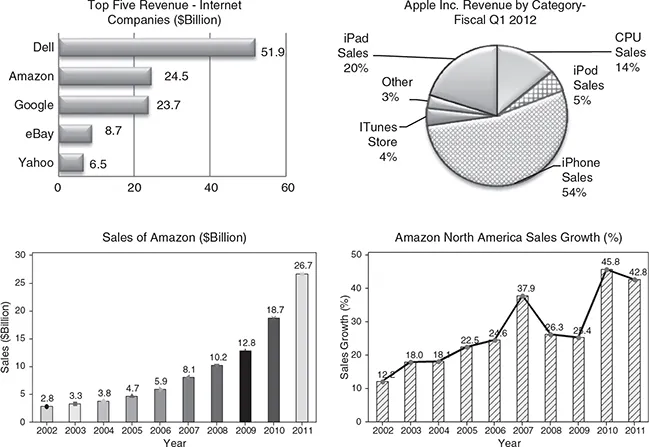
It is said that a picture is worth a thousand words; this is particularly true when a large set of data is effectively presented using charts and graphs that quickly reveal important features. Visual displays of the data are easily recognizable and found ubiquitously in business periodicals, financial magazines, on the Internet, and television. Some examples where visual displays (in the form of graphs) are used to summarize data are presented below. These graphs summarize the sales and revenue of the top computer companies—Amazon and Apple Inc.
The below examples show how a number of charts and graphs are used to describe the key features of data. A solid understanding of these graphs will enable you to describe the key concept of the data visually, and will aid in both your personal and professional life. With the advancement in technology, high-quality and complex charts and graphs can be easily produced. A number of charts and graphs can be found in reports of financial periodicals such as The Economist, Business Week, Fortune, and many other business and engineering periodicals. Almost every issue of USA Today and The Wall Street Journal contains a number of visual displays in its articles.
Most of the graphs in this text can be produced using statistical and data visualization software. We will illustrate several examples where computer software such as EXCEL® and MINITAB® are used to construct the charts and graphs. Some other graphical displays, for example, flow diagrams, process maps, and value stream maps, are widely used in studying and improving process. These are created using specialized software. MINITAB’s Quality Companion, Microsoft Visio, and Smart Draw® are some of the widely used programs for this purpose. Another widely used software for Data Visualization and Visual Analytics is Tableau Software. This software is capable of handling big data and creates high-level graphs and charts to visually display data. An added feature of Tableau is the analytics feature built into it that can answer many queries not apparent from the graphs and charts alone.
Graphical Tools at a Glance
The book discusses in detail a number of charts and graphs that are visual representation of data. We discuss the applications, construction, and computer implementation of graphical tools.
The first part of the book presents the basic concepts and fundamentals of data and data analysis including various types of data. The importance of data visualization, widely used charts and graphs, and their applications are discussed in detail followed by examples and computer applications.
A number of quality tools, referred to as the conventional and new tools of quality, are presented with examples and applications. These Quality Tools are not limited to solving quality problems but have wide applications in any field of data analysis and decision making.
Visualizing data graphically helps detect potential problems and identify the areas for improvement. The chapters in the text are divided into sections, with the following data visualization tools:
Chapter 1
This chapter provides an introduction to data visualization and discusses how graphs and charts are used to summarize and present data. It provides an overview of software that is widely used to create graphs and charts. Specially designed Data Visualization and Visual Analytics software capable of handling big data are briefly discussed. Quality Tools are also introduced. They have been successfully used in analyzing data and solving quality problems. These graphical tools have been discussed in separate chapters.
Chapter 2
Chapter 2 discusses the basic concepts related to data and data analysis. Various types of data, such as qualitative or categorical data, quantitative data, and other classifications of data, are presented. This chapter also presents the concept of variables. Almost all data show variation, and visual tools are an excellent way to study variation in the data. The sources of data and how data are collected for research and analysis are also discussed. The types of data based on measurement scales, recent trends in data visualization, and big data are introduced.
Chapter 3
Chapter 3 presents the most commonly used charts and graphs and their applications in data analysis and visualization. The need for presenting data in compact form using a frequency distribution and related measures calculated using the frequency distribution are discussed. The construction and applications of graphs and charts in this chapter include histograms and its variations, graphical summary of data with calculated statistics, plotting variability in the data, stem-and-leaf plot, box plots and its variations with applications, dot plots, bar charts and different variations of bar charts, for example, cluster bar charts, stacked bar charts, bar charts from tally and two-way and three-way tables. The chapter also presents pie charts and variations of the pie charts, for example, pie of a pie chart, bar of a pie chart, and their applications. Some specialized graphs, such as intervals plots, sequence plots, connected line plots, time-series plots, area graphs, probability plots, and symmetry plots and their applications are explained with examples.
Chapter 4
Chapter 4 presents graphical techniques of investigating the relationships between two or more variables. The most commonly used graphs and plots for this purpose are as follows:
Scatter plots and variations of scatter plots
Scatter plots with histogram, box plots and dot plots
Scatter plot with fitted line or curve
Scatter plot showing an inverse relationship between X and Y
Scatter plot showing a nonlinear relationship between X and Y
Scatter plot showing a nonlinear (cubic) relationship between X and Y
Bubble graphs showing the relationship between three variables
Matrix plots that investigate the relationship between several independent variables and the response or dependent variable
Three-dimensional plots, surface plots, and contour plots
These graphs along with their applications are explained.
Chapter 5
This chapter discusses data visualization techniques using big data. The current trend is visualization with big data. Data visualization makes complex and large data understandable. The chapter provides an introduction to big data, applications of big data in different fields including business, health care, government, manufacturing, and others. The emerging trends in big data, visual analytics, and software products in this area are Introduced. Examples of processing business data using the Tableau software and dashboards are presented. Big data software provides a number of views and graphs of the same data. The chapter discusses the emerging need for visualization with big data in the light of the increase in the volume of data being collected and stored and the challenges of storing, analyzing, processing, and communicating such huge amounts of data.
Chapter 6
Chapter 6 provides an overview and applications of data visualization. It summarizes the commonly used software, current trends, and specially designed computer software to process and analyze massive volume of data or big data. Since computers are essential parts of data analysis and visualization, the computer instructions, applications, and analyses procedures using widely used software—EXCEL and Minitab—are provided in separate appendices. This chapter provides the details and content of each appendix. It also provides the details on how to download the data files for the charts and graphs.
Summary
This chapter provided an overview of data visualization and its importance. It has laid a foundation for the rest of the book by outlining the chapter contents. Each chapter presents a class of graphical tools that can be applied in areas ranging from simple to advanced analysis. The charts and graphs find wide application in data analysis and also in quality improvement projects to detect and solve a number of problems. These graphs and charts are critical in understanding the process from which data are collected. Each chapter in the book is devoted to a particular class of graphical and visual tools ranging from most commonly used graphical tools to data visualization using big data.
![]()
CHAPTER 2
Data and Data Analysis Concepts
Introduction
One of the major functions of data analysis is to describe the data in a way that is easy to comprehend and communicate. This can be done both by presenting the data in graphical form and by calculating various summary statistics, such as the measures of central tendency and the measures of variability. The graphical techniques enable the analyst to describe a data set that is more concise than the original data. These techniques help reveal the essential characteristics of the data so that effective decisions can be made.
The graphical techniques described here are useful in the following ways:
• The techniques will help you gain insight into the way the variable or variables seem to behave.
• The graphical techniques enable one to understand how the values of a random variable under study are distributed.
• The shapes produced using the graphical techniques help select an appropriate theoretical distribution for the random variable ...