![]()
1
WHAT’S IN YOUR PIE CHART?
On most investment prospectus or disclaimers, it usually says past performance is no indication of future success. Yet in looking to build portfolios that produce the best returns with the least risk, most do use past historical performance to create a framework for classical portfolios. For many years, investors have built portfolios owning some mix of stocks and bonds. Often, they are printed out in a nice graphical pie chart to illustrate the percent allocated to each. The most aggressive of investors would slant toward 100% stocks, while a conservative or income-seeking individual might be almost 100% in bonds. It would be natural to gravitate toward some mix to reduce annualized portfolio volatility, especially as one gets to retirement age.
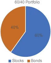
Portfolios are then named after their makeup of assets. Many will point to historical returns over long periods, as evidence that what worked in the past will continue to work going forward. A keep-it-simple approach might suggest subtracting one’s current age from 100 to figure out what percentage can be in stocks. Someone who is 40 years of age using that formula would do simple math and come up with a 60/40 stocks/bonds mix. A statement might include a pie chart as shown in Figure 1.
Figure 1. Classic 60% Stocks and 40% Bonds Allocation.
Yet will this approach work in the next decade or two? You see often historical returns are given that represent many years. Some go back to the late 1800s. Bond returns such as long, intermediate, and short-term treasuries include periods that are historically bullish with higher interest rates spanning multiple decades. If you use enough years, it smooths out the shorter run bumps in returns when markets correct. If we use a total return as in Table 1 we can see between 1928 and 2016, the S&P 500 and Treasury 10-Year Bond’s continuous maturity.
Table 1. Average Annual Returns 1928–2016 with Standard Deviation and Range.
| S&P 500 Total Return (%) | 10-Year Treasury Total Return (%) |
Average annual return | 11.42 | 5.18 |
Standard deviation | 19.59 | 7.72 |
1-Standard deviation range | −8.17 to +31.01 | −2.54 to +12.90 |
2-Standard deviation range | −27.76 to +50.60 | −10.26 to +20.62 |
Data Source: Aswath Damodaran NYU Stern School of Business.
1.1. HISTORICAL RETURN AVERAGES
All of this is fine, but will investors get the historical averages or something different going forward? You see the problem is many individuals only have segments of time to achieve their goals. Markets have had periods where selloffs happen even multiple times. Other times may just have next to nothing in cumulative growth over a decade or more — a so-called lost decade for investors. Bonds, as we will learn later, are using historical numbers whose replication moving forward in the next 10–20 years is doubtful.
1.2. LIFECYCLE FOR INVESTORS
Investors are often thought of as being in various stages of their investment life. You’ve probably heard these cycles referred to as accumulation, preservation, and distribution. Accumulation deals with the period when investors are building their accounts and contributing assets. Including those able to put extra funds away in taxable accounts and participate in a company’s 401k plan. Inherently contributing to company retirement plans allows each paycheck to dollar cost average into investments.
Preservation is next where the goal is to grow a little bit but de-risk portfolios to look to manage for less volatility and downside. I view this stage a little different though. As we will see later, adding new pieces to the pie chart may allow for potential returns in various market conditions while allowing for more market exposure while hedging the downside. This is a crucial period, as by now investors have a base of assets to work with. What many call preservation, I would call base maximization. This is a crucial stage where catastrophic downturns or periods of no or low returns can derail the ability to retire and the quality of life thereafter. Really, 15 years to retirement period is where many can advance their balances. The goal should be protecting but look to surge the value of portfolios. The problem is what will typical markets like stocks and bonds deliver during this period?
Finally, the distribution phase where drawdowns from portfolios will be needed to fund income needs. This is equally important. When we think about drawdowns, we refer to withdrawing money on a periodic basis to use for income, now that one isn’t drawing the same salary any longer. The ability for assets to last is a function of the return on assets post retirement, the rate of inflation, and the amount taken out. It used to be a no brainer to transition to a portfolio of mostly bonds. Yet as we will discuss, the time for new entries into our pie chart has come. Alternatives to the classic allocations are needed as bonds are likely to offer little total return in the next decade.
1.3. INVESTORS MAY NOT REALIZE THE AVERAGE OF SHORTER TIME PERIODS
Because investors have limited amounts of time to get what they need out of the various markets, it will be important to modernize their portfolios. People don’t have 100 years to realize the averages. They have real goals and aspirations. They want to be able to return and support a lifestyle. Some polls (Gallup, 2014) indicated an average of 69% of people aged 30–64 worried about not having enough money for retirement. While stocks over time have produced some of the best annualized returns for investors, they also have had periods of significant downturns.
Stocks have also had periods of unbelievable runs. At the same time, they have experienced lost decades. If one is in that maximization period and stocks have a magical run of significant returns, those fears of retirement might go away or at least be significantly improved. Stocks returns in each year are a combination of their change in market value and dividends paid to form a total return. This doesn’t account for capital gains tax paid in the case of non-qualified accounts. We can also look at a simple point-to-point cumulative return in an underlying index like the Dow Jones to identify periods of both little growth or stagnation and periods of powerful secular bull markets. When markets offer small or negative cumulative returns, all investors are left with are the dividends. Cumulative returns simply are a point-to-point percentage gain or loss excluding dividends. If we look at some historical periods in the Dow Jones Industrial Index in Table 2, we see a great disparity in segments of time in the markets.
Table 2. Dow Jones Industrial Index Cumulative Return.
Period | Length (Years) | Cumulative Return (%) |
1/1897–1/1906 | 9 | +148.92 |
2/1906–6/1924 | 18 | −4.29 |
7/1924–8/1929 | 5 | +294.66 |
9/1929–11/1954 | 25 | +1.69 |
12/1954–1/1966 | 11 | +154.29 |
2/1966–10/1982 | 17 | +0.83 |
11/1982–12/1999 | 17 | +1059.31 |
1/2000–12/2010 | 11 | +0.70 |
1/2011–12/2016 | 6? | +70.70 |
Data Source: Guggenheim Investments.
This data should be stunning to some. It’s hard to imagine 25 years, point to point, of essentially nothing to show for equity investments but dividends as happened between 1929 and 1954. More recently, the 2000–2010 decade was one of no growth. Then you have the end of 1982 to the end of the 1999, when stocks cumulative return was over 1000%. This is exactly the reason stocks must be part of a portfolio simply because they offer the opportunity to have runs like this. Part of designing portfolios with equity strategies that offer downside protection is if markets do run great. If they don’t, there is other “stuf...