Start making better business decisions backed by dataAbout This Book• Predict new opportunities and risks in a few mouse clicks• Eliminate complexity with tools that let you plan, analyze, and collaborate in context—in real time• Discover, visualize, plan, and predict in a single product with agile BI toolsWho This Book Is ForThis book targets IT professionals, business analysts, BI developers, managers, newcomers to SAP Analytics Cloud, and ultimately anyone who wants to learn from self-paced, professional guidance and needs a solid foundation in SAP Analytics Cloud.What You Will Learn• A clear understanding of SAP Analytics Cloud platform• Create data models using different data sources, including Excel and text files.• Present professional analyses using different types of charts, tables, geo maps, and more• Using stories, drill up and down instantly to analyze data from various angles• Share completed stories with other team members or compile them in SAP Digital Boardroom agendas for presentation to major stakeholders• Export the results of a story to a PDF file• Save time by planning, analyzing, predicting, and collaborating in context• Discover, visualize, plan, and predict in one product as opposed to separate solutionsIn DetailThe book starts with the basics of SAP Analytics Cloud (formerly known as SAP BusinessObjects Cloud) and exposes almost every significant feature a beginner needs to master. Packed with illustrations and short, essential, to-the-point descriptions, the book provides a unique learning experience. Your journey of exploration starts with a basic introduction to the SAP Analytics Cloud platform. You will then learn about different segments of the product, such as Models, Stories, Digital Boardroom, and so on. Then, you are introduced to the product's interface: the Home screen, the main menu, and more. Then comes the hands-on aspect of the book, which starts with model creation. Next, you learn how to utilize a model to prepare different types of stories(reports) with the help of charts, tables, Geo Maps, and more. In the final chapters of this book, you will learn about Digital Boardroom, Collaboration, and Administration.Style and approachThe easy-to-follow visual instructions provided in this book help business users and report developers create simple and complex stories (reports) quickly
- 420 pages
- English
- ePUB (mobile friendly)
- Available on iOS & Android
eBook - ePub
Learning SAP Analytics Cloud
About this book
Trusted by 375,005 students
Access to over 1.5 million titles for a fair monthly price.
Study more efficiently using our study tools.
Information
Working with Tables and Grids
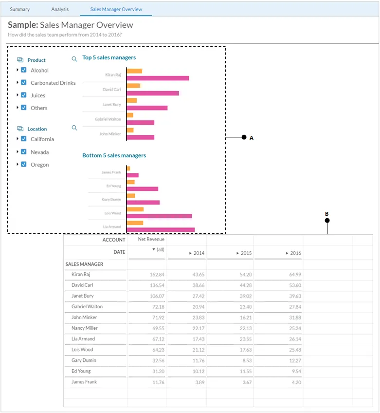
After completing the Summary and Analysis pages in which you added some useful objects to visualize data, here is the third one--Sales Manager Overview. As the name implies, this page will have objects to analyze the performance of the sales team. Some of the objects to be created on this page (filters and bar charts (A)) are already known to you. The table object (B) is the one that is new to this chapter. A table is a spreadsheet-like object that can be used to view and analyze text data. You can add this object to either canvas or grid pages in stories, as shown in the following screenshot:
In addition to the table object, you will have hands-on experience with grid, which is a type of page used to create analysis comprising text and formulas. Here is a list of topics covered in this chapter:
- Copying objects between pages and a to the same page
- Applying ranking
- Creating a table
- Applying filters to tables
- Showing/hiding table elements
- Sorting data in tables
- Showing totals
- Styling tables
- Creating formatting rules to apply custom styles to a table
- Setting visibility filters
- Swapping the table axis
- Freezing rows and columns in a table
- Using KPIs in a table
- Working with grids
- Creating a blended table
- Making copies of objects, pages, and stories
- Saving a story as a PDF
- Creating a dashboard for your story
- Setting reminders using text notes
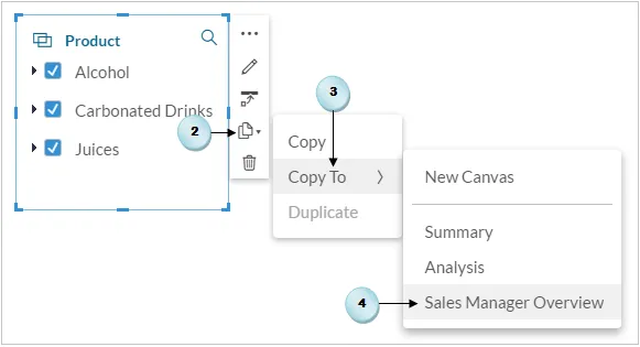
Copying objects between pages
As illustrated in the previous screenshot, there are a couple of filters placed to narrow down the scope of your analysis on this page. Recall that these two filters were created in Chapter 5, Extending Filters with KPI, Filters and other Handy Objects, for the Summary page. In this exercise, we will utilize the same filters by copying them to the Sales Manager Overview page. So, let's get started!
- Click on the Summary page, and then select the Product filter, as illustrated in the following screenshot.
- Click on the Copy icon in the menu.
- Select Copy To from the sub-menu.
- Finally, select the Sales Manager Overview page as the target for this filter. Recall that this page was created and renamed in Chapter 6 , Analyzing Data Using Geo Maps and Other Objects. The filter will appear on the selected page.
- Repeat steps 2 to 4 to also copy the location filter to the Sales Manager Overview page.
Here is the screenshot illustrating the preceding points:
Applying ranking
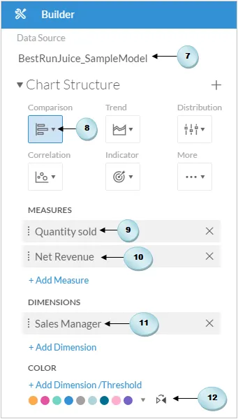
Now, you will add two charts to the page. Both the charts will be created using the same measures and dimensions. The only difference between these charts is that the first chart will display the top five managers, while the second one will show the bottom five managers. This ranking will be applied by choosing Top N Options in the menu. Filtering data by rank focuses a chart on a specified number of data points with the highest or lowest values. Let's see how to apply ranking in a chart.
- Add a blank chart from the Insert toolbar.
- Select the BestRun model as the Data Source for the chart.
- Select the Bar/Column chart from the Comparison category.
- In the Measures section, click on the Add Measure link, and select Quantity Sold.
- Once again, click on the Add Measure link in the Measures section, and select Net Revenue as the second measure for this chart. Both the charts on this page will reveal the values of the sold quantity and the amount earned from sale proceeds by sales managers.
- Finally, click on the Add Dimension link in the Dimensions section, and select Sales Manager as the chart's dimension.
- Optionally, click on the Add Dimension/Threshold link in the Color section, and select a color scheme, as illustrated in the following screenshot:
The chart, as illustrated in the following screenshot, will appear on the page.
- Select the chart and replace its title with Top 5 sales managers.
- Click on Top N options in the chart's menu.
- Select Top N Options from the sub-menu.

- In the Top N Options dialog box, set Mode to Top (A) to show the top results. Set Value to 5 (B) to show the top five results in the chart. Select Net Revenue (C) for Measure to display the top five records with the highest net revenue. Click on Apply to close the dialog box:
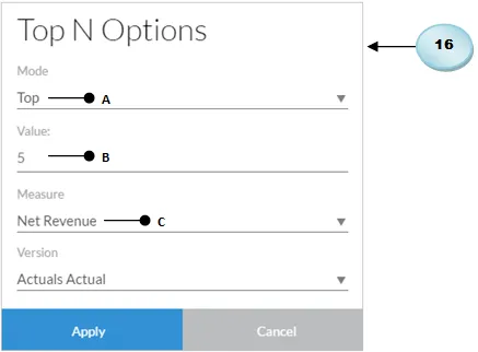
Here's the output of the chart, which shows the five top-ranking sales managers, ranked according to the net revenue they have earned for the company. Kiran Raj has been ranked on top of the chart for his 161.79 mi...
Table of contents
- Title Page
- Copyright
- Credits
- About the Author
- About the Reviewer
- www.PacktPub.com
- Customer Feedback
- Preface
- Getting Started with SAP Analytics Cloud
- Models in SAP Analytics Cloud
- Planning model
- Creating Stories Using Charts
- Extending Stories with KPI, Filters, and Other Handy Objects
- Analyzing Data Using Geomaps and Other Objects
- Working with Tables and Grids
- Collaboration
- Digital Boardroom
- System Administration
Frequently asked questions
Yes, you can cancel anytime from the Subscription tab in your account settings on the Perlego website. Your subscription will stay active until the end of your current billing period. Learn how to cancel your subscription
No, books cannot be downloaded as external files, such as PDFs, for use outside of Perlego. However, you can download books within the Perlego app for offline reading on mobile or tablet. Learn how to download books offline
Perlego offers two plans: Essential and Complete
- Essential is ideal for learners and professionals who enjoy exploring a wide range of subjects. Access the Essential Library with 800,000+ trusted titles and best-sellers across business, personal growth, and the humanities. Includes unlimited reading time and Standard Read Aloud voice.
- Complete: Perfect for advanced learners and researchers needing full, unrestricted access. Unlock 1.5M+ books across hundreds of subjects, including academic and specialized titles. The Complete Plan also includes advanced features like Premium Read Aloud and Research Assistant.
We are an online textbook subscription service, where you can get access to an entire online library for less than the price of a single book per month. With over 1.5 million books across 990+ topics, we’ve got you covered! Learn about our mission
Look out for the read-aloud symbol on your next book to see if you can listen to it. The read-aloud tool reads text aloud for you, highlighting the text as it is being read. You can pause it, speed it up and slow it down. Learn more about Read Aloud
Yes! You can use the Perlego app on both iOS and Android devices to read anytime, anywhere — even offline. Perfect for commutes or when you’re on the go.
Please note we cannot support devices running on iOS 13 and Android 7 or earlier. Learn more about using the app
Please note we cannot support devices running on iOS 13 and Android 7 or earlier. Learn more about using the app
Yes, you can access Learning SAP Analytics Cloud by Riaz Ahmed in PDF and/or ePUB format, as well as other popular books in Computer Science & Data Modelling & Design. We have over 1.5 million books available in our catalogue for you to explore.