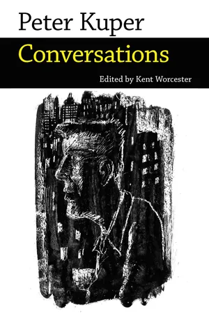
Peter Kuper (b. 1958) is one of the country's leading cartoonists. His artwork has graced the pages and covers of numerous newspapers and magazines, including Time, the New Yorker, Mother Jones, and the New York Times. He is a longtime contributor to Mad magazine, where he has been writing and drawing Spy vs. Spy for two decades, and the cofounder and coeditor of World War 3 Illustrated, the cutting-edge magazine devoted to political graphic art.Most of the interviews collected here are either previously unpublished or long out of print. They address such varied topics as world travels, teaching at Harvard, Hollywood deal-making, climate change, Spy vs. Spy, New York City in the 1970s and 1980s, and World War 3 Illustrated. Among the works examined are his books The System, Sticks and Stones, Stop Forgetting to Remember, Diario de Oaxaca, and adaptations of Franz Kafka's The Metamorphosis and Upton Sinclair's The Jungle. Kuper also discusses his graphic novel Ruins, which received the Eisner Award for Best New Graphic Novel in 2016.Along with two dozen images, this volume features ten lively, informative interviews as well as a quartet of revealing conversations, conducted in collaboration with Kuper's fellow artist Seth Tobocman, with underground comix legends Robert Crumb and Vaughn Bodé, Mad magazine publisher William Gaines, and Jack Kirby.
- 240 pages
- English
- ePUB (mobile friendly)
- Available on iOS & Android
eBook - ePub
About this book
Trusted by 375,005 students
Access to over 1.5 million titles for a fair monthly price.
Study more efficiently using our study tools.
Information
The Long Haul
Previously unpublished. Printed by permission.
RUINS
Kent Worcester: Let’s start with Ruins. A lot of your work is short-form—illustrations, comic strips, one-page stories, and the like. Ruins is 328 pages. Was this something you’d been thinking about for a long time?
Peter Kuper: The first ideas that I had for the book came in 2007, when I was still living in Oaxaca, Mexico. I lived in Oaxaca with my wife and daughter from 2006 to 2008. I had a general idea for a book that was going to be autobiographical, but as time went by it became clear that the story wanted to be bigger than that and needed to step outside my direct experience. I was looking at my contract recently and it said that I was expected to deliver 224 pages. I turned in something that was over a hundred pages longer than that. The ultimate shape of the book depended on what the material was saying, and it kept expanding. It’s definitely the most ambitious work I’ve ever done, by at least one hundred pages. And it explores areas that I’ve avoided until now, for the most part. I’ve tended to avoid fiction, in favor of autobiography. Of course, it draws on things I’ve seen and done, and people I’ve met, especially in Oaxaca.
KW: Do you feel as if you hit a wall with short form cartooning? Are there things you haven’t been able to say via short form cartooning? And isn’t it the case that the longer format automatically pulls you away from a strictly political approach?
PK: I never thought about it that way. It gives you more room to stretch so that the story can wander in lots of different directions. It doesn’t have to make a single point, in other words. Ruins is actually two or three books—there’s the flight of the monarch butterfly, and that’s done wordlessly, and then there’s the lead story about the two characters who move to Mexico, and then there’s a story within the story, about one of the character’s books. Then there are stories about secondary characters who turn out to be pretty interesting in their own right. I’m fitfully trying to explore comics as a form, and I’m interested in all of the different avenues I can go down. I’m still excited by the possibility of comics—adaptation, nonfiction, fiction, political, humorous … with Ruins I can incorporate lots of different approaches. I’m throwing the kitchen sink into it, as it were, and thereby demonstrating to myself as much as anyone what you can do with the form. I’ve been playing with word balloons and panel shapes, as well as the way that color can inform character, place, and time frames. Stylistically I’ve made use of all of the images I recorded in my sketchbooks when we lived in Oaxaca, drawing from life and capturing details. I really wanted to have that in Ruins so that it conveys the flavor of life in that part of Mexico. At the same time, I wanted to make certain that I had a solid and clear story to tell.
KW: A lot of your early work is in black-and-white. It’s not clear from, say, the pages of Bleeding Heart, that color was central to your thinking. Was there a moment when you suddenly thought, “I should be doing more with color”? Was it mostly driven by financial considerations?
PK: Financial concerns are part of it. For a long time most of the opportunities I had were for smaller publications such as World War 3 Illustrated that had to be in black-and-white. And for a long time the idea of using color was pretty daunting. Simply creating longer comics was a big step by itself, and the idea of doing something that was as long as Ruins and in color was something that I hadn’t even considered. For the most part I focused on developing my chops within the short comic format and in black-and-white. Color adds a whole other dimension.
When I teach I only allow students to use black-and-white. I don’t want them to become overwhelmed by the choices that color engenders. It’s nice to have the relative simplicity of black-and-white to work with. It’s like with film—something was lost when film went to color, because of the subtle approaches that people had developed for bringing the most out of black-and-white. Sometimes it serves the work if the imagery is in black-and-white. But color is increasingly affordable, and in my case sketchbooking had a big impact on the way I think about color. I was travelling in Africa and Southeast Asia for eight months and I played around with watercolors in my sketchbooks. When I returned to the U.S., one of the first projects that I worked on was an adaptation of Upton Sinclair’s The Jungle, and the coloring that I had developed in my sketchbooks was in there. In The Jungle I also made use of the stencil-based technique that I was beginning to develop. I showed the editor at First/Classics Illustrated an example of my stencil art, and we decided to use that approach for the entire book, even though I had never done anything with stencils on that sort of scale before. It was a leap of faith, as it were. The book ended up combining this stencil-based technique along with a color palette that I had developed through sketchbooking, although my use of color was bolder in the book than in the sketchbooks. For Ruins I used pen-and-ink and watercolors, rather than stencils, but the book’s color palette itself is ultimately based on things I learned as a sketchbook artist.
KW: It sometimes seems as if you are almost two artists. When you’re working in black-and-white your view of the world seems more pessimistic [laughs], whereas when you use color you’re often invoking natural landscapes. If I see a work of yours that is in black-and-white I can almost assume it’s going to be about politics. There’s a grim side to your black-and-white comics, and an exuberant quality to your colors. Adding color has seemed less like an extension of what you’ve been doing and more like a departure.
PK: That’s an interesting observation, because when I got back from Mexico I went through a period of thinking hard about what kind of work I wanted to produce next. I had spent a couple of decades mostly doing very politically minded illustrations and short nonfiction—much of it intended to be as eye-catching as possible, so that if you saw it from across a room you’d immediately realize what you were looking at. A lot of my work was iconic, poster-ish—a fast read in a lot of ways. When I was in Mexico there was so much subtlety in the color and the imagery of everyday life, as well as in the Mexican artwork that I saw in galleries and museums and in people’s homes. I knew I couldn’t honor Mexico in Ruins without having a subtle color palette. Also, I was beginning to get bored with the type of work I was doing, and a little burned-out. The timing of it was interesting as well. Bush was leaving office, and Obama was just starting his presidency. Obama’s been a mushy president and it’s been a pretty mushy period, politically speaking. It’s not as if everything has been fixed but some of the urgency of the Bush/Cheney years dissipated. I experienced some of the same thing when Clinton became president. This is not to say that either Clinton or Obama have been great presidents, and that everything is fine when a Democrat is in the White House. But sometimes the attack is so much clearer when you have more obvious villains in power.
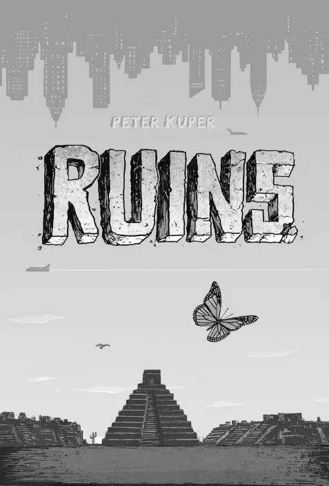
Cover artwork for Kuper’s graphic novel Ruins
KW: Obviously we’ll return to these political issues but let’s talk about color for another minute. When I think about some of your generational counterparts—the Hernandez brothers, Dan Clowes, Peter Bagge—they also moved from mainly working in black-and-white to doing more things in color as the technology became more affordable and as they started to work with bigger publishers. But for the most part these folks have tended to use color very differently than you have—flat colors, and limited palettes, whereas you use a very distinctive palette that is extremely subtle in its effects. Was there a period of time in which you were thinking about color as color or has it always been connected to storytelling?
PK: Drawing from life is almost inevitably going to require bringing in these other palettes. There are subtle patterns and colors in the real world that you don’t find if you’re sitting in front of a computer. My experiences in Mexico, and traveling in Africa and Asia in the late 1980s and 1990s, definitely helped shape my use of color. At the same time, I’m basically schizophrenic—I put on a lot of different clothes. Doing “Spy vs. Spy” is one of my personalities, and it’s almost like being an actor. I go through a process where I’m “getting into the role” of drawing, say, “Spy vs. Spy.” Sometimes I’m more of a German Expressionist. I like to respond to the material, of course. If it’s an adaptation my linework and use of color will reflect what I’m getting out of the writing. Obviously I have a voice of my own but I’m also trying to be true to the material. It’s important to leave that door open. I’m always trying to leave enough room so that my approach can shift depending on what’s happening in the story. That doesn’t mean that my work has to change stylistically from panel to panel, although Dan Clowes does that in Wilson and Ice Haven to some extent, and in a way that definitely works in the context of the story. I like to keep those parameters pretty wide so that I can move into different areas and explore stylistic variety but in a way that doesn’t make it difficult for the reader to follow.
KW: If we look at your early work, it’s pretty easy to identify some of the artists who influenced your work—the artists who contributed to the Masses, for example, Lynd Ward, Frans Masereel, political art from the sixties and seventies, and so on—but it’s not as easy for me to identify the artistic inspirations behind your more recent work, such as Ruins.
PK: I didn’t look at other artists for the color palette that I’ve developed in recent years. That came from travelling and using sketchbooks. But I will say that I’ve learned a lot from looking at David Mazzucchelli’s Asterios Polyp, especially in terms of reminding me about what not to put in backgrounds and so on. I’ve also learned a lot from teaching comics—I always tell students to “make their own adventure” and not to use the same panel designs, fonts, and so on, over and over again. It’s such a long catalogue of things to think about. It’s definitely been the case that I’ve looked at someone else’s work and gone, “Oh right!” and was reminded about something that I thought I already knew. But at this point it’s unlikely that I’m going to be knocked off my game by looking at someone else’s work. My work isn’t suddenly going to look like someone else’s. But it’s important to look at a variety of work, and sometimes it’s useful to take a break from looking at other people’s work, and comics in general.
KW: Having completed Ruins, are you planning to do more of this sort of novelistic work, or are you itching to get back to autobiography?
PK: As usual, when I finish a project I want to move onto something very different. A wordless short story would make sense about now. There was a lot of autobiography in Ruins, of course.
KW: Now that I’ve had a chance to read it, I would say that George is a very different person from you. He’s less you than I thought was going to be the case. For one thing, he’s much more neurotic.
PK: I fall somewhere between George and Samantha. I related to both of them. That’s ideally what happens when you’re working on a story. More than with any other project I identified with several different characters at the same time. I was putting on these different clothes, and stepping into these different personalities. That’s one of the many things that was great about working on Ruins.
EARLY DAYS
KW: Did Heavy Metal help subsidize your career when you were starting out?
PK: Definitely. It was one of the few places that would consistently publish my work, and that would allow me to create all sorts of oddball pieces. And they were paying commercial rates. You couldn’t live on what they paid for very long, but it was way better than what I was making from alternative publishers.
KW: Were you ever tempted to do work for places like Screw and other kinds of porn outlets?
PK: Actually, I think I did do some illustrations for Screw. I never had a problem with them; they were a nice outlet for many cartoonists. I did some political illustrations for another men’s magazine called Swank. I also did a lot of work for Twilight Zone magazine. My confounding schizophrenia … I started out doing a lot of art with linoleum, and I started to get work on that basis, and then I got tired of linoleum and wanted to do something else. Saul Steinberg became a huge influence on my work toward the end of my art school studies, and his influence was particularly important in terms of my sketchbooks. His impact threw everything up in the air and he helped me rethink the whole approach of what I wanted to do. Just at the time when I was heading out into the illustration world my work was pointing in several different directions. I was doing drawings on rocks and airsickness bags, and wanted to do a crazy patchwork of things, and that made it hard for art directors to get a handle on my work. For a long time I would do work for almost any political magazine I could dig up, and I even approached political organizations that would let me do my thing.
KW: Should we assume that, along with Hitchcock and Ch...
Table of contents
- Cover
- Title Page
- Copyright
- Contents
- Introduction
- Chronology
- Peter Kuper Interview
- System Failure
- Comics: Underground, Adult, Real-Life, and Radical
- The World War 3 Illustrated Roundtable
- Diario de Peter Kuper
- Drawn to an International Comic Art Career
- Kuper & Tobocman Celebrate WW3 Illustrated
- World War 3 Has Raged for 35 Years
- Thirty-Five Years of WW3
- The Long Haul
- Interview with Robert Crumb
- Vaughn Bodē Interview
- G.A.S. Lite Presents a Bill Gaines Interview!
- Jack Kirby Interview
- Additional Resources
- Index
Frequently asked questions
Yes, you can cancel anytime from the Subscription tab in your account settings on the Perlego website. Your subscription will stay active until the end of your current billing period. Learn how to cancel your subscription
No, books cannot be downloaded as external files, such as PDFs, for use outside of Perlego. However, you can download books within the Perlego app for offline reading on mobile or tablet. Learn how to download books offline
Perlego offers two plans: Essential and Complete
- Essential is ideal for learners and professionals who enjoy exploring a wide range of subjects. Access the Essential Library with 800,000+ trusted titles and best-sellers across business, personal growth, and the humanities. Includes unlimited reading time and Standard Read Aloud voice.
- Complete: Perfect for advanced learners and researchers needing full, unrestricted access. Unlock 1.5M+ books across hundreds of subjects, including academic and specialized titles. The Complete Plan also includes advanced features like Premium Read Aloud and Research Assistant.
We are an online textbook subscription service, where you can get access to an entire online library for less than the price of a single book per month. With over 1.5 million books across 990+ topics, we’ve got you covered! Learn about our mission
Look out for the read-aloud symbol on your next book to see if you can listen to it. The read-aloud tool reads text aloud for you, highlighting the text as it is being read. You can pause it, speed it up and slow it down. Learn more about Read Aloud
Yes! You can use the Perlego app on both iOS and Android devices to read anytime, anywhere — even offline. Perfect for commutes or when you’re on the go.
Please note we cannot support devices running on iOS 13 and Android 7 or earlier. Learn more about using the app
Please note we cannot support devices running on iOS 13 and Android 7 or earlier. Learn more about using the app
Yes, you can access Peter Kuper by Kent Worcester in PDF and/or ePUB format, as well as other popular books in Literature & Literary Collections. We have over 1.5 million books available in our catalogue for you to explore.