- 160 pages
- English
- ePUB (mobile friendly)
- Available on iOS & Android
eBook - ePub
Computers and Typography 2
About this book
This second Volume of Computers and Typography reflects new developments in this rapidlychanging field. This book complements without in any way supplanting Volume1 through an extensive elaboration of issues that were considered only briefly the first Volume. Its aim is to alert those involved in computer interface design that the skills of layout, spacing and usage of type are equally vital in the constuction of onscreen layouts as they are on the printed page.
Trusted by 375,005 students
Access to over 1.5 million titles for a fair monthly price.
Study more efficiently using our study tools.
Information
PART 1
ISSUES INVOLVED IN THE DESIGN OF WEB SITES
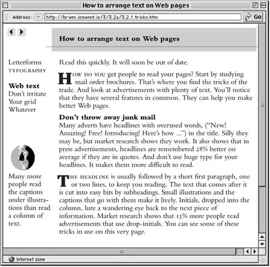
How to arrange text on web pages
GUNNLAUGUR SE BRIEM LETTERFORM DESIGNER CALIFORNIA
‘Does your information really need every bell, whistle, and blinking light of an arcade game?’
Computer screens are not like paper: typography on the web
ARI DAVIDOW TYPOGRAPHER WHO NOW APPLIES HIS SKILLS TO THE WEB AND TO VIRTUAL COMMUNITY. [email protected]
‘Given the restraints created by today’s web browsers and by HTML, typography, as it is understood to relate to fonts, might seem irrelevant to the web. This is not true, although the issues and the solutions are different to those used for print.’
GUNNLAUGUR SE BRIEM
How to arrange text on web pages
ARI DAVIDOW
Computer screens are not like paper: typography on the web
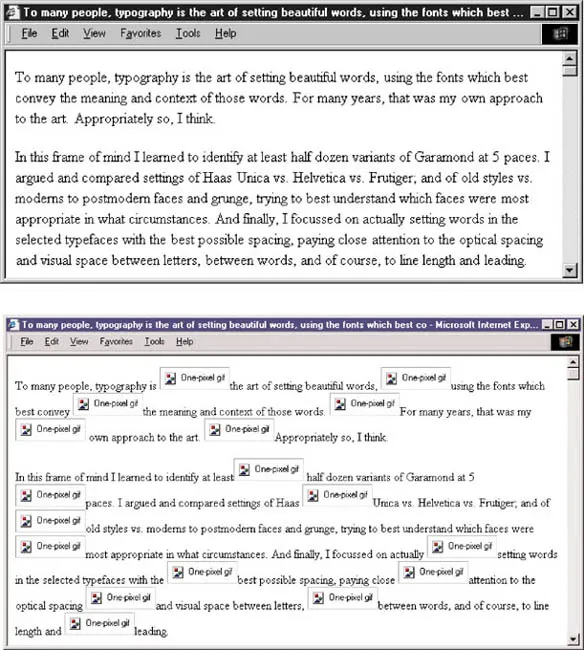
To many people, typography is the art of setting beautiful words, using the fonts which best convey the meaning and context of those words. For many years, that was my own approach to the art. I learned to identify at least half a dozen variants of Garamond at 5 paces. I argued and compared settings of Haas Unica vs. Helvetica vs. Frutiger; and of old styles vs. moderns to postmodern faces and grunge, trying to best understand which faces were most appropriate in what circumstances. Finally I focused on actually setting words in the selected typefaces with the best possible spacing, paying close attention to the optical spacing and visual space between letters, between words, and of course, to line length and leading.
These are important issues. To many people, they are typography. It is important to realise, however, that to limit typography to the font, size and leading is to study the details, while missing the forest: the broader issues of communicating print to eye, and of doing so in as economical manner as possible.
What made the invention of the printing press revolutionary was not the fonts. Indeed, I am sure that many contemporaries entirely missed the beauty of those initial books, seeing only that they lacked much of the grace of handwritten manuscript. Instead, the printing press made possible the mass production of books. It opened the door to making more information accessible to more people than ever before in history, more clearly and less expensively. Yet industrialised type is not inherently readable or accessible, it is simply mass-produced. The basis for typography as I understand it is the art of ameliorating that mass production and conveying that more information less expensively, with grace. It was only after years of increasing knowledge that this began to sink in too. (The assumption that I possessed the knowledge was fairly immediate; knowing enough not to be an utter fool took longer.) Indeed, I was taught to follow specs, to identify typefaces, and to set them well: well-kerned and letterspaced as appropriate; with correctly cut small caps rather than photographic or digital imitations where necessary. I hadn’t really paid attention to broader typographic issues except as specified by customers of the type shop wherein I worked.
My epiphany occurred while reading Ferdinand Baudin’s How Typography Works. This handwritten book on typography first called my attention to the concept of the page. Of course, once I began to think of how letters and words sat upon a page, rather than the beauty of individual letters or words, I came to see pages entirely differently. I was bound to see web pages in terms of access and readability, rather than in tricking a screen not designed for the purpose, into displaying something derived from Simoncini Garamond 12 pt.
For example, having previously missed the critical sections in Ruari McLean’s The Thames and Hudson Manual of Typography, or Geoffrey Dowding’s Finer Points in the Spacing & Arrangement of Type (to pick two obvious examples), I now began paying attention to how many words were put on a line. Reading an otherwise well-formed but difficult-to-read book, I would find myself counting the numbers of characters in a series of lines. Sure enough, the move into desktop publishing has opened the field to a plethora of people who confuse visually appealing with “readable.” If you consider that 10–12 words, or about 60–65 characters, are as many as the human eye will generally read comfortably in a line of text at standard leading, you will share my discomfort. An astonishing number of books now present difficult-to-muddle-through average line lengths of 80 or 100 characters. The opposite is also true. Books that are easy and comfortable to read, even when the contents are Heidegger or Calculus, seem quite approachable (well, up to a point) when the line length is shorter. There is also a lower limit. When the line length drops below about 40 characters, the length one might see in an average magazine or newspaper column, the average reader becomes impatient.
Poor selection of font, size, line length, and leading became worse when computer word processors began supporting normal type, rather than the fixed-width typewriter imitations with which they began. I found myself calling my students’ attention to the fact that no major word processor has been shipped with default line width/ type size settings that bore any relationship to visual literacy. Because most early laser printers could be guaranteed to support Helvetica and Times New Roman, people began using the two faces together as though they naturally complement each other. (They don’t.) The default typeface in Microsoft Word is Times 10pt, which at the default margins yields an astonishingly opaque 100 characters/line, at a leading (called “line spacing” by much current software) suitable for half that width.
Still, even I was astonished when I began exploring this fascinating new medium, the world wide web. That part of me that has always been interested in making more information available to more people, more quickly, more clearly, and less expensively, is easy to impress with text markup, even the simple markup afforded by the initial HTML specifications.
Yet, when I began to consider issues of “display”, I became confused. How does one represent this information most clearly on the computer screen? I found the settings on my “Mosaic” browser for choosing typefaces and sizes. Surprisingly, there appeared to be no controls for page width, or leading. This came as quite a surprise to someone who remembered dedicated typesetting systems that wouldn’t let one begin typing until the four “basic” parameters - font, size, page width, leading - were specified. This seemed especially important since text seemed to flow to the width of the window created for the browser, on the reader’s computer. That users will attempt to see as much of a web “page” in one view is quite natural, given the affordance, and given the extreme low resolution of standard computer displays. Yet, surely no one would design a text display system in which basic visual literacy could be so violated so unthinkingly?
Since browsers hadn’t been designed to allow users to mess with basic typographic controls, I sought them in the HTML specification. I tried earnest study. Then I tried posting in online forums, sure that everyone but me got the joke: “C’mon guys, where are the basic typographic controls?” There were none. And, indeed, when HTML evolved to provide such controls, enough time had passed to realise that such controls were out of context and inappropriate ways of visualizing how to best display information using this new medium.
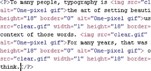
In the meantime, this lack of typographic control did leave many traditional page designers nonplussed. Plausible responses came quickly. Most notably, in 1996, not a year after the web began encroaching upon general public consciousness, David Siegel wrote a book on page design for the web which included, among other things, the idea of placing a plethora of teeny tiny graphics in lines (the “single-pixel gif”) such that browsers would increase the space between lines to something that might provide readability.
Those who attempted to follow Siegel’s advice soon discovered that it created some enormous problems. The most obvious problem was that anyone viewing such pages without having instructed their web browser to display images (common in that era of slow modems and slow web servers) could no longer read the information. Repurposing the pages and searching them using the new full-text search tools became problematic because of the overflowing cornucopia of irrelevant codes.
The core issue, however, was not leading – any browser manufacturer at any time could have resolved basic viewability by giving users sane defaults or reasonable controls over such parameters. None did, and few users thought to ask. Designers “knew” that typography consisted of being able to specify fonts and sizes and leading, but few apparently had considered the difference between portraying information in a book, or on paper, and portraying that same information on a standard computer screen.
Let’s consider. The average “book quality” imagesetter – the poor digital equivalent to the impression and ink flow of cold metal – uses about 2500 x 2500 dots per square inch, or over 6 million bits of information. The average computer screen offers less than 100 dots squared (usually 72dpi or 96dpi), which adds up to about 5000 bits of information – less than 1/1000th of the resolution in a common book and many many times less than even the common 600dpi office laserprinter.
This looks quite nice if you are viewing with image display on. Below, see what happens if your browser can’t, or isn’t, displaying images.
One can begin to intuit that good web typography might shape itself differently than good print typography. So when the HTML 4.0 specification incorporated “cascading style sheets” (CSS) in which one could, in fact, specify type size by point (a point, today, being about 1 pixel on a computer screen, or a bit less), and one could specify leading – also in points should one be under the illusion that this was relevant, one could also intuit that this is not dissimilar to having millions of one mark bills in Germany in the 1930s, when it took millions of marks to purchase a potato. The fact that each major web browser understands CSS differently, and evidences different forms of bugginess when interpreting pages coded using CSS, only adds a few extra wheelbarrows of useless currency. (Most notably, CSS styles need to be specified anew in each table cell in Netscape 4. This, at least, is predictable. It is not nearly so debilitating as the fact that the same browser happily interprets separate tables, all specified alike, differently on the same page.)
The quagmire is only deepened when one considers that there are two ways of specifying specifications – what the page designer put on the page, and what the reader specified in his or her personal web controls. Happily, few viewers mess with personal controls, and most, where necessary, can be overridden by the people viewing the pages. Some cannot. The poor viewer who has set his or her web browser to display pages at a large size, so as to overcome problems of distance or vision, is undone by the designer whose wisdom demands specifying specific sizes on the pages. Of course, one need only sit with a Macintosh and a Windows computer side by side to realize that “size” as relates to fonts in a web browser is significantly different between computers.
In addition to the type and size and leading problems, there are other cues available to readers of printed matter that are unavailable to the web. The most important is “foreshadowing.” When you pick up a book, you can tell how thick it is, how big the index is, how the chapters are divided, where the illustrations are, and whether or not they are frequent, all at a glance. In two seconds you can follow the page numbers and know how long the item is.
There is no such indicator on the web. There is no easy way to sense how long a web page is, much less what will happen when one follows a hypertext link. It is my belief that this correlates strongly with the desirability of making browser wind...
Table of contents
- Cover
- Title Page
- Copyright Page
- Contents
- Introduction
- Part 1 Issues Involved in the Design of Web Sites
- Part 2 Non-Latin Typography
- Part 3 Changes in Work Practices
- Part 4 Letterforms and the Computer
- Part 5 Typography and Educational Software
- Epilogue
- Index
Frequently asked questions
Yes, you can cancel anytime from the Subscription tab in your account settings on the Perlego website. Your subscription will stay active until the end of your current billing period. Learn how to cancel your subscription
No, books cannot be downloaded as external files, such as PDFs, for use outside of Perlego. However, you can download books within the Perlego app for offline reading on mobile or tablet. Learn how to download books offline
Perlego offers two plans: Essential and Complete
- Essential is ideal for learners and professionals who enjoy exploring a wide range of subjects. Access the Essential Library with 800,000+ trusted titles and best-sellers across business, personal growth, and the humanities. Includes unlimited reading time and Standard Read Aloud voice.
- Complete: Perfect for advanced learners and researchers needing full, unrestricted access. Unlock 1.5M+ books across hundreds of subjects, including academic and specialized titles. The Complete Plan also includes advanced features like Premium Read Aloud and Research Assistant.
We are an online textbook subscription service, where you can get access to an entire online library for less than the price of a single book per month. With over 1.5 million books across 990+ topics, we’ve got you covered! Learn about our mission
Look out for the read-aloud symbol on your next book to see if you can listen to it. The read-aloud tool reads text aloud for you, highlighting the text as it is being read. You can pause it, speed it up and slow it down. Learn more about Read Aloud
Yes! You can use the Perlego app on both iOS and Android devices to read anytime, anywhere — even offline. Perfect for commutes or when you’re on the go.
Please note we cannot support devices running on iOS 13 and Android 7 or earlier. Learn more about using the app
Please note we cannot support devices running on iOS 13 and Android 7 or earlier. Learn more about using the app
Yes, you can access Computers and Typography 2 by Rosemary Sassoon in PDF and/or ePUB format, as well as other popular books in Art & Art General. We have over 1.5 million books available in our catalogue for you to explore.