A comprehensive guide to design, build and execute effective Big Data strategies using HadoopAbout This Book• Get an in-depth view of the Apache Hadoop ecosystem and an overview of the architectural patterns pertaining to the popular Big Data platform• Conquer different data processing and analytics challenges using a multitude of tools such as Apache Spark, Elasticsearch, Tableau and more• A comprehensive, step-by-step guide that will teach you everything you need to know, to be an expert Hadoop ArchitectWho This Book Is ForThis book is for Big Data professionals who want to fast-track their career in the Hadoop industry and become an expert Big Data architect. Project managers and mainframe professionals looking forward to build a career in Big Data Hadoop will also find this book to be useful. Some understanding of Hadoop is required to get the best out of this book.What You Will Learn• Build an efficient enterprise Big Data strategy centered around Apache Hadoop• Gain a thorough understanding of using Hadoop with various Big Data frameworks such as Apache Spark, Elasticsearch and more• Set up and deploy your Big Data environment on premises or on the cloud with Apache Ambari• Design effective streaming data pipelines and build your own enterprise search solutions • Utilize the historical data to build your analytics solutions and visualize them using popular tools such as Apache Superset • Plan, set up and administer your Hadoop cluster efficientlyIn DetailThe complex structure of data these days requires sophisticated solutions for data transformation, to make the information more accessible to the users.This book empowers you to build such solutions with relative ease with the help of Apache Hadoop, along with a host of other Big Data tools.This book will give you a complete understanding of the data lifecycle management with Hadoop, followed by modeling of structured and unstructured data in Hadoop. It will also show you how to design real-time streaming pipelines by leveraging tools such as Apache Spark, and build efficient enterprise search solutions using Elasticsearch. You will learn to build enterprise-grade analytics solutions on Hadoop, and how to visualize your data using tools such as Apache Superset. This book also covers techniques for deploying your Big Data solutions on the cloud Apache Ambari, as well as expert techniques for managing and administering your Hadoop cluster. By the end of this book, you will have all the knowledge you need to build expert Big Data systems.Style and approachComprehensive guide with a perfect blend of theory, examples and implementation of real-world use-cases
- 394 pages
- English
- ePUB (mobile friendly)
- Available on iOS & Android
eBook - ePub
Modern Big Data Processing with Hadoop
About this book
Trusted by 375,005 students
Access to over 1 million titles for a fair monthly price.
Study more efficiently using our study tools.
Information
Designing Data Visualization Solutions
Once we have the data living in the Hadoop ecosystem and it's been processed, the next logical step is to build the analytics that drive the business decisions.
In this chapter, we will learn the following topics:
- Data visualization
- Apache Druid
- Apache Superset
Data visualization
Data visualization is the process of understanding the relationships between various entities in the raw data via graphical means. This is a very powerful technique because it enables end users to get the message in a very easy form without even knowing anything about the underlying data.
Data visualization plays a very important role in visual communication of insights from big data. Its both an art and a science, and requires some effort in terms of understanding the data; at the same time we need some understanding of the target audience as well.
So far, we have seen that any type of data can be stored in the Hadoop filesystem (HDFS). In order to convert complex data structures into a visual form, we need to understand the standard techniques that are used to represent the data.
In data visualization, the message is conveyed to the end users in the form of graphics which can be in 1D, 2D, 3D, or even higher dimensions. This purely depends on the meaning we are trying to convey.
Let's take a look at the standard graphics that are used to convey visual messages to users:
- Bar/column chart
- Line/area chart
- Pie chart
- Radar chart
- Scatter/bubble chart
- Tag Cloud
- Bubble chart
Bar/column chart
This is a 2D graphical representation of data where the data points are shown as vertical/horizontal bars. Each bar represents one data point. When there is no time dimension involved with reference to the data points, the order in which these points are shown might not make any difference. When we deal with time series data for representing bar charts, we generally follow the chronological order of display along the X (horizontal) axis.
Let's take a look at a sample chart that is generated with four data points. The data represents the amount each user has:
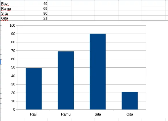
Interpretation: The graph has both text data in rows and columns, and also visuals. If you observe carefully, the textual data is smaller in size and has only four records. But the visual graphic conveys the message straightaway without knowing anything about the data.
The message the graph conveys is that:
- Sita has more money than everyone
- Gita has the least money
Other interpretations are also possible. They are left to the reader.
Line/area chart
This is also typically a 2D chart where each data point is represented as a point on canvas and all these points belonging to the same dataset are connected using a line. This chart becomes an area chart when the region from the horizontal/vertical axis is completely covered up to the line.
There can be more than one line in the same graph, which indicates multiple series of data for the same entities.
Let's take a look at the sample of this area chart based on the same data as before:
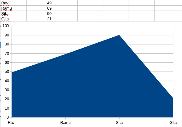
These are the properties of the chart:
- The x axis has the list of all the people
- The y axis indicates the amount from 0 to 100
- Points are drawn on the graph at four places, corresponding to the values in tabular form
- Points are connected with straight lines
- The area is filled below the line to make it an area chart
Pie chart
This is also a 2D chart drawn as multiple sectors in a circle. This char...
Table of contents
- Title Page
- Copyright and Credits
- Packt Upsell
- Contributors
- Preface
- Enterprise Data Architecture Principles
- Hadoop Life Cycle Management
- Hadoop Design Consideration
- Data Movement Techniques
- Data Modeling in Hadoop
- Designing Real-Time Streaming Data Pipelines
- Large-Scale Data Processing Frameworks
- Building Enterprise Search Platform
- Designing Data Visualization Solutions
- Developing Applications Using the Cloud
- Production Hadoop Cluster Deployment
Frequently asked questions
Yes, you can cancel anytime from the Subscription tab in your account settings on the Perlego website. Your subscription will stay active until the end of your current billing period. Learn how to cancel your subscription
No, books cannot be downloaded as external files, such as PDFs, for use outside of Perlego. However, you can download books within the Perlego app for offline reading on mobile or tablet. Learn how to download books offline
Perlego offers two plans: Essential and Complete
- Essential is ideal for learners and professionals who enjoy exploring a wide range of subjects. Access the Essential Library with 800,000+ trusted titles and best-sellers across business, personal growth, and the humanities. Includes unlimited reading time and Standard Read Aloud voice.
- Complete: Perfect for advanced learners and researchers needing full, unrestricted access. Unlock 1.4M+ books across hundreds of subjects, including academic and specialized titles. The Complete Plan also includes advanced features like Premium Read Aloud and Research Assistant.
We are an online textbook subscription service, where you can get access to an entire online library for less than the price of a single book per month. With over 1 million books across 990+ topics, we’ve got you covered! Learn about our mission
Look out for the read-aloud symbol on your next book to see if you can listen to it. The read-aloud tool reads text aloud for you, highlighting the text as it is being read. You can pause it, speed it up and slow it down. Learn more about Read Aloud
Yes! You can use the Perlego app on both iOS and Android devices to read anytime, anywhere — even offline. Perfect for commutes or when you’re on the go.
Please note we cannot support devices running on iOS 13 and Android 7 or earlier. Learn more about using the app
Please note we cannot support devices running on iOS 13 and Android 7 or earlier. Learn more about using the app
Yes, you can access Modern Big Data Processing with Hadoop by V. Naresh Kumar, Prashant Shindgikar in PDF and/or ePUB format, as well as other popular books in Computer Science & Data Mining. We have over one million books available in our catalogue for you to explore.