In Class Dismissed, John Marsh debunks a myth cherished by journalists, politicians, and economists: that growing poverty and inequality in the United States can be solved through education. Using sophisticated analysis combined with personal experience in the classroom, Marsh not only shows that education has little impact on poverty and inequality, but that our mistaken beliefs actively shape the way we structure our schools and what we teach in them.
Rather than focus attention on the hierarchy of jobs and power—where most jobs require relatively little education, and the poor enjoy very little political power—money is funneled into educational endeavors that ultimately do nothing to challenge established social structures, and in fact reinforce them. And when educational programs prove ineffective at reducing inequality, the ones whom these programs were intended to help end up blaming themselves. Marsh’s struggle to grasp the connection between education, poverty, and inequality is both powerful and poignant.
- 328 pages
- English
- ePUB (mobile friendly)
- Available on iOS & Android
eBook - ePub
About this book
Trusted by 375,005 students
Access to over 1.5 million titles for a fair monthly price.
Study more efficiently using our study tools.
Information
Topic
EducationSubtopic
Educational Policy1. The Paths of Inequality Lead But to the Grave
Wander around a Glasgow graveyard long enough and you may notice something unusual. In the nineteenth and early twentieth centuries some Scottish families built obelisks to commemorate their dead (the obelisks look like smaller Washington monuments). Meanwhile, other families had to settle for common headstones. As indicated by the birth and death dates etched onto the memorials, the dead commemorated by obelisks had considerably longer life spans than those commemorated by common headstones. On average, those with commemorative obelisks died at age sixty-five for men and sixty-three for women. By contrast, the average Glasgow man during this period died at age fifty and the average woman at age fifty-two.1
You probably do not need too many guesses as to why those with obelisks lived longer than those without. Obelisks were not cheap. In general, only well-to-do families could afford to build them for their dead. Working-class and poor families could not. Since the wealthy tend to live longer than everyone else, those commemorated by expensive obelisks would also tend to live much longer than those who had to settle for ordinary headstones—and much, much longer than those who could not even afford a headstone.
Strikingly, the obelisks remind us that though time is money, money is also time. The rich, simply put, have more time on this earth than the poor. And these disparities are not just a relic of the nineteenth and twentieth centuries. In Scotland, as elsewhere, including the United States, the rich continue to live longer, healthier lives than everyone else, especially the poor. “Poorer people,” as one leading economist has summarized the overwhelming evidence, “die younger and are sicker than rich people.”2
This is not the unusual thing about these graveyards, however. If you kept investigating the obelisks, you would notice something even stranger than the disparities between the rich and everyone else. Whereas most of the dead with obelisks lived longer than those without obelisks, some of the dead commemorated by obelisks lived longer than others who also had obelisks. By itself, that would not be all that remarkable since even rich people die at different ages. But if you got out your yardstick and began to measure the height of the obelisks, you would find something remarkable. On average, those with the tallest obelisks also had the longest life spans. In fact, for each additional yard or so of obelisk height, the dead commemorated by that obelisk lived an additional 1.93 years for men and 2.92 years for women.3
Why is that strange? Because most if not all of the dead commemorated by obelisks came from the same class of well-to-do merchants and professionals. Few, next to none at all, would have been exposed to the pestilent living or hazardous working conditions of workers and the poor. Those conditions, presumably, explain why the rich live longer than the poor. But if none of the well-off was exposed to those perilous conditions, why would some of the rich, those with taller obelisks, live longer than others, those with shorter obelisks? Either you could afford nutritious food and what passed for first-rate health care in nineteenth- and early twentieth-century Scotland or you could not. Most if not all of those with obelisks could. So why did those with taller obelisks live longer than those with shorter ones?
The solution to this puzzle lies in the fact that inequalities of wealth do not just influence differences in life spans between classes but within classes as well. To some extent, the height of obelisks stands in for the wealth of the dead. Some wealthy families could purchase more obelisk than others, and people from those families lived longer than those whose families could afford less. Not only did the rich live longer than the poor, but the very richest lived longer than the merely rich, who in turn lived longer than the barely rich. Thus, even among the rich, differences in wealth—relative versus absolute well-being—partly determined how long a Scotsman would live.
In short, poverty kills. But so does not being quite as well-off as your neighbors.
You may want to keep these obelisks in mind as I explore the significance of poverty and economic inequality in the United States in this chapter. For some, it will not seem like too great a problem if others believe that education will rescue people or the nation from poverty and economic inequality. That is not because these critics believe education will or can do these things. Rather, they believe that the problems such mistaken beliefs seek to combat (poverty and inequality) do not qualify as problems. If you do not think that rising levels of obesity in the United States count as a problem, for example, then you will not worry too much about the federal government’s misguided plan to combat it by distributing slimming funhouse mirrors to families across the nation. Similarly, if you do not think that poverty and economic inequality count as problems, then you will not much care if the nation chooses a quixotic approach like education to solving them.
In this chapter, I explain why poverty and economic inequality matter, why they count as grave problems, so to speak, and why, therefore, we would do well to lessen them. While all that may seem blandly self-evident, I can assure you it is not. Many people, mostly but not all conservatives, argue that as a nation we worry too much about poverty and economic equality and therefore devote too many resources to combating them. In particular, these critics assert that common methods of calculating poverty and, especially, economic inequality, exaggerate their extent and severity. In terms of economic inequality, however, such critics argue that even if it were as widespread and severe as people are led to believe, that does not make it a problem. Indeed, far from being a problem, economic inequality may be a good thing.
I hope to convince you otherwise, to demonstrate that poverty and economic inequality entail real costs, not just for those on the losing end of them, but for everyone. In other words, we are all on the losing end of them. These are not the only reasons to wish that the United States had less poverty and more economic equality, but they are among the most compelling.
In the next chapter, I examine whether education is the best, or even a feasible solution to these problems. In what follows, I survey the most recent data about poverty and income inequality in the United States. I also focus on how poverty and economic inequality have changed over time, and how the United States compares to other rich countries in terms of the extent and severity of these, yes, problems. Although researchers have come to a new, more accurate appreciation of these disparities in the last decade, few people are aware of quite how much poverty the United States has or quite how unequal it has become. Fewer still are aware of how much damage poverty and economic inequality do to individuals, communities, and the nation. I should warn you in advance that some of this discussion, here and in later chapters, gets a bit technical, but since I am an English professor, it can get only so technical.
Poverty
According to the most recent data from the Census Bureau, in 2009, and based on income alone, 14.3 percent of Americans, over 43 million people, lived in poverty.4 (For 2009, a family of four—two parents, two children—had to earn $21,756 or less to be considered living in poverty.)5 That is one out of every seven people in the United States. The poverty rate for children was even higher, about 21 percent, well over 15 million.6 That is slightly more than one out of every five children in the United States.
As even the Census Bureau admits, these numbers do not capture the extent or the depth of poverty in the United States. In particular, critics charge that the formula used to determine the poverty threshold, developed in 1963 from patterns of consumption that have changed immensely since then, vastly undercounts the number of poor. (In brief, the poverty threshold was calculated by determining the cost of how much food a family of a given size would need. Since a study showed that families spent about one-third of their budget on food, multiplying the cost of that food budget by three would give you a poverty threshold.)7 Recognizing these limitations, many state and federal anti-poverty programs raise the maximum income for eligibility to some percentage of the poverty threshold. By this revised measure, say 150 percent of the poverty level, which was the number I used to determine who would be eligible for the Odyssey Project, over 70 million people, or 23.6 percent of the population, live in or near poverty.8 That is roughly one out of every four people.
Out of context these numbers may mean little. Unless one believes that any number of people living in poverty is too many—a defensible if unlikely ideal—the better approach may be to ask how the United States compares with other developed countries. If the United States does no worse than other countries, one might regret its poverty rate. But it would hardly seem worth singling it out for censure. However, the United States compares rather badly to other countries in terms of the number of citizens living in poverty.
As one might guess from the unique way the United States calculates poverty thresholds, comparisons across countries are difficult. For this reason, the Organization for Economic Co-operation and Development (OECD) relies on a relative measure to determine extents of poverty in different countries. That is, it determines who is poor by asking how many people in a given country have incomes less than half the national median income. (A median is the numeric value that separates the higher half of a set from the lower half. Half of all people have an income greater than the median, and half of all people have an income less than the median.) Unlike the Census Bureau, the OECD also accounts for the effect of taxes on income. By this measure, the United States ranks third worst among OECD countries in extent of poverty, behind Mexico and Turkey, with roughly 17 percent of the population earning less than half the median national income.9 Excluding emerging countries like Mexico and Turkey, and using the OECD measure, the United States has the highest poverty rate among developed nations.
FIGURE 1.1: The Evolution of Low, Middle, and High Family Incomes from 1947 to 2009 (relative)
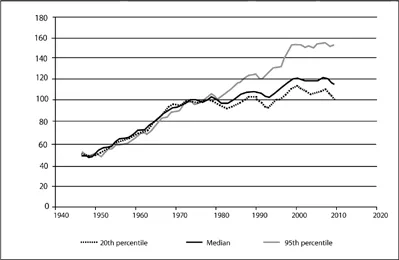
Source: Author’s analysis of U.S. Census Bureau data. See U.S. Census Bureau, Table F-1, “Income Limits for Each Fifth and Top 5 Percent of Families (All Races)”; and Table F-7, “Type of Family by Median and Mean Income (All Races).”
Economic Inequality
When presidents and journalists discuss the relation between education and economics, they more often than not have in mind economic inequality rather than poverty. And about economic inequality in the United States, they are right. It is real. And unlike poverty, which has hovered between 11 and 15 percent since 1966, economic inequality has been steadily rising for more than twenty-five years.10
FIGURE 1.2: The Evolution of Low, Middle, and High Family Incomes from 1947 to 2009 (absolute)
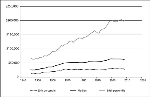
Source: Author’s analysis of U.S. Census Bureau data. See U.S. Census Bureau, Table F-1, “Income Limits for Each Fifth and Top 5 Percent of Families (All Races)”; and Table F-7, “Type of Family by Median and Mean Income (All Races).”
The study of economic inequality turns on the question of who benefited from economic growth during the last three decades, and how that pattern of growth differed from earlier periods. Figure 1.1 offers a preliminary answer to that question. It plots the evolution of low, middle, and high family incomes from 1947 to 2009.11 (The y axis represents the ratio of each family’s income relative to how much it earned in 1973. Thus 1973 = 100.)
From 1947 to the late-1970s, the incomes of families at the 20th, median, and 95th percentiles increase virtually identically. The rich are still rich, of course, and the poor still poor, but a rising tide—economic growth—is lifting all boats.
In the late 1970s, however, this pattern shifts. Overall, the economy grows at a slower pace. But some families start to receive more of that growth than others. Families at the 20th percentile see their incomes more or less stagnate, while the median family does slightly better. Only those at the 95th percentile continue to grow at the rate every other family did prior to the late 1970s. For the families at the 95th percentile the good times never stopped.
Figure 1.2 offers another depiction of this pattern. Instead of indexing incomes to 1973, it simply charts the evolution of incomes at the 20th, median, and 95th percentiles from 1947 to 2009. You can still see, though, the 95th percentile family gradually separate from the median and 20th percentile families.
A family at the 20th percentile in 1973 earned $26,240, adjusted for inflation. In 2009, that same 20th percentile family earned $26,934. In other words, in 2009, that family made just about exactly what it did in 1979. (These are not the same families, of course, but families that when the economic picture is snapped happen to occupy the 20th or median or whatever percentile.) Meanwhile, the median family in 1973 earned $52,001, and a median family in 2009 earned $60,088, for an increase of about 15 or 16 percent.12 By contrast, families at the 95th percentile did remarkably well over the same period. In 1973, they earned $129,517. In 2009, they earned $200,000, an increase of about 43 percent. So whereas income has increased for most families since 1973, it has grown at a much more rapid clip for families who were already well-off.
FIGURE 1.3: Two Eras of Economic Growth and Distribution
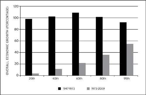
Source: Author’s analysis of U.S. Census Bureau data. See U.S. Census Bureau, Table F-1, “Income Lim...
Table of contents
- Cover page
- Title Page
- Copyright Page
- Contents
- Acknowledgments
- Introduction: Unintended Consequences
- 1. The Paths of Inequality Lead But to the Grave
- 2. Which Supply Side Are You On?
- 3. A Nation of Carnegies: The Puritans to the Great Depression
- 4. A Nation of Carnegies: The Second World War to the Present
- 5. Belling the Cat
- Appendix: The Gini Coefficient
- Notes
- Index
Frequently asked questions
Yes, you can cancel anytime from the Subscription tab in your account settings on the Perlego website. Your subscription will stay active until the end of your current billing period. Learn how to cancel your subscription
No, books cannot be downloaded as external files, such as PDFs, for use outside of Perlego. However, you can download books within the Perlego app for offline reading on mobile or tablet. Learn how to download books offline
Perlego offers two plans: Essential and Complete
- Essential is ideal for learners and professionals who enjoy exploring a wide range of subjects. Access the Essential Library with 800,000+ trusted titles and best-sellers across business, personal growth, and the humanities. Includes unlimited reading time and Standard Read Aloud voice.
- Complete: Perfect for advanced learners and researchers needing full, unrestricted access. Unlock 1.5M+ books across hundreds of subjects, including academic and specialized titles. The Complete Plan also includes advanced features like Premium Read Aloud and Research Assistant.
We are an online textbook subscription service, where you can get access to an entire online library for less than the price of a single book per month. With over 1.5 million books across 990+ topics, we’ve got you covered! Learn about our mission
Look out for the read-aloud symbol on your next book to see if you can listen to it. The read-aloud tool reads text aloud for you, highlighting the text as it is being read. You can pause it, speed it up and slow it down. Learn more about Read Aloud
Yes! You can use the Perlego app on both iOS and Android devices to read anytime, anywhere — even offline. Perfect for commutes or when you’re on the go.
Please note we cannot support devices running on iOS 13 and Android 7 or earlier. Learn more about using the app
Please note we cannot support devices running on iOS 13 and Android 7 or earlier. Learn more about using the app
Yes, you can access Class Dismissed by John Marsh in PDF and/or ePUB format, as well as other popular books in Education & Educational Policy. We have over 1.5 million books available in our catalogue for you to explore.