A complete guide to designing and building fun games with Qt and Qt Quick using associated toolsetsAbout This Book• A step by step guide to learn Qt by building simple yet entertaining games• Get acquainted with a small yet powerful addition—Qt Gamepad Module, that enables Qt applications to support the use of gamepad hardware• Understand technologies such as QML, OpenGL, and Qt Creator to design intuitive gamesWho This Book Is ForIf you want to create great graphical user interfaces and astonishing games with Qt, this book is ideal for you. No previous knowledge of Qt is required; however knowledge of C++ is mandatory.What You Will Learn• Install the latest version of Qt on your system• Understand the basic concepts of every Qt game and application• Develop 2D object-oriented graphics using Qt Graphics View• Build multiplayer games or add a chat function to your games with Qt Network module• Script your game with Qt QML• Explore the Qt Gamepad module in order to integrate gamepad support in C++ and QML applications• Program resolution-independent and fluid UIs using QML and Qt Quick• Control your game flow in line with mobile device sensors• Test and debug your game easily with Qt Creator and Qt TestIn DetailQt is the leading cross-platform toolkit for all significant desktop, mobile, and embedded platforms and is becoming popular by the day, especially on mobile and embedded devices. It's a powerful tool that perfectly fits the needs of game developers. This book will help you learn the basics of Qt and will equip you with the necessary toolsets to build apps and games.The book begins by how to create an application and prepare a working environment for both desktop and mobile platforms. You will learn how to use built-in Qt widgets and Form Editor to create a GUI application and then learn the basics of creating graphical interfaces and Qt's core concepts.Further, you'll learn to enrich your games by implementing network connectivity and employing scripting. You will learn about Qt's capabilities for handling strings and files, data storage, and serialization.Moving on, you will learn about the new Qt Gamepad module and how to add it in your game and then delve into OpenGL and Vulcan, and how it can be used in Qt applications to implement hardware-accelerated 2D and 3D graphics. You will then explore various facets of Qt Quick: how it can be used in games to add game logic, add game physics, and build astonishing UIs for your games.By the end of this book, you will have developed the skillset to develop interesting games with Qt.Style and approachLearn Qt with the help of numerous sample games, introduced step-by-step in each chapter
- 704 pages
- English
- ePUB (mobile friendly)
- Available on iOS & Android
eBook - ePub
Game Programming using Qt 5 Beginner's Guide
About this book
Trusted by 375,005 students
Access to over 1.5 million titles for a fair monthly price.
Study more efficiently using our study tools.
Information
Topic
InformaticaSubtopic
Grafica per computerCustomization in Qt Quick
In the previous chapter, you learned how to use controls and layouts provided by Qt Quick to build the user interface of your application. Qt contains numerous QML types that can serve as building blocks for your game, providing rich functionality and a nice appearance. However, sometimes you need to create a custom component that satisfies the needs of your game. In this chapter, we will show a couple of convenient ways to extend your QML project with custom components. By the end of this chapter, you will know how to perform custom painting on a canvas, handle various input events, and implement lazy loading for your components. We will also see how to integrate a C++ object into QML's object tree.
The main topics covered in this chapter are as listed:
- Creating a custom component
- Handling mouse, touch, keyboard, and gamepad events
- Dynamic and lazy loading
- Painting on Canvas using JavaScript
Creating a custom QML component
We already touched the topic of custom components when we worked with the form editor in the previous chapter. Our QML files implemented reusable components with a clean interface that can be used in the rest of the application. We will now take a more low-level approach and create a new QML component directly from QML code using the basic Qt Quick building blocks. Our component will be a button with a rounded shape and a nice background. The button will hold definable text and an icon. Our component should look good for different texts and icons.
Time for action – Creating a button component
Start by creating a new project in Qt Creator. Choose Qt Quick Application - Empty as the project template. Name the project custom_button and leave the rest of the options unchanged.
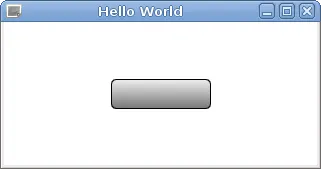
At this point, you should end up with a QML document containing an empty window. Let's start by creating the button frame. Edit the main.qml file to add a new Rectangle item to the window:
import QtQuick 2.9 import QtQuick.Window 2.2 Window { visible: true width: 640 height: 480 title: qsTr("Hello World") Rectangle { id: button anchors.centerIn: parent border { width: 1; color: "black" } radius: 5 width: 100; height: 30 gradient: Gradient { GradientStop { position: 0; color: "#eeeeee" } GradientStop { position: 1; color: "#777777" } } } } After running the project, you should see a result similar to the following:
What just happened?
You can see that the rectangle is centered in the window using a centerIn anchor binding that we didn't mention before. This is one of the two special anchors that are provided for convenience, to avoid having to write too much code. Using centerIn is equivalent to setting both horizontalCenter and verticalCenter. The other convenience binding is fill, which makes one item occupy the whole area of another item (similar to setting the left, right, top, and bottom anchors to their respective anchor lines in the destination item).
Instead of setting a solid color for the button, we declared the background to be a linear gradient. We bound a Gradient element to the gradient property and defined two GradientStop elements as its children, where we specified two colors to blend between. Gradient does not inherit from Item and thus is not a visual Qt Quick element. Instead, it is just a QML object that serves as a data holder for the gradient definition.
The Item type has a property called children that contains a list of the visual children (Item instances) of an item and another property called resources, which contains a list of non-visual objects (such as Gradient or GradientStop) for an item. Normally, you don't need to use these properties when adding visual or non-visual objects to an item, as the item will automatically assign child objects to appropriate properties. Note that in our code, the Gradient object is not a child object of the Rectangle; it is just assigned to its gradient property.
Time for action – Adding button content
The next step is to add text and an icon to the button. First, copy the icon file to the project directory. In Qt Creator, locate the qml.qrc resource file in the project tree. In the context menu of the resource file, select Add Existing Files and select your icon file. The file will be added to the resources and will appear in the project tree. Our example file is called edit-undo.png, and the corresponding resource URL is qrc:/edit-undo.png.
You can get the resource path or URL of a file by locating that file in the project tree and using the Copy Path or Copy URL option in its context menu.
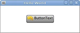
Next, we will add the icon and the text to our button using another item type called Row, as shown:
Rectangle { id: button anchors.centerIn: parent border { width: 1; color: "black" } radius: 5 gradient: Gradient { GradientStop { position: 0; color: "#eeeeee" } GradientStop { position: 1; color: "#777777" } } width: buttonContent.width + 8 height: buttonContent.height + 8 Row { id: buttonContent anchors.centerIn: parent spacing: 4 Image { id: buttonIcon source: "qrc:/edit-undo.png" } Text { id: buttonText text: "ButtonText" } } } You'll get the following output:
What just happened?
Row is a positioner QML type provided by the QtQuick module. Its purpose is similar to the RowLayout type from the QtQuick.Layouts module. The Row item spreads its children in a horizontal row. It makes it possible to position a series of items without using anchors. Row has the spacing property that dictates how much space to leave between items.
The QtQuick module also contains the Column type that arranges children in a column, the Grid type that creates a grid of items, and the Flow type that positions its children side by side, wrapping as necessary.
Time for action – Sizing the button properly
Our current panel definition still doesn't behave well when it comes to sizing the button. If the button content is very small (for example, the icon doesn't exist or the text is very short), the button will not look good. Typically, push buttons enforce a minimum size—if the content is smaller than a specified size, the button will be expanded to the minimum size allowed. Another problem is that the user might want to override the width or height of the item. In such cases, the content of the button should not overflow past the border of the button. Let's fix these two issues by replacing the width and height property bindings with the following code:
clip: true implicitWidth: Math.max(buttonContent.implicitWidth + 8, 80) implicitHeight: buttonContent.implicitHeight + 8
What just happened?
The implicitWidth and implicitHeight properties can contain the desired size the item wants to have. It's a direct equivalent of sizeHint() from Qt Widgets. By using these two properties instead of width and height (which are bound to implicitWidth and
implicitHeight by default), we allow the user of our component to override those implicit values. When this happens and the user does not set the width or height big enough to contain the icon and text of the button, we prevent the content from crossing the boundaries of the parent item by setting the clip property to true.
implicitHeight by default), we allow the user of our component to override those implicit values. When this happens and the user does not set the width or height big enough to contain the icon and text of the button, we prevent the content from crossing the boundaries of the parent item by setting the clip property to true.
Clipping can reduce performance of your game, so use it only when necessary.
Time for action – Making the button a reusable component
So far, we have been working on a single button. Adding another button by copying the code, changing the identifiers of all components, and setting different bindings to pr...
Table of contents
- Title Page
- Copyright and Credits
- Dedication
- Packt Upsell
- Contributors
- Preface
- Introduction to Qt
- Installation
- Qt GUI Programming
- Custom 2D Graphics with Graphics View
- Animations in Graphics View
- Qt Core Essentials
- Networking
- Custom Widgets
- OpenGL and Vulkan in Qt applications
- Scripting
- Introduction to Qt Quick
- Customization in Qt Quick
- Animations in Qt Quick Games
- Advanced Visual Effects in Qt Quick
- 3D Graphics with Qt
- Pop quiz answers
- Other Books You May Enjoy
Frequently asked questions
Yes, you can cancel anytime from the Subscription tab in your account settings on the Perlego website. Your subscription will stay active until the end of your current billing period. Learn how to cancel your subscription
No, books cannot be downloaded as external files, such as PDFs, for use outside of Perlego. However, you can download books within the Perlego app for offline reading on mobile or tablet. Learn how to download books offline
Perlego offers two plans: Essential and Complete
- Essential is ideal for learners and professionals who enjoy exploring a wide range of subjects. Access the Essential Library with 800,000+ trusted titles and best-sellers across business, personal growth, and the humanities. Includes unlimited reading time and Standard Read Aloud voice.
- Complete: Perfect for advanced learners and researchers needing full, unrestricted access. Unlock 1.5M+ books across hundreds of subjects, including academic and specialized titles. The Complete Plan also includes advanced features like Premium Read Aloud and Research Assistant.
We are an online textbook subscription service, where you can get access to an entire online library for less than the price of a single book per month. With over 1.5 million books across 990+ topics, we’ve got you covered! Learn about our mission
Look out for the read-aloud symbol on your next book to see if you can listen to it. The read-aloud tool reads text aloud for you, highlighting the text as it is being read. You can pause it, speed it up and slow it down. Learn more about Read Aloud
Yes! You can use the Perlego app on both iOS and Android devices to read anytime, anywhere — even offline. Perfect for commutes or when you’re on the go.
Please note we cannot support devices running on iOS 13 and Android 7 or earlier. Learn more about using the app
Please note we cannot support devices running on iOS 13 and Android 7 or earlier. Learn more about using the app
Yes, you can access Game Programming using Qt 5 Beginner's Guide by Pavel Strakhov, Witold Wysota, Lorenz Haas in PDF and/or ePUB format, as well as other popular books in Informatica & Grafica per computer. We have over 1.5 million books available in our catalogue for you to explore.