The new history of the book has constituted a vibrant academic field in recent years, and theories of print culture have moved to the center of much scholarly discourse. One might think typography would be a basic element in the construction of these theories, yet if only we would pay careful attention to detail, Joseph A. Dane argues, we would find something else entirely: that a careful consideration of typography serves not as a material support to prevailing theories of print but, rather, as a recalcitrant counter-voice to them.In Out of Sorts Dane continues his examination of the ways in which the grand narratives of book history mask what we might actually learn by looking at books themselves. He considers the differences between internal and external evidence for the nature of the type used by Gutenberg and the curious disconnection between the two, and he explores how descriptions of typesetting devices from the seventeenth and eighteenth centuries have been projected back onto the fifteenth to make the earlier period not more accessible but less. In subsequent chapters, he considers topics that include the modern mythologies of so-called gothic typefaces, the presence of nontypographical elements in typographical form, and the assumptions that underlie the electronic editions of a medieval poem or the visual representation of typographical history in nineteenth-century studies of the subject.Is Dane one of the most original or most traditional of historians of print? In Out of Sorts he demonstrates that it may well be possible to be both things at once.
- 256 pages
- English
- ePUB (mobile friendly)
- Available on iOS & Android
eBook - ePub
About this book
Trusted by 375,005 students
Access to over 1.5 million titles for a fair monthly price.
Study more efficiently using our study tools.
Information
Publisher
University of Pennsylvania PressYear
2011Print ISBN
9780812242942
9780812242942
eBook ISBN
9780812203639
PART I

Out of Sorts
CHAPTER ONE

On the Continuity of Continuity: Print Culture Mythology and the Type of the Gutenberg Bible (B42)
Proponents of Print Culture have now for decades debated the nuances of this notion: its relation to Oral Culture, learning, individuality, technology, and the obligatory Rise of Humanism. Print culture is a given, and all that is left for scholars to do is mop up: when did print culture emerge? what is its technological essence? In 2003, I argued the reverse—not of one of these positions, but of all of them: the entire notion of print culture is constructed in bad faith, and acts not to reveal or uncover evidence but to create specious supporting evidence.1
My subject in this chapter is early type, how little we know about it, and how our ignorance challenges larger cultural narratives generated by modern studies in the History of the Book. Early typography was subjected to minute and detailed study by German, Dutch, and English scholars in the late nineteenth and early twentieth centuries (I discuss this further in Chapter 2 below). These scholars were what we now call “analytical bibliographers”— they looked at material books for evidence of early printing practices. The identification of a particular typefont could identify a particular printer; the nature of the impressions left by these typefaces could reveal the techniques used to manufacture them.2 Yet in 1958 Henri-Jean Martin and Lucien Febvre, in one swat of Annales rhetoric, ruled all this once “unimpeachable”3 evidence out of court: “We get no nearer to a solution [concerning early printing techniques] by looking at the books since no evidence of actual techniques used can be found by examining them.”4 This is an extraordinary statement, and even reading it today, I cannot help but look for a redeeming trace of irony that I realize is not there. Twenty years later, in her now seminal work on print culture, Elizabeth Eisenstein was equally cavalier, denying in her preface that any scholarship existed at all “on the subject”—the subject being her particular theory of print culture (“there was not even a small literature available for consultation”).5 Another extraordinary statement, and here I am not even tempted to look for irony.
The kindest thing one could say about either claim is that such an assertion was a devious way of defining as irrelevant mountains of material evidence readily available “for consultation” (the 10,000–15,000 incunables in the Bibliothèque Nationale and the British Library) and the equally imposing mountains of scholarly material that in fact had been written about such things, much of it inconveniently in German, and some of it even less conveniently in Dutch.6 What do such statements imply about their own evidentiary basis?
The Myth of Continuity and the Early Fifteenth-Century Printing Press
A children's pop-up book from 1995 shows Gutenberg in his printing shop along with his familiar accouterments: the press, typecase, and so on.7 (My Figure 5 I hope captures the spirit of this book, whose publishers will not allow it to be reproduced.) Nearly all these details come from descriptions of a seventeenth- or eighteenth-century printing house and the way things were done more than 200 years later. It is easy to deride the pop-up book, as some bibliographically inclined reviewers have done. But the assumptions embodied in this book have a strong pedigree in scholarship. I quote from some of the top experts and writers in this field:
Stephen Füssell (1999): “The technical essentials of Gutenberg remained unchanged for 350 years.”
Maurice Audin (1972): “[from the fifteenth to the nineteenth century] l’atelier typographique n’a pas beaucoup varié.”
Henri-Jean Martin (1987): “If Gutenberg had walked into the print shop of David Sechart of Angoulême as described in Balzac's Illusions perdus of 1820, he would have been at home in a few hours.”
A variation appears even in R. B. McKerrow's classic Introduction to Bibliography for Literary Students (1927): “After a comparatively short period of experiment, methods were evolved which remained extraordinarily constant for centuries so that we can say that in all essentials of book production there was little difference between the methods of 1500 and those of 1800.”8
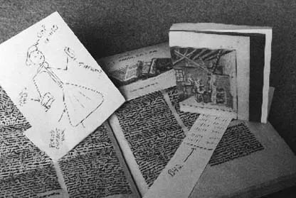
Figure 5. Gutenberg and his press.
Yet there is very little evidence regarding the nature of fifteenth-century printing beyond the products themselves—those thousands of fifteenth-century books from whose examination Febvre and Martin claimed “nothing can be found.” When those books present evidence that we can see, that evidence often shows the reverse of what these bibliographical scholars claim: not that early printers followed classical methods described in, say, Joseph Moxon's Mechanick Exercises on the Whole Art of Printing (1683) or in eighteenth-century encyclopedias, but rather that they did something else.
Here I will be considering typefounding. Although this is portrayed as a zealously guarded secret in early references, many modern scholars see it as the very essence of printing with movable type. The first visual description of typecasting is in 1568, in an often reprinted woodcut by Jost Ammon (Book of Trades; see Figure 8 below). The first detailed verbal account is by Joseph Moxon in 1683.9 The woodcut was published more than a hundred years after the invention of printing; Moxon's manual was written more than a hundred years after that. Yet scholars seem to have reached a consensus: these and other later descriptions provide all the evidence we need. We don’t have to look at early books for evidence of early typography; everything we need to know set out in great detail in the systematic and heavily illustrated manual by Pierre-Simon Fournier, Manuel typographique (1764) (a hundred years later than Moxon's account) or in the contemporary Encyclopédie, ou dictionnaire raisonné des sciences, des arts et des métiers (the source of my Figure 9 below). Martin, in 1987, goes even farther, and for details on fifteenth-century type, refers his readers to Philip Gaskell's 1972 New Introduction to Bibliography, whose descriptions are based entirely on eighteenth-century printing practices.10 Google Image searches will pull up dozens of pictures of”Gutenberg's press” and “Gutenberg tools,” most of them from Fournier or related eighteenth-century prints. These histories could be defended as teleological myths—they are simply imagined constructions of history with their goal the fully developed press of the eighteenth century. But they seem, rather, something less (or more): the fifteenth century does not lead to the eighteenth century through some Rise and Progress narrative; it simply is the eighteenth century.
The Gutenberg Bible (B42)
I begin with the typography of what is likely the most familiar early printed book: the Gutenberg Bible (known as B42). A series of studies by early twentieth-century scholars, chief among them Paul Schwenke, showed that this was produced some time between 1450 and 1455. The type used for B42 is contemporary with a second, somewhat larger type known as DK type. This was used to print a series of Donatus grammars, the variously dated Astronomical Calendar, and eventually the 36-line Bible (B36). I will be discussing problems associated with this second type in Chapter 2 below.11
Both typefonts are classified as texturas (squarish, gothic type, also known as Missal type or, in English, blackletter). They are, moreover, designed and typeset according to a characteristic set of conventions known as the “Gutenberg system.” Figure 6 is a page from B42; Figure 7 shows a cropped image of line a7.12 Note two things: the fence-post construction, shown more clearly in Figure 7, and the proliferation of typesorts: for each letter, different surroundings require different letterforms. Both features— the large number of ligatures and what is often characterized as the symmetry of composition—are products of contemporary paleographical styles. Gottfried Zedler and others argued convincingly that some of the letterforms (w, and upper-case K) show that the typefont is modeled more specifically on the writing used for Missals.13 In addition to ligatures, there are a series of alternate letterforms, constructed in imitation of (or perhaps more accurately “in an allusion to”) fifteenth-century scribal practice. Figure 6 shows two alternate forms of r in line 13a (in manuscript, the “round-r” is used in a number of positions, following p or b or o; B42 uses it less frequently). Complicating this are what German scholars called variously “Nebenformen” or “Anschlußformen”; the English term is “abutting forms.” Certain letters in B42 or DK type have “right extension,” that is, the horizontal bars in these letters extend to the right (c, t, e, g); see Figure 6, line 3 propiciatorium. In order to maintain symmetrical or fence-post construction, every letter that follows these must be modified; the slight spur on the upper left of the single vertical stroke (the minim) must be shaved or the entire letter modified (see for example the i following p in line 3). Under the conventions of modern printing, this would entail more than doubling the size of the typecase and the number of letter-forms, since an entire set of letters must be available with the features required by these abutting forms. This is particularly visible in the case of i. Note the three different forms in the single word sanctificationibus (line 13b); note further that the abutting form following f is not the same as the abutting form following t. All these characteristics can also be found in the contemporary DK type (see Figures 3, 10, and 11).14
Schwenke claimed there were 290 different letterforms in the B42 type-case.15 That figure is repeated by many scholars, even those who dismiss Schwenke's work or who have never heard of him, as if its meaning were self-evident. A number is a respectable, quantifiable thing, and there are plenty of specialists or Fachleute who will compute these things for us.Yet the number is based on the assumption of classical typecasting; it is tempting to say the true figure may be higher; but the word true may have no meaning in this situation, depending as it does on a series of dubious assumptions.
The Gutenberg system of typesetting and the fence-post construction of letters have some bearing on the techniques of early typecasting. To the modern scholar, accustomed to keyboards and imagined typecases where the combined number of characters, upper and lower case, is barely 100, the notion of a 290-character typefont and this intricate system of abutting forms seems extraordinary: not only did Gutenberg have to solve basic problems of typecasting, he was under even greater constraints to produce the so-called perfect symmetry of the Gutenberg system of type. Gutenberg enthusiasts have been quick to point this out. But Gutenberg scholars should be more skeptical: the fence-post construction of type, whereby all minims are equidistant from each other, may not have made type manufacture more complex, since such a system might not have required the tools ordinarily used by later typefounders.
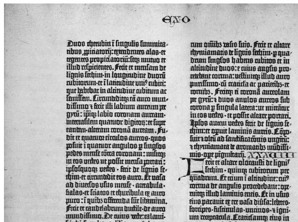
Figure 6. Gutenberg Bible. From A Noble Fragment: Being a Leaf of the Gutenberg Bible (New York: Wells, 1921). Courtesy of the William Andrews Clark Memorial Library, University of California, Los Angeles.

Figure 7. Line 7a cropped.
For an alphabet where every letter is unique, the most obvious method of typecasting involves an adjustable hand-mold, such as was used in the seventeenth and eighteenth centuries (see Figure 9 below). Early printers casting type to be set according to the Gutenberg system could get by with non-adjustable molds (if, that is, we concede that things comparable to modern hand-molds were used at all): since typesorts had either one (i, r), two (n, o), or three (m) minims, and these were equally spaced, three fixed molds would do for ordinary letters, another fixed set for abutting forms. The fact that, say, o and n are almost indistinguishable does not make the problem of typecasting more difficult, it makes it easier. Why make things more complicated than they were already by inventing something close to what is pictured in the 1763 image from the Encyclopédie (Figure 9) or Fournier's 1764 Manuel typographique?
The 40-Line and 41-Line Settings of B42
As early as 1845, S. Leigh Sotheby noted that the Gutenberg Bible existed in variant states. Most copies show 42-line pages throughout, that is, 42 lines per page.16 In a few copies, the first nine pages are in 40-line settings (leaves 1–5r), as are leaves 129–32 of volume 1. Page 10 in these copies (the last page of the first quire) has 41 lines. All other pages, even when they exist in multiple settings, show 42 lines per page. Schwenke, by examining the paper used in these sections and comparing multiple copies, found that the variant sections in 40- or 41-line settings (leaves 1–5r and 129–32 of volume 1 of some copies) were set more or less simultaneously at the beginning of the printing project. At some later point (after these quires had been printed), the projected edition expanded. Those earlier quires, including all pages set in 40 lines and the single page set in 41 lines, had to be reprinted, and they were all reprinted in the 42-line per page format.17
This analysis is consistent with what is now seen as a familiar case of an expanded edition, where extant copies show two variants of early quires and invariant later quires.18 A printing project is begun with an imagined print run of, say, 500; after printing the first few quires, the printer decides the print run could be, say, 700. After all later quires are printed in 700 copies each, the printer must return to the early quires and reset and reprint 200 copies of each; all early quires will exist in two settings. The problem complicating the case of the Gutenberg Bible is that the early 40- and 41-line settings do not take up one line (or two lines) less vertical space than the 42-line settings: the vertical height of the various text blocks is roughly the same. In other words, the type used for these settings is not quite the same as that used in the 42-line settings. More precisely: what does the phrase the same mean in this context?19
In 1900, Schwenke claimed that this was the same type: the printer, having printed eight pages in 40-line settings, filed down each typesort individually, such that a newly set page of roughly the same size would contain 41 lines; he later (almost immediately) filed these sorts down again, such that a page set in this type would contain 42 lines.20 This process would obviously have entailed enormous difficulties. By 1923, Schwenke had gone over all objections and alternative explanations; although he modified many of his earlier positions, he still maintained a version of the theory of the filing-down of type.21 B42 type evolved during the process of printing, and certain identifiable letterforms make their appearance only later in the typesetting process; this is seen also in DK type and is characteristic of much early pri...
Table of contents
- Cover Page
- Title Page
- Copyright Page
- Contents
- List of Abbreviations
- List of Illustrations
- Introduction
- Part I. Out of Sorts
- Interlude
- Part II. Images and Texts
- Notes
- Principal Works Cited
- Index
- Acknowledgments
Frequently asked questions
Yes, you can cancel anytime from the Subscription tab in your account settings on the Perlego website. Your subscription will stay active until the end of your current billing period. Learn how to cancel your subscription
No, books cannot be downloaded as external files, such as PDFs, for use outside of Perlego. However, you can download books within the Perlego app for offline reading on mobile or tablet. Learn how to download books offline
Perlego offers two plans: Essential and Complete
- Essential is ideal for learners and professionals who enjoy exploring a wide range of subjects. Access the Essential Library with 800,000+ trusted titles and best-sellers across business, personal growth, and the humanities. Includes unlimited reading time and Standard Read Aloud voice.
- Complete: Perfect for advanced learners and researchers needing full, unrestricted access. Unlock 1.5M+ books across hundreds of subjects, including academic and specialized titles. The Complete Plan also includes advanced features like Premium Read Aloud and Research Assistant.
We are an online textbook subscription service, where you can get access to an entire online library for less than the price of a single book per month. With over 1.5 million books across 990+ topics, we’ve got you covered! Learn about our mission
Look out for the read-aloud symbol on your next book to see if you can listen to it. The read-aloud tool reads text aloud for you, highlighting the text as it is being read. You can pause it, speed it up and slow it down. Learn more about Read Aloud
Yes! You can use the Perlego app on both iOS and Android devices to read anytime, anywhere — even offline. Perfect for commutes or when you’re on the go.
Please note we cannot support devices running on iOS 13 and Android 7 or earlier. Learn more about using the app
Please note we cannot support devices running on iOS 13 and Android 7 or earlier. Learn more about using the app
Yes, you can access Out of Sorts by Joseph A. Dane in PDF and/or ePUB format, as well as other popular books in Literature & European History. We have over 1.5 million books available in our catalogue for you to explore.