We are used to thinking about inequality within countries--about rich Americans versus poor Americans, for instance. But what about inequality between all citizens of the world? Worlds Apart addresses just how to measure global inequality among individuals, and shows that inequality is shaped by complex forces often working in different directions. Branko Milanovic, a top World Bank economist, analyzes income distribution worldwide using, for the first time, household survey data from more than 100 countries. He evenhandedly explains the main approaches to the problem, offers a more accurate way of measuring inequality among individuals, and discusses the relevant policies of first-world countries and nongovernmental organizations.
Inequality has increased between nations over the last half century (richer countries have generally grown faster than poorer countries). And yet the two most populous nations, China and India, have also grown fast. But over the past two decades inequality within countries has increased. As complex as reconciling these three data trends may be, it is clear: the inequality between the world's individuals is staggering. At the turn of the twenty-first century, the richest 5 percent of people receive one-third of total global income, as much as the poorest 80 percent. While a few poor countries are catching up with the rich world, the differences between the richest and poorest individuals around the globe are huge and likely growing.
- 240 pages
- English
- ePUB (mobile friendly)
- Available on iOS & Android
eBook - ePub
About this book
Trusted by 375,005 students
Access to over 1.5 million titles for a fair monthly price.
Study more efficiently using our study tools.
Information
Publisher
Princeton University PressYear
2011Print ISBN
9780691130514
9780691121109
eBook ISBN
9781400840816
Part I
SETTING THE STAGE
1
The Three Concepts of Inequality Defined
THERE are three concepts of world inequality that need to be sharply distinguished. Yet, they are often confounded; even the terminology is unclear. So, we shall now first define them and give them their proper names.
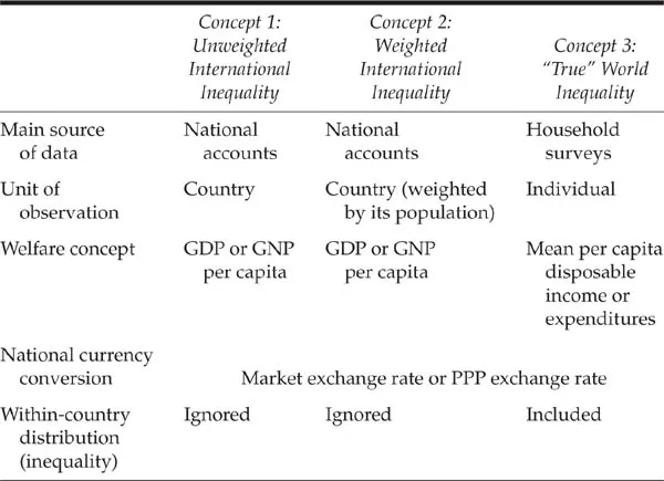
The first (Concept 1) is unweighted international inequality. This concept takes country as the unit of observation, uses its income (or GDP) per capita, disregards its population, and thus compares, as it were, representative individuals from all the countries in the world. It is a kind of UN General Assembly where each country, small or large, counts the same. Imagine a world populated with ambassadors from some 200 countries, each of whom carries a sign on which is written the GDP per capita of his/her country. These ambassadors are then ranked from the poorest to the richest, and a measure of inequality is calculated across such ranking of nations (ambassadors). Note that this is properly a measure of international inequality, since it is compares countries. It is “unweighted” because each country counts the same. Concept 1 is not a measure of inequality among citizens of the world.
Since it is reasonable to hold that if China becomes richer, this event should have more impact on the world than if Mauritania were to become so, we come to the second type of inequality (Concept 2): population-weighted international inequality, where we still assume that everyone in a country receives the same income but the number of representative individuals from each country reflects its population size.2 Note that this is still international inequality because we compare mean incomes among nations, but it is now weighted by the population of each country. The difference when compared to Concept 1 is that the number of ambassadors from each country in our fictional assembly is proportional to the country’s population. Otherwise, everything else is the same: each ambassador carries a sign with the GDP per capita of his/her country, and income ranks–a concept crucial in the calculation of every inequality measure—are the same. Concept 2 assumes that “within-country” distribution is perfectly equal: all Chinese have the same mean income of China, all Americans, the mean income of the United States, etc. This is the distribution that is often billed as “world” income distribution (e.g., Melchior et al. 2000), but, as we have just seen it is not.
Concept 2 is only a halfway house to the calculation of a true world income distribution (Concept 3), where inequality is calculated across all individuals in the world. Concept 3 treats, in principle, everybody the same. We no longer have ambassadors from the countries: we line up all individuals, regardless of the country, from the poorest to the richest. Now, Chinese individuals will no longer be crowded together: the poor Chinese will mix with poor Africans, the rich Chinese with the middle-class or rich Americans, and a few rich Africans may even mix with the U.S. “top dogs.” If one thinks that this is impractical because we cannot array all 6 billion individuals, one is right. But what we can do, as we would in any household survey, is interview individuals or households selected in a worldwide random sample (such that the Chinese will have a chance to be selected proportionally to their population size), and rank all such individuals from the poorest to the richest. World distribution (Concept 3) goes back to the individual as the unit of analysis, ignoring country boundaries.
In terms of Jan Pen’s (1971) parade, which is similar to the idea of our fictional assembly but where in addition the height of each individual is proportional to his income, in Concept 1, only countries’ ambassadors parade, each having the height of that country’s GDP per capita. The number of participants in such a parade is small: at most 180–200, as many persons as there are countries in the world. In Concept 2, each country has a number of participants proportional to its population. Thus if the entire parade consists of 1000 people, China would have some 200 participants, and Luxembourg 1/150 of a participant, but all participants from a given country have the same height—equal to that country’s GDP per capita. In Concept 3, the number of participants from each country remains as in Concept 2, but the participants’ height now reflects their true income: there are tall and short Chinese just as there are tall and short Americans.
The idea of the parade is illustrated in figure 1.1, where we suppose that there are three countries with different average incomes given by the height of each individual in the top row. Concept 1 inequality is calculated across them. In the second row, we let each country be represented by all of its population. The poorest county has five people (men with briefcases), the middle-income country has two (women), and the richest country three (men with hardhats). Concept 2 inequality is calculated across these ten persons, each assigned the average income of their country. In the bottom row, finally, we let each individual come into the parade with his or her true income. Concept 3 inequality is calculated across the ten people in the bottom row. Not all people from the poorest country are poor; in effect, the poorest person is from a middle-income country. Note that the total height of people from each country in the bottom row must be the same as their total height in the middle row—for obviously the total income of each country is given. The example shows how Concept 2 inequality indeed stands between the other two: the height of people from a given country in the middle row is the same as their height in the top row (Concept 1), while the number of people from each country is the same as their number in the bottom row (Concept 3).
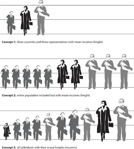
Figure 1.1. Three concepts of inequality illustrated.
TABLE 1.1.
Comparison of the Three Concepts of Inequality
Comparison of the Three Concepts of Inequality
Clearly, we would like to know Concept 3 inequality if we are interested in how world individuals are doing, even if the other two concepts have their uses too. Concept 1 answers whether nations are converging (in terms of their income levels). When we talk of convergence, we are not, necessarily or at all, interested in individuals but in countries. Concept 2 is perhaps the least interesting. It deals neither only with nations nor individuals but falls somewhere in between. Its main advantage is that it approximates well Concept 3 inequality (which, although a concept we would like to know, is the most difficult one to compute). Once Concept 3 is available, however, Concept 2 inequality will be (as the saying goes) history.
Table 1.1 summarizes our discussion of the differences among the concepts.
But how do these concepts perform empirically and how big are the differences among them? Before we turn to this issue, comparing the three concepts at the world level, let’s compare them at a level where this is easy. Take the United States and break it down into fifty states. Concept 1 is simply inequality calculated after ranking all states from the poorest to the richest and giving them equal weight. Concept 2 inequality is the same except that weights are now proportional to the states’ populations. Concept 3 is our usual U.S. inequality that we obtain from the Bureau of the Census’s Current Population Survey. Why is it, then, that neither researchers nor ordinary people ever speak of Concept 2 (or even Concept 1) inequality when they discuss income distribution in the United States? Simply because we have a reasonably good estimate of “true” income distribution (Concept 3) thanks to the Bureau of the Census surveys.3 The reader has already seen my point: once we have such an estimate of Concept 3 inequality for the world, hardly anyone would bother about Concept 2 inequality. (We might still find it interesting to look at Concept 1 inequality to know whether mean incomes of the countries are converging.) And, of course, the three concepts can move in very different directions.
TABLE 1.2.
The Three Concepts Applied to the U.S. Data: Gini Coefficients, 1959–89
The Three Concepts Applied to the U.S. Data: Gini Coefficients, 1959–89
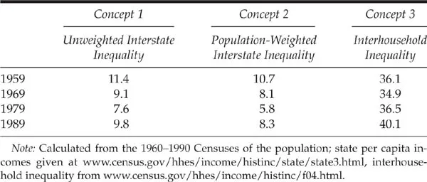
Table 1.2 shows the three concepts calculated for the United States and the fifty states over the period 1959–89 (per capita incomes by state are available at decennial intervals only). First, note the huge difference in Gini values between Concept 3 inequality and the other two. For sure, we do not expect to find such a big difference in results for the world as a whole because mean per capita incomes among countries are much more diverse than mean incomes of U.S. states, and thus both Concept 1 and Concept 2 inequality will be closer to Concept 3 inequality. We note, though, that in the United States, Concepts 1 and 2 do not even display the same trend as “true” inequality (Concept 3). While “true” inequality increased between 1969 and 1979, the other two concepts show a decline. Notice, too, that if one were to make conclusions about “true” U.S. inequality based on the first two concepts, one would be led to believe that inequality in 1989 was less than in 1959. The reverse is true: in 1989, inequality was four Gini points (or 11 percent) higher than thirty years ago.
2
Other Differences between the Concepts
DO DIFFERENT STUDIES of world or international inequality differ only by the concept they use? Unfortunately not. Other differences also complicate comparisons. If readers or even researchers are not aware of these differences, comparing the results is difficult. And even when these differences are taken into account, comparisons remain difficult because the relationship among different variables (e.g., between GDP per capita and mean income or expenditures from household surveys) is not clear or obvious.
What Currency?
First, when we compare incomes of individuals who live in different nations, we need to express them in a common currency. Some studies use the simple exchange rate of the local currency into dollars to convert national incomes. This is fine: it gives us a comparison of people across the world in terms of their international purchasing power. When an Indian travels abroad, he faces world prices. It is of little solace to him that hotels in India may cost only $20 per night. Once he is in London he needs to shell out more than $100 per night, maybe his entire monthly salary. This is why the middle class from poor countries have a hard time traveling abroad as tourists. Exactly the opposite is true when a Swede travels south. He can enjoy nice wine, excellent human services, and tasty food for a fraction of what he would have to pay at home. However, most people most of the time do not face international prices: they face prices of the place where they live. This is why another conversion makes more sense: national currency income is converted into “welfare” (available consumption) using the domestic price level. In other words, we need to account for the fact that the price level in India is lower than the price level in Sweden. Luckily, we have such information: since the mid-1980s the International Comparison Project (ICP) has been collecting information on relative price levels in different countries. This information is used to calculate Purchasing Power Parity (PPP) exchange rates. We thus know that price levels tend to be lower in poor than in rich countries, and when local currency incomes are converted using PPP rather than market exchange rates, poor countries’ incomes get a boost, and the difference between rich and poor countries’ incomes is less than when calculated using market exchange rates. The use of PPP exchange rates will give us a much better handle on the real welfare of people. Thus, not surprisingly, almost all studies of world or international inequality use PPP exchange rates. We shall do the same here.
What PPPs?
But just when we thought that the problem has been solved, that a comparison of the welfare of people living in different countries would require the use of dollars of equal purchasing power, several technical problems appear. These problems are of two kinds: the appropriateness of PPP in cross-country comparisons, and the transitivity in...
Table of contents
- Cover
- Half title
- Title
- Copyright
- Contents
- Acknowledgments
- Prologue The Promise of the Twentieth Century
- Introduction A Topic Whose Time Has Come
- Part I: Setting the Stage
- Part II: Inequality Among Countries
- Part III: Global Inequality
- Part IV: Concluding Comments
- Appendixes 1–7
- Notes
- References
- Index of Authors
- Index of Subjects
Frequently asked questions
Yes, you can cancel anytime from the Subscription tab in your account settings on the Perlego website. Your subscription will stay active until the end of your current billing period. Learn how to cancel your subscription
No, books cannot be downloaded as external files, such as PDFs, for use outside of Perlego. However, you can download books within the Perlego app for offline reading on mobile or tablet. Learn how to download books offline
Perlego offers two plans: Essential and Complete
- Essential is ideal for learners and professionals who enjoy exploring a wide range of subjects. Access the Essential Library with 800,000+ trusted titles and best-sellers across business, personal growth, and the humanities. Includes unlimited reading time and Standard Read Aloud voice.
- Complete: Perfect for advanced learners and researchers needing full, unrestricted access. Unlock 1.5M+ books across hundreds of subjects, including academic and specialized titles. The Complete Plan also includes advanced features like Premium Read Aloud and Research Assistant.
We are an online textbook subscription service, where you can get access to an entire online library for less than the price of a single book per month. With over 1.5 million books across 990+ topics, we’ve got you covered! Learn about our mission
Look out for the read-aloud symbol on your next book to see if you can listen to it. The read-aloud tool reads text aloud for you, highlighting the text as it is being read. You can pause it, speed it up and slow it down. Learn more about Read Aloud
Yes! You can use the Perlego app on both iOS and Android devices to read anytime, anywhere — even offline. Perfect for commutes or when you’re on the go.
Please note we cannot support devices running on iOS 13 and Android 7 or earlier. Learn more about using the app
Please note we cannot support devices running on iOS 13 and Android 7 or earlier. Learn more about using the app
Yes, you can access Worlds Apart by Branko Milanovic in PDF and/or ePUB format, as well as other popular books in Economics & Development Economics. We have over 1.5 million books available in our catalogue for you to explore.