- 272 pages
- English
- ePUB (mobile friendly)
- Available on iOS & Android
eBook - ePub
About this book
This is a different kind of web design book. Above the Fold is not about timely design or technology trends; instead, this book is about the timeless fundamentals of effective communication within the context of web design. It is intended to help you, the reader, understand the considerations that web designers make when developing successful websites. Above the Fold is divided into three sections:
- Design & Typography
- Planning & Usability
- Business Value
Each section represents a phase in the continuous cycle of web design. It's the balance among design, usability, and return on investment that makes a website truly great.Topics covered in Above the Fold include:
- What makes web design unique
- The history of web design
- Anatomy of a web page
- White space and grid use in web design
- The elements of web design: color, texture, imagery, scale, depth, animation, and variability
- Web typography, including web-safe type, images of type, and font replacement and embedding
- Web project planning
- Information architecture, including site maps, wireframes, and user flow diagrams
- The elements of usability: navigation, breadcrumbs, links, search, submission forms, and error messaging
- Search engine optimization
- Online marketing, including banner ads, viral and social marketing, on-site marketing, and email marketing
- Web statistics and analysis
Frequently asked questions
Yes, you can cancel anytime from the Subscription tab in your account settings on the Perlego website. Your subscription will stay active until the end of your current billing period. Learn how to cancel your subscription.
No, books cannot be downloaded as external files, such as PDFs, for use outside of Perlego. However, you can download books within the Perlego app for offline reading on mobile or tablet. Learn more here.
Perlego offers two plans: Essential and Complete
- Essential is ideal for learners and professionals who enjoy exploring a wide range of subjects. Access the Essential Library with 800,000+ trusted titles and best-sellers across business, personal growth, and the humanities. Includes unlimited reading time and Standard Read Aloud voice.
- Complete: Perfect for advanced learners and researchers needing full, unrestricted access. Unlock 1.4M+ books across hundreds of subjects, including academic and specialized titles. The Complete Plan also includes advanced features like Premium Read Aloud and Research Assistant.
We are an online textbook subscription service, where you can get access to an entire online library for less than the price of a single book per month. With over 1 million books across 1000+ topics, we’ve got you covered! Learn more here.
Look out for the read-aloud symbol on your next book to see if you can listen to it. The read-aloud tool reads text aloud for you, highlighting the text as it is being read. You can pause it, speed it up and slow it down. Learn more here.
Yes! You can use the Perlego app on both iOS or Android devices to read anytime, anywhere — even offline. Perfect for commutes or when you’re on the go.
Please note we cannot support devices running on iOS 13 and Android 7 or earlier. Learn more about using the app.
Please note we cannot support devices running on iOS 13 and Android 7 or earlier. Learn more about using the app.
Yes, you can access Above the Fold by Brian D Miller in PDF and/or ePUB format, as well as other popular books in Design & Digital Marketing. We have over one million books available in our catalogue for you to explore.
Information
Topic
DesignSubtopic
Digital MarketingSection I
WEB DESIGN & TYPOGRAPHY
Understanding Web Design
Anatomy of a Web Site
Web Design Unity
Elements of Web Design
Web Typography
CHAPTER 1
UNDERSTANDING WEB DESIGN
There’s an old legend in the world of football that says Vince Lombardi, head coach of the Green Bay Packers, started every season with a speech to his players about the game of football. He began the lecture by holding up a football and saying, “This is a football.” He proceeded to describe its size and shape, talk about how it can be thrown, kicked and carried. Then he’d point down at the field and say, “This is a football field.” He’d walk around, describing the dimensions, the shape, the rules, and how the game was played.
| S1 Design & Typography | S2 Planning & Usability | S3 Business Effectiveness |
This is the Internet
The message from the two-time Super Bowl-winning coach was simple: Remember the basics. This ingenious demonstration stripped away the complexities of the game and reduced it to its essence. In doing this, Mr. Lombardi refocused his players’ attention on what was truly important about playing the game of football effectively.
Taking a cue from Vince Lombardi, I’d like to conduct a similar exercise for you: Go over to a computer, open the Web browser of your choice (Safari, Chrome, Firefox, Internet Explorer, etc.), type in the address of your favorite Web site, and behold—this is the Internet. The Internet is a series of interconnected computers, called servers, that enables companies, brands, organizations, governments, religious groups, and individuals to share information on a worldwide scale in real time. The “World Wide Web,” or Web for short, is actually only a portion of the Internet, which includes all aspects of computer-to-computer communication like email, messaging and file serving, just to name a few.
When an Internet user types the address of a Web site into his or her Web browser, the computer transmits a signal to a server, and the server responds by sending bits of information back to the computer. This information includes images, raw content, and instructions for the computer to reassemble the layout, called markup (the “M” in “HTML”). The computer then takes that information and configures the files based on two things: the markup and styles that came from the designer/developer, and the preferences and limitations of the Web browser and computer itself. When a computer reassembles a Web page that it has received from a server, the following factors influence exactly how that page appears on the screen:
These charts highlight the majority share of users in each category. When designing for the Web, designers must tailor their design toward the limitations of their target demographic. The capabilities of individual users vary by market.
Color Depth
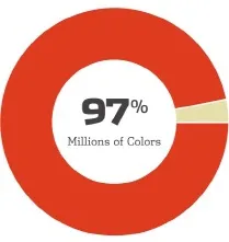
Color depth is the number of colors that a monitor is able to display. The number depends on the video card in the computer as well as the monitor itself. Most current computers/monitors can display millions of colors, making color-depth a non-issue in most cases of Web design today. In the not-sodistant past, monitors could only display 256 colors. Therefore, Web designers were limited to a color palette of 216 colors called the Websafe palette. The colors in this palette consisted of the common hues that could be displayed on both Mac and PC operating systems.
Monitor Resolution
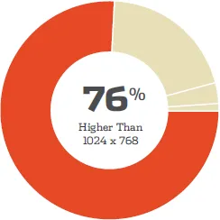
Not to be confused with the monitor size in inches, monitor resolution is the number of pixels when measured horizontally and vertically on a monitor. Most monitors today are 1024 x 768 or higher, although some computers still display at 800 x 600 or even 640 x 480. Most sites these days are optimized for a 1024-pixel width and are designed in a size range of 975 and 990 pixels wide. Fifty or so pixels are subtracted from the overall width to accommodate for the scroll bars and borders on the browser window.
Operating System
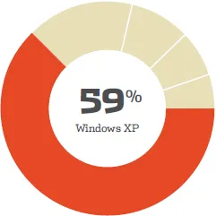
The type of computer and version of the operating system (OS) the audience is using to browse a site can have an effect on how a site is seen. The main difference in operating systems is their ability to anti-alias type. Anti-aliased type looks smoother because the system creates a slight blur effect around each character. Non-anti-aliased type can look jagged or “pixelated.” The operating system can also limit the availability of certain Web browsers. For example, in 2004, Microsoft suspended development of Internet Explorer for the Macintosh OS because of the emergence of Safari, which is made by Apple.
Browser Type
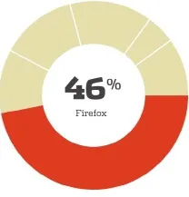
The primary Web browsers used today are Safari, Chrome, Firefox, and Internet Explorer. A Web browser is an application whose function is to receive layout and styling information from a host and display that information on screen. Because these are different applications developed by different companies, they all interpret this information slightly differently. Added to this, the language that makes up Web styling, cascading style sheets or CSS, is always evolving; therefore, Web browsers are constantly updating to keep up with the latest styling attributes.
While the connection speed of someone browsing a site won’t have a direct effect on how a site looks, it will definitely have an effect on the person’s experience of the site. This was a major consideration for Web designers in the early days of dial-up Internet—using a phone line to access the Internet. For a time this issue subsided due to the prevalence of high-speed Internet services such as cable and DSL; however, now the issue is re-emerging as a factor in Web design because of mobile Web browsing. Mobile devices are increasingly accounting for a larger percentage of the Web audience, and the majority of mobile browsers use low-bandwidth methods to connect to the Web.
To complicate matters, beyond these inherent system-based influences, individual user preferences also can affect the way a site looks. In this image we see the “Content” preferences in Firefox. These controls allow a savvy Web user to change the fonts, the minimum size for type (this is an accessibility feature for users with impaired v...
Table of contents
- Cover Page
- Title Page
- Copyright Page
- Table of Contents
- Acknowledgements
- Foreword by Roger Black
- Preface
- Introduction
- Section I: Web Design & Typography
- Section II: Planning & Usability
- Section III: Business Value