The visual and written works by acclaimed artist and critic Victor Burgin span four decades. Parallel Texts presents a compilation of essays, interviews and extracts relating to his own production of artworks in galleries and museums, and theoretical essays in books and journals, over the past 40 years. Unusually, Burgin considers his artistic and critical writing to be interconnected.
Burgin’s ideas are ordered chronologically in the book: in 1969 - 72 he is first heard explaining the newly emerged ‘conceptual art’ to interlocutors accustomed to traditional painting and sculpture. In 1976 - 78 he explores theoretical foundations for a post-conceptualist socialist art practice in such non-Western precedents as Maoism and Russian Formalism. From 1979 issues of gender politics and sexuality come to the fore, together with a psychoanalytic framework for understanding these. Observations upon an ‘artworld’ turning to fashion and flattering wealth as it discovers its postmodernity are given. From 1987 - 2000, Burgin taught cultural theory in California, returning to Britain in 2001.
The interviews and writings from 1987 - 2010 reprise some core issues previously addressed, but now from within an environment almost unrecognizably transformed by cultural, political and economic globalization, and unprecedented forms of technology and violence. Parallel Texts will be invaluable to all admirers of Burgin’s art and writing and to those readers with an interest in contemporary art and art theory.
- English
- ePUB (mobile friendly)
- Available on iOS & Android
eBook - ePub
About this book
Trusted by 375,005 students
Access to over 1 million titles for a fair monthly price.
Study more efficiently using our study tools.
Information
Topic
ArtSubtopic
Art General09. 1981
Rosetta Brooks: There seems to be a quite definite change in artists’ use of photography in the 1970s. From the almost documentary use of conceptual artists, it seemed to evolve into a reflection of the medium itself. How do you relate this change in your work?
I think there are two main attitudes. You can think about the medium in almost purely technological terms: to take a ‘photograph’ is to exercise a number of options – plane of focus, shutter-speed, aperture, framing, angle and so on – and the ‘content’ of the work becomes your choice from amongst these options and the way you structure them. This is an attitude which comes very directly out of Greenbergian modernism. Or you can start from the fact that photography was invented to give an illusionistic rendering of some aspect of the world in front of the camera – which leads into considerations of representation and narrative – which is what I’m interested in.
You’ve been very critical of modernism in fact.
I’ve been critical of the political conservatism of modernism, of its complicity in the Cold War cultural politics of the 1950s for example, but we should remember that the humanist documentary realism of Steichen’s ‘Family of Man’ photography show served the same ideological ends as painterly abstraction in that same period. When I said that the first sort of attitude comes out of Greenberg, I should have said it comes out what Greenberg says about painting. Basically, modernism says you should ground your practice in its specificity – that which it has to offer that is different from the other media around it. Obviously, how you define that specificity is crucial. The technology of the medium is just part of this specificity – no need to make a fetish of it.
On one level your work might be seen as Adorno’s nightmare – advertising for its own sake. How do you respond to this sort of criticism – dismissing the works as radical advertisements? Do you feel you inherit the limitations of the advertising image – the singular, unambiguous reading, consumed in a moment?
Both advertisers and critics of advertising like to believe in that Thurberesque beast, the ‘unambiguous reading’ – I don’t believe it ever existed; it’s certainly extinct now. The form of the text, the context in which it’s produced, the mind of the reader, all can reverse the communicative intention. Take that ad in the London Underground which shows a woman opening her garage door to reveal a tube-train – I saw one poster where someone had added in pencil ‘so that’s where they’ve all got to’. That familiar sort of semiotic subversion wouldn’t be possible if readings could be made unambiguous. As for the speed of consumption … from what I’ve just said, obviously I don’t accept the idea of ‘consumption’ – there’s always some investment of meaning made by the reader. Now certainly you can design the text to encourage a reading which is closer to the ‘consumption’ end of the scale than the ‘investment’ end, one which is read more easily and therefore faster – which is what I did when I made posters for the street. Other texts I deliberately construct to slow down the reading, to make it more difficult.
Your pictures and your texts often seem like quotations. One gets no sense of a single voice from the words. The texts range from the documentary to the almost poetic; but I find there is more of a trace of style in the photographs. They all at least remain within the documentary genre.
What I’ve always aimed for in the texts is a ‘lapidary’ style – the idea originates in classical antiquity, it’s a style suitable to inscriptions carved in stone: terse, economical. The work called us77 has three distinct voices: didactic, narrative and paradoxical. As far as the images are concerned, I used a documentary style because of three things: first, I believed that was what photography did best; second, I tend to have a cut and dried approach to things, so I wanted to put myself in a situation – the street – where it was impossible to be fully in control; third, who knows what appearances of our period are going to be interesting to people in 100 years time or more? Maybe it’s something in the street we don’t even think about now.
The monumental transient image of the advertisement was obviously something you were thinking about in the ‘US’series. The pieces themselves were all big, giving the impression of interior billboards. ‘Police of Mind’ (illus. 4), for example, is a strong, spatial experience at that scale. Yul Brynner’s head almost seems to come out at you from the space of the cityscape. It seems to reproduce that giddiness in looking up in New York, of being forced to look higher and higher and confronting representations which are proportionally bigger and bigger. The piece seems to be about this historical dominion of space … the way that the monumental hero of an earlier epoch is dwarfed by the cinematic hero.
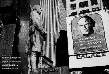
4 ‘Police of Mind’, from US77 (1977), one of twelve parts, 100 × 150 cm.
It’s interesting to me that you should say that, because although I was thinking about power relations in that panel, in the whole piece in fact, I never consciously gave the image that particular reading – a reading in terms of the power of the ‘cinematic imago’.
Well, Yul Brynner’s head is a part of the walls which have boxed in the horizons which the stare of the soldier was intended to suggest. The soldier is dwarfed by becoming the object of the intimate stare of the cinema.
When I did that piece, I was aware of something in that image which I felt was there for me – as a coherent meaning, but which escaped me. It’s interesting for me personally because I feel you’ve just supplied the repressed meaning; repressed perhaps, because as a worker in a largely marginal art institution, I feel castrated when confronted with the cultural power of the movie industry.
Like the old soldier?… But you are not merely powerless. The photograph exerts a power. It makes us see what we might otherwise overlook. It gives us a privileged perception of the coincidence of these different representations in space. There’s a third vantage point – yours. The most powerful is the invisible one – the artist’s or photographer’s.
Certainly the act of photography is an act of appropriation: it’s also a way in which we can return the looks directed at us from advertising, and it can be an aggressive act, an act of revenge.
It is interesting that as your work has become more involved with sexuality and with sexual stereotypes that the works have become more associative.
It isn’t just in respect of sexuality that the texts have become more associative – it becomes a necessary condition of the way I work. The text superimposed on the image had to be comparatively small in area, otherwise it would take on too much independence – which meant it had to be short otherwise the typeface would be too small to read. As there was a lot I wanted to put into that small text, it meant a work of condensation, of compression into a small space. Compressing a text like that meant breaking, short-circuiting, the usual sorts of linear connections we expect to be offered. It means shortening the horizontal lines which are actually present, set in type, and relying on the vertical chains of associations which are always potentially there in your mind.
What do you think about the tendency in advertising to separate the word and image? I’m thinking about the much-discussed Benson and Hedges campaign, and in recent Guinness advertising, where the text is absent altogether, or in 1970s fashion photography, the tendency to give the image greater and greater autonomy from the product.
All texts depend on, are associated with and are invaded by, other texts. Advertising has known this for a long time. If, for example, you use the caption ‘Play it again, Sam’, then you instantly engage with a whole narrative, a morality, a cult and so on – all of which is activated by those four words. What is being recognized now is that you don’t actually need to put words on the image because the words are already in the mind of the viewer – again, this is hardly new knowledge; painting in the Renaissance was based entirely on this. In more recent history we got the silly dogma of the ‘purely visual’ that the more academic of our art schools still teach. Certainly, light striking the retina is something ‘purely visual’ – but that retina is connected to the brain, and that brain doesn’t see the retinal image. What the brain ‘sees’ is mediated by prior experience and knowledge which is both visually and verbally encoded. Dreams are examples of mental activity that turns words into images, and vice versa. Dreams also show us how profligate this mental activity can be; and to control this you need some words. Those ads which, of late, have seemed so empty of language, all contain words, but words now keep a low profile.
Where does the idea of an image/text fusion come from? I think of the artist as film director – wholly in charge of the scenario. Cinema, I suppose, is the ultimate fusion of the word and the image. Working in series imposes an equivalent linear ordering of encounter with the image. Do you wish you were a film director?
I do from time to time wish I was making films, but not because I’m unhappy with my own form of practice – it’s rather that I’m unhappy with the conditions of distribution and consump – tion of that practice. It’s like this – one works for an imaginary audience; now for someone with my sort of theoretical and political concerns who makes films there is a real audience to correspond to that imaginary audience, and there are modes of distribution for reaching that audience. More or less the same audience is potentially there for the type of work I produce – for example, I know there were a lot of people who went to the recent shows of feminist work at the ICA, and who went to the ‘Three Perspectives’ photography show at the Hayward in 1979, who never normally set foot in a gallery – but there’s no corresponding distribution network. I made a large work in Berlin – Zoo. It’s been shown once in England – at the Hayward in 1979 as part of the ‘Annual’ – and it’s unlikely that it will be shown again anywhere in this country. If I had made a film in Berlin, then that film could have gone several times round one or other of the universities, and other networks by now. Also, with film, there’s always the possibility of moving into a more general audience arena: with art, if it’s been hung in the Hayward, that’s it – finished. As an avant-garde filmmaker friend said to me: ‘You’re at the centre of a periphery – I’m at the periphery of a centre.’ I spoke about this to another filmmaker, and she told me that I overestimated the conditions for theoretical/political filmmaking – she said that you should consider the work as being not one of ‘reaching’ an audience but one of creating an audi-ence – but how is that possible without minimal access to the means of distribution?
But isn’t art inevitably peripheral? Most artists could feel that margin-ality is the price of independence.
There’s a position on the ‘left’ in which ‘art’, indeed any form of cultural activity, is seen as ‘peripheral’ to the ‘real world’ of party politics and economic class struggle. There’s a position on the ‘right’ which agrees with this and welcomes it as a ‘guaranteeing the independence’ of artistic creativity. You’re then offered a choice as to which square to occupy on a checkerboard of positions – any position as long as it’s black or white. I think it’s important not to accept any games played on this board. Cultural production, to which ‘art’ contributes, involves social relations and apparatuses, and has definite societal effects. Artists are not independent – socially, economically, ideologically, politically – for all it suits some of them to pretend that they are. But neither are they ‘a cog and a screw’ in the party machine.
Your work uses a format which relates to a cultural mainstream of image use. Marginality seems to be an essential part of the strategy.
I think what’s at issue here is a metaphor. You use the word ‘margin’. A margin is a space running along the edge of something to which it doesn’t belong. I’ve used this term myself – ‘society marginalizes its artists and intellectuals’ – that sort of idea. It’s a metaphor which slips out easily, but I wonder if it’s the most appropriate one. Maybe ‘fringe’ would be better. If I’ve got it right, ‘fringe interference’ is what takes place where different ‘wave forms’ encounter each other. If you throw three stones into a pond and watch the ripples, then there are places where those waves are encountering each other and producing something new. So ‘fringe’ allows for a more dynamic and de-centred picture than ‘margin’. I feel I’m working across the fringe areas – for example, as I’ve said already, where ‘art’, ‘advertising’, ‘documentary’, ‘theory’, etc. overlap, but the very fact of cultural production then taking place in those areas of overlap means that ‘ripples’ then emanate from those points. Definitions of art change as a result – for example, the idea of what it’s possible for an art exhibition to be about. The changes are resisted, but then the resistance becomes the very sign of change. Even exclusion, that silent form of resistance, marks a space which is destined to be occupied.
10. 1986
The intermediary of money guarantees the abolition of difference and the creation of equivalence – much as, in horror films, Dracula’s kiss converts the contradictory social heterogeneity of the living into the single-minded unity of the undead. Dracula’s victims lose their identity, along with their blood, in exchange for parity with their victimizer, an analogous transfusion of contents and status is performed at the art auction: the painting is drained of its symbolic value, which passes to its purchaser in the form of prestige, in exchange for investment value. Part of the symbolic value of the painting, of course, inheres in the (magical) belief that its essential substance is congealed ‘creativity’ – this too (by the same magic of communion) becomes the property of the purchaser. Hence the catalogue to an exhibition at the Museum of Contemporary Art, Los Angeles, 1983: The First Show: Painting and Sculpture from Eight Collections 1940–1980. In place of the customary names of artists, the cover carries only the names of the collectors; the greater part of the catalogue is devoted to interviews with them; the essays in the catalogue are about the collectors and their place in the history of the art of collecting. In short, the discursive forms of dominant, ‘common sense’, art criticism are transferred, unmodified, from ‘art and artists’ to ‘collections and collectors’. For example: ‘Rowan’s is a cultivated, sensuous taste that first found expression in his renowned collection of colour-field paintings’; or, again, ‘The collection of Count and Countess Giuseppe Panza di Biumo is a brilliant creative endeavour unlike any we have seen in this century. Guided by his own innate and dramatic grasp of the beauties of architectural space …’ and so on. I read all this in Los Angeles, but am now writing in London and am aware of an opinion here which would attach no more significance to this show than that of a mere quirk of the Californian ‘grotesque’, the product of a singularly unmixed economy which dictates that museum and university must flatter private wealth or perish; in Europe, the state cocoons those it charges with the preservation of eternal verities and values from such undignified soliciting. This, of course, is untrue – here in Thatcher’s Britain it becomes patently less true by the minute.
…
It is thus that art history, criticism, the market and the museum, mutually circulate their meanings: a fashionably nostalgic de Chirico revival amongst young painters in Italy, selected for capitalization and promotion by art dealers, results in the upward valuation of works by de Chirico, a major exhibition of his work, and the millionpound price tag [on a de Chirico painting], which in turn underwrites the spiralling prices of his young ‘followers’. All meanings here contribute to, and are swallowed up in, the roar of fashion; the heady alternation/alteration which converts ‘different’ into ‘same’; a dizzy whirl whose very velocity, like a gyrating toy, guarantees its stability; a vortex of effects which sucks a vacuum into its own core, such that it no longer makes sense to posit the market – the economy – as ‘origin’. The ‘centre’, prime cause (like power itself, in Foucault’s description), is now everywhere and nowhere. In contemporary capitalism […] the market is ‘behind’ nothing, it is in everything. It is thus that, in a society where the commodification of art has progressed apace with the aestheticization of the commodity, there has evolved a universal rhetoric of the aesthetic in which commerce and inspiration, profit and poetry, may rapturously entwine. Compare, for instance, the following two passages (they are by no means exceptional, they are typical), the first is from Vogue magazine:
As the sun descends the butterfly-bright colours that flourish at high noon give way to the moth shades. The tones are pale, delicate. These are the classic Mayfair colours, White, naturally, takes pride of place, but evening white lightly touched with silver or sometimes gold. Mayfair colours are almond, pink and green, dove greys and blue with the occasional appearance of what can only be described as peach. Jewellery is kept to a...
Table of contents
- Front Cover
- Half Title
- Title Page
- Copyright
- Contents
- 00. Preface
- 01. 1969 From ‘Situational Aesthetics’, Studio International, vol. 178, no. 915 (October 1969), pp. 118–21.
- 02. 1971 From ‘Conceptual Art: Interview with Victor Burgin’, Varsity, Cambridge University (October 1971).
- 03. 1971 From ‘Rules of Thumb’, Studio International, vol. 181, no. 933 (May 1971), pp. 237–39.
- 04. 1972 ‘In Reply’, Art-Language, 2 (Summer, 1972), pp. 32–4.
- 05. 1976 From ‘Introduction’, in Two Essays on Art, Photography and Semiotics (London, 1976), pp. 2–3.
- 06. 1976 ‘Socialist Formalism’, Studio International, vol. 191, no. 980 (March/April 1976), pp. 148–154.
- 07. 1978 ‘Images of People’, contribution to The State of British Art debate, Institute of Contemporary Arts (London, February 1978); Studio International, vol. 193, no. 987, 2 (1978), pp. 132–4.
- 08. 1979 From Tony Godfrey, ‘Sex, Text, Politics: An Interview with Victor Burgin’, recorded in 1979, published in Block, no. 7 (1982), pp. 2–26.
- 09. 1981 From Rosetta Brooks, ‘Victor Burgin: Interview’, Z.G., 1 (1981), unpaginated.
- 10. 1986 Excerpts from The End of Art Theory: Criticism and Postmodernity (London and Basingstoke, and Atlantic Highlands, nj, 1986) pp. 171–6, 197–8.
- 11. 1987 From Mark Lewis, ‘Victor Burgin: Interviewed by Mark Lewis’, C magazine, 16, (Toronto, Winter, 1987/88), pp. 54–65.
- 12. 1989 From Geoffrey Batchen, ‘For an Impossible Realism: An Interview with Victor Burgin’, Afterimage, vol. xvi, no. 7 (February 1989), pp. 4–9.
- 13. 1991 Homi Bhabha, ‘Visualizing Theory’, from a public conversation at the Institute of Contemporary Arts (London, April 1991); Visual Anthropology Review, vol. viii, no. i (Spring, 1992), pp. 70–81.
- 14. 1997 From Tony Godfrey, ‘The Space Man’, Tate Magazine (Winter 1997), pp. 50–53.
- 15. 1998 From Amanda Nowinski, ‘Victor Burgin: The Art of Being Understood’, Speak (April/May 1998), pp. 26–9.
- 16. 2000 From Peter Suchin, ‘Seeing Between Signs: Peter Suchin interviews Victor Burgin’, dpict, no. 5 (Dec/Jan 2000–01), pp. 36–41.
- 17. 2005 From Sarah Thornton, ‘Zeitgeitst and Transmission: interview with Victor Burgin’ (26 April 2005) [previously unpublished].
- 18. 2006 ‘“Medium” and “Specificity”’, in Photography Theory, ed. James Elkins (New York, 2006), pp. 363–9.
- 19. 2007 ‘Populism, Genre and the Blank Canvas’, paper given at the conference Populism and Genre, Tate Britain (14 October 2006) [previously unpublished].
- 20. 2008 From a ‘Q&A’ with graduate students at the University of Rennes, Haute Bretagne and the Université catholique de Louvain; in Components of a Practice (Milan, 2008), pp. 246–61.
- 21. 2009 From Alexander Streitberger, ed., Situational Aesthetics: Selected Writings by Victor Burgin (Leuven, 2009), pp. 3–5, 109–10, 205–7.
- 22. 2009 David Campany, question put in an e-mail (7 May 2009).
- 23. 2009 ‘Face à l’histoire: Document and Interpretation’, paper given at the conference L’image document, entre réalité et fiction, la Fémis (Paris, 3 November 2009) [previously unpublished].
- 24. 2010 From ‘Interactivity and Cinema’, talk given at the Jeu de Paume (Paris, 13 February 2010) [previously unpublished].
- 25. 2010 From ‘Uncinematic and Virtual Signifier’, talk given at the Jeu de Paume (Paris, 22 May 2010) [previously unpublished].
- 26. 2010 Hilde Van Gelder, ‘Artistic Representation and Politics: an Exchange between Victor Burgin and Hilde Van Gelder’, A Prior (2010), pp. 92–120.
- 27. 2010 From ‘Interview with Victor Burgin’, 1453: Journal of Istanbul’s Culture and Art, no. 10 (October–December 2010), pp. 17–18.
- references
- acknowledgements
Frequently asked questions
Yes, you can cancel anytime from the Subscription tab in your account settings on the Perlego website. Your subscription will stay active until the end of your current billing period. Learn how to cancel your subscription
No, books cannot be downloaded as external files, such as PDFs, for use outside of Perlego. However, you can download books within the Perlego app for offline reading on mobile or tablet. Learn how to download books offline
Perlego offers two plans: Essential and Complete
- Essential is ideal for learners and professionals who enjoy exploring a wide range of subjects. Access the Essential Library with 800,000+ trusted titles and best-sellers across business, personal growth, and the humanities. Includes unlimited reading time and Standard Read Aloud voice.
- Complete: Perfect for advanced learners and researchers needing full, unrestricted access. Unlock 1.4M+ books across hundreds of subjects, including academic and specialized titles. The Complete Plan also includes advanced features like Premium Read Aloud and Research Assistant.
We are an online textbook subscription service, where you can get access to an entire online library for less than the price of a single book per month. With over 1 million books across 990+ topics, we’ve got you covered! Learn about our mission
Look out for the read-aloud symbol on your next book to see if you can listen to it. The read-aloud tool reads text aloud for you, highlighting the text as it is being read. You can pause it, speed it up and slow it down. Learn more about Read Aloud
Yes! You can use the Perlego app on both iOS and Android devices to read anytime, anywhere — even offline. Perfect for commutes or when you’re on the go.
Please note we cannot support devices running on iOS 13 and Android 7 or earlier. Learn more about using the app
Please note we cannot support devices running on iOS 13 and Android 7 or earlier. Learn more about using the app
Yes, you can access Parallel Texts by Victor Burgin in PDF and/or ePUB format, as well as other popular books in Art & Art General. We have over one million books available in our catalogue for you to explore.