R can plot data without installing any additional packages. This is commonly referred to as base plotting. It is called base plotting because, like functions that come pre-installed with R in the base package, discussed in Chapter 1, Introduction to R, these plots are built into R. The graphics package comes with a download of R and enables you to plot data without installing any other packages.
Base plots are often not used outside of work done for data cleaning and EDA. Many data scientists use other more aesthetically pleasing plots, such as those generated using ggplot2 or Plotly, for any plots or graphs that a customer may see. It is important to know how to use plot() and create base plots, however, so let's dive in!
The plot() function is the backbone of base plots in R. It provides capability for generic X-Y plotting. It requires only one argument, x, which should be something to plot—a vector of numbers, one variable of a dataset, or a model object such as linear or logistic regression. You can, of course, add a second variable, y, plus an assortment of options to customize the plot, but x is the only input required for the function to run successfully.
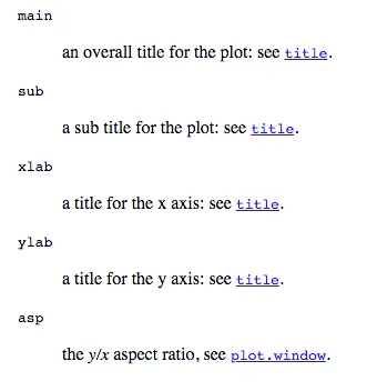
For anything beyond the basic x and y arguments to the function, you'll need to get very familiar with using ?plot or help(plot). The documentation suggests options, such as those for titles and axis labels, and also points you to the documentation for other graphical parameters, found under the par() function in R. The options provided by the function are far more detailed and allow you to change the colors, fonts, positions of axis labels, and much more for your base plots.
Beyond knowing the basics about how to use plot(), you do not need to memorize all of the function's possible options. Realistically, you do not need to memorize all of the options for any function in R. Most of the time when you are doing your work, you will have access to documentation and help. Learning R is about learning both how to use functions and also how to look for help when you need it.
All of the preceding options take you directly to the help documentation, also found online at the following URL: https://stat.ethz.ch/R-manual/R-devel/library/graphics/html/plot.html.
When you start out to write plots in base R, you may be interested to know that there are many other inputs besides just the data you want to plot. You can access the R help documentation for the plot() function in the following ways:
- ?plot
- help("plot")
- help(plot)
In RStudio, sometimes the plot may be skewed or squished, as it is constrained by the size of your plot window (usually the bottom-right window, under the
Plots tab.) You can, at any time, click the
Zoom button and your plot will pop out, usually larger, and give you a better look:
If we first load the datasets library, we gain access to a number of built-in datasets in R that will be useful for both base plotting and using ggplot2. To begin with, we'll use the mtcars dataset. mtcars is a very famous example dataset, and its description (accessed using ?mtcars) is as follows:
The data was extracted from the 1974 Motor Trend US magazine, and comprises fuel consumption and 10 aspects of automobile design and performance for 32 automobiles (1973–74 models).
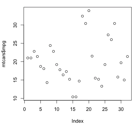
Minimally, we can plot just one variable of mtcars, for example mpg or the miles per gallon of the cars. This generates a very basic plot of mpg on the y-axis, with index on the x-axis, literally corresponding to the row index of each observation, as follows:
This plot isn't very informative, but it is powerful in terms of seeing how well R can plot even when it is not installed on a particular mac...