![]()
Chapter 1
The effect of type design and typesetting on visually impaired readers
Eleni Beveratou
The term ‘visually impaired readers’ refers to people who have a sight impairment that cannot be improved with the use of corrective aids. The vast majority of such readers have developed this impairment only in the later years of their lives. Therefore, reading habits and letter recognition patterns have already been established in earlier stages, making the challenge of adaptation to the new situation even harder. Documents referred to as ‘large prints’ have come to facilitate the reading process. In compliance with a range of guidelines, they manage to bridge the gap between the needs of the readers and their impairment. However, there are factors concerning readability and legibility that are neglected or, often, misinterpreted in their implementation, decreasing the efficiency of large print documents. This chapter analyses the typesetting parameters and the typographic details that optimize typefaces for visually impaired readers. Through a series of conducted experiments, issues concerning the leading, spacing, type size, thickness of the stroke, as well as the use of serifs are examined. The experiments focus mainly on the comparison of various typefaces’ reading rates to highlight the typographical details which cause misreading and confusions. As a conclusion, the results will draw attention to the interdependency of all the aforementioned variables; none of them alone can make a typeface ideal for use in documents intended for visually impaired readers.
1.1 Introduction
Visual impairment is a sight deficiency, affecting mainly the elderly, which cannot be improved with the use of correction aids. Having established their reading habits and letter recognition patterns from early years, the disruption becomes harder to adapt to. Documents referred to as ‘large prints’ have come to facilitate the reading process. In compliance with a range of guidelines, they bridge the gap between the needs of the readers and their impairment. However, factors concerning readability and legibility are neglected or misinterpreted in their implementation, detracting from the efficiency of these documents.
At this stage, it is important to clarify two terms that tend to be misused: ‘readability’ and ‘legibility’. Tracy [1986] refers to legibility as the ability to distinguish single typographic characters, and to readability as the comprehension of a text, implying reading ease.
The aim of this chapter is to analyze the typesetting parameters and typographic details that optimize typefaces for visually impaired readers. Through a series of experiments, issues concerning the leading, spacing, type size, thickness of the stroke, as well as the use of serifs will be examined. However, it is important to clarify that this research is qualitative, not quantitative.
1.2 Previous research on the topic
1.2.1 Type size
Extensive research underlines type size as the main factor impeding the reading process of sighted [Legge and Bigelow, 2011] and partially sighted people [Rubin et al., 2006]. From a simple scientific point of view, a retina is formed by multiple sensors; the smaller the shown element, the fewer sensors are activated, making shapes harder to distinguish [Bailey et al., 1993]. As such, a person with central field vision loss benefits from a larger font size [Chung et al., 1998]. In fact, in order to read with ease people require a much bigger font size than that of their acuity threshold [Rubin and Turano, 1994]. Reading speed is optimal for font sizes between 16 to 18 points [Russel et al., 2007]. However, one should take into account that the reading distance will change the perceived size of the typeface [Legge and Bigelow, 2011].
Nonetheless, other research shows that the amelioration of letter identification is non-significant even when letter size is increased [Parish and Sperling, 1991]. Consequently, there are probably some additional factors that affect reading performance. In order to gain insight as to which features contribute to letter recognition, a comparison will be made between the reading rates of large-sized typefaces and their threshold viewing.
1.2.2 Leading and spacing
Leading (the gap between lines) and word and letter spacing are critical for the reading speed of the partially sighted. Larger than default leading is preferred [Paterson and Tinker, 1947], as it helps to identify the start of the next line. For sighted people, generous inter-letter spacing allows better letter recognition [Bouma, 1970]. This way, ‘crowding’ (the decrease in letter identification when surrounded by other letters [Cline et al., 1997]) is avoided. For the visually impaired, crowding seems worse when peripheral vision is used [Ciuffreda et al., 1991]. Therefore, wider spacing is essential [Levi et al., 2007]. However, so as to avoid reverse results, extensive leading and spacing should not be exaggerated for all kind of readers [Yu et al., 2007; Al Otaibi and Dickinson, 2000]. Optimum figures have been sought and Prince [1967] demonstrated that when typesetting for visually impaired readers ‘inter-letter spacing should be 40% and inter-line spacing 140% of the letter ‘o’’. Researchers seem to agree more on this topic. However, they do not explain how letter spacing may be affected by the use of serifs.
1.2.3 Serif and sans serif
There is no apparent preference between serif and sans serif [Minda et al., 2007]. However, when examining the details, there seems to be a differentiation depending on the intended use. Arditi and Cho [2000] discovered that serifs do make a minor positive difference regarding sizes close to the reading acuity limits of readers. Prince [1967] realised that sans serifs were more effective when used for single letters or syllables, but serifs were preferred for normal words. As Unger says: ‘Serifs seem to make words and lines hang together better’; their structure is more rigid. Serifs give a personal character to each letter that probably makes it distinguishable [Unger, 2007].
Nonetheless, these observations do not apply to every situation. As stated by Reece [2008]: ‘previous studies differed in methodology, fonts and participant characteristics, which makes comparisons difficult and may account for some variations in results’. Hence, it would be interesting to measure the effect of serifs on readability, when the tested typefaces have similar proportions and features.
1.2.4 Other typographic details
A limited set of research has tried to identify whether stroke thickness is another significant variable. Indeed, it was shown that people affected by glaucoma benefit from a bolder typeface [Shaw, 1969]. More specifically, the ideal stroke thickness is thought to be equivalent to 17.5% of the height of an ‘o’ [Prince, 1967]. This research shows that smaller details could have a great impact; therefore modulation of the stroke and the counters could be a potential area for further exploration.
Figure 1: Example of a testing pack. Original size: 23x12cm.
1.3 Testing each parameter
As a general conclusion, the preceding research seems to not communicate the same message. It was, thus, necessary to conduct an experiment that would clarify, validate and further research some untested—or vaguely—tested parameters (style, size, leading, spacing).
1.3.1 Testing method and possible risks to consider
The experiment consisted of a pack of six testing pages, one result sheet and two reading guides (Figure 1). The test was divided into three parts. Each part contained six paragraphs of eighty words varying from 2 to 8 letters. To ensure that the reading speed was not accelerated due to the content of the text [Aitchison, 2003], the paragraphs were formed by placing words in random order [Wilkins, 2003]. The participants had to read each paragraph aloud for twenty seconds, at their usual reading pace [Tinker, 1963]. The last word read was marked down.
Figure 2 (Left): Spectacles simulating loss of peripheral vision (N.1). Width 13cm. (Right): Spectacles simulating loss of central vision (N.7). Width 13cm. Both spectacles are from the Visual Impairment North East simulation package.
Reading speed can be affected by factors like the reader’s experience, the content’s familiarity, the vocabulary used and the kind of document read [Smith, 1994]. As one reads and becomes more familiar with the process, the reading speed increases. If the same word order were kept throughout the paragraphs, the results would have been compromised. Therefore, the parts, sequences and paragraphs of the experiment had to be carefully ordered resulting in an experiment with six different packs.
1.3.2 Selection of participants
Thirty-three adults took part in this experiment. Twenty-one were partially sighted people aged from 70 to 94 years old. Of these, ten had macular degeneration and eleven had various eye deficiencies. The rest were divided into two categories: six with perfect vision and six with pronounced myopia. They constituted an element of comparison to the results of the partially sighted. Participants with normal visual acuity were tasked to simply read the paragraph. Participants with myopia were asked to remove their glasses and use spectacles simulating two different eye conditions: loss of central vision and loss of peripheral vision (Figure 2). Simulating the sight of the visually impaired would provide examples of how people unaccustomed to these conditions read.
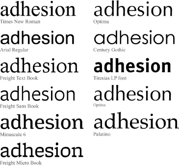
Figure 3: Sample of the typefaces used for this experiment.
1.3.3 Tested aspects and selection of typefaces
The testing material consisted of eighteen paragraphs typeset in ten different typefaces. All paragraphs used Latin lowercase letters, due to their common usage [Jones and Mewhort, 2004]. The first part looks at size and readability comparing serif and sans serif. It consists of six paragraphs, each typeset in a different size (Arial in 12, 16 and 20 points and Times New Roman, with its sizes adjusted to match the three x-heights of Arial). See Figure 3.
The sizes were chosen in compliance with the recommendations of the Royal National Institute of the Blind (RNIB). Sizes 12 and 20 pts are the minimum and maximum sizes recommended for clear prints (documents for a wide audience) and 16 points, the ideal size for typesetting large prints [2007]. Therefore, for the second and third part, all fonts were scaled to fit the x-height of Arial, 16 pts (Figure 4).
Figure 4 (Top): Two different typefaces displayed at the same font size. (Bottom): Two different typefaces displayed at a different point size but with matching x-heights.
The second part investigates whether spacing affects legibility. Six paragraphs are typeset with varying leading and kerning using Freight Text and Freight Sans. The fonts were selected as they have the same proportions, thus preventing the text’s tonality to affect the results.
The third part focuses on whether some typographical design details (thickness, strokes and counters) affect legibility. The selection of the fonts for this last category was less obvious. Minuscule 6, and Freight Micro Book are caption fonts and were chosen based on a hypothesis: if they work in small sizes for normal-sighted people, then they should have the same effect for partially sighted people when enlarged. Palatino, Century Gothic, and Optima, were c...


