![]()
1
MAPS
… a different view of the UK
This chapter suggests that your view of these countries has been created by the environment in which you grew up. Throughout this book the reader is assumed to be an 18-year-old student who has just gone to university or is just about to go there. Your view of the UK has been built up through how the media have depicted the UK, through how you were taught at school to view human geography, and through what your friends and family told you.
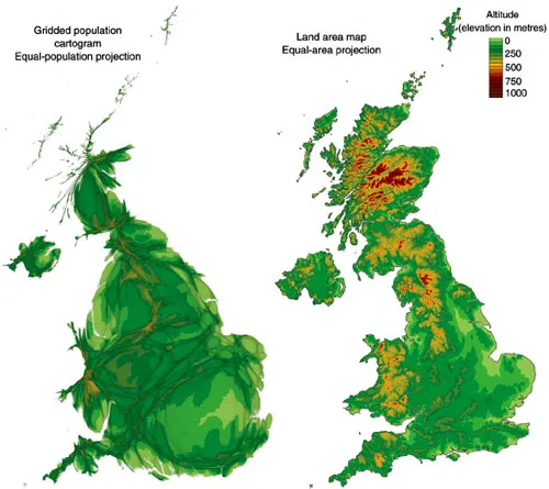
If you grew up in Britain then you grew up with the view shown on the right of Figure 1.1. However, throughout this book the view on the left will be used (see page xiv overleaf). Both images show the same value at every place – the height of land. But the gridded population cartogram on the left uses a map projection that gives every person equal space and shows that most people live at relatively low heights (at low altitude). The land-area map on the right is good for studying land. It is the traditional map used by the media in Britain, but it is not a good map to use to see people.
The media need to sell newspapers or gain viewers and listeners. They tend to present a salacious view of life in Britain, concentrating on the highs and lows, on the lives of the very rich and the travails of the very poor. Ultimately the media consist of just another collection of people, most of whom were very like you when they were 18. What they were taught and how they were shown the country and world they lived in influenced them too.
One thing you can be sure of is that the picture of the UK presented in this short book is not the picture that was presented a decade or two ago. However, this book too is just as influenced by its author’s exposure to the media, the schools he attended, and the views of his family and friends as your views are. I’ve just had a little more time to think about these things, and I think we can look at these countries in a new way as a result of those influences and that thinking. What I am asking you to do is to bear with me while I try to present you with a different view of the country you grew up in. I am trying to present that view from your point of view. This chapter begins by looking at where 18-year-olds live, and which of them go to university. How uneven is this landscape, and how in turn is that likely to be shaping the view of the UK which university students have?
Figure 1.1 Topography: gridded UK population cartogram and UK land area map
Note: The cartogram gives every person the same amount of space. Each faintly drawn grid cell on the cartogram relates to the same amount of space in the physical world. The size of a grid cell reflects the number of people living in that space in relation to the other grid cells.
Source: Population: SEDAC Columbia University (2010); Topography: US Geological Survey (2011).
We begin with a question: From where are you looking at the UK? To start to answer that question we need a simple picture of the UK. The new map used here is one that has never been drawn in any book before. Throughout this book just 85 areas on it will be shaded, but despite this simplicity the new map can be used to unveil a great deal about the human geography of these countries, its people and, first, its 18-year-olds.
You are used to a particular map of the UK. This is the map you grew up with, the one used in most textbooks and which appears on television every evening in the weather reports, the map which shows the UK as it appears from space. However, looking at the UK from space is not the best way to see its population. More people live in London than Scotland, for instance.
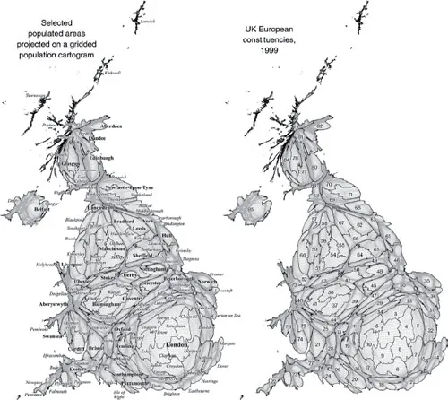
The alternative map of the UK, shown with places labelled on it on the left of Figure 1.2, presents a picture which tries to give the people of the UK fairer representation and allows us to see upon it variations within large cities alongside variations between regions and between more rural areas simultaneously. Grid lines are shown drawn faintly on the cartogram; they depict areas of the same size when drawn on a land-area map, but here every ‘square’ has its area made proportional to its population.
The grid lines in Figure 1.2 coalesce in sparsely populated rural areas. The grid is not shown on the ordinary land area map in Figure 1.1 because its lines would all be too close together to see any individual squares. An ordinary map would have to be thousands of times bigger to show much of the detail about people’s lives that the cartogram shows, and it would still distort things from the perspective of most of the population. However, the grid is shown on all of the cartogram-maps that follow to remind you that these are not just diagrams, but maps of real places with the topology (areas that touch each other) preserved.
On the map on the right of Figure 1.2 are shown the 85 constituencies drawn up in 1999 for the European parliamentary elections of that year. Northern Ireland was defined as one large constituency that would return three members of the parliament. At the last minute the UK government chose a different voting system for that election and so these areas were not used in that election. We use them here as they present a way of grouping the population of the UK into large adjacent areas, each containing roughly the same number of people.
While you may not be used to the map shown in Figure 1.2, the names of the areas on that map listed in Table 1.1 should be a little more familiar. These are the labels for the 85 constituencies used in the rest of this book. Most are named after old counties or parts of counties. They were designed to each contain roughly half a million electors (people aged 18 or over) and to combine together those electors who had most in common geographically.
Note these maps are identical to the fold out maps at the end of this book which have been included to allow you to locate places easily without having to turn back to pages 4 and 5 continuously.
Use the list of names in Table 1.1 and the two maps in Figure 1.2 to identify in which constituencies you have lived. If you have difficulty doing this, the full list of which areas make up each constituency is given in the Appendix at the end of this book. Once you have identified your constituency you can see where, on this new map of the UK, you have lived.
Figure 1.1 shows not only each area of the UK drawn roughly in proportion to the size of its population, but also the underlying physical landscape (topography). It also shows the map drawn using a conventional equal-area projection. The disadvantage of using a conventional map is that those areas that are home to most people are obscured in comparison to sparsely populated places which appear most prominent. The advantage of showing a physical topography on both these maps is that it shows that even aspects of physical geography can be displayed on a population projection and tell us something new (in this case the altitudes at which people live).
Figure 1.2 Selected population areas and UK European constituencies in 1999
Source: UK European Constituencies obtained from the House of Commons Research Paper 98/102. See Table 1.1, opposite, for the constituency key and page xiv for an enlarged inset of the labelled cartogram.
Topography is a familiar depiction: rivers run down mountains; temperature tends to fall as the land rises. In human geography there is no single obvious variable to use to map the basic contours of the social landscape. In the first edition of this book the height on all the maps was drawn in proportion to a child’s chances of winning a place to attend university. The result was a little confusing, so here a more detailed but flat equal-population cartogram projection is used. The projection and all the maps included here were created by Ben Hennig (see www.viewsoftheworld.net).
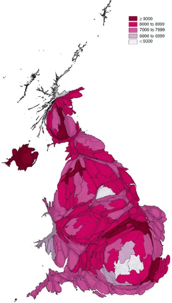
The new map has been created to provide a fairer base to look at the life of a hypothetical university student who turned 18 in the year 2000, and hence (with luck) 30 in the year 2012. Where might that student have come from? Figure 1.3 provides an answer based on how many 15-year-olds attended schools in each constituency three years earlier. The Figure records, to the nearest thousand, the number of people within each European constituency area who turned 18 in the year 2000.
Table 1.1 Areas that never existed – UK European constituencies, 1999
London
1 London Central
2 London East
3 London North
4 London North East
5 London North West
6 London South and Surrey East
7 London South East
8 London South Inner
9 London South West
10 London West
South East
11 Buckinghamshire and Oxfordshire East
12 East Sussex and Kent South
13 Hampshire North and Oxford
14 Kent East
15 Kent West
16 South Downs West
17 Surrey
18 Sussex West
19 Thames Valley
20 Wight and Hampshire South
South West
21 Bristol
22 Cornwall and West Plymouth
23 Devon and East Plymouth
24 Dorset and East Devon
25 Gloucestershire
26 Itchen, Test and Avon
27 Somerset and North Devon
28 Wiltshire North and Bath
East of England
29 Bedfordshire and Milton Keynes
30 Cambridgeshire
31 Essex North and Suffolk South
32 Essex South
33 Essex West and Hertfordshire East
34 Hertfordshire
35 Norfolk
36 Suffolk and South West Norfolk
West Midlands
37 Birmingham East
38 Birmingham West
39 Coventry and North Warwickshire
40 Herefordshire and Shropshire
41 Midlands West
42 Staffordshire East and Derby
43 Staffordshire West and Congleton
44 Worcestershire and South Warwickshire
East Midlands
45 Leicester
46 Lincolnshire
47 Northamptonshire and Blaby
48 Nottingham and Leicestershire North West
49 Nottinghamshire North and Chesterfield
50 Peak District
North West
51 Cheshire East
52 Cheshire West and Wirral
53 Cumbria and Lancashire North
54 Greater Manchester Central
55 Greater Manchester East
56 Greater Manchester West
57 Lancashire Central
58 Lancashire South
59 Merseyside East and Wigan
60 Merseyside West
Yorkshire and the Humber
61 East Yorkshire and North Lincolnshire
62 Leeds
63 North Yorkshire
64 Sheffield
65 Yorkshire South
66 Yorkshire South West
67 Yorkshire West
North East
68 Cleveland and Richmond
69 Durham
70 Northumbria
71 Tyne and Wear
Wales
72 Mid and West Wales
73 North Wales
74 South Wales Central
75 South Wales East
76 South Wales West
Scotland
77 Central Scotland
78 Glasgow
79 Highlands and Islands
80 Lothian
81 Mid Scotland and Fife
82 North East Scotland
83 South of Scotland
84 West of Scotland
Northern Ireland
85 Ulster (Northern Ireland)
Source: House of Commons Research Paper 98/102 (map on page 49). Available at www.parliament.uk/commons/lib/research/rp98/rp98-102.pdf.
Figure 1.3 People aged 18 in 2000
Note: Counts by European Constituency area.
Source: Estimated from school rolls of 15-year-olds in 1997 and 2000 mid-year estimate for Northern Ireland.
Figure 1.3 shows disparities of the order of many thousands in the number of people who turned 18 in each area of Britain in 2000. Part of the pattern will be due to the fact that each constituency was designed to contain roughly half a million voters, not exactly equal numbers of people (there were just over a million voters in the three Northern Ireland seats). To see the degree to which there is actual variation in this population group we need to divide the numbers counted f...