![]()
1
Common Errors
Be Careful When Translating Statistics into English
An oft-repeated criticism is that one can make statistics say anything. That’s not correct. Statistics don’t “say” anything at all. The person interpreting the statistics is doing the saying. The problem is that statistics exist in the language of mathematics. When we translate the mathematics into English, we introduce the possibility of error and misinterpretation—and the error can be the listener’s fault as readily as the speaker’s. For example, consider the following statistics (the dollar figures are adjusted for differences in cost of living and are converted to U.S. dollars):
Average per capita income in Eastern Europe one generation ago = $3,400
Average per capita income in Asia one generation ago = $1,600
These are statistical statements, and many people would accept the following sentence as an accurate translation of the statistics:
“A generation ago, Eastern Europeans’ incomes exceeded Asians’ incomes.”
But that interpretation isn’t correct. The population of Eastern Europe is around 100 million, whereas the population of Asia is around 4 billion. At an average of $3,400 each, Eastern Europeans earned a total of around $340 billion in income while, at an average of $1,600 each, Asians received a total of around $7 trillion in income—or about 20 times what the Eastern Europeans earned.1
A more refined translation might be:
“A generation ago, individual Eastern Europeans earned higher incomes than did individual Asians.”
This interpretation isn’t correct either because we only know average incomes. It is possible that some Eastern Europeans’ incomes were much less than the $3,400 average for Eastern Europe, and it is possible that some Asians’ incomes were much greater than the $1,600 average for Asia. Unless every Eastern European were earning exactly $3,400 and every Asian were earning exactly $1,600, we could not say that individual Eastern Europeans earned more than did individual Asians.
The statistics we have tell us only the average per capita income. We have no idea how typical this average was for individual people. For example, it’s possible that all Eastern Europeans earned approximately $3,400 plus or minus a few hundred dollars. Or, it is possible that most people earned nothing at all while a small number earned billions of dollars. In short, we don’t know how much individual people’s incomes are dispersed around the average. We know the random variable’s average, but we don’t know its standard deviation.
The media are quick to report averages, but they rarely report standard deviations. Yet the average alone doesn’t tell us nearly as much as the average and standard deviation together. Roughly speaking, a standard deviation measures the average amount by which individual observations differ from the average. For example: Randomly select 100 high school students and weigh each one. Examine by how much the weights of the individual students differ from the average weight for the set of 100 students. Then randomly select 100 professional jockeys and weigh each one. Examine by how much the weights of the individual jockeys differ from the average weight for the set of 100 jockeys. The weights of the individual jockeys will all likely be rather close to the average weight for all the jockeys. In contrast, the weights of the individual students will likely vary from the average for all the students by a larger amount. In technical language, we say that the standard deviation of the jockeys’ weights is lower and the standard deviation of the students’ weights is higher.
Depending on the circumstances, the standard deviation of a random variable can be just as important as the random variable’s average. For example, the mean temperature on the moon is around 5 degrees (Fahrenheit). The mean temperature in Fairbanks, Alaska, in February is about –2 degrees. Based on those means, it would appear that the moon’s temperature is more hospitable than that of Fairbanks in winter. But we’re ignoring the standard deviation. Fairbanks’s February temperatures vary from a typical high of 10 degrees to a typical low of –13 degrees, putting the standard deviation somewhere around 12 degrees. In other words, Fairbanks’s daily temperature fluctuates around its mean of –2 degrees by about 12 degrees up or down, on average. But the standard deviation of temperatures on the moon is around 250 degrees, meaning that a typical high on the moon is 255 degrees and a typical low is –245 degrees. It turns out that the standard deviation is incredibly important. If we compare mean temperatures, surviving on the moon seems a little easier than surviving a Fairbanks winter. But when we look at the standard deviations, we see that we wouldn’t survive even a single day under the moon’s temperatures. In this case, it’s the temperature extremes, not the means, that are deadly.
Beware of Correlation
Even people not schooled in statistical analysis know that correlation is not causation. Just because two things move together doesn’t mean that one causes the other. But it’s more complicated than the simple phrase, “correlation isn’t causation.”
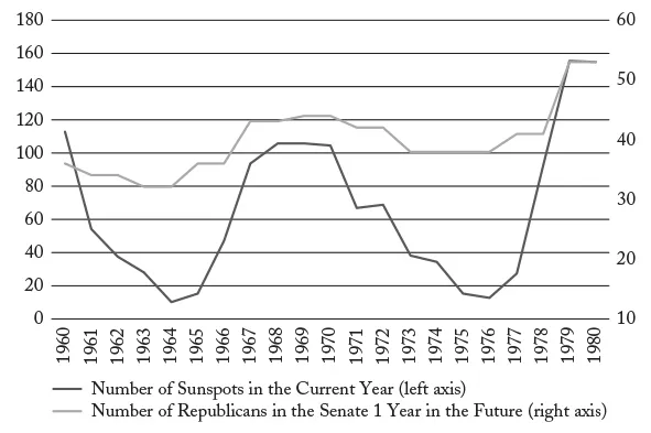
Figure 3 shows the number of sunspots (darker line) in each year from 1960 through 1980, and the number of Republicans in the U.S. Senate one year later (lighter line). Notice that the two data sets are correlated (i.e., they move together). When the number of sunspots declines, the number of Republicans in the Senate one year later falls. When the number of sunspots increases, the number of Republicans in the Senate one year later rises. Of course, it’s unlikely that sunspots affect elections, so what we’re seeing is an example of correlation without causation. Two things can be correlated because one causes the other, but they can also be correlated because, by random chance, they happen to move in the same direction. Since you were born, you’ve gotten taller. Also, since you were born, the stock market has gone up in value. Changes in your height don’t cause changes in the stock market, and changes in the stock market don’t cause changes in your height. The two phenomena are correlated but not causally related.
Figure 3
Sunspots and Republicans in the Senate, 1960–1980
Source: National Geophysical Data Center (http://www.sws.bom.gov.au/Educational/2/3/6); U.S. Senate, “Party Division” (www.senate.gov/pagelayout/history/one_item_and_teasers/partydiv.htm).
Now, you might argue that, even though there is no causal relationship between sunspots and Republican senators, had you known about this correlation, you could have used it to predict election results. After all, if your goal is to predict an election, all you care about is that sunspots predict Republicans in the Senate—the why doesn’t matter. The problem is that you’re seeing the data in hindsight. In 1960, no one could make use of the correlation shown in Figure 3 because the data shown on the chart didn’t exist. Now, by 1970, the data in the left half of the chart existed. But, if you were an election analyst in 1970 and saw the left half of this chart, you might have said something like, “Well, sunspots and Republicans do appear to move together, but we’re only seeing 10 years here. And even then, it’s a single down followed by a single up. Who knows whether this pattern is going to continue?” In short, in 1970, if you saw the left half of this chart, you probably would not have been sufficiently convinced to actually start using sunspots as an election predictor.
But, by 1980, you would have had the whole chart in front of you. You would have seen that sunspots correctly predicted elections for the past 20 years. Not only that, they predicted elections through a period of Republican losses (1960–1964), then Republican gains (1964–1969), then losses (1969–1976), then gains again (1976–1980). So, by 1980, you would probably have felt more confident about using sunspots to predict elections. You would have known that there couldn’t be a causal relationship, but nonetheless, if you had been using sunspots as predictors over the previous 20 years, you would have been able to predict election results very well.
And here’s the problem with correlation in the absence of causation. Without causation, the correlation is simply due to random chance. Because the correlation is due to random chance, you never know when the correlation will disappear. It turns out that the correlation between sunspots and Republican victories disappeared around 1980—about the same time you would have started becoming comfortable with relying on sunspots as a predictor.
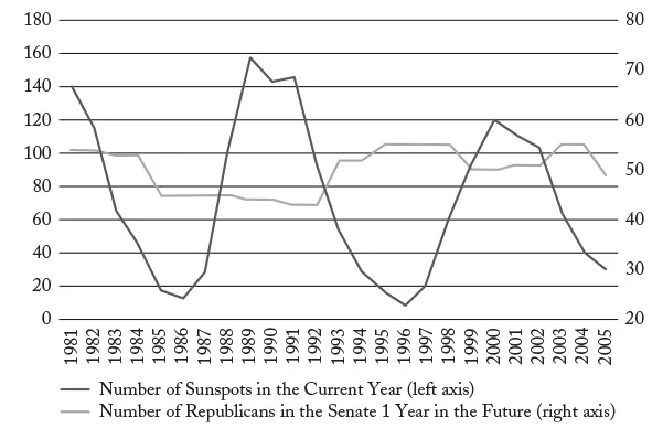
Figure 4 shows sunspots and Republicans in the Senate from 1981 through 2005. Notice that the correlation has vanished. In fact, from 1987 through 1999, sunspots moved in the opposite direction of the number of Republicans in the Senate.
Random correlation is the basis for a well-known stock scam.2 An investment adviser emails 200,000 people (group A) telling them that the stock market will rise the next day, and another 200,000 people (group B) telling them that the stock market will fall the next day. The stock market actually rises, so the investment adviser takes group A and splits it in half. To 100,000 people (group C) he emails a prediction that the stock market will rise the next day. To the other 100,000 (group D) he emails a prediction that the stock market will fall the next day. The stock market actually falls, so the investment adviser takes group D and splits it in half. To 50,000 people (group E) he emails a prediction that the stock market will rise the next day. To the other 50,000 (group F) he emails a prediction that the stock market will fall the next day. The stock market actually falls. Now the investor emails the people in group F and says that he correctly predicted stock market movements in each of the past three days. If they’d like to continue receiving his predictions, they can pay him $20 each.
Figure 4
Sunspots and Republicans in the Senate, 1981–2005
Source: National Geophysical Data Center (http://www.sws.bom.gov.au/Educational/2/3/6); U.S. Senate, “Party Division” (www.senate.gov/pagelayout/history/one_item_and_teasers/partydiv.htm).
For those 50,000 people, the investor did correctly predict stock market movements three days in a row. But, he did so by random chance. His predictions were correlated with the stock market but, since there is no causality, there is no reason to believe that his predictions will continue to be correlated with the stock market.
Beware of Causation
Even if we correctly identify two phenomena as causal, we can mischaracterize the nature of causality. Every morning, you set your alarm. And every morning, the sun rises. The two events are causally related. But, it isn’t your alarm clock causing the sun to rise. Rather, your anticipation of the sun rising causes you to set your alarm. Mischaracterizing causality in the wrong direction is called reverse causality. States with clean air and little pollen tend to have more asthma sufferers. The cleanliness of the air and the asthma rate are causally related. But it’s not because clean air causes asthma. The causality runs in the other direction: asthma sufferers tend to move to states that have cleaner air.
Another mischaracterization of causality is the third variable effect. The third variable effect (also called a confound) occurs when two phenomena are causally related, yet neither causes the other. Instead, both are caused by a third phenomenon. For example, communities with more churches, on average, also experience more crimes. But crimes do not cause churches and churches do not cause crimes. Rather, both the number of churches and the number of crimes are caused by population size.
Although correlation is not causation, with rare exceptions, the absence of correlation is the absence of causation.3 Figure 5 shows the most recent data for 113 reporting countries on the economic freedom index (a measure of how free people are to make economic choices for themselves—a higher score means the country is more free) compared with the global peace index (a measure of the extent to which a country’s government employs violence—a lower score means the country is more peaceful). The data are correlated: on average, countries that are more economically free are also more peaceful. Correlation isn’t causation, so the data do not tell us that more economic freedom causes more peace. However, the absence of correlation is the absence of causation, so the data do tell us that more economic freedom does not cause less peace.
...