Type is the bridge between writer and reader, between thought and understanding. Type is the message bearer: an art-form that impinges upon every literate being and yet for most of its history it has conformed to the old adage that 'good typography should be invisible', it should not distract with its own personality. It was only at the end of the nineteenth century that designers slowly realised that they could say as much with their lettering as writers could with their words. Form, of course, carries as much meaning as content. Now, anyone within reach of a computer and its limitless database of fonts has the same power. "Type: The Secret History of Letters" tells its story for the first time, treating typography as a hidden measure of our history. From the tempestuous debate about its beginnings in the fifteenth century, to the invention of our most contemporary lettering, Simon Loxley, with the skill of a novelist, tells of the people and events behind our letters. How did Johann Gutenberg, in late 1438, come to think of printing? Does Baskerville have anything to do with Sherlock Holmes? Why did the Nazis re-invent Blackletter? What is a Zapf?
"Type" is a guide through the history of our letters and a study of their power. From fashion through propaganda and the development of mass literacy, Loxley shows how typography has changed our world.
- 248 pages
- English
- ePUB (mobile friendly)
- Available on iOS & Android
eBook - ePub
About this book
Trusted by 375,005 students
Access to over 1.5 million titles for a fair monthly price.
Study more efficiently using our study tools.
Information
1 | The adventure and the art: the obscure origins of a revolution
‘Have you ever seen a scribe at work?’ I asked. Indeed they had, and sighed, ready to be disappointed.
‘And have you any notion of how long it takes a scribe to write ten pages? Two hours? Ten?’
‘Something in between, perhaps.’
‘What would you say if I told you I can make one hundred pages in an hour?’
‘I would not believe you,’ laughed von Seckingen.
‘I would think you had supped too much from your own cellar,’ scoffed Smalriem.
‘We have heard you are quick-fingered, Johann, but no hand could write that fast,’ they mocked together.
‘Yes, yes, but suppose,’ I went on, ‘the hand were that of a machine. You have seen a wine-press? Well, imagine a wine-press being used to make words. Imagine a line of metal squeezing out letters on paper. Imagine the method that stamped this mirror’ – here I brandished one of the mirrors made for the Aachen pilgrimage – ‘being used to stamp books.’ (Blake Morrison, The Justification of Johann Gutenberg, 2000)
The story of type begins in the mid-fifteenth century. Many of the people and designs that we will meet in the following pages drew inspiration or used letter forms from earlier sources. The capital letters carved on the Trajan Column in Rome in AD 114, or the lower case letters, the Carolingian minuscules, developed in the reign of the Emperor Charlemagne at the start of the ninth century, are the two salient examples. They belong to the world of lettering and calligraphy, but are not in themselves, by definition, also type – lettering for mass production. When people refer to the birth of printing in Europe, what they actually mean is the birth of type. Movable type – individual letters that could be arranged, edited, printed from, then dismantled and reassembled to print again in a new configuration – this was the real breakthrough, the spark that fired the printing revolution that was to sweep through Europe during the rest of the century, its output greedily consumed by an information-hungry population.
Printing itself had existed in China since at least the start of the second millennium, possibly as early as the middle of the first. But the sheets were probably rubbed down on a reversed image in a single unit, made from hand-carved wooden blocks. Movable type is known to have been used in China, and later in Korea, made of porcelain, wood or cast in bronze; all this before its European introduction. But its development and widespread use were conceivably too daunting and impractical for Far Eastern languages, with their thousands of ideograms. The mere twenty-six characters of the Latin alphabet presented a far more manageable proposition.
But what exactly did movable type mean? Today we are used to arranging, manipulating and printing from letters on a computer screen. But until the 1950s ‘type’ meant each letter having a physical existence as an individual piece of metal, comprising of the face – a reversed image of the letter, which was the surface that would receive the ink and form an impression on the paper – and the shank, a rectangular body of metal, of varying width according to the letter it was carrying, but of a uniform length, usually just slightly longer than the width of a thumb, for maximum ease in picking it up and minimum wastage of materials. The shank had to be exactly the same length as all its counterparts, so that the printing surface of the letters was at an even height – the height-to-paper – when the type was placed on the bed of the printing press.
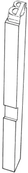
4 Gutenberg’s breakthrough – a piece of movable type (actual length 23 mm). The little nick on the side allowed the compositor to tell, by touch alone, which side was up. The reversed image of a capital B forms the upper surface.
The type was created by first cutting a punch. This was sculpted out of steel, with the letter reversed. The punch was then struck with a mallet to form an impression in a softer metal, copper, crucially always to the same depth. This piece of copper became the matrix, a mould for the letter. When the matrix was fitted into a type mould and filled with molten metal – a mixture of lead, tin and antimony – a piece of type, a relief reversed-image character, shank and all – was produced, and could be replicated in whatever quantities were required.
Until the invention of typesetting machines in the late nineteenth century, the individual pieces of type were picked by hand out of a tray and placed, in the required order, in a hand-held composing stick. This was a right-angled holder in which the type could be held until transferred to a work surface and locked up tight in a chase, a metal frame. It could then be moved to the bed of the printing press.
Regardless of any possible knowledge of artefacts from the Far East, it would be an insult to the intelligence of our medieval ancestors to imagine that the concept of simple printing hadn’t occurred to more than one mind; a hand or fingerprint, the mark of a dog’s muddy paw, would be sufficient to sow the seeds of the idea. But what to do with it? Two vital factors needed to be in place for the printing revolution to succeed, and by the middle of the fifteenth century they were.
There are European examples of printed items which at least bear dates earlier than that of the generally accepted arrival of movable type, although exactly what method was used to create them is still open to speculation.4 But up to this point such books as existed were handwritten. Initially this work had been done by monks. As long as the demand was restricted to monastic libraries or private collections, this didn’t represent a problem. If you could read them and afford them, a dozen books could constitute a library.
In the late 1980s the course of my work as a freelance designer took me into many different offices. I started noticing over and again the same cartoon taped to the walls of design departments. In some instances it looked like a fourth-generation photocopy, as though the thing had been passed around London like a chain letter. The cartoon showed two monks, one standing, the second seated at a table in front of him, halfway through creating a magnificent illuminated manuscript. The seated monk had turned around, a look of intense annoyance on his face, and the caption read: ‘Deadline? No one told me about any ****ing deadline.’
Of course, beyond the comic shock of the blaspheming monk, the reason for the cartoon’s popularity among hard-pressed art directors is obvious. But maybe the cartoonist was closer to the truth than he imagined. The number of universities in western Europe in the fifteenth century was increasing; education was spreading. The English king Henry VI, a saintly nonentity who ended as a pawn in a civil war that cost him his throne and his life, nevertheless left lasting monuments as the founder of Eton College and King’s College, Cambridge.
To be able to read and write was seen increasingly as an essential asset for advancement, and not an accomplishment limited just to scholars. In the prologue to Geoffrey Chaucer’s Canterbury Tales, written in about 1387, we find among the descriptions of his motley band of pilgrims several references to literacy, the love of reading, or to professions that would have required the ability to read and write. The Squire, alongside his skills in riding and warfare, can also write and draw, and at the start of ‘The Prioress’s Tale’ she tells us of a small school where the children learn ‘… to rede, As smale children doon in hire childhede’.
With the growth of educational establishments, perhaps the unfortunate monks were indeed being presented with deadlines they were no longer able to meet.5 Secular scribes joined the fray; in university towns, the most important of which at this time was Paris, the copyists became numerous enough to form their own professional guilds. A growing market was waiting to receive information and learning, but these new consumers were students and their funds were limited.
The crucial parallel development was the growth of paper manufacture. Up until this time, the material used by the scribes was vellum. Made from the skins of calves, vellum was expensive, whereas paper was now becoming affordable. And, as has been observed, it’s easier to make paper than to produce calves. So all that was needed now was a means of duplicating the required information, more cheaply and much, much faster.
It has been a matter of furious dispute as to who exactly should receive the credit for the invention of movable type, but the laurels are now generally allowed to rest on the brow of Johann Gutenberg (or Gensfleisch zur Laden – the name Gutenberg was taken from his family house). He is the least shadowy figure in a small, ill-lit cluster of otherwise dubious claimants. There is no book or printed work in existence which bears his name, and no portrait was done of him in his lifetime. His exact date of birth is uncertain, but he was born in Mainz in Germany in the late 1390s, or possibly at the start of the fifteenth century. Any evidence is purely circumstantial, but there is enough of it to make him by far and away the strongest and most feasible contender. To him, also, falls the credit for the first major printed work in the Western world, the 42-line Bible, published about 1455.
What little we know of Gutenberg’s life comes mainly from legal records. He initiated or was drawn into legal conflict on a fairly frequent basis, and for this historians must be profoundly grateful. Mainz has taken a pounding over the centuries; pillaged and burnt during a conflict between two rival archbishops in October 1462, it also experienced the ravages of the Thirty Years War in the seventeenth century6 and of French Revolutionary mobs at the end of the eighteenth. So it’s possible that other material that could throw more light on Gutenberg’s life and work has been lost along the way.
We know that his father was connected to the episcopal mint, and Johann himself gained experience in working with metal, a knowledge that proved invaluable in his later undertaking. He is first recorded in 1420, in connection with the settlement of his father’s will, which meant that he was legally of age, at least fifteen. In 1430 he is listed in a decree issued by the council of Mainz allowing certain exiled citizens to return, although there is no record that he did. In 1434 he was involved in the arrest of a Strasburg city official for non-payment of money owed, and a couple of years later in a breach-of-promise suit.
In 1439 he is back in the courts, and here is where the story becomes interesting. Gutenberg had set up a business partnership, he and his colleagues working together initially on two projects: polishing gemstones and making mirrors for pilgrims. These latter were useful for glimpsing holy relics from the midst of a large crowd, but there was more; catch the reflection of the relic in the glass, then carefully cover it, and the healing powers of the devotional object would be held until required, or so ran the belief. Then simply uncover the mirror and direct it to where the blessing was needed.
The Aachen pilgrimage was the marketing opportunity for these items, but the small cooperative got the date wrong. The pilgrimage was to be in 1440, not, as they thought, in 1439 – a good instance of the need for some printed pre-publicity. Now short of work and with another year to wait to recoup their outgoings, Gutenberg reluctantly let the partners in on his third project, what would be mysteriously referred to in the court documents as ‘the adventure and the art’. Chestmaker Konrad Saspach built a press for the purpose, and Hans Dünne, a goldsmith, was commissioned to engrave ‘forms’ (an early term for type). Unfortunately one of Gutenberg’s partners, Andreas Dritzehn, died of plague, and his two brothers were keen to take over his interests in the businesses, not least the mysterious third project. Even before Dritzehn’s death, Gutenberg had given orders to melt down ‘forms’ so that no one would see them. He now instructed his servant, Lorenz Beildeck, to go to Dritzehn’s brother Claus and ask him to take apart something that was lying in a press in the work premises. The object was in four pieces which could be dismantled by removing two screws. The pieces were then to be laid out separately on the press so that no one would know what they were. But when Claus arrived at the workshop, the mysterious object was nowhere to be found. The Dritzehns took legal action over their stake in the business, but they retired defeated; the terms of the partnership stipulated that relatives of a deceased member would receive just 100 guilders compensation.
Gutenberg was trying to keep the number of people who knew about the third project as small as possible. Even in the court case it is never revealed exactly what the nature of the business is. Maybe this was because, to use the terminology of the computer industry, it was about to ‘ship’. Albert Kapr, in his definitive 1996 biography Gutenberg: the Man and His Invention, states his belief that printing was born in Strasburg. He dates the fragment of the Weltgericht, a poem about the Last Judgment found in 1892 in the binding of an account book for Mainz University, at between 1440 and 1444.7 The typeface is recognizable as Gutenberg’s but the variance in height-to-paper of some of the letters, resulting, in places, in weak impressions, suggests earlier, unperfected technology. He dates a twenty-seven-line Donatus – a Latin grammar also later found in the bindings of Strasburg books – even earlier, probably about 1440, the year after the Strasburg trial.
Gutenberg drops from view from 1444 until 1448 – the missing years – when he resurfaces back in Mainz. We owe much of subsequent documentation to the fact that his venture was an expensive one, and he had to seek loans to finance it. In that year he borrowed 150 Rhenish guilders, and a year later another 800 from a lawyer called Johann Fust. In 1455 he was involved in yet another legal action, this time against Fust, who in the interim had become Gutenberg’s business partner and financier. Fust had foreclosed on his loans, and took over Gutenberg’s operation.
Also in 1455, the future Pope Pius II wrote of a meeting held the previous year in which a man had either been showing or talking about his work on a Bible. In 1458 Gutenberg defaulted on some old Strasburg debts; 1465 found him granted a pension by the prince-archbishop of Mainz, and finally, in February 1468, we have the record of a beneficiary to his will, Dr Konrad Humery, who had presumably also lent Gutenberg money, and received as posthumous conpensation some print-related equipment and material.
It is irresistible to cast Fust as the villain of the piece, the man who robbed Gutenberg of the fruits of his genius at the point when more than fifteen years of perseverance were about to pay off. To his credit, he brought into the enterprise Peter Schoeffer, a punch-cutter par excellence, who probably raised Gutenberg’s production to a higher aesthetic plane than it would otherwise have achieved. With Gutenberg out of the picture, Fust and Schoeffer went on to produce further books: the Mainz Psalters, The Rationale of Durandus, and another Bible in 1462.
Gutenberg’s enduring monument is his Bible, known as the 42-line Bible, from the number of lines of text on the page. It ran to over 1,200 pages, and was finished in about 1455. For some it remains one of the most beautiful books ever made, both aesthetically and technically.
His typeface was an imitation of the monastic script, a blackletter. The decorations were put in by hand afterwards. In the use of this lettering it has been argued that he was simply going to every possible length to make his printed Bible as close in appearance to a handwritten one as he could, to make his new product acceptable to his potential market. The Bible had to be a commercial success, if only so that Gutenberg could pay back his creditors. This was no vanity publishing, undertaken purely for aesthetic motives or solely for the glory of God. It has been remarked that ‘extreme conservatism as to the presentation of reading matter has always been the outstanding characteristic of the reading public’.8 In other words, if it looks strange and unfamiliar, the reader won’t go near it.
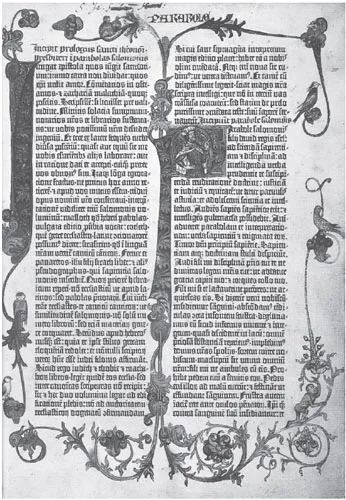
5 The opening page, Proverbs, of the second volume of Gutenberg’s 42-line Bible. The decorations were put in by hand. ‘For regularity of setting, uniform silky blackness of impression, harmony of layout … it is magisterial in a way to which we can rarely aspire under modern conditions’ (Albert Kapr).
But equally we have no evidence that Gutenberg was intrinsically interested...
Table of contents
- Cover
- Title page
- Copyright page
- Contents
- Sine qua non
- The naked letter: the anatomy of type
- Introduction
- 1 The adventure and the art: the obscure origins of a revolution
- 2 Dynasty: in which William Caslon makes Britain the type centre of the world
- 3 Garamuddle: when is a sixteenth-century typeface not a sixteenth-century typeface?
- 4 The maverick tendency: the type and strange afterlife of John Baskerville
- Detour | Meltdown: a stroll around a fallen giant
- 5 ‘Hideous Italians’: thicks, thins, and the rise of advertising type
- 6 American spring: creating the modern age
- 7 An awful beauty: the private press movement
- 8 Under fire: Frederic Goudy, type star
- Detour | Typecast: on the trail of the metal fanatics
- 9 Going Underground: Edward Johnston’s letters for London
- 10 The doves and the serpent: Stanley Morison and the Wardes
- 11 Dangerous passions: radical European typography in the inter-war years
- 12 Leper messiah: Gill semi-light, Gill heavy
- 13 Europe after the rain: rebirth and twilight
- Detour | Portable serenity: the precision and the passion of the letter cutter
- 14 Two ghosts: forgotten technologies from the dustbin of history
- 15 Motorway madness: David Kindersley and the great road sign ruckus
- 16 A company man: Herb Lubalin and the International Typeface Corporation
- 17 The twenty-six soldiers: fiddling with the format
- 18 New gods: Neville Brody and the designer decade
- 19 Revolution again: liberating the letter
- Detour | Inside the micro-foundry: twenty-first-century type
- 20 Typocalypse
- Illustration credits
- Bibliography
- Endnotes
Frequently asked questions
Yes, you can cancel anytime from the Subscription tab in your account settings on the Perlego website. Your subscription will stay active until the end of your current billing period. Learn how to cancel your subscription
No, books cannot be downloaded as external files, such as PDFs, for use outside of Perlego. However, you can download books within the Perlego app for offline reading on mobile or tablet. Learn how to download books offline
Perlego offers two plans: Essential and Complete
- Essential is ideal for learners and professionals who enjoy exploring a wide range of subjects. Access the Essential Library with 800,000+ trusted titles and best-sellers across business, personal growth, and the humanities. Includes unlimited reading time and Standard Read Aloud voice.
- Complete: Perfect for advanced learners and researchers needing full, unrestricted access. Unlock 1.5M+ books across hundreds of subjects, including academic and specialized titles. The Complete Plan also includes advanced features like Premium Read Aloud and Research Assistant.
We are an online textbook subscription service, where you can get access to an entire online library for less than the price of a single book per month. With over 1.5 million books across 990+ topics, we’ve got you covered! Learn about our mission
Look out for the read-aloud symbol on your next book to see if you can listen to it. The read-aloud tool reads text aloud for you, highlighting the text as it is being read. You can pause it, speed it up and slow it down. Learn more about Read Aloud
Yes! You can use the Perlego app on both iOS and Android devices to read anytime, anywhere — even offline. Perfect for commutes or when you’re on the go.
Please note we cannot support devices running on iOS 13 and Android 7 or earlier. Learn more about using the app
Please note we cannot support devices running on iOS 13 and Android 7 or earlier. Learn more about using the app
Yes, you can access Type by Simon Loxley in PDF and/or ePUB format, as well as other popular books in Design & History of Art. We have over 1.5 million books available in our catalogue for you to explore.