- 208 pages
- English
- ePUB (mobile friendly)
- Available on iOS & Android
eBook - ePub
Art and Advertising
About this book
Over the past twenty-five years the relationship between art and advertising has become increasingly varied and complex, with artists appropriating the billboards and neon displays of the ad world, and advertising strategies borrowing both the tactics and imagery of contemporary art. This wide-ranging book charts key points of contact, overlap and exchange between the two fields. Joan Gibbons looks at the work of a number of artists from Barbara Kruger, Les Levine and Victor Burgin though to Sylvie Fleurie and Swetlana Heger and at cutting edge advertising campaigns including Benson's Silk Cut, Benetton's Shock of Reality and US agency Wieden and Kennedy's work for Nike. She discusses too the various collaborations and crossovers between art and advertising: the work of artist, director and creative Tony Kaye; adman turned collector Charles Saatchi and the issues of celebrity and branding that surround him; and the endorsement of art by highly branded products such as Absolut Vodka, to show that art and advertising are more mutually enriching than ever.
Trusted by 375,005 students
Access to over 1 million titles for a fair monthly price.
Study more efficiently using our study tools.
Information
Chapter 1
Wordplay
Although art and advertising are both seen primarily as visual arts, I want, initially, to explore an area of convergence that is as much about linguistic practices as it is about visual correspondences and exchanges. I am both captivated by the way that words acquire plasticity and become an ambient medium when co-opted by the visual arts and intrigued by correspondences that occur at the level of language forms, with a shared preference in both instances for particular types of shorthand, such as truisms, clichés and commonplaces. The term ‘ambient’ is already used in a specialised way in relation to advertising, referring to works that appear on surfaces beyond the hoarding or the magazine insert. In such cases, the encounter with an advertisement is often more unexpected and its presence more insinuative. For example, advertisements on the hanging straps of London Underground trains demand that you actually touch them; an advertisement placed at the bottom of a golf hole speaks directly to a captive, one-to-one audience. Of course, novel forms of contact such as these are not actually a defining feature of ambience, which is traditionally created in works of art or advertising through the choice and arrangement of forms, as with the emotive use of colour or, indeed, the emotive deployment of words. With this more conventional sense of ambience in mind, what I offer in this chapter is a discussion of how, through their incorporation into the visual arts, words have gained a purchase of a different order in the culture. I will do this by looking at the ways in which words have mutated in both art and advertising: ways that not only demonstrate a relationship between the two fields of practice, but which have also made important, although quite different, contributions to the development of words as a visual art form.
Although words have long constituted the stuff of advertising, they are no longer central to its practices, displaced by the introduction of new printing methods in the second half of the nineteenth century; most importantly, chromo-lithography in posters facilitated the bulk production of large-scale coloured images that could emulate the sensual effects of oil paint. Such is the overriding power of the image that advertising has since then been perceived as primarily a visual medium, its visually seductive messages and pleasures further enhanced by the mass-reproducibility of photography, film and television. This preconception of advertising as a visual medium persists despite the continued relevance of strap-lines and short pieces of body copy, and has been strengthened by the emergence of several major campaigns in the late twentieth century that operated successfully without words.1Art, on the other hand, has become increasingly conceptual, with a significant number of artists readily presenting their work through the medium of words, despite the continued need to render their conceptualisations plastic in some way. The move into sometimes purely verbal works of art has been aided by a purposeful recuperation of the word in art over the last century.
The appropriation of words and syntax from the mass media, including advertising, by Cubist artists is exemplified by Picasso’s Still Life ‘Au Bon Marché’ (1913), which features the department store Bon Marché’s logo as well as a fragment of a newspaper advertisement for a rival store, Samaritaine. A number of examples are also found in Dadaism, especially in the work of Duchamp, such as Apolinère Enameled (1916–1917), in which the words in an advertisement for enamel paint have been altered to form a tribute to the poet Apollinaire.2 The appropriations from the mass media found in Cubist collage and Duchamp’s consistent interest in wordplay have been of particular importance for the use of words in Pop and Conceptual Art and their legacy in the art of our own time. Richard Hamilton’s seminal work of Pop Art, Just What Is It that Makes Today’s Homes So Different, So Appealing? (1956) is in the spirit of Picasso’s Cubist collages and constitutes a mixture of source materials from different aspects of popular culture, advertising, film, comic books, labour-saving devices, magazines and processed foods. It may also be that the tin of ham prominently displayed to the right of the female pin-up is a Duchamp-like pun on Hamilton’s name, connecting to the colloquial expression hamming it up, which is what the two figures in Hamilton’s collage appear to be doing. While Duchamp is an acknowledged influence on Hamilton, he has also been of immense importance for the development of Conceptual Art by retreating from what he termed ‘retinal’ artworks, which represented the appearances of things, to pieces based on the actuality of found objects and found language. For instance, works such as Joseph Kosuth’s Titled (Art as Idea (as Idea)) (1967), an appropriation of a dictionary definition, owe a direct debt to Duchamp’s proto-conceptualism. Similarly, it is difficult to conceive of a work such as Bruce Nauman’s One Hundred Live and Die (1984) without the precedent set by Duchamp’s numerous puns.
What emerged with the incorporation of words into art in all of these major movements was a fusion of the verbal and the visual that has made it possible to speak of words in terms of their visual presence as well as their linguistic content. The ways in which words can add to the signification of the work has been crucial from the early days of their incorporation into modern art. The introduction of printed letters into early twentieth-century avant-garde art, for example, has been seen not only as a critique of the institutional boundaries between art and the mass media, but also as a subversion of the power relations between them.3 Typographic appropriations in contemporary art have also followed suit, falling into two camps, as J. Abbott Miller, writing for Eye magazine, has noted. The first of these factions is occupied by those who make a limited use of ‘professional’ or ‘designer’ typography, Barbara Kruger, for instance; the second by those who persistently employ ‘anonymous, ready-made, vernacular, non-designerly type’, such as Lawrence Weiner or Joseph Kosuth.4 While this is generally the case, a notable exception is Ed Ruscha, who has ‘transcribed’ a wide variety of letterforms and typographic styles into his word paintings since the late 1960s.
What Kruger, Weiner, Ruscha and other word artists all share with advertising is not only the ability to give words a visual plasticity, but a tendency to adopt certain types of linguistic forms that, although frequently banal, have an indisputable hold on the unconscious. These forms are often (although by no means always) short and economic, and include clichés, commonplaces, aphorisms, maxims or epigrams. Indeed, the words and word combinations used in art, like the words and word combinations used in advertising, are frequently idiomatic, terse and loaded with suggestion and implication. Moreover, they are word forms that often belong to the vernacular and the popular and, as such, can be readily taken as extensions of the general ambience of everyday life. American artist Lawrence Weiner’s Many coloured objects placed side by side to form a row of many coloured objects, exhibited outdoors on the façade of the Fridericianum at the Documenta 7 exhibition in 1982, provided an example of the ways that words in art can create a particular ambience through a combination of the nature of the language employed and the spaces upon which it is deployed. Although the message itself was disingenuously simple, it held the potential to prompt complex thoughts concerning the nature of art exhibitions, in the way that advertising slogans often provide access to deeper levels of subliminal thought. Despite their apparent modesty, the words achieved a monumental presence through their presentation in plain sans serif upper-case lettering on a neo-classical building. The contrast between form and subliminal content not only helped complexify the ways in which the piece could be read, but also altered the ambience of the conditions in which it was shown.5 In 1986, Weiner received the support of Artangel to present a poster campaign to the public, in conjunction this time with an exhibition at the AIR gallery. The ‘copy’ on these posters, ‘we are ships at sea not ducks on a pond’, was presented in a flyer-like format in far less formal spaces than the Fridericianum, fostering viewing conditions of a very different nature. These are just two of several examples of Weiner’s outdoor works. In a more recent project, for instance, he has co-opted a number of manhole covers in New York (fig. 1.), striking the same sort of relationship with the viewer as is effected by the ambient advertising referred to at the start of this chapter. As already noted, Weiner preferred utilitarian typefaces – such as Franklin Gothic or even just stencilled lettering – in a deliberate attempt to avoid the issue of style and signature and to develop a neutral voice. This choice was not just a way to avoid what Weiner saw as the ‘excesses’ of late modernist typography and a middle-class preoccupation with style, it also helped bring out the enigmatic nature of the words themselves.6 Indeed, it is often through the use of simple and familiar word forms expressing complex and ambiguous thoughts that Weiner achieves a critical purchase in his work.
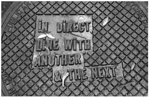
1. Lawrence Weiner, NYC Manhole Covers (2000). Cast iron, 19 manhole covers installed throughout lower Manhatten. A project of the Public Art Fund. Photo: Richard Griggs.
While a number of artists such as Weiner, Ruscha and Kosuth employ an ambiguous and condensed use of words in art and have displayed works both in and out of doors, it is artists such as Les Levine, Kruger and Jenny Holzer who have used such approaches more consistently in the actual spaces of advertising. This constitutes a significant development with regard to the issue of words and their ambient effects, since the viewing conditions of advertising that often form part of the flow of daily life have offered a more ambient relationship between the work of art and viewer than that offered by the gallery. I will address the implications of taking art into the spaces of advertising at some length in Chapter 2; however, for the present I want to confine my discussion to the comparison of language forms in art and advertising and to the way that they are given visual form.
From the point of view of linguistic comparisons, Jenny Holzer’s work is of particular interest. The similarities to or connections with advertising are perhaps less immediate in her work, despite it having been dubbed ‘The political alternative to advertising’.7 As with Weiner’s work, Holzer has presented messages in the form of truisms and epigrams, although perhaps focusing more on their hackneyed and platitudinous nature. This is not to say that Holzer’s work is limited in visual expression, since her choice of support for the words is often iconographically rich and important in terms of the plasticity that her words assume and for the ambience they create. Examples of such richly plastic and ambient surfaces include the granite, onyx and marble sarcophagi of the installation The Laments at the Dia Art Foundation in New York (1989–1990), or the skin in the photographs that make up the Lustmord project (1993).8 Furthermore, although Holzer often uses verbal shorthand similar to that commonly used in advertisements to make subliminally suggestive statements in the actual sites of advertising, her work as a whole has a particularly strong rapport with the literary. Like that of Bruce Nauman, Holzer’s work is significant because it illustrates a historically more complex relationship between art and advertising, a relationship that incorporates both avant-garde art and literature.
In effect, it is possible to trace Holzer’s use of suggestion back to strategies found in the approaches of the late nineteenth- and early twentieth-century Symbolists, whose emphasis in both literature and art was also on subjectivity and the evocative. This becomes especially relevant when it is remembered that the use of suggestion and association in advertising stems equally from the evocative strategies of Symbolist artists, whose use of colour and form was meant to work subliminally to produce analogous emotions. Indeed, subliminal methodologies were first incorporated into advertising through the commercial poster work of late nineteenth-century Symbolist artists such as Alphonse Mucha and Fernand Khnopff.9 It is also through Symbolism and its predecessors, Romanticism and Impressionism, that artists in the West first made a significant break with the so-called ‘ocularcentrism’ of works of art in the classical tradition that were constructed and viewed in a more detached and objective manner.10 For example, the coordinates of perspective were undermined in favour of atmospherics, in the case of Impressionism, and in favour of mood and the creation of a psychological ambience for the viewer, in the case of Romanticism and Symbolism. These developments, of course, were to be of seminal importance for opening up and extending the viewing conditions of the work of art in a variety of ways in the twentieth century. As I will also show later, Symbolism and its influence was as seminal to the development of a new form of subjectivity in late twentieth-century graphic design and advertising.
Interestingly, it was literary Symbolism in particular that anticipated the way that language has developed as an visual art form, not only because the poet Stephan Mallarmé produced important pioneering work that addressed the plasticity of w...
Table of contents
- Cover
- Title page
- Copyright page
- Contents
- Acknowledgements
- Introduction
- 1. Wordplay
- 2. Art Invades and Appropriates
- 3. From Capitalist Realism to Surrealism (and back again)
- 4. Reality Bites: From the Abject to the Sublime
- 5. Tony Kaye: Both Sides Now
- 6. Wieden+Kennedy and Nike Advertising
- 7. Celebrity: The Art of Branding and the Branding of Art
- Conclusion
- Notes
- Bibliography
- List of Illustrations
Frequently asked questions
Yes, you can cancel anytime from the Subscription tab in your account settings on the Perlego website. Your subscription will stay active until the end of your current billing period. Learn how to cancel your subscription
No, books cannot be downloaded as external files, such as PDFs, for use outside of Perlego. However, you can download books within the Perlego app for offline reading on mobile or tablet. Learn how to download books offline
Perlego offers two plans: Essential and Complete
- Essential is ideal for learners and professionals who enjoy exploring a wide range of subjects. Access the Essential Library with 800,000+ trusted titles and best-sellers across business, personal growth, and the humanities. Includes unlimited reading time and Standard Read Aloud voice.
- Complete: Perfect for advanced learners and researchers needing full, unrestricted access. Unlock 1.4M+ books across hundreds of subjects, including academic and specialized titles. The Complete Plan also includes advanced features like Premium Read Aloud and Research Assistant.
We are an online textbook subscription service, where you can get access to an entire online library for less than the price of a single book per month. With over 1 million books across 990+ topics, we’ve got you covered! Learn about our mission
Look out for the read-aloud symbol on your next book to see if you can listen to it. The read-aloud tool reads text aloud for you, highlighting the text as it is being read. You can pause it, speed it up and slow it down. Learn more about Read Aloud
Yes! You can use the Perlego app on both iOS and Android devices to read anytime, anywhere — even offline. Perfect for commutes or when you’re on the go.
Please note we cannot support devices running on iOS 13 and Android 7 or earlier. Learn more about using the app
Please note we cannot support devices running on iOS 13 and Android 7 or earlier. Learn more about using the app
Yes, you can access Art and Advertising by Joan Gibbons in PDF and/or ePUB format, as well as other popular books in Art & Art General. We have over one million books available in our catalogue for you to explore.