Provides a step-by-step approach to statistical procedures to analyze data and conduct research, with detailed sections in each chapter explaining SPSS® and Excel® applications
This book identifies connections between statistical applications and research design using cases, examples, and discussion of specific topics from the social and health sciences. Researched and class-tested to ensure an accessible presentation, the book combines clear, step-by-step explanations for both the novice and professional alike to understand the fundamental statistical practices for organizing, analyzing, and drawing conclusions from research data in their field.
The book begins with an introduction to descriptive and inferential statistics and then acquaints readers with important features of statistical applications (SPSS and Excel) that support statistical analysis and decision making. Subsequent chapters treat the procedures commonly employed when working with data across various fields of social science research. Individual chapters are devoted to specific statistical procedures, each ending with lab application exercises that pose research questions, examine the questions through their application in SPSS and Excel, and conclude with a brief research report that outlines key findings drawn from the results. Real-world examples and data from social and health sciences research are used throughout the book, allowing readers to reinforce their comprehension of the material.
Using Statistics in the Social and Health Sciences with SPSS® and Excel® includes:
Use of straightforward procedures and examples that help students focus on understanding of analysis and interpretation of findings
Inclusion of a data lab section in each chapter that provides relevant, clear examples
Introduction to advanced statistical procedures in chapter sections (e.g., regression diagnostics) and separate chapters (e.g., multiple linear regression) for greater relevance to real-world research needs
Emphasizing applied statistical analyses, this book can serve as the primary text in undergraduate and graduate university courses within departments of sociology, psychology, urban studies, health sciences, and public health, as well as other related departments. It will also be useful to statistics practitioners through extended sections using SPSS® and Excel® for analyzing data.
Trusted by 375,005 students
Access to over 1.5 million titles for a fair monthly price.
The world suddenly has become awash in data! A great many popular books have been written recently that extol “big data” and the information derived for decision makers. These data are considered “big” because a certain “catalog” of data may be so large that traditional ways of managing and analyzing such information cannot easily accommodate it. The data originate from you and me whenever we use certain social media, or make purchases online, or have information derived from us through radio frequency identification (RFID) readers attached to clothing and cars, even implanted in animals, and so on. The result is a massive avalanche of information that exists for businesses leaders, decision makers, and researchers to use for predicting related behaviors and attitudes.
Big Data Analysis
Decision makers are trying to figure out how to manage and use the information available. Typical computer software used for statistical decision making is currently limited to a number of cases far below that which is available for consideration of big data. A traditional approach to address this issue is known as “data mining” in which a number of techniques, including statistics, are used to discover patterns in a large set of data.
Researchers may be overjoyed with the availability of such rich data, but it provides both opportunities and challenges. On the opportunity side, never before have such large amounts of information been available to assist researchers and policy makers understand widespread public thinking and behavior. On the challenge side however are several difficult questions:
How are such data to be examined?
Do current social science methods and processes provide guidance to examining data sets that surpass historical data-gathering capacity?
Are big data representative?
Do data sets so large obviate the need for probability-based research analyses?
Do decision makers understand how to use social science methodology to assist in their analyses of emerging data?
Will the decisions emerging from big data be used ethically, within the context to social science research guidelines?
Will effect size considerations overshadow questions of significance testing?
Social scientists can rely on existing statistical methods to manage and analyze big data, but the way in which the analyses are used for decision making will change. One trend is that prediction may be hailed as a more prominent method for understanding the data than traditional hypothesis testing. We will have more to say about this distinction later in the book, but it is important at this point to see that researchers will need to adapt statistical approaches for analyzing big data.
Visual Data Analysis
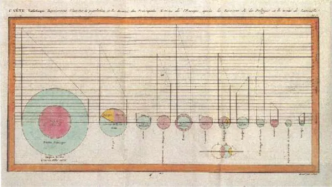
Another emerging trend for understanding and managing the swell of data is the use of visuals. Of course, visual descriptions of data have been used for centuries. It is commonly acknowledged that the first “pie chart” was published by Playfair (1801). Playfair's example in Figure 1.1 compares the dynamics of nations over time.
Figure 1.1 William Playfair's pie chart.
Source: https://commons.wikimedia.org/wiki/File:Playfair_piecharts.webp. Public domain.
Figure 1.1 compared nations using size, color, and orientation over time. Using this method for comparing information has been useful for viewing the patterns in data not readily observable from numerical analysis.
As with numerical methods, however, there are opportunities and challenges in the use of visual analyses:
Can visual means be used to convey complex meaning?
Are there “rules” that will help to insure a standard way of creating, analyzing, and interpreting such visual information?
Will visual analyses become divorced from numerical analysis so that observers have no way of objectively confirming the meaning of the images?
Several visual data software analysis programs have appeared over the last several years. Simply running an online search will yield several possibilities including many that offer free (initial) programs for cataloging and presenting data from the user. I offer one very important caveat (see the final bullet point earlier), which is that it is important to perform visual data analysis in concert with numerical analysis. As we will see later in the book, it is easy to intentionally or unintentionally mislead readers using visual presentations when these are divorced from numerical statistical means that discuss the “significance” and “meaningfulness” of the visual data.
Importance of Statistics for the Social and Health Sciences and Medicine
The presence of so much rich information presents meaningful opportunities for understanding many of the processes that affect the social world. While much of the time big data analyses are used for understanding business dynamics and economic trends, it is also important to focus on those data patterns that can affect the social sphere beyond these indicators: social and psychological behavior and attitudes, changes in understanding health and medicine, and educational progress. These social indicators have been the subject of a great deal of analyses over the decades and now may make significant advances depending on how big data are analyzed and managed. On a related note, the social sciences (especially sociology and psychology) are now areas included in the new Medical College Admission Test (MCAT), which also includes greater emphasis upon “Scientific Inquiry & Reasoning Skills.” The material we will learn from this book will help to support study in these areas for aspiring health and medical professionals.
In this book, I intend to focus on how to use and analyze data of all sizes and shapes. While we will be limited in our ability to dive into the world of big data fully, we can study the basics of how to recognize, generate, interpret, and critique analyses of data for decision making. One of the first lessons is that data can be understood both numerically and visually. When we describe information, we are attempting to see and convey underlying meaning in the numbers and visual expressions. If I have a collection of data, I cannot recognize its meaning by simply looking at it. However, if I apply certain numerical and visual methods to organize the data, I can see what patterns lay below the surface.
Historical Notes: Early Use of Statistics
Statistics as a field has had a long and colorful history. Students will recognize some prominent names as the field developed its mathematical identity: Pearson, Fisher, Bayes, Laplace, and others. But it is important to note that some of the earliest statistical studies were based in solving social and political problems.
One of the earliest of such studies was developed by John Graunt who compiled information from Bills of Mortality to detect, among other things, the impact and origins of deaths by plague. Parish records documented christenings, weddings, and burials at the time, so Graunt's study tracked the number of deaths in the parishes as a way to understand the dynamics of the plague. His broader goal was to predict the population of London using extant data from the parish records.
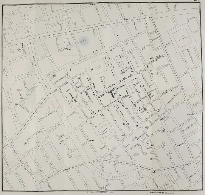
Another early use of statistics was Dr John Snow's map showing deaths in the houses of London's Soho District during the 1854 cholera epidemic, as popularized by Johnson's book, The Ghost Map (2006). In order to investigate the reasons for the spread of cholera other than odor (“miasma theory”), Snow created a map showing each death as a black line outside each household, along with features of the neighborhood including the water sources located throughout the district. The map created a visual picture of the concentration of deaths across the district and led to hypotheses about cholera spreading by waterborne contamination rather than smell. (If you were to walk across the same London district today, you will see that the great social theorist Karl Marx lived just a few streets away from the center of the cholera deaths.)
Figure 1.2 shows Snow's map. You can see that near the center of the map is the “Broad Street Pump” which Snow determined to be the source for the spread of cholera. (At the time, Karl Marx lived on Dean Street, just to the east of the Broad Street Pump.) Notice that the houses nearest this pump recorded the highest numbers of deaths.
Figure 1.2 John Snow's map showing deaths in the London cholera epidemic of 1854.
Source: https://commons.wikimedia.org/wiki/File:Snow-cholera-map-1.webp. Public domain.
Figure 1.2 example not only shows how descriptive statistics underscored the use of visual means of representing data, but it also helped to clarify possible reasons for an epidemic. Graunt's tables based on the Bills of Mortality were rudimentary visuals, but Snow's map was a more effective means of portraying complex data by visual means. A still later statistician made even greater advancements in using visual information to communicate trends in data.
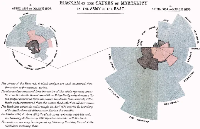
Nightingale (1858) is most often remembered as the founder of modern nursing. She is often represented in paintings as “the lady with the lamp,” since she was known to walk among the bedsides checking on the sick and wounded of the war. But Nightingale was also an astute statistician who used statistics to capture the dramatic need in hospitals during the Crimean War. She is credited as being one of the first to use a “pie chart” (more accurately, a “polar chart”). Figure 1.3 shows comparisons in her original polar chart of differences between soldiers who died of battlefield wounds (“red” wedges near the center) and those who died from other causes (“blue” wedges measured from the center of the graph) over time. The relationship between these groups fueled Nightingale's efforts to obtain further funding for sanitary hospital conditions since those who died of infections were greater in number than those dying of battlefield wounds.
Source: https://en.wikipedia.org/wiki/Pie_chart#/media/File:Nightingale-mortality.webp. Public domain.
Approach of the Book
Many students and researchers are intimidated by statistical procedures, which may be due to fear of math, problematic math teachers in earlier education, or the lack of exposure to a “discovery” method for understanding difficult procedures. This book is an introduction to understanding statistics in a way that allows students to discover patterns in data and developing skill at making interpretations from data analyses. I describe how to use statistical programs (SPSS and Excel) to make the study more understandable and to teach students how to approach problem solving. Ordinarily, a first...
Table of contents
COVER
TITLE PAGE
COPYRIGHT
DEDICATION
TABLE OF CONTENTS
PREFACE
ACKNOWLEDGMENTS
CHAPTER 1: INTRODUCTION
CHAPTER 2: DESCRIPTIVE STATISTICS: CENTRAL TENDENCY
CHAPTER 3: DESCRIPTIVE STATISTICS: VARIABILITY
CHAPTER 4: THE NORMAL DISTRIBUTION
CHAPTER 5: PROBABILITY AND THE Z DISTRIBUTION
CHAPTER 6: RESEARCH DESIGN AND INFERENTIAL STATISTICS
CHAPTER 7: THE T TEST FOR SINGLE SAMPLES
CHAPTER 8: INDEPENDENT SAMPLE T TEST
CHAPTER 9: ANALYSIS OF VARIANCE
CHAPTER 10: FACTORIAL ANOVA
CHAPTER 11: CORRELATION
CHAPTER 12: BIVARIATE REGRESSION
CHAPTER 13: INTRODUCTION TO MULTIPLE LINEAR REGRESSION
CHAPTER 14: CHI-SQUARE AND CONTINGENCY TABLE ANALYSIS
CHAPTER 15: REPEATED MEASURES PROCEDURES: Tdep AND ANOVAWS
APPENDIX A: SPSS® BASICS
APPENDIX B: EXCEL BASICS
APPENDIX C: STATISTICAL TABLES
REFERENCES
INDEX
END USER LICENSE AGREEMENT
Frequently asked questions
Yes, you can cancel anytime from the Subscription tab in your account settings on the Perlego website. Your subscription will stay active until the end of your current billing period. Learn how to cancel your subscription
No, books cannot be downloaded as external files, such as PDFs, for use outside of Perlego. However, you can download books within the Perlego app for offline reading on mobile or tablet. Learn how to download books offline
Perlego offers two plans: Essential and Complete
Essential is ideal for learners and professionals who enjoy exploring a wide range of subjects. Access the Essential Library with 800,000+ trusted titles and best-sellers across business, personal growth, and the humanities. Includes unlimited reading time and Standard Read Aloud voice.
Complete: Perfect for advanced learners and researchers needing full, unrestricted access. Unlock 1.5M+ books across hundreds of subjects, including academic and specialized titles. The Complete Plan also includes advanced features like Premium Read Aloud and Research Assistant.
Both plans are available with monthly, semester, or annual billing cycles.
We are an online textbook subscription service, where you can get access to an entire online library for less than the price of a single book per month. With over 1.5 million books across 990+ topics, we’ve got you covered! Learn about our mission
Look out for the read-aloud symbol on your next book to see if you can listen to it. The read-aloud tool reads text aloud for you, highlighting the text as it is being read. You can pause it, speed it up and slow it down. Learn more about Read Aloud
Yes! You can use the Perlego app on both iOS and Android devices to read anytime, anywhere — even offline. Perfect for commutes or when you’re on the go. Please note we cannot support devices running on iOS 13 and Android 7 or earlier. Learn more about using the app
Yes, you can access Using Statistics in the Social and Health Sciences with SPSS and Excel by Martin Lee Abbott in PDF and/or ePUB format, as well as other popular books in Social Sciences & Biostatistics. We have over 1.5 million books available in our catalogue for you to explore.