Chart Patterns
eBook - ePub

Chart Patterns

After the Buy

Thomas N. Bulkowski

Share book
  1. English
  2. ePUB (mobile friendly)
  3. Available on iOS & Android
eBook - ePub

Chart Patterns

After the Buy

Thomas N. Bulkowski

Book details
Book preview
Table of contents
Citations

About This Book

Take chart patterns beyond buy triggers to increase profits and make better trades

Chart Patterns: After the Buy goes beyond simple chart pattern identification to show what comes next. Author and stock trader Thomas Bulkowski is one of the industry's most respected authorities in technical analysis; for this book, he examined over 43, 000 chart patterns to discover what happens after you buy the stock. His findings are detailed here, to help you select better buy signals, avoid disaster, and make more money.

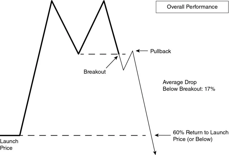
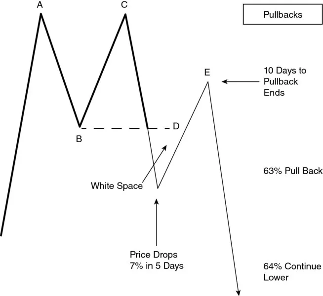
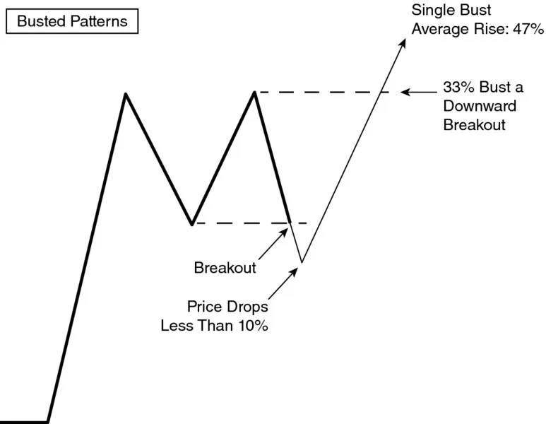
Bulkowski analyzed thousands of trades to identify common paths a stock takes after the breakout from a chart pattern. By combining those paths, he discovered the typical routes a stock takes, which he calls configurations. Match your chart to one of those configurations and you will know, before you buy, how your trade will likely perform. Now you can avoid potentially disastrous trades to focus on the big winners.

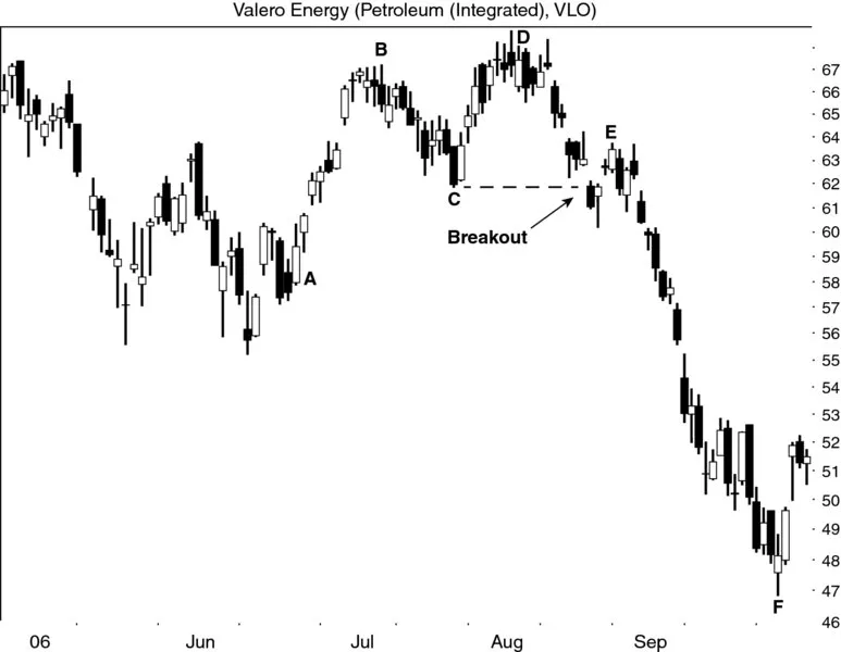
Each chapter illustrates the behavior of a specific pattern. Identification guidelines help even beginners recognize common patterns, and expert analysis sheds light on the period of the stock's behavior that actually affects your investment. You'll discover ideal buy and sell setups, how to set price targets, and more, with almost 370 charts and illustrations to guide you each step of the way. Coverage includes the most common and popular patterns, but also the lesser-known ones like bad earnings surprises, price mirrors, price mountains, and straight-line runs. Whether you're new to chart patterns or an experienced professional, this book provides the insight you need to select better trades.

  • Identify chart patterns
  • Select better buy signals
  • Predict future behavior
  • Learn the best stop locations

Knowing the pattern is one thing, but knowing how often a stop will trigger and how often you can expect a stock to reach its target price is another matter entirelyā€”and it impacts your trade performance immensely. Chart Patterns: After the Buy is the essential reference guide to using chart patterns effectively throughout the entire life of the trade.

Frequently asked questions

How do I cancel my subscription?
Simply head over to the account section in settings and click on ā€œCancel Subscriptionā€ - itā€™s as simple as that. After you cancel, your membership will stay active for the remainder of the time youā€™ve paid for. Learn more here.
Can/how do I download books?
At the moment all of our mobile-responsive ePub books are available to download via the app. Most of our PDFs are also available to download and we're working on making the final remaining ones downloadable now. Learn more here.
What is the difference between the pricing plans?
Both plans give you full access to the library and all of Perlegoā€™s features. The only differences are the price and subscription period: With the annual plan youā€™ll save around 30% compared to 12 months on the monthly plan.
What is Perlego?
We are an online textbook subscription service, where you can get access to an entire online library for less than the price of a single book per month. With over 1 million books across 1000+ topics, weā€™ve got you covered! Learn more here.
Do you support text-to-speech?
Look out for the read-aloud symbol on your next book to see if you can listen to it. The read-aloud tool reads text aloud for you, highlighting the text as it is being read. You can pause it, speed it up and slow it down. Learn more here.
Is Chart Patterns an online PDF/ePUB?
Yes, you can access Chart Patterns by Thomas N. Bulkowski in PDF and/or ePUB format, as well as other popular books in Business & Finance. We have over one million books available in our catalogue for you to explore.

Information

Publisher
Wiley
Year
2016
ISBN
9781119274926
Edition
1
Subtopic
Finance

CHAPTER 1

Big M

Image described by surrounding text.
I fired up my computer and typed ā€œbig M chart patternā€ into a search engine and my website (thepatternsite.com) came up first on the list. That tells me not a lot of research has been done on the big M.
You might think that the big M is a burger joint, but in technical analysis, it is a variation of a double top chart pattern. The difference between a double top and a big M is that the big M has tall sides (when it works). When it fails, the left side remains tall, but the right side is amputated.
Let us take a closer look.

ā–  Behavior at a Glance

FIGURE 1.1 shows the typical behavior after a big M chart pattern forms. The big M is shown in a slightly thicker line.
Diagram shows a big M chart pattern where launch price, breakout, sixty percentage return to launch price and pullback are represented; the average breakout is 17 percentage.
FIGURE 1.1 This is the typical behavior of a big M chart pattern.
The launch price is where the uptrend begins that leads to the big M. Often the run up to a big M is a straight-line affair, not a rounded turn. The climb lasts as long as bullish enthusiasm drives price higher. Eventually, however, the stock peaks and retraces. That retrace forms the first peak of the big M.
Bulls gather and attempt a new high, but price stalls at or near the price of the first high and drops back. This up-and-down movement forms the second peak.
When price closes below the valley between the two peaks, it confirms the chart pattern as a valid one and signals a breakout. Timber!
Price drops an average of 17% below the breakout price, but that is for more than 1,300 perfect trades. Do not expect to duplicate those results. You might hurt yourself.
Comparing the ultimate low with the launch price, we find that 60% of the big Ms see price returning to or dropping below the launch price. That also means 40% remain above the launch price.
  • After a big M, the stock returns to the launch price 60% of the time.

Pullbacks

Figure 1.2 shows what happens to big M patterns 63% of the time.
Diagram shows a big M chart pattern where the white space, price drop of 7 percentage in 5 days, 10 days to pull back ends, 63 percentage pull back and 64 percentage continue lower are represented.
FIGURE 1.2 Statistics related to pullbacks.
A big M appears as peaks AC with B marking the lowest valley between the two peaks (the so-called confirmation, or breakout price). A close below the price of B means a downward breakout. If price closes above the highest peak (A or C) before closing below the breakout price (B), then you do not have a big M.
D represents a pullback when the stock returns to the breakout price within a month after the breakout. The one-month window is arbitrary, but it serves as a good benchmark. I prefer that white space appear between the breakout and pullback as shown in the figure.
After a downward breakout, price drops an average of 7% in 5 days. Price reverses and retraces the drop for 5 more days (10 calendar days total since the breakout) until it peaks again at the top of the pullback (E).
Thirty-six percent of the time price continues higher, often leaving traders with a loss on their ledgers. However, the vast majority of the time (64%) price continues lower.
  • A pullback occurs 63% of the time and price continues lower 64% of the time.

Busted Tops

Figure 1.3 shows the performance of busted big M chart patterns. A pattern busts after a downward breakout when price drops less than 10% before reversing and closing above the top of the chart pattern.
Diagram shows a big M chart pattern where the breakout, price drops less than 10 percentage, single bust average rise of 47 percentage and 33 percentage bust a downward breakout.
FIGURE 1.3 The average performance of big Ms that bust a downward breakout.
I found that 33% of big Ms will bust a downward breakout in a bull market. That means 1 in 3 trades will likely lose money. However, if you see a busted big M, then buy it. The average rise for a single busted chart pattern is a mouthwatering 47%. Of course, a single bust can turn into a double or triple bust, too. That is a risk. I will explain double and triple busts later or you can visit the glossary, which shows a picture (see Figure G.1).
  • Big Ms bust 33% of the time.

ā–  Identification

Figure 1.4 shows an example of a big M chart pattern. The launch price is at A. The bulls get excited about the stock and bid it up, day after day, so that a straight-line run forms and takes price much higher, to the first top (B).
Chart shows the candle stick index wave pattern for valero energy from January to September 2006. The breakout point of the pattern is also represented.
FIGURE 1.4 This big M looks like a double top wit...

Table of contents