
eBook - ePub
In Progress
See Inside a Lettering Artist's Sketchbook and Process, from Pencil to Vector
Jessica Hische
This is a test
Buch teilen
- 176 Seiten
- English
- ePUB (handyfreundlich)
- Über iOS und Android verfügbar
eBook - ePub
In Progress
See Inside a Lettering Artist's Sketchbook and Process, from Pencil to Vector
Jessica Hische
Angaben zum Buch
Buchvorschau
Inhaltsverzeichnis
Quellenangaben
Über dieses Buch
This show-all romp through design-world darling Jessica Hische's sketchbook reveals the creative and technical process behind making award-winning hand lettering. See everything, from Hische's rough sketches to her polished finals for major clients such as Wes Anderson, NPR, and Starbucks. The result is a well of inspiration and brass tacks information for designers who want to sketch distinctive letterforms and hone their skills. With more than 250 images of her penciled sketches, this highly visual ebook is an essential—and entirely enjoyable—resource for those who practice or simply appreciate the art of hand lettering.
Häufig gestellte Fragen
Wie kann ich mein Abo kündigen?
Gehe einfach zum Kontobereich in den Einstellungen und klicke auf „Abo kündigen“ – ganz einfach. Nachdem du gekündigt hast, bleibt deine Mitgliedschaft für den verbleibenden Abozeitraum, den du bereits bezahlt hast, aktiv. Mehr Informationen hier.
(Wie) Kann ich Bücher herunterladen?
Derzeit stehen all unsere auf Mobilgeräte reagierenden ePub-Bücher zum Download über die App zur Verfügung. Die meisten unserer PDFs stehen ebenfalls zum Download bereit; wir arbeiten daran, auch die übrigen PDFs zum Download anzubieten, bei denen dies aktuell noch nicht möglich ist. Weitere Informationen hier.
Welcher Unterschied besteht bei den Preisen zwischen den Aboplänen?
Mit beiden Aboplänen erhältst du vollen Zugang zur Bibliothek und allen Funktionen von Perlego. Die einzigen Unterschiede bestehen im Preis und dem Abozeitraum: Mit dem Jahresabo sparst du auf 12 Monate gerechnet im Vergleich zum Monatsabo rund 30 %.
Was ist Perlego?
Wir sind ein Online-Abodienst für Lehrbücher, bei dem du für weniger als den Preis eines einzelnen Buches pro Monat Zugang zu einer ganzen Online-Bibliothek erhältst. Mit über 1 Million Büchern zu über 1.000 verschiedenen Themen haben wir bestimmt alles, was du brauchst! Weitere Informationen hier.
Unterstützt Perlego Text-zu-Sprache?
Achte auf das Symbol zum Vorlesen in deinem nächsten Buch, um zu sehen, ob du es dir auch anhören kannst. Bei diesem Tool wird dir Text laut vorgelesen, wobei der Text beim Vorlesen auch grafisch hervorgehoben wird. Du kannst das Vorlesen jederzeit anhalten, beschleunigen und verlangsamen. Weitere Informationen hier.
Ist In Progress als Online-PDF/ePub verfügbar?
Ja, du hast Zugang zu In Progress von Jessica Hische im PDF- und/oder ePub-Format sowie zu anderen beliebten Büchern aus Arte & Arte general. Aus unserem Katalog stehen dir über 1 Million Bücher zur Verfügung.
Information
Thema
ArteThema
Arte general
Process in Action: Differing Steps for Different Projects
Most of the work that I do falls into these categories: editorial, advertising, books, logos, and miscellaneous (which includes hard-to-categorize printed and non-printed projects, including some of my type design work). Through case studies, you’ll see how my process shifts depending on the category of work and who the work is for. We’ve gotten over the hump of technical talk; on to the pretty pictures!

Creating artwork for magazines and newspapers is very fun, and because the timelines are generally pretty tight, you can create a large portfolio of work very quickly. Early in my career, people who stumbled upon my portfolio were shocked at the amount of work I’d created in such a short period of time, and I was able to amass such a big body of work because of all the editorial projects I’d been working on. If I look at my calendar from that time, it’s packed with editorial work. I’d be working on up to twelve or fifteen jobs simultaneously, which in retrospect seems crazy. What made it possible to work on so many projects at once was the inflexibility of editorial deadlines—a magazine or newspaper went to press on a certain date, and my artwork had to be delivered by that time. I could piece together my calendar like a complicated puzzle, everything staying neatly in place, jobs hardly ever requiring many rounds of revision or pushing past their original deadlines.
One of the most fun things about editorial work is that you get to read endless fascinating articles and brainstorm about what concepts would best articulate the ideas expressed in them. I particularly love illustrating for science magazines because of all the random things I get to learn about. As an editorial illustrator, you have more freedom to experiment than you often do on other client projects because what you’re creating isn’t a part of a big expensive campaign. It isn’t going to be used by the client on everything they make for all eternity—it exists in just one issue, on one page, as a part of one article of one publication. I don’t do as many editorial jobs now as I used to, but I still love to take them on here and there as palate cleansers.
32° of Fun
Client: Northern Virginia Magazine
Art Direction: Hana Jung
Art Direction: Hana Jung
Much of my early lettering work was quite illustrative, like this piece for Northern Virginia Magazine. I wasn’t quite as crazy about point placement at this time in my career, so everything feels a bit looser. There are a lot of gradients and drop shadows (created not with the drop shadow tool, but by adding a Gaussian blur to duplicated shapes and turning the opacity down to 50 percent or lower), which makes the work feel a bit like cut paper. I used to use a paper texture layer on top of all of my work, which warmed it up and made everything feel cohesive. Now, I try not to rely on textures and tricks to make the work feel “finished.”


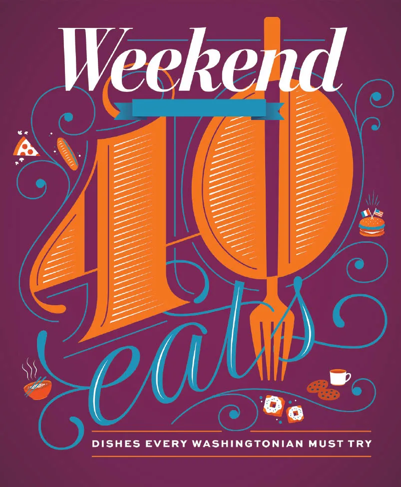
40 Eats
Client: The Washington Post
Art Direction: Chris Barber
Art Direction: Chris Barber
Chris reached out for me to create the cover of the Washington Post’s Weekend section for their annual 40 Eats feature, which highlights forty culinary things to try in DC. In previous issues, a giant 40 was a prominent feature, and as I love giant letters and numbers, I kept that in my design. I wanted to use an unexpected color palette and settled on plum, orange, and cyan.

Fortune 50
Client: Fortune magazine
Art Direction: Michael Solita
Art Direction: Michael Solita
Fortune contacted me to create a giant 50 for their upcoming issue about the fifty most powerful women. Since the timeline was tight, and the layout wasn’t totally nailed down yet, we decided to create two versions—one that was more fancy and feminine and one that was more modern and deco-influenced. The former was the one that ended up in the magazine, but I’m really...