eBook - ePub
Colour Design
Theories and Applications
Janet Best
This is a test
- 704 Seiten
- English
- ePUB (handyfreundlich)
- Über iOS und Android verfügbar
eBook - ePub
Colour Design
Theories and Applications
Janet Best
Angaben zum Buch
Buchvorschau
Inhaltsverzeichnis
Quellenangaben
Über dieses Buch
Colour Design: Theories and Applications, Second Edition, provides information on a broad spectrum of colour subjects written by seasoned industry professionals and academics. It is a multidisciplinary book that addresses the use of colour across a range of industries, with a particular focus on textile colouration.
Part One deals with the human visual system, colour perception and colour psychology, while Part Two focuses on the practical application of colour in design, including specifically in textiles and fashion. Part Three covers cultural and historical aspects of colour, as well as recent developments, addressing areas such as dyes and pigments, architecture, colour theory, virtual reality games, colour printing, website development, and sustainability. This revised, expanded, and updated edition reflects recent technological developments, and new industry priorities.
Bringing together the science of colouration and the more artistic elements of design, this book supports students, academics, and industry professionals in developing a deep knowledge of colour use. It will also be an important reference for those involved in textile dyeing, design and manufacture.
- Provides a comprehensive review of the issues surrounding the use of color in textiles
- Discusses the application of color across a wide range of industries, supporting interdisciplinary knowledge and research
- Offers a revised, expanded, and updated look that reflects the rise of new technology and industry priorities
Häufig gestellte Fragen
Wie kann ich mein Abo kündigen?
Gehe einfach zum Kontobereich in den Einstellungen und klicke auf „Abo kündigen“ – ganz einfach. Nachdem du gekündigt hast, bleibt deine Mitgliedschaft für den verbleibenden Abozeitraum, den du bereits bezahlt hast, aktiv. Mehr Informationen hier.
(Wie) Kann ich Bücher herunterladen?
Derzeit stehen all unsere auf Mobilgeräte reagierenden ePub-Bücher zum Download über die App zur Verfügung. Die meisten unserer PDFs stehen ebenfalls zum Download bereit; wir arbeiten daran, auch die übrigen PDFs zum Download anzubieten, bei denen dies aktuell noch nicht möglich ist. Weitere Informationen hier.
Welcher Unterschied besteht bei den Preisen zwischen den Aboplänen?
Mit beiden Aboplänen erhältst du vollen Zugang zur Bibliothek und allen Funktionen von Perlego. Die einzigen Unterschiede bestehen im Preis und dem Abozeitraum: Mit dem Jahresabo sparst du auf 12 Monate gerechnet im Vergleich zum Monatsabo rund 30 %.
Was ist Perlego?
Wir sind ein Online-Abodienst für Lehrbücher, bei dem du für weniger als den Preis eines einzelnen Buches pro Monat Zugang zu einer ganzen Online-Bibliothek erhältst. Mit über 1 Million Büchern zu über 1.000 verschiedenen Themen haben wir bestimmt alles, was du brauchst! Weitere Informationen hier.
Unterstützt Perlego Text-zu-Sprache?
Achte auf das Symbol zum Vorlesen in deinem nächsten Buch, um zu sehen, ob du es dir auch anhören kannst. Bei diesem Tool wird dir Text laut vorgelesen, wobei der Text beim Vorlesen auch grafisch hervorgehoben wird. Du kannst das Vorlesen jederzeit anhalten, beschleunigen und verlangsamen. Weitere Informationen hier.
Ist Colour Design als Online-PDF/ePub verfügbar?
Ja, du hast Zugang zu Colour Design von Janet Best im PDF- und/oder ePub-Format sowie zu anderen beliebten Büchern aus Design & Industrial Design. Aus unserem Katalog stehen dir über 1 Million Bücher zur Verfügung.
Information
Part One
Colour vision and colour perception
1
What is colour?
A.R. Hanson National Physical Laboratory, London, United Kingdom
Abstract
Colour is incredible! It is an important sense providing us with essential information about our world, but it is not simple. This chapter describes how we resolve light the way we do, through an attempt to create a space to contain all the colours that exist. Human colour vision is a sensation of three dimensions so the space will necessarily comprise three dimensions, however, as there are many uses of colour; several such spaces have been developed.
Keywords
Spectrum; Hue; Colour spaces; Subtractive colour mixing; Additive colour mixing.
1.1 Introduction: what is colour?
Turning to dictionaries to answer this question, the reader finds that in general colour is defined by negatives: ‘the visual property of light which is not related to lightness, saturation, texture, glossiness or translucency’. Such technical definitions underplay the enormously positive value colour brings our species and the impact it has upon us. From a survival point of view, it is the primary sense in distinguishing ripe from unripe fruit and safe from unsafe meat; it informs us of the quality of beer or honey and tells us how strong a cup of coffee is or the quality of tomato puree. It adds richness and immediacy to complex visual information, for example in maps and warning signals. It identifies football teams, snooker balls and political parties. It affects mood and performance, dominates fashion aesthetics, whilst its symbolism permeates fine art, national flags and corporate branding. For human beings as sensory, intellectual animals with a high proportion of information about world surrounding us channelled through vision, colour is a highly significant component of our everyday life.
One of the most curious things about colour is its intangible nature. It is a human sense that is very hard to replicate in mathematical software or robotic hardware and research into its complicated functionality is as active today as it has ever been. The colour we see is to some extent time-averaged: the different persistences of various phosphors in fluorescent lighting means that the colour of their illumination changes imperceptibly cyclically 100 times a second. If we stare at a static scene for about 20 seconds we see after-images. As we age, the lens in our eye, our window upon the world, yellows and (although we tend not to notice this) blues dull. Spatially, colours influence each other through the process called simultaneous contrast (Chevreul and Birren, 1981). The impressionist artist Van Gogh appreciated this in his vibrant paintings, often juxtaposing complementary colours (such as blue against yellow and green against red) for enhanced effect. For various reasons, even simple colour tests will generate wide ranges of responses from the same observer at different times, and between different observers. We see colour differently according to illumination type and level. It is not unusual for a person’s left and right eye to see colour slightly differently. Taking these factors into account, one starts to realise that any model of human colour vision is going to be very complicated. At best we can create one which will work under a very limited set of conditions. Designing a machine to predict when a printed photograph matches the original scene is a very tall order. In fact photographic film manufacturers have long known that beyond colour fidelity, their customers have a more sales-worthy colour preference. For example, there are distinct ways in which Japanese and European photographic film stock, respectively, represent the colour of grass.
Such is the complexity and influence of colour that some designers shy from its use (Batchelor, 2000).
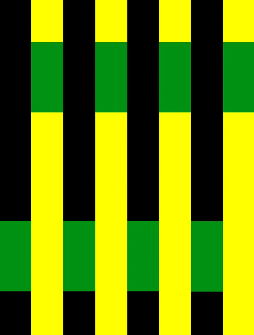
To see colour involves several components—a source, a detector and usually a medium. The light source may be coloured, the eye provides discriminatory resolution over the range of visible light and the medium alters the light source colour through its optical properties (reflection, refraction, scattering, absorption, fluorescence and so on). Altering any of these components, and indeed the viewing conditions, can lead to a change in the relative and absolute colours in a scene. When a light source illuminating a scene is changed, the human visual system largely adapts, seemingly referencing colours to the whitest visible entity in the scene, in the same way that the white point may be adjusted for a digital camera or image. The human visual system performs many intriguing operations, several of which lead to odd visual effects such as simultaneous contrast mentioned previously. These are the basis of several fascinating optical illusions such as that shown in Fig. 1.1, but present considerable challenges to someone wishing to organise colour, build a machine to measure it or construct a numerical model comprehensively describing its perception.
Nassau (2001) comprehensively collates the various causes of colour in media, ranging from the chemical properties of atoms and molecules to physical optics. For example, he explains that the sky is blue (and the setting sun red) because atmospheric molecules scatter light of different wavelengths by enormously different amounts—violet light is scattered about 16 times more than red light.
A scientific definition of colour is that it is a variation in the spectral power distribution of light as discriminated by the human visual system. It is qualitative perception of light.
In the rest of this chapter we shall begin with a description of light, and how the eye has a limited range of its detection. We shall see how three sensor species within human eyes resolve the visible spectrum into three dimensions of colour, and how the nature of these three dimensions changes as neural signals move from retina to brain. Many systems are used to specify colour, each with a rationale based on the understanding of colour at the time of derivation or a particular set of observations or practicalities such as the implementation of colour mixing systems.
1.2 Visible light
Natural light illuminating human activity on earth has a range limited by the light source, and by our eyes.
Light is the carriage of energy by distortions of an electromagnetic field. The field does not require a physical medium to support it—light can travel through a vacuum, as it does when moving from the sun to the earth. Light has electrical and magnetic properties, refracting and diffracting like a wave, so is called an electromagnetic wave.
It is useful to understand a little of the wave properties of light. Light can be described as having a wavelength, a frequency and a speed. Ocean waves might typically hit a beach with a frequency of 10 every minute, have a wavelength (distance between waves) of about 25 m and travel at roughly 4 m/s (about 9 mph). In a vacuum, light of all wavelengths (or frequencies) travel at the same speed (about 3 thousand million metres per second or 186 thousand miles per hour) and a typical (actually bluish-green) visible wavelength of light would be about 530 millionths of a millimetre, normally described as 530 nm, written as 530 nm. This same blue–green light has a frequency of about 566 million million oscillations per second. From now on, this chapter will describe light in terms of wavelength (expressed in nm) only. White light is a mixture of different wavelengths. In normal dispersive materials, such as a glass and water, different wavelengths of light travel at slightly different speeds (blue light travels slower than red light) causing the splitting of spectra by prisms and rain through the process of refraction. The resulting continuum of wavelengths of visible light appears to us as different spectral colours as exhibited in a rainbow.
Three properties constrain the range of solar light illuminating us. The first is the relative spectral power distribution of the sun, which depends on its temperature. Planck’s Law can be applied to calculate—to a good approximation—the amount of light present at each wavelength, giving appreciable fluxes from the ultraviolet (UV) to the mid-infrared. Wien’s Law may be used to find the peak wavelength as a function of the surface temperature of the sun which, depending on the assumption of temperature, ranges from 480 to 520 nm. Secondly, fine gaps in the solar spectrum called the Fraunhofer lines are caused by gases within the sun absorbing very narrow ranges of optical wavelengths. Finally the nature of the earth’s atmosphere and other surfaces (clouds, oceans, grasslands, etc.) reflect and absorb light by varying amounts over the spectrum. Atmospheri...