1 Colour and Texture
COLOUR
For a Production Designer, colour is a vital part of communicating the visual language of a story to an audience. This chapter aims to help you start thinking about colour and texture in a different way, and to make you realize how the right emotional connection can have a profound affect on the audience.
Colour is a massive part of our everyday lives. It allows us to process, understand and relate to everything that we come into contact with, and can directly and indirectly affect our mood. Its versatility means that colour can be used in simple and complex ways to manipulate and control how we experience emotions and memories. It is a screen designer’s primary tool for creating a visual language for the narrative. By providing information to the audience in this way, the Designer can convey a great deal of detail and information.
So powerful is this medium that it requires the Designer to approach a production’s colour palette with considerable care and thought. Each project has its unique narrative, and you must carefully consider the colours to support and enhance that narrative. Colour should not be chosen just because you like it, but rather on the basis of how it will affect the audience.
The use of colour must come out of a complete understanding of the story and how it is told. Colour can provide a real or unreal look, depending on the form of storytelling. For example, music videos are a form of musical storytelling, where colour can be used to punctuate the melody, rhythm, narrative and mood of a song in a short space of time. Dramatic colour and unreal colour changes can grab attention and provide a more immediate experience.
This differs greatly to how colour is used in film, television, and video, where time is taken to tell the story. So, the colour palettes can be subtler, mimicking a sense of reality and authenticity. Dramatic colour changes in drama enhance the action and the narrative, for example, dream sequences that use unreal colours to indicate to the audience that this isn’t reality. It can also be used as a subtle change to blur the boundaries of the real and the unreal.
Colour is especially important for lower budget productions, as it is virtually impossible to build elaborate sets without a decent budget. Through experimentation, colour can be an invaluable and effective way to communicate ideas. But before we continue discussing colour further, in terms of creating mood and atmosphere, we must understand the theory and psychology behind colour.
COLOUR THEORY
Colour is the visual characteristic of refracted white light. Fig. 3 shows what happens when white light passes through a glass prism – it creates a spectrum of colour. Our eyes are only responsive to three parts of the spectrum: red, blue and green, known as the primary colours of light. When these coloured lights are blended together in different combinations, they form every single colour of light that we see.
Colour is divided into two groups: light and pigment. A lighting designer works with coloured light. The Production Designer and Art Director deal with colour in pigment form. Even though light is not a Screen Designer’s medium, they must be familiar with it and the way in which it affects pigment colours.
LIGHT
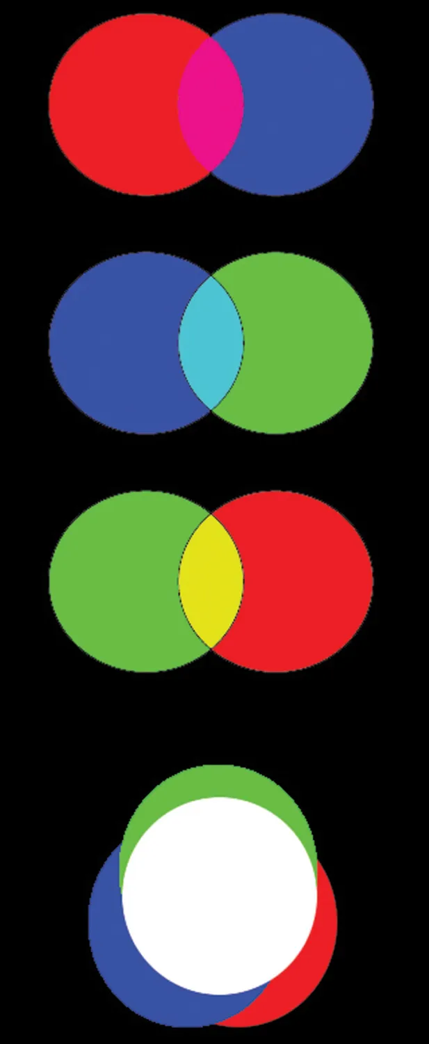
Different-coloured lights can be used to produce what is known as ‘additive’ colour. Red, blue and green are the three elements of the spectrum that the human eye can detect and respond to. These are the basic primary additive colours for direct light, television, computer monitors, stage and screen lighting. When these colours overlap equally (Fig. 4), they create secondary colours: yellow, magenta and cyan. When all three are positioned on top of each other, they produce white light.
PIGMENT
Pigment is a substance that can change colour in reflected light by absorbing different parts of the wavelengths of that light. It is used to create paints, inks, and other materials.
Pigment has been in use for millennia and developed alongside painting. Early pigments were made from mineral or biological matter and experimented with through painting. The most vibrant pigments were purple and blue. The earliest purple pigment came from a rare species of snail, while the blue pigment was made from powdered lapis lazuli (a semi-precious stone). These striking pigments were rare and expensive, making them a symbol of wealth and power. One of the great Flemish painters, Jan Van Eyck, charged extra if clients requested those pigments in their portraits. (Blue: The History of a Color, Michel Pastoureau). Today, most if not all, natural and biological pigments have been replaced by synthetic ones that are less toxic, easier to use and cheaper to produce.
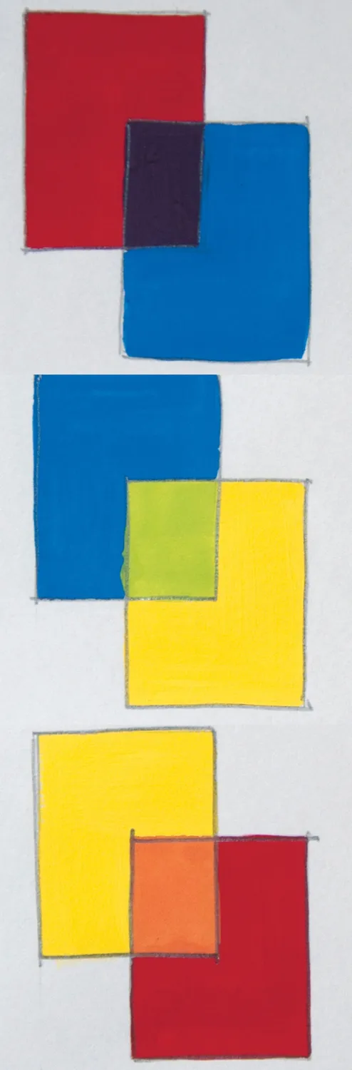
Primary pigment colours are different from primary additive colours. They are red, yellow and blue and are absolutes – they cannot be created through any other colour combinations, but when mixed in equal parts, create all other colours. For example, 50 per cent of red mixed with 50 per cent of yellow will create orange. Fig. 5 shows the primary colour combinations that create three new colours, known as secondary colours. By blending these with primary colours, a further range of new colours known as tertiary colours is created.
THE MUNSELL COLOUR SYSTEM
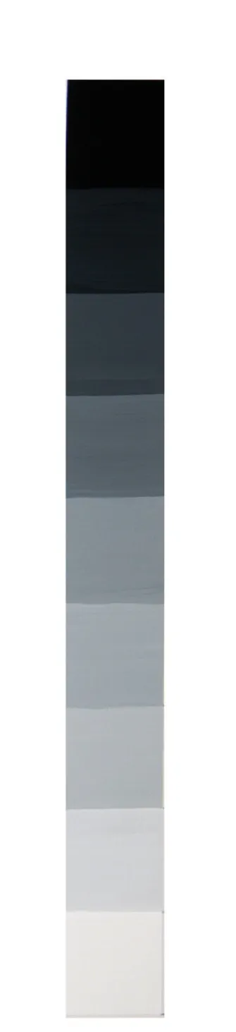
Artist, teacher and inventor, Albert Munsell found a way to explain and teach the theory of colour. He developed a system that made it possible to define the hue (colour) through value and chroma. The value refers to the light or darkness of the hue, and the chroma is defined by its saturation and intensity. His theory is widely accepted around the world and has been used as the basis of many other systems.
HUE, VALUE AND CHROMA
Hue: distinguishes one colour from another – yellow from blue or green from red for example. It only defines each colour by name, not by lightness, darkness, strength or quality.
Value: the second dimension that tells you how light or dark a colour or hue is. Munsell created a vertical axis to measure the progression from black to white (Fig. 6).
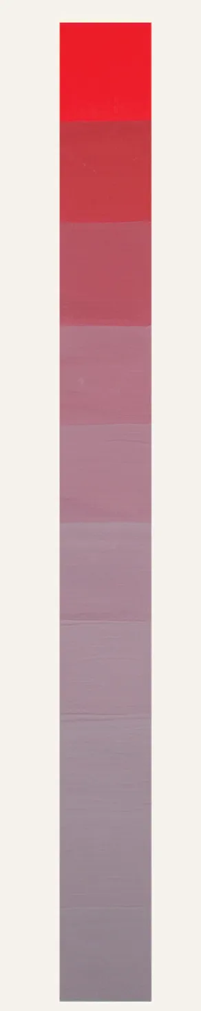
Chroma: the third dimension that defines the strength of a colour. Chroma defines the purity of a colour in relation to grey. Colour chroma and colour saturation do not mean the same thing. Colour saturation defines its degree of purity (Fig. 7). The strength or weakness of a colour is measured on a horizontal axis. The closer to the vertical value axis, the weaker or greyer the chroma (Fig. 8). The further away from the vertical axis, the stronger and purer the hue (Fig. 9).