
eBook - ePub
The Layout Look Book
Max Weber
This is a test
Buch teilen
- English
- ePUB (handyfreundlich)
- Über iOS und Android verfügbar
eBook - ePub
The Layout Look Book
Max Weber
Angaben zum Buch
Buchvorschau
Inhaltsverzeichnis
Quellenangaben
Über dieses Buch
When undertaking a new project, the first thing that must be decided on is the layout. Organized so as to encourage creativity, serendipitous discovery, and inspiration, The Layout Look Book is a great guide for both amateur and professional designers. The book includes techniques that can be used to enhance any layout, as well as insights into the factors that helped make each layout an effective piece. The styles covered in the volume range from traditional to cutting edge, and will enable any designer to become a more creative thinker and produce fantastic work.
Häufig gestellte Fragen
Wie kann ich mein Abo kündigen?
Gehe einfach zum Kontobereich in den Einstellungen und klicke auf „Abo kündigen“ – ganz einfach. Nachdem du gekündigt hast, bleibt deine Mitgliedschaft für den verbleibenden Abozeitraum, den du bereits bezahlt hast, aktiv. Mehr Informationen hier.
(Wie) Kann ich Bücher herunterladen?
Derzeit stehen all unsere auf Mobilgeräte reagierenden ePub-Bücher zum Download über die App zur Verfügung. Die meisten unserer PDFs stehen ebenfalls zum Download bereit; wir arbeiten daran, auch die übrigen PDFs zum Download anzubieten, bei denen dies aktuell noch nicht möglich ist. Weitere Informationen hier.
Welcher Unterschied besteht bei den Preisen zwischen den Aboplänen?
Mit beiden Aboplänen erhältst du vollen Zugang zur Bibliothek und allen Funktionen von Perlego. Die einzigen Unterschiede bestehen im Preis und dem Abozeitraum: Mit dem Jahresabo sparst du auf 12 Monate gerechnet im Vergleich zum Monatsabo rund 30 %.
Was ist Perlego?
Wir sind ein Online-Abodienst für Lehrbücher, bei dem du für weniger als den Preis eines einzelnen Buches pro Monat Zugang zu einer ganzen Online-Bibliothek erhältst. Mit über 1 Million Büchern zu über 1.000 verschiedenen Themen haben wir bestimmt alles, was du brauchst! Weitere Informationen hier.
Unterstützt Perlego Text-zu-Sprache?
Achte auf das Symbol zum Vorlesen in deinem nächsten Buch, um zu sehen, ob du es dir auch anhören kannst. Bei diesem Tool wird dir Text laut vorgelesen, wobei der Text beim Vorlesen auch grafisch hervorgehoben wird. Du kannst das Vorlesen jederzeit anhalten, beschleunigen und verlangsamen. Weitere Informationen hier.
Ist The Layout Look Book als Online-PDF/ePub verfügbar?
Ja, du hast Zugang zu The Layout Look Book von Max Weber im PDF- und/oder ePub-Format sowie zu anderen beliebten Büchern aus Design & Graphic design. Aus unserem Katalog stehen dir über 1 Million Bücher zur Verfügung.
Information
Thema
DesignThema
Graphic designPoster

UWE LOESCH // GER //
UWE LOESCH // GER //

UWE LOESCH // GER //

UWE LOESCH // GER //

UWE LOESCH // GER //

UWE LOESCH // GER //
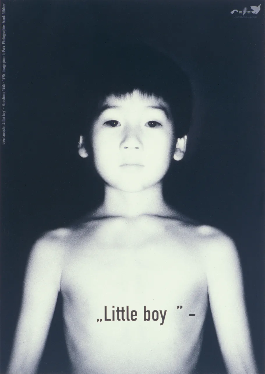
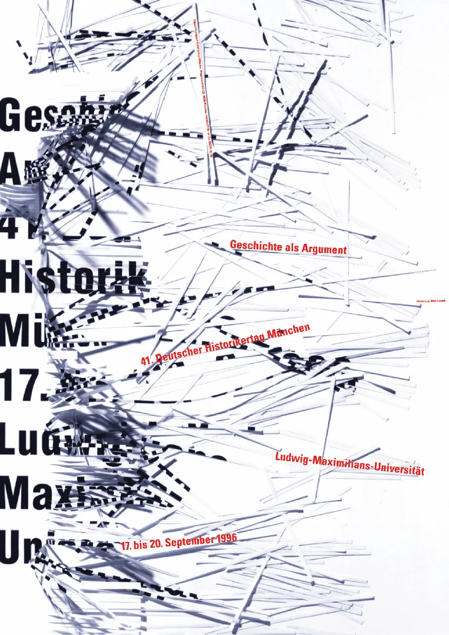
Little boy // Geschichte als Argument // www.scheisse.de // Faire le beaux // Vogelfrei // Istanbul bye bye! //
Uwe Loesch’s posters communicate with extreme efficiency: only few visual elements entangle the viewer in levels of importance. Often the parts of the poster build upon themselves in the head of the viewer to a pulsating whole. Typography provides content that goes beyond the literal meaning of the printed message, creating a tense relationship with the image in which typography becomes the image itself. In the first example, the prize-winning poster that recalls the 50th anniversary of the bombing of Hiroshima, Loesch writes the code name for the bomb, “Little Boy” on the iconic, tender photo of an Asian boy. From the reciprocal effect of writing and image, the poster derives its dizzying strength. During such pointed reduction, even a blank character in the typography has meaning. An example in which typography becomes the image itself can be found in the poster created for the German Historian’s Conference of 1996. The slogan of the conference, “History as Argument,” is almost unrecognizable after being devoured by a shredder. A poster which becomes a part of the discussion of the conference.
Uwe Loesch // Düsseldorf, Germany // www.uweloesch.de //
More than 30 individual exhibitions and 100 group exhibitions, and the awarding of nearly all international design prizes prove that Uwe Loesch is one the most important current poster designers worldwide. Born in Dresden in 1943, Uwe Loesch has been working for publishing houses, companies and social and cultural organizations from his own design firm in Düsseldorf since 1968. By the beginning of the 1980s, his posters were receiving international acclaim. His pointed, content-driven images cannot be pigeon holed ina specific style, but instead anticipate numerous trends decades ahead, such as the treatment of the sharp and the obscure, the evaluation of typography as a multilayered experiential element, unconventional formats such as a poster that can be cut up into a book and much more. Internationally renowned museums like the MoMA in New York collect and show his works in their permanent exhibitions.
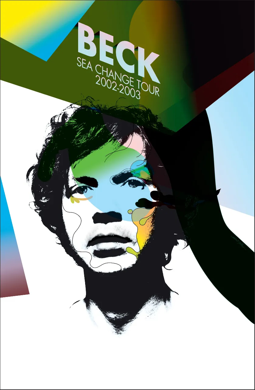
LAURENT FETIS // FR //
Beck: Sea Change // 2002 //
For the “Sea Change” tour of the singer/songwriter and multi-instrumentalist Beck, the Paris-based designer Laurent Fétis of Paris designed the tour poster into an idiosyncratic combination of photographs, illustrations and typographies that recall the psychedelic aesthetic of the 1960s and 1970s. The poster was printed in a limited edition of 2,000 copies.
NLXL // NL //
Volksbuurtmuseum: Buitenspel // 2003 //
The Dutch design studio NLXL designed the printed media for Buitenspel, a theater production by the Volksbuurtmuseum based upon interviews of thirty young people from “De schilderswijk”, a multicultural residential area in The Hague. In the interviews the young people express their views on their expectations of the future. Under professional direction, the same young people brought distilled excerpts from the interviews to the stage.
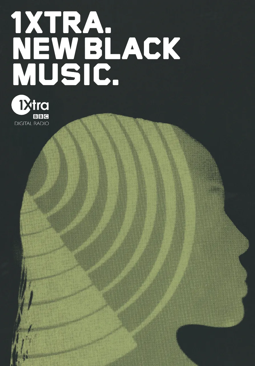
BLUE SOURCE // UK //
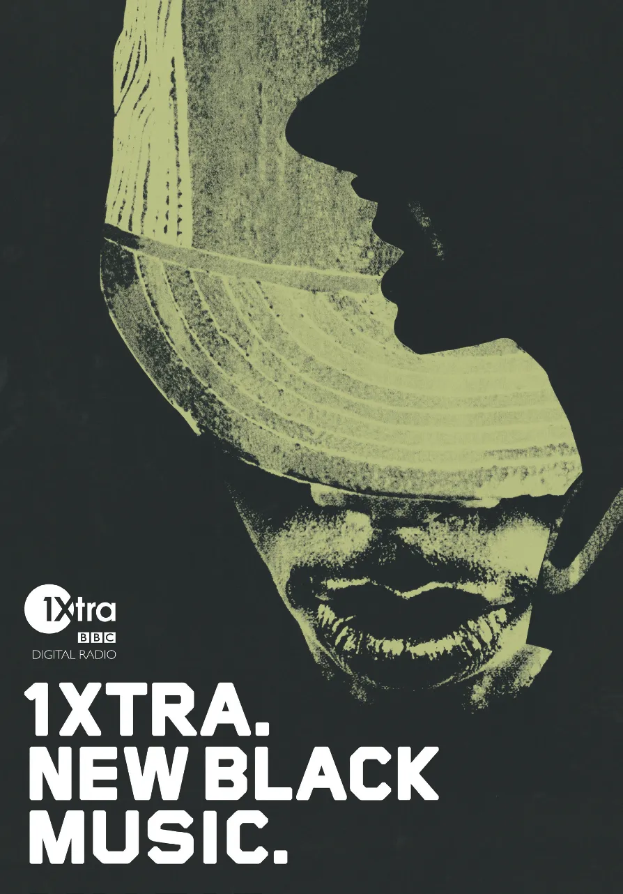
BLUE SOURCE // UK //
1Xtra //
The London-based design firm Blue Source developed a completely new visual identity for 1Xtra, a digital radio transmitter of the BBC that focuses primarily on current black music for a predominantly young audience.

DUEL // NL //

DUEL // NL //
PEK Film Festival // 2006 //
In film all colors are created from the combination of three colors: red, green and blue. By means of various large portions of these three basic ingredients, the entire light spectrum can be represented. This knowledge forms the design concept that the that the graphic design firm Duel created for the advertising media for the contemporary PEK Film Festival in The Hague. For example, the contents of the program publication are placed on full-format monochrome background images that reflect the color tones of the light spectrum: starting with red on the title page to green in the center of the publication to blue at the end. The posters follow the same concept: each of the three posters is reduced to one of the three basic colors.
Duel // Hederik van der Kolk & Bas de Koning // The Hague, Netherlands // www.studioduel.nl //
While still studying at the Academy of Fine Arts in Arnhem, we were hired to design a bookcover for an upcoming new version of a Dutch Youth Bible. Our cooperation turned out to be so fruitful that after finishing this assignment we decided to work together under the name Duel.
Duel is mainly concerned with graphic design, but we are interested in everything that concerns visuals. Our activities are very wide-ranging. Up until now we did flyers, posters, brochures, corporate identities, book design, annual reports, websites, video performances and much more.
In particular, we are very content with the line of prints we are producing for Workspace. Every print we designe...