
eBook - ePub
Cool Infographics
Effective Communication with Data Visualization and Design
Randy Krum
This is a test
Buch teilen
- English
- ePUB (handyfreundlich)
- Über iOS und Android verfügbar
eBook - ePub
Cool Infographics
Effective Communication with Data Visualization and Design
Randy Krum
Angaben zum Buch
Buchvorschau
Inhaltsverzeichnis
Quellenangaben
Über dieses Buch
Make information memorable with creative visual design techniques
Research shows that visual information is more quickly and easily understood, and much more likely to be remembered. This innovative book presents the design process and the best software tools for creating infographics that communicate. Including a special section on how to construct the increasingly popular infographic resume, the book offers graphic designers, marketers, and business professionals vital information on the most effective ways to present data.
- Explains why infographics and data visualizations work
- Shares the tools and techniques for creating great infographics
- Covers online infographics used for marketing, including social media and search engine optimization (SEO)
- Shows how to market your skills with a visual, infographic resume
- Explores the many internal business uses of infographics, including board meeting presentations, annual reports, consumer research statistics, marketing strategies, business plans, and visual explanations of products and services to your customers
With Cool Infographics, you'll learn to create infographics to successfully reach your target audience and tell clear stories with your data.
Häufig gestellte Fragen
Wie kann ich mein Abo kündigen?
Gehe einfach zum Kontobereich in den Einstellungen und klicke auf „Abo kündigen“ – ganz einfach. Nachdem du gekündigt hast, bleibt deine Mitgliedschaft für den verbleibenden Abozeitraum, den du bereits bezahlt hast, aktiv. Mehr Informationen hier.
(Wie) Kann ich Bücher herunterladen?
Derzeit stehen all unsere auf Mobilgeräte reagierenden ePub-Bücher zum Download über die App zur Verfügung. Die meisten unserer PDFs stehen ebenfalls zum Download bereit; wir arbeiten daran, auch die übrigen PDFs zum Download anzubieten, bei denen dies aktuell noch nicht möglich ist. Weitere Informationen hier.
Welcher Unterschied besteht bei den Preisen zwischen den Aboplänen?
Mit beiden Aboplänen erhältst du vollen Zugang zur Bibliothek und allen Funktionen von Perlego. Die einzigen Unterschiede bestehen im Preis und dem Abozeitraum: Mit dem Jahresabo sparst du auf 12 Monate gerechnet im Vergleich zum Monatsabo rund 30 %.
Was ist Perlego?
Wir sind ein Online-Abodienst für Lehrbücher, bei dem du für weniger als den Preis eines einzelnen Buches pro Monat Zugang zu einer ganzen Online-Bibliothek erhältst. Mit über 1 Million Büchern zu über 1.000 verschiedenen Themen haben wir bestimmt alles, was du brauchst! Weitere Informationen hier.
Unterstützt Perlego Text-zu-Sprache?
Achte auf das Symbol zum Vorlesen in deinem nächsten Buch, um zu sehen, ob du es dir auch anhören kannst. Bei diesem Tool wird dir Text laut vorgelesen, wobei der Text beim Vorlesen auch grafisch hervorgehoben wird. Du kannst das Vorlesen jederzeit anhalten, beschleunigen und verlangsamen. Weitere Informationen hier.
Ist Cool Infographics als Online-PDF/ePub verfügbar?
Ja, du hast Zugang zu Cool Infographics von Randy Krum im PDF- und/oder ePub-Format sowie zu anderen beliebten Büchern aus Computer Science & Data Visualisation. Aus unserem Katalog stehen dir über 1 Million Bücher zur Verfügung.
Information
1
The Science of Infographics
Why do people love infographics?
Humans have been drawing pictures to communicate with each other for thousands of years—from pictograms on cave walls to Egyptian hieroglyphics to ideograms on modern signs (Figure 1-1). People love using pictures to communicate and tell stories because it’s hardwired into the human brain.

FIGURE 1-1: Altamira bison cave painting, ancient Egyptian hieroglyphics, and modern signs.
Infographics and data visualizations are all around us. We are surrounded by visual representations of information—charts, maps, icons, progress bars, signs, posters, diagrams, and online visuals (Figure 1-2). These are all examples of visual communication, but these are not all infographics.
FIGURE 1-2: Collage of infographics and data visualizations
The word infographic is used by people to mean many different things. In many cases infographics and data visualizations are considered synonymous, but in the world of an infographic designer they mean different things.
Data visualizations are the visual representations of numerical values. Charts and graphs are data visualizations and create a picture from a given set of data. Figure 1-3 shows the price chart of the S&P 500, the Nasdaq, and the Dow Jones Industrial Average since 1950. The reader can easily see the overall upward trend and the comparison between the three data sets. Including the volume chart beneath the price chart, this data visualization creates a picture using at least 80,000 data points.
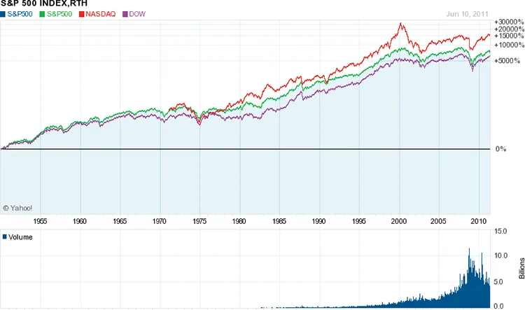
FIGURE 1-3: Stock price chart
It takes us only seconds to understand the long-term trend, to see the close relationship between the three indices, and to see the significant spikes and falls in the stock market. This visualization easily fits on one piece of paper, a computer screen without scrolling, or a presentation slide. Seeing the entire data set on one page, we can understand the data quickly and with little effort.
This is an efficient way to communicate data. Data visualizations can be very space efficient by visualizing a large set of numbers in a small space. By designing a visualization that displays all of the data within the readers’ field of view, this enables us to see the entire data set with minimal eye movement without scrolling or flipping between pages.
If we looked at a spreadsheet with 80,000 values instead, how long would it take us to get a general understanding of the market?
In 2001, Dr. Edward R. Tufte, one of the pioneers of modern data visualization and professor emeritus of political science, statistics, and computer science from Yale University, clearly explained this phenomenon when he stated, “Of all methods for analyzing and communicating statistical information, well-designed data graphics are usually the simplest and at the same time the most powerful.”[1]
This screen shot (Figure 1-4) from the StockTouch app on an iPad is another example of a good data visualization design. The top 100 largest U.S. stocks are shown from nine different market sectors. In this view, the companies from each market segment are organized in a spiral pattern from largest (in the center) to smallest. Each stock is color coded based on its stock price performance over the prior 12 months, but the time period is adjustable with the slider on the right. The shades of green show stock prices that have increased, and shades of red show prices that have decreased.
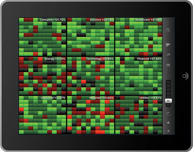
FIGURE 1-4: Heatmap visualization of stock price changes
coolinfographics.com/Figure-1-4Source: StockTouch iOS app, Visible Market, Inc.
Whether it’s a new definition or an additional definition of the term infographics, its use now implies much more than just a data visualization. Up until recently, a common definition for infographics was simply “a visual representation of data”; however, that definition is outdated and is more indicative of data visualizations. Originally derived from the phrase information graphics, infographics was a term used in the production of graphics for newspapers and magazin...