
eBook - ePub
Layout Essentials
100 Design Principles for Using Grids
Beth Tondreau
This is a test
Compartir libro
- 208 páginas
- English
- ePUB (apto para móviles)
- Disponible en iOS y Android
eBook - ePub
Layout Essentials
100 Design Principles for Using Grids
Beth Tondreau
Detalles del libro
Vista previa del libro
Índice
Citas
Información del libro
Adhering to certain layout and grids standards and principles is important for any job from brochures, to annual reports, to posters, to websites, to publications. However, knowing how to bend the rules and make certain grids work for the job at hand takes skill.
This book outlines and demonstrates basic layout/grid guidelines and rules through 100 entries including choosing a typeface, striving for rhythm and balance with type, combining typefaces, using special characters and kerning and legibility. These essentials of grid design are critical to the success of any job.
Preguntas frecuentes
¿Cómo cancelo mi suscripción?
¿Cómo descargo los libros?
Por el momento, todos nuestros libros ePub adaptables a dispositivos móviles se pueden descargar a través de la aplicación. La mayor parte de nuestros PDF también se puede descargar y ya estamos trabajando para que el resto también sea descargable. Obtén más información aquí.
¿En qué se diferencian los planes de precios?
Ambos planes te permiten acceder por completo a la biblioteca y a todas las funciones de Perlego. Las únicas diferencias son el precio y el período de suscripción: con el plan anual ahorrarás en torno a un 30 % en comparación con 12 meses de un plan mensual.
¿Qué es Perlego?
Somos un servicio de suscripción de libros de texto en línea que te permite acceder a toda una biblioteca en línea por menos de lo que cuesta un libro al mes. Con más de un millón de libros sobre más de 1000 categorías, ¡tenemos todo lo que necesitas! Obtén más información aquí.
¿Perlego ofrece la función de texto a voz?
Busca el símbolo de lectura en voz alta en tu próximo libro para ver si puedes escucharlo. La herramienta de lectura en voz alta lee el texto en voz alta por ti, resaltando el texto a medida que se lee. Puedes pausarla, acelerarla y ralentizarla. Obtén más información aquí.
¿Es Layout Essentials un PDF/ePUB en línea?
Sí, puedes acceder a Layout Essentials de Beth Tondreau en formato PDF o ePUB, así como a otros libros populares de Design y Graphic Design. Tenemos más de un millón de libros disponibles en nuestro catálogo para que explores.
Información
Categoría
DesignCategoría
Graphic DesignSINGLE COLUMN
11. Give the Subject Matter a Face
When choosing an appropriate typeface for a page or spread of a single-column grid, consider the subject matter. Some faces are classic and neutral and work with most material, while other faces give a point of view and nearly mimic the topic. A typeface can help set an attitude or it can recede discreetly. The type area of the page, type size, and leading (interlinear space) affect the overall fit of the text. No matter how the material fills the given or desired space, proportions are important.
Project
For the Love of Animals
For the Love of Animals
Client
Henry Holt and Company
Henry Holt and Company
Design
Fritz Metsch
Fritz Metsch
A simple and elegant page with neutral typography displays restraint and concentrates on readability.
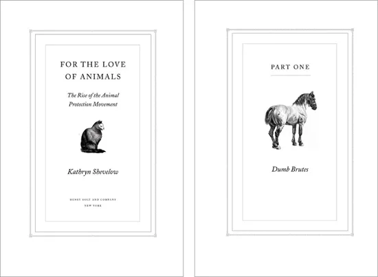
With a simple text design, typographic details are crucial. Letter-spacing and relationships between type sizes contribute to the overall success of a design.
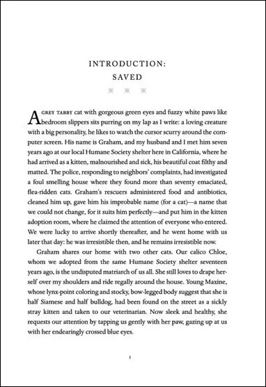
Basic type size is a crucial factor for readability. A successful page incorporates a type size that sits comfortably in the width of the text column. If the type is justified, a type size that is too large in proportion to a small text width will result in gappy word spacing.
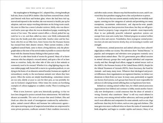
A classical page design generally calls for a small head margin and a large foot margin. Gutter margins are traditionally smaller than the outside margins. Even simple, single-column pages normally take a marker, such as a running head or running foot, and a page number.
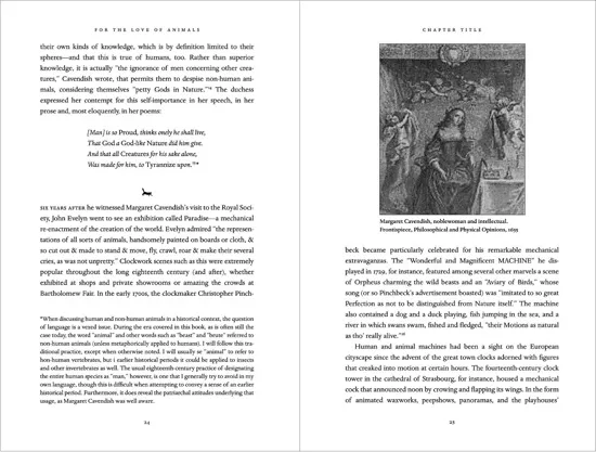
Carefully consider the leading, or interlinear space. Allow enough space to avoid typesetting that looks like a dense, gray mass. Conversely, setting too much space can result in type that looks more like texture than readable text.
12. Design with Ample Margins

If a project contains many pages, a good practice is to leave a gutter margin large enough to keep the text from getting lost in the binding. When the project is a book, a spread that looks proportionate on screen or in laser printouts can change radically once the book is printed and bound. The amount of spatial loss in the gutter depends on the length of the book or brochure as well as the binding method. Whether the piece is perfect bound, sewn, or saddle stitched, it’s a good idea to make certain that nothing goes missing.
BINDING METHODS AND MARGINS
Depending on the number of pages in a project, some binding methods cause type to get lost in the gutters more than others. A project with a sewn or notch binding can be opened flatter than a perfect-bound (glued) project. Type may get lost in the gutter of a perfect-bound project and readers may be reluctant to crack the binding when pulling the book open. If the project is spiral bound, leave enough space in the gutter for the spiral holes.
Project
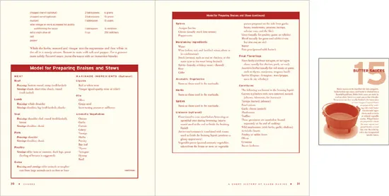
Sauces
Sauces
Client
John Wiley and Sons
John Wiley and Sons
Design
BTDNYC
BTDNYC
Eight hundred–plus pages of hard-core cooking information begs for—and receives—healthy portions of gutter space.
Images are from Sauces, published by John Wiley & Sons, © 2008 by James Peterson. Reprinted with permission of John Wiley & Sons, Inc.
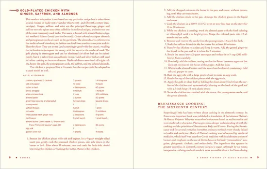
Wide gutter margins ensure that important recipe instructions remain easy to read, without text slipping into the gutter.
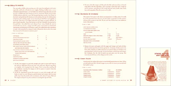
Generous margins take into account elements such as charts and sidebars, which are set to wider measures than text. Wide margins also act as buffers for images.
13. Work in Proportion
Keep proportions in mind, even for the page foot, and leave plenty of space for your page number.
THE GOLDEN RATIO
Designers often work by eye and instinct to determine the most handsome proportions. They then find that other people working ...